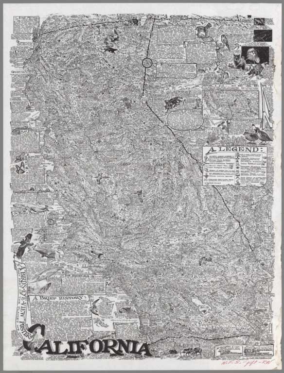
- Featured Maps
- September 28, 2025
Search results from Blog
Viewing: Featured Maps
Map of Near and Middle East Oil 1965
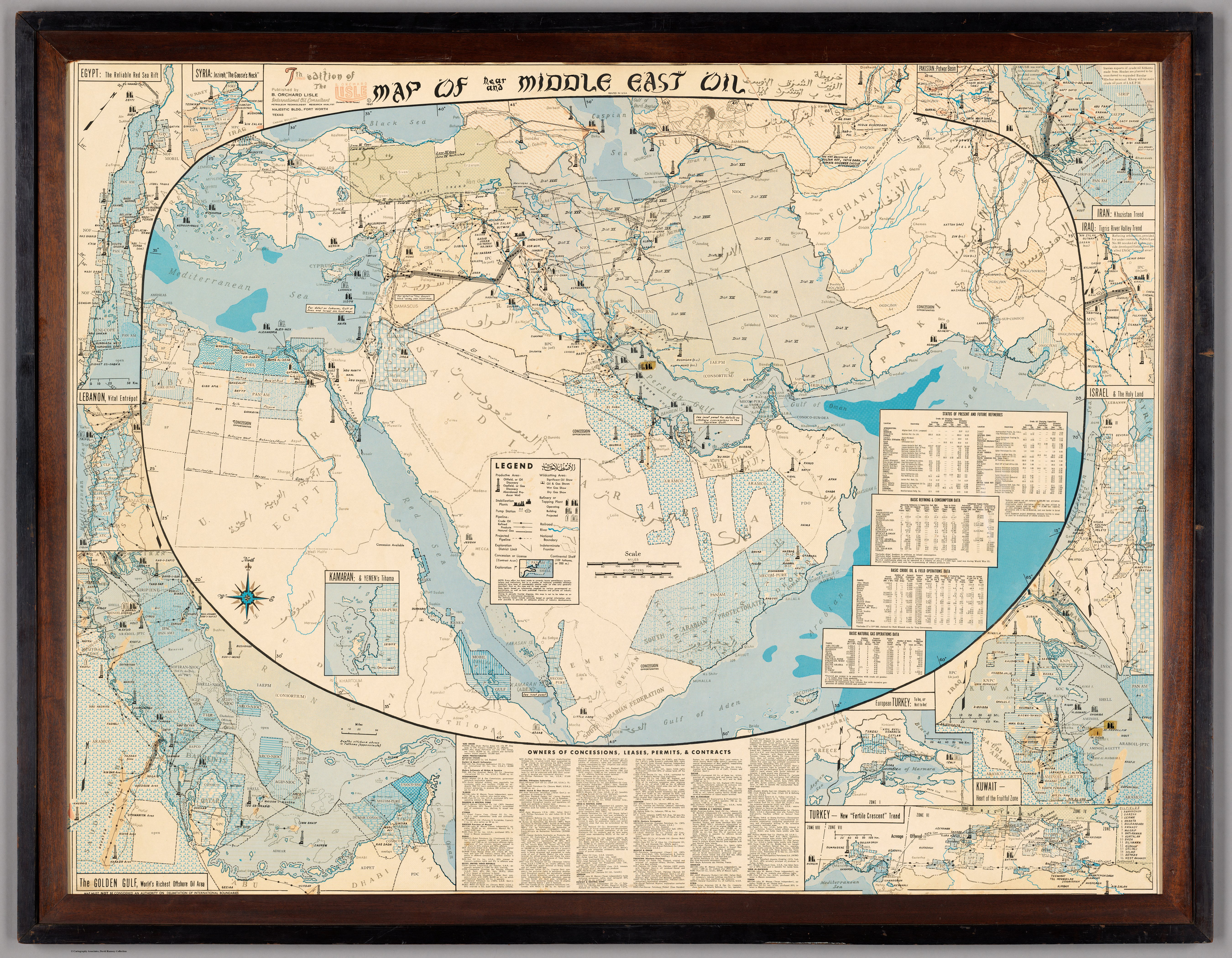
Networks are a central visual and analytical feature of this map. Here’s a breakdown of the networks present, what they mean, and how they relate to the map’s context:
1. Oil and Gas Pipeline Networks
- Major Pipelines: Heavy lines traverse the map, notably from Iraq (Kirkuk) to the Mediterranean (Tripoli, Haifa), from the Persian Gulf inland, and across the Arabian Peninsula. These pipelines connect oilfields to export terminals and refineries, forming the literal backbone of the Middle Eastern oil economy.
- Example: The Iraq Petroleum Company pipeline runs from northern Iraq westward to the Mediterranean.
- Additional Examples: Pipelines from Abadan (Iran), Dhahran-Dammam (Saudi Arabia), and Kuwait to coastlines and terminals.
- Legend: The legend at lower center distinguishes between types of pipelines (existing, under construction, projected).
2. Oilfield and Refinery Networks
- Fields and Refineries: Networks of oilfields (clusters of wells, symbolized by icons) are shown in:
- Southeastern Iran
- Kuwait
- Eastern Saudi Arabia (Ghawar, Dhahran)
- Northern Iraq
- Bahrain
- Qatar
- Baku (Azerbaijan)
- Refineries and Terminals: These are networked nodes, connected by pipelines and shipping routes.
3. Concession and Ownership Networks
- Company Areas: Shaded patterns and color blocks delineate which multinational or national company controls which areas.
- Inset tables and lower text blocks list the principal owners, revealing a web of corporate and political control stretching across national borders.
- Contracts and Permits: These are mapped as overlapping zones, emphasizing the legal and economic network underlying physical infrastructure.
4. Maritime and Shipping Networks
- Tanker Terminals: Coastal nodes show where oil is loaded for maritime transport, connecting Middle Eastern production to global consumption.
- Shipping Routes: While not always explicitly drawn, the proximity of terminals to major sea lanes (Persian Gulf, Red Sea, Mediterranean) suggests the networked nature of oil export.
5. Regional and International Networks
- Inset Maps: Marginal insets provide high-density detail for network nodes (e.g., Kuwait, Dhahran, Baku), showing how networks become denser at critical points.
- Transnational Connections: Pipelines and concession boundaries frequently cross modern political borders, underlining the supra-national character of the oil network.
Interpretive Significance
- Technical and Political Network: The map reveals not just the physical infrastructure but the political-economic web of relationships—companies, concession boundaries, and intergovernmental arrangements.
- Historical Context: In 1965, these networks were dominated by Western companies, but the complexity also hints at coming shifts (nationalization, OPEC).
- Integrated System: The map visually asserts that the Middle East’s oil is not a collection of isolated sites, but a tightly interwoven system shaping global politics and economics.
Conclusion
The map is a diagram of networks—pipelines, oilfields, terminals, company concessions, and shipping routes—depicting the Middle East’s oil as a vast, interdependent system. These networks are both physical (infrastructure) and abstract (ownership, contracts), making the map a powerful tool for understanding the strategic importance and international entanglement of oil in the mid-20th century. AI analysis.
- Featured Maps
- December 18, 2023
1320 Selected Maps And Images From The David Rumsey Map Collection
Over the past 20 years, I have featured these maps and images to rotate on my home page. They represent the growing depth and breadth of the collection.
- Featured Maps
- January 25, 2022
More Than Digital Copies: Maps That Interpret Maps
When we digitize historical maps we create copies that can be shared and used by all. But we also create the potential to repurpose these copies to advance understanding of the original maps. To do this, we create composite maps, georeferenced maps, composite views, interactive globes, composite texts and other types of digital versions that expand map interpretation and enhance use. Below are some examples of these interpretive maps that we have created over the past 20 years. To date we have created 1,674 interpretive composite maps, views, and texts as well as over 56,000 georeferenced maps.
Click on any of the images below to view the interactive online version.
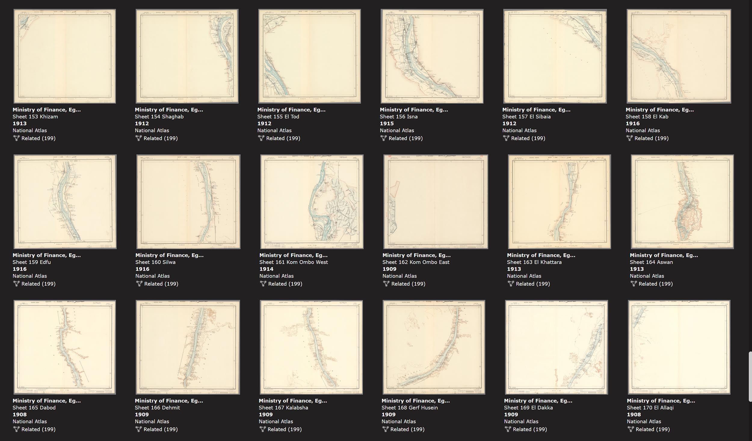
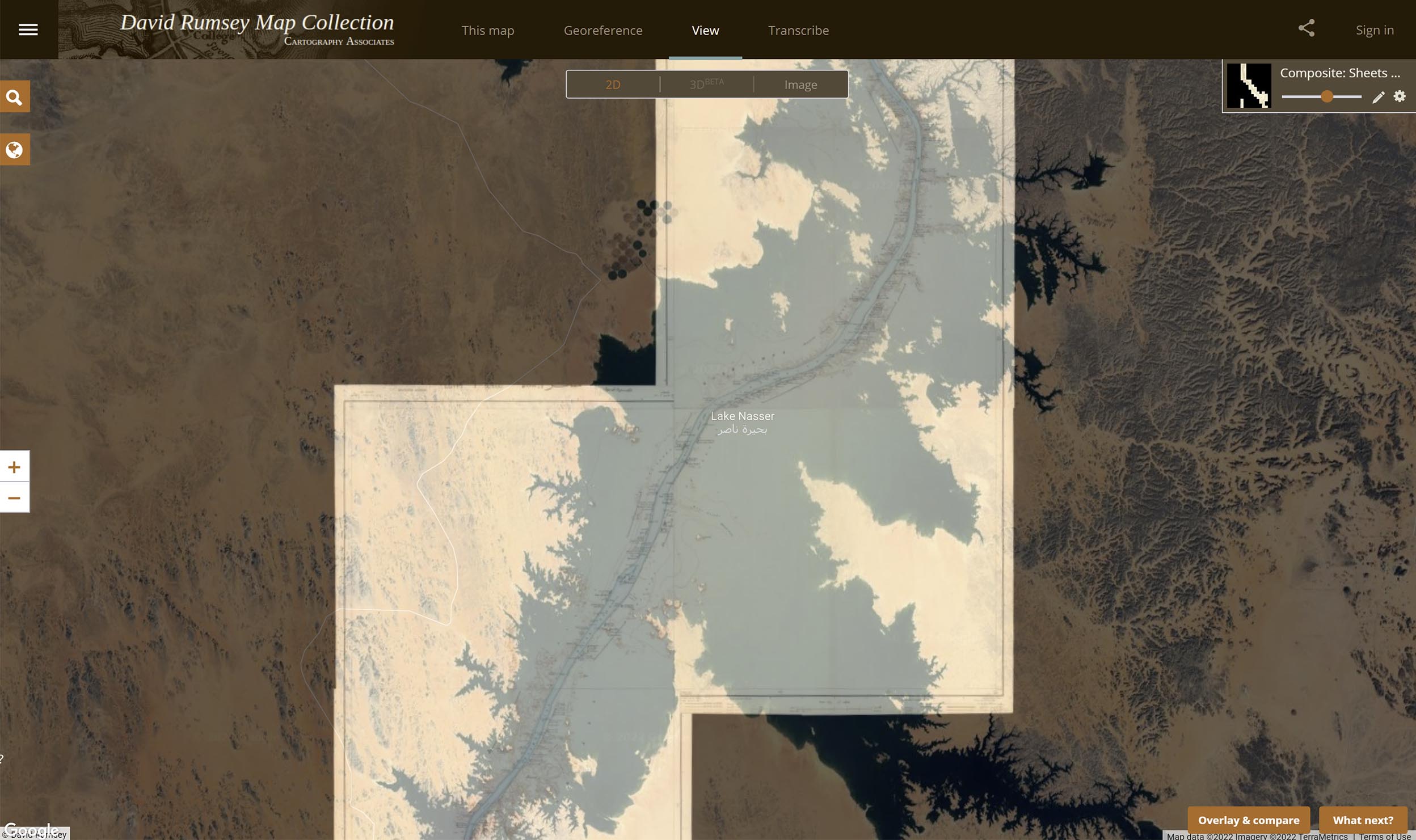
The 1914 Atlas of Egypt shows the entire Nile River in 165 sheets at a large scale of 1:50,000. We combined all 165 sheets, georeferenced them, and overlaid them on modern maps below to show changes.
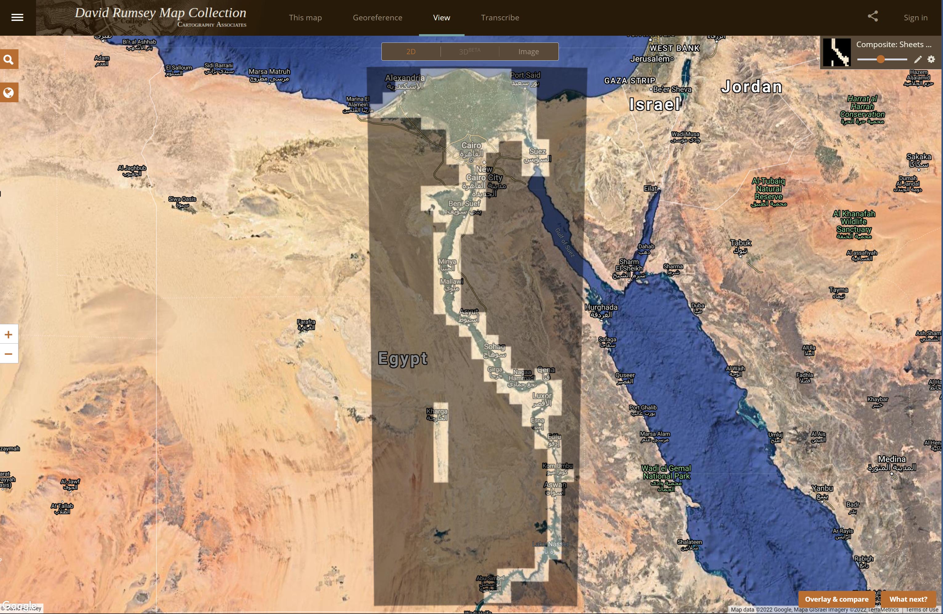
The 165 separate sheets of the 1914 Atlas of Egypt
All 165 sheets of the Atlas of Egypt joined. The joined sheets give a complete view of the Nile and its huge delta.
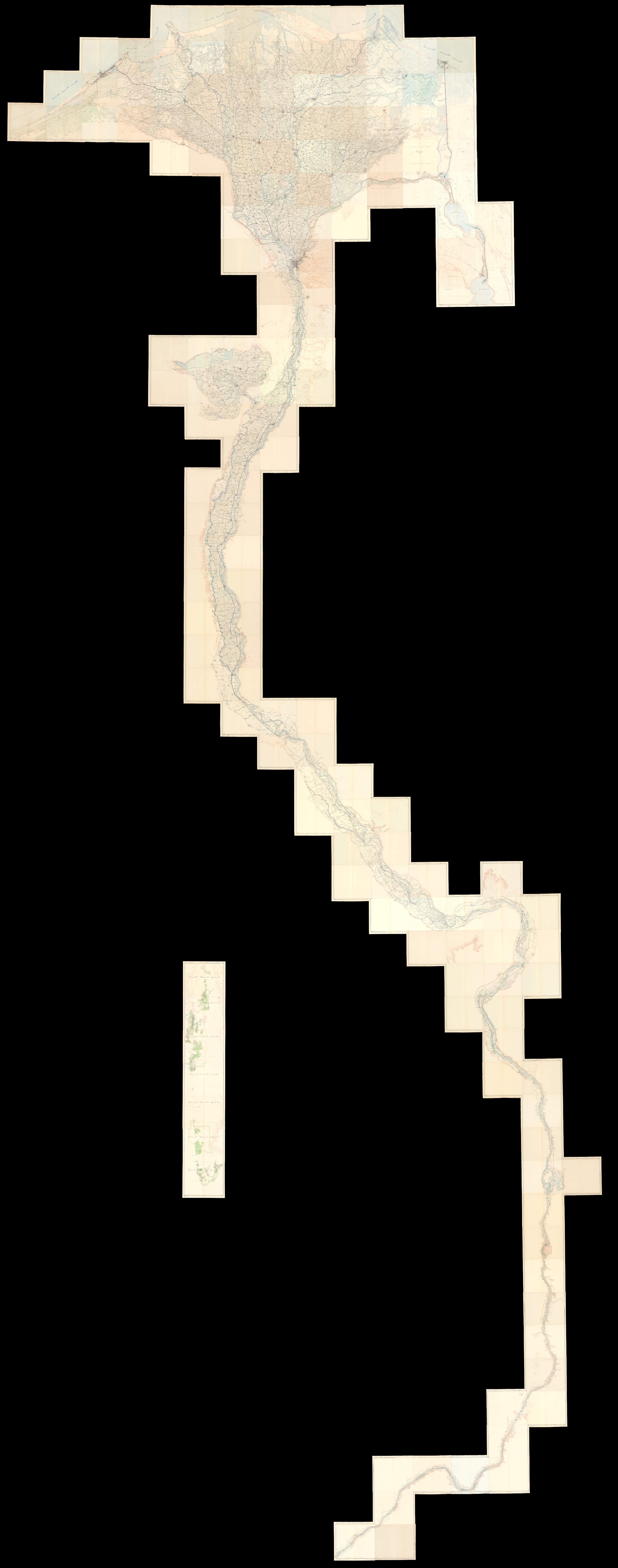
Detail of the Atlas of Egypt sheets showing the original Nile river course underneath Lake Nasser.
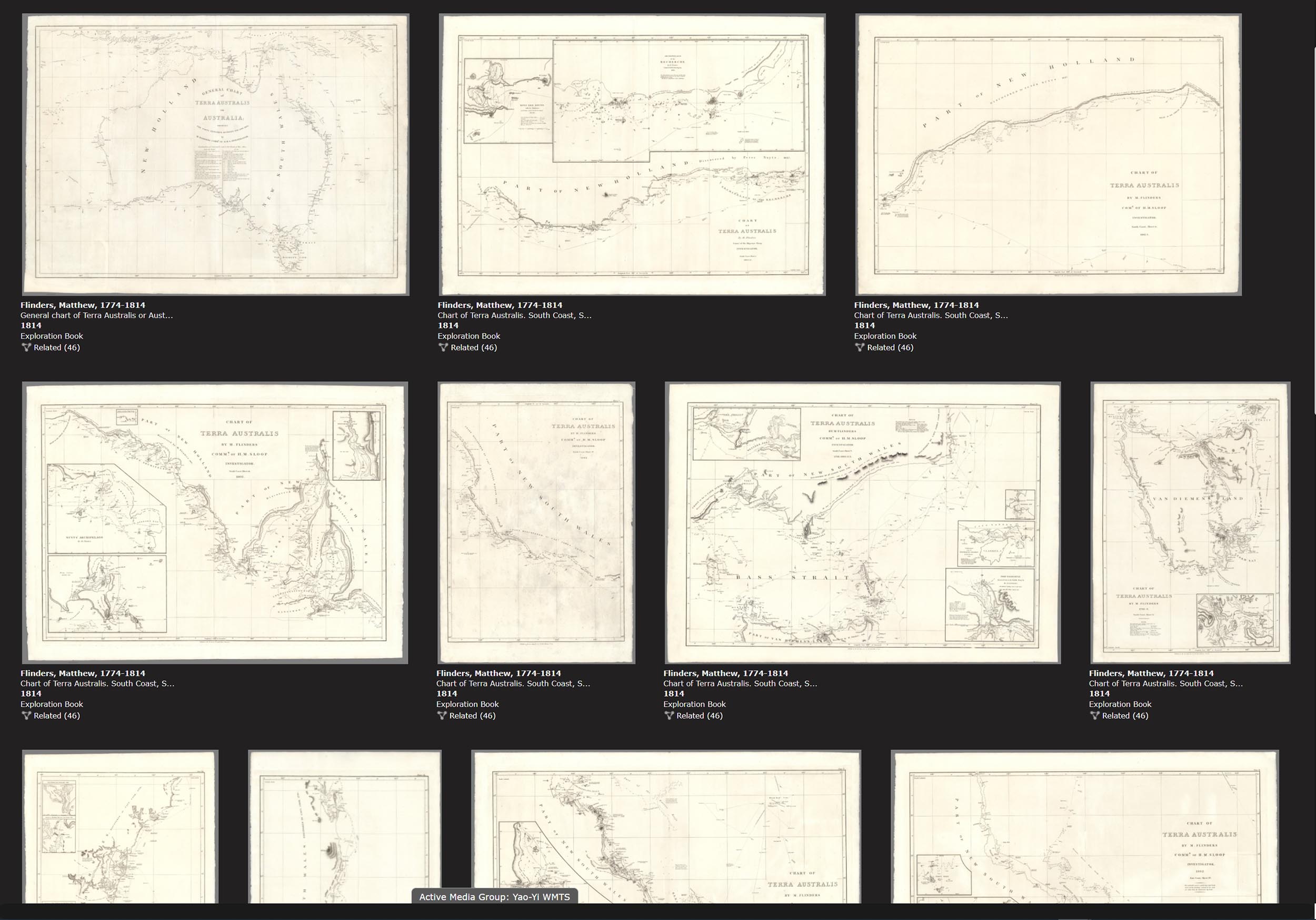
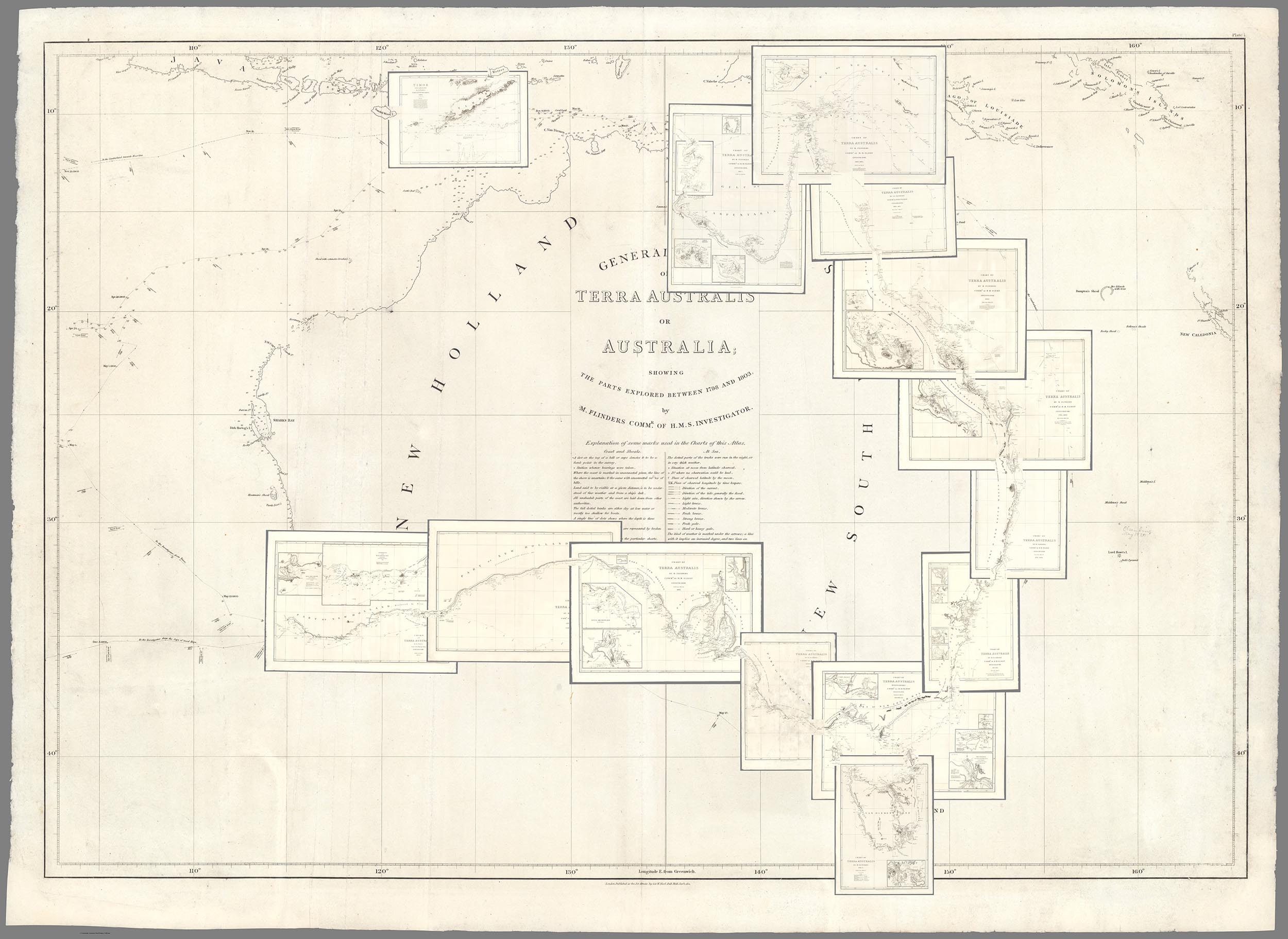
Matthew Flinders' 16 charts published in 1814 were among the first to map the coast line of Australia.
Here the 16 Flinders Australia charts are joined and overlaid on the general chart to show how all the charts fit together.
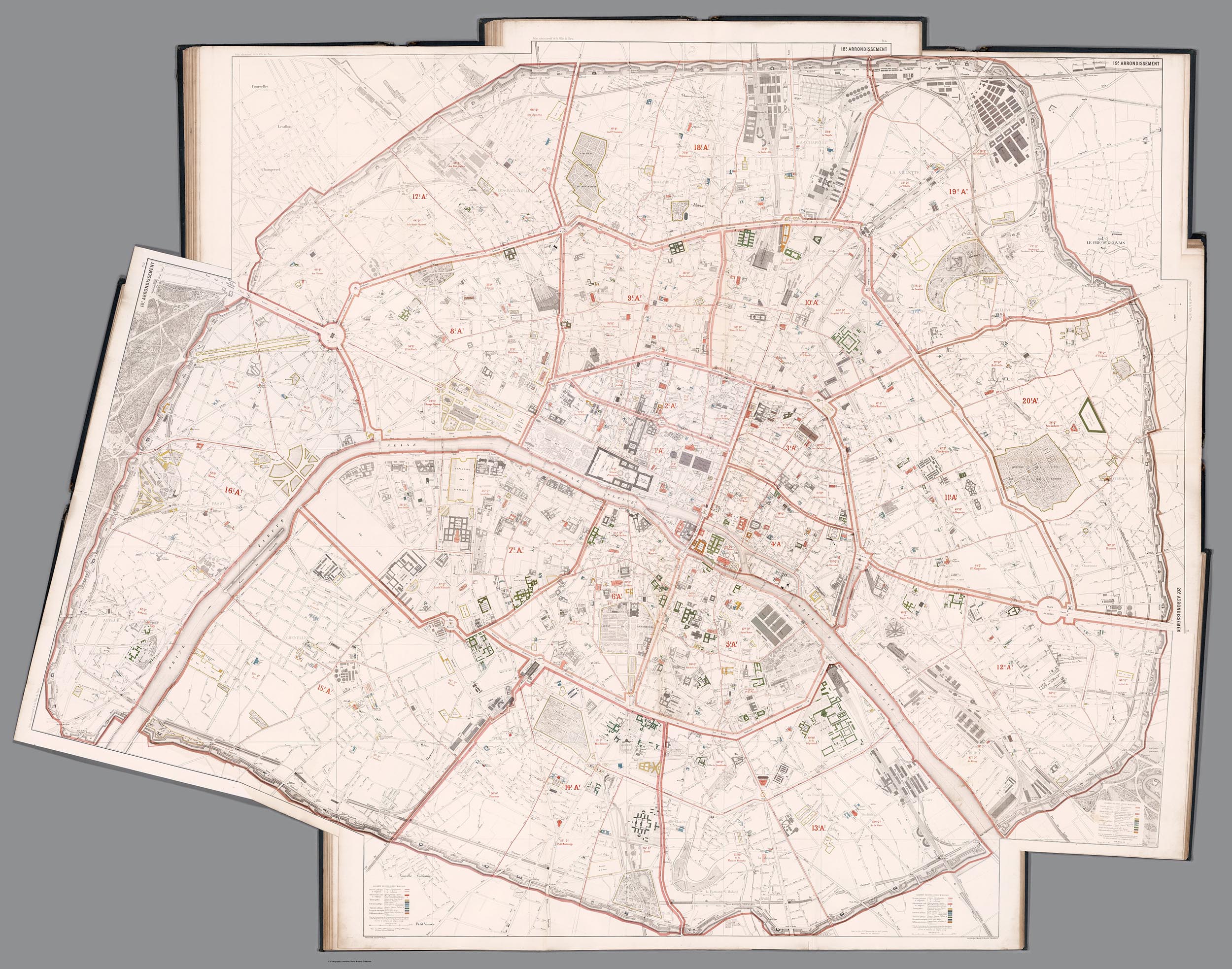
Baron Haussmann published these 16 separate maps of Paris in 1868 to show his proposed new boulevards that would transform Paris into a modern metropolis.
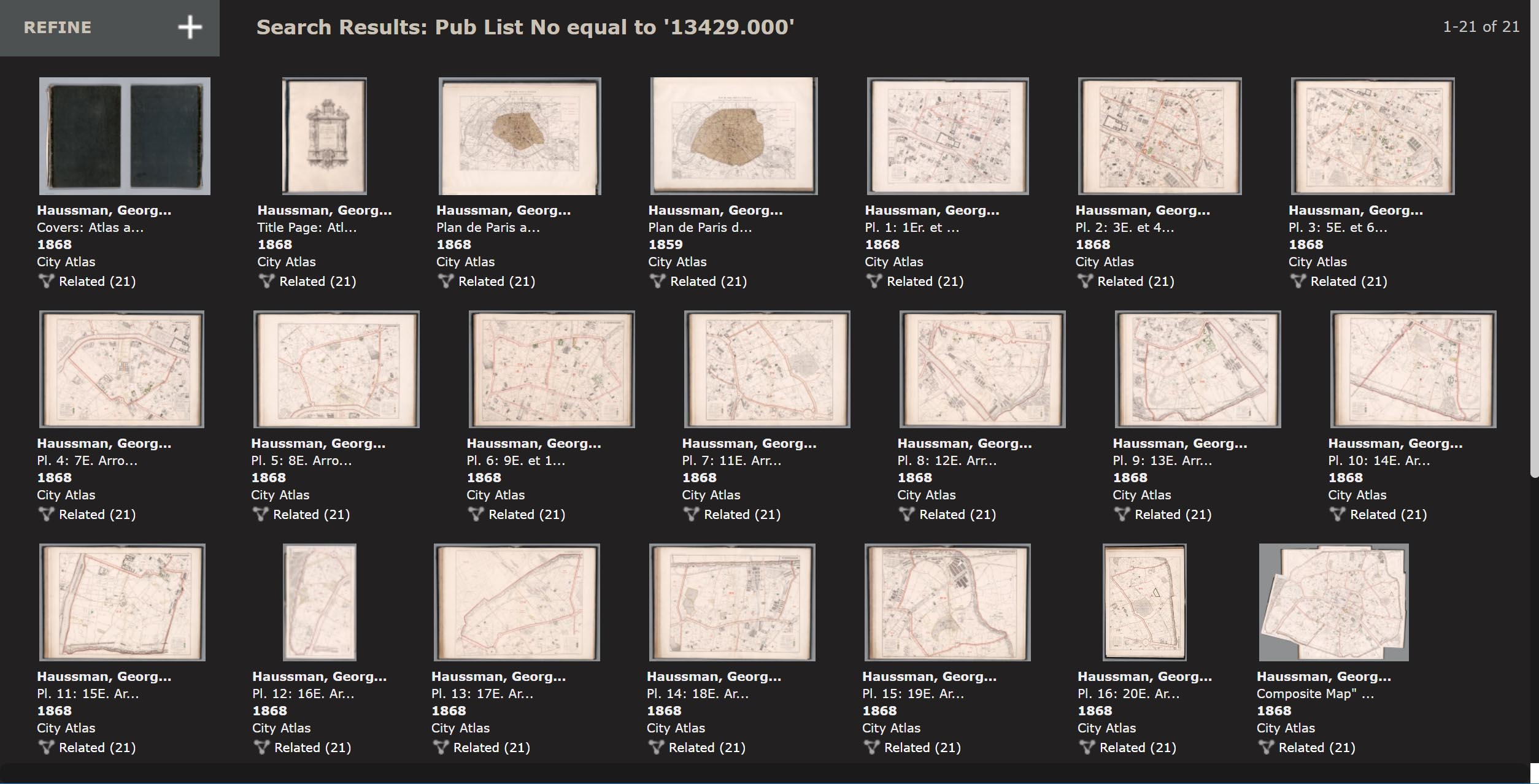
This new map image joins all 16 separate sheets of Paris to show the entire city as one map. It gives a much better picture of Haussmann's changes than the separate maps do by themselves.
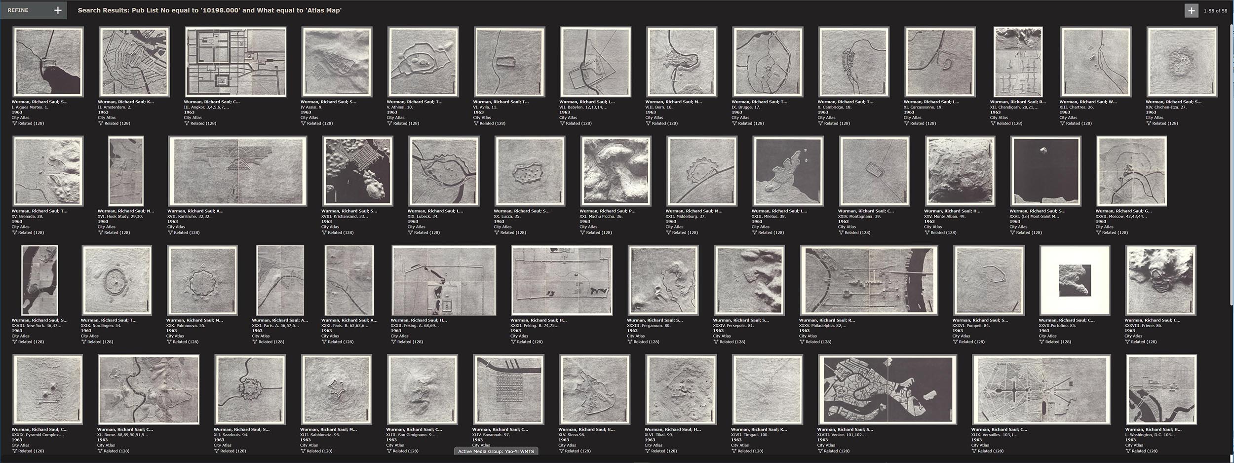
Architect and data visualizer Richard Saul Wurman in 1963 created with his students a book - The City, Form and Intent - with images that enable comparison of 50 cities in different parts of the world at the same scale, 1:14,400. This composite map below shows all 50 cities at the same scale in one image.
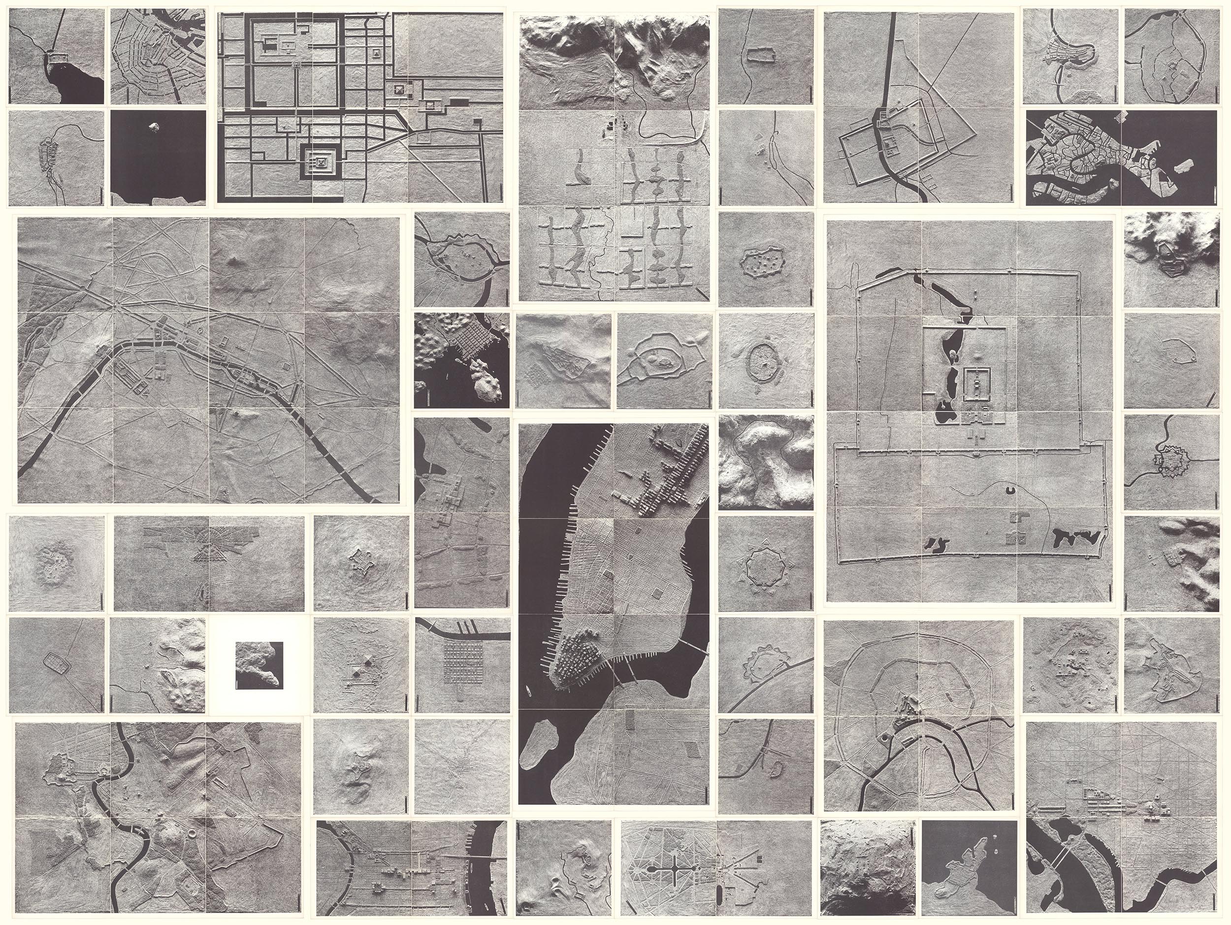
Below are the separate images of the 50 cities that are not able to show relative size because of the digital display system - digital images tend to all look the same size.
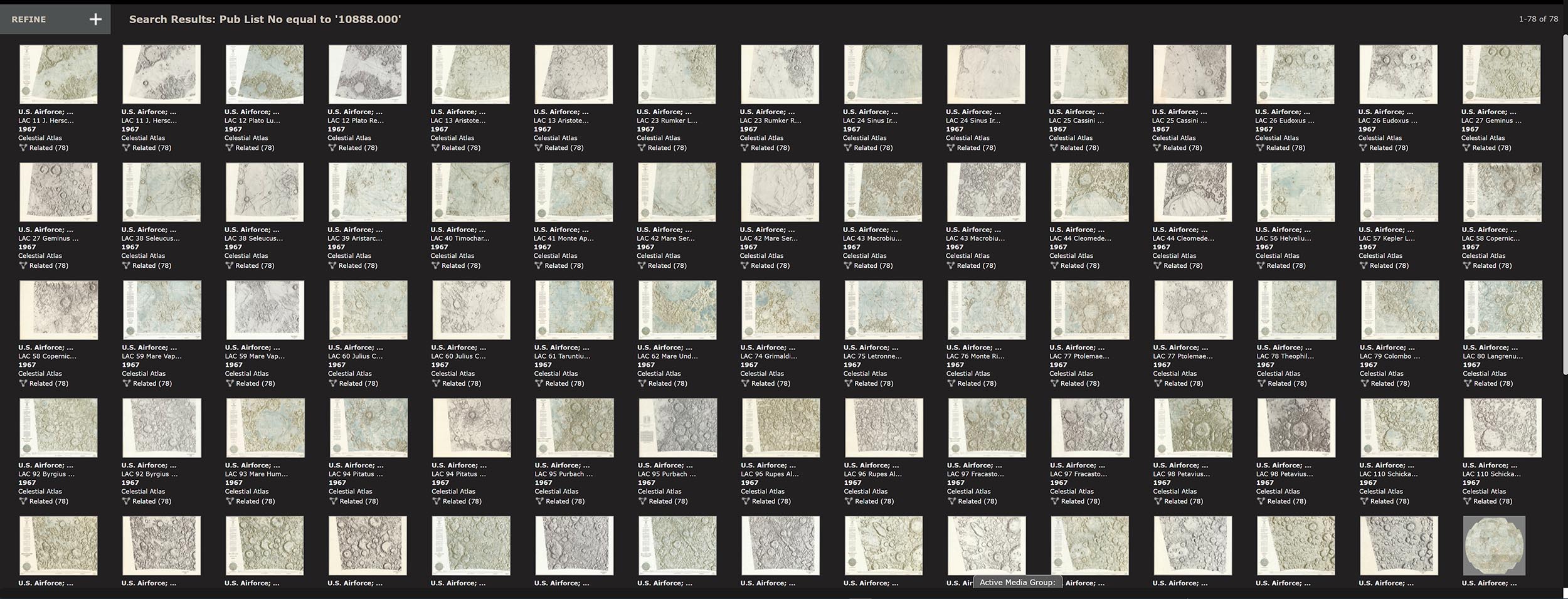
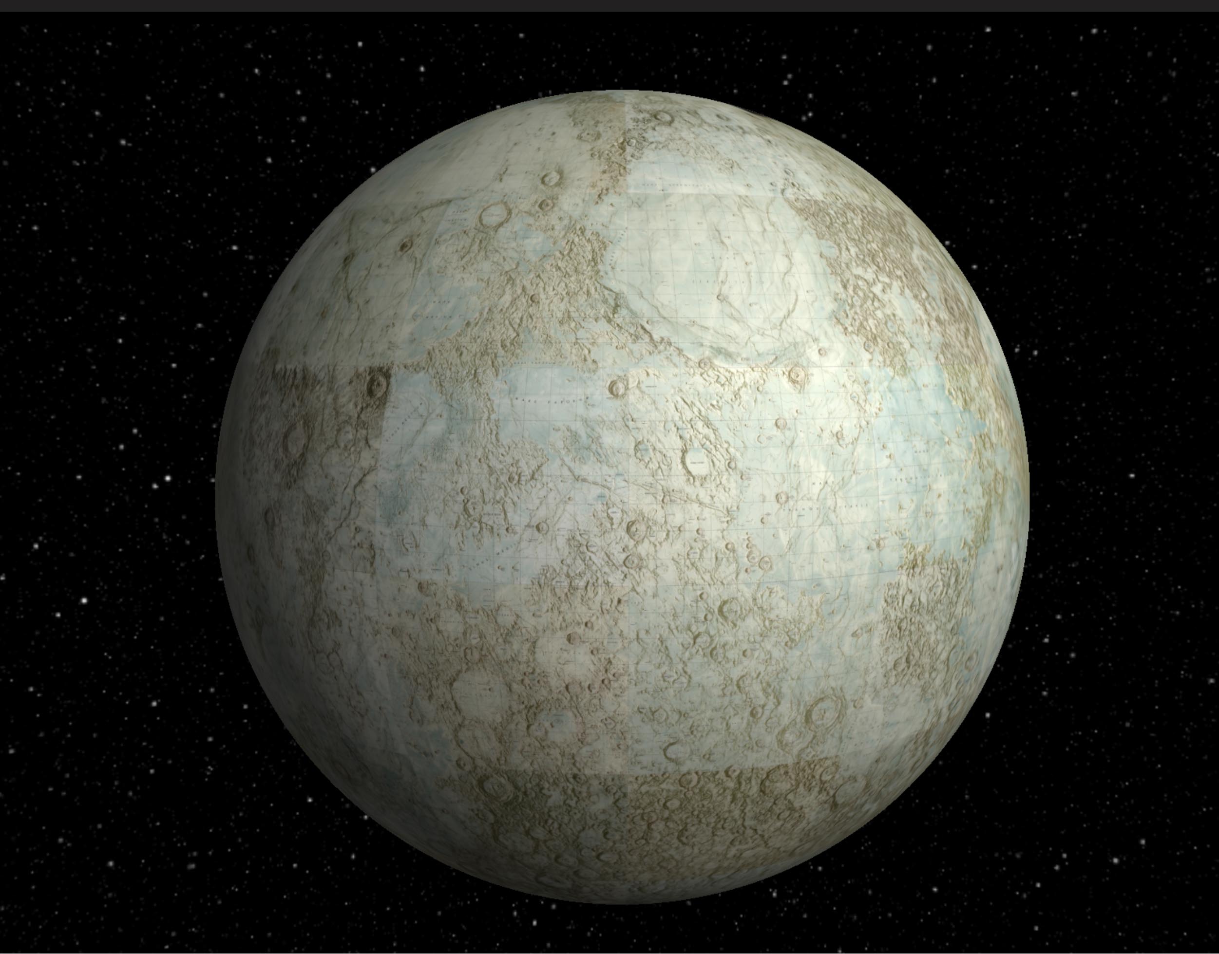
The United States Air Force and NASA produced 44 maps of the moon in the early 1960's that combined earth-based telescope observations with existing photographs, adding lunar features artistically drawn and airbrushed with India ink. All 44 maps in the series were joined using GIS to georeference them in their native projections, Lambert Conformal for the top and bottom 3 rows and Mercator for the 2 middle rows north and south of the equator. Then the joined images can be reprojected as below into a single orthographic projection.
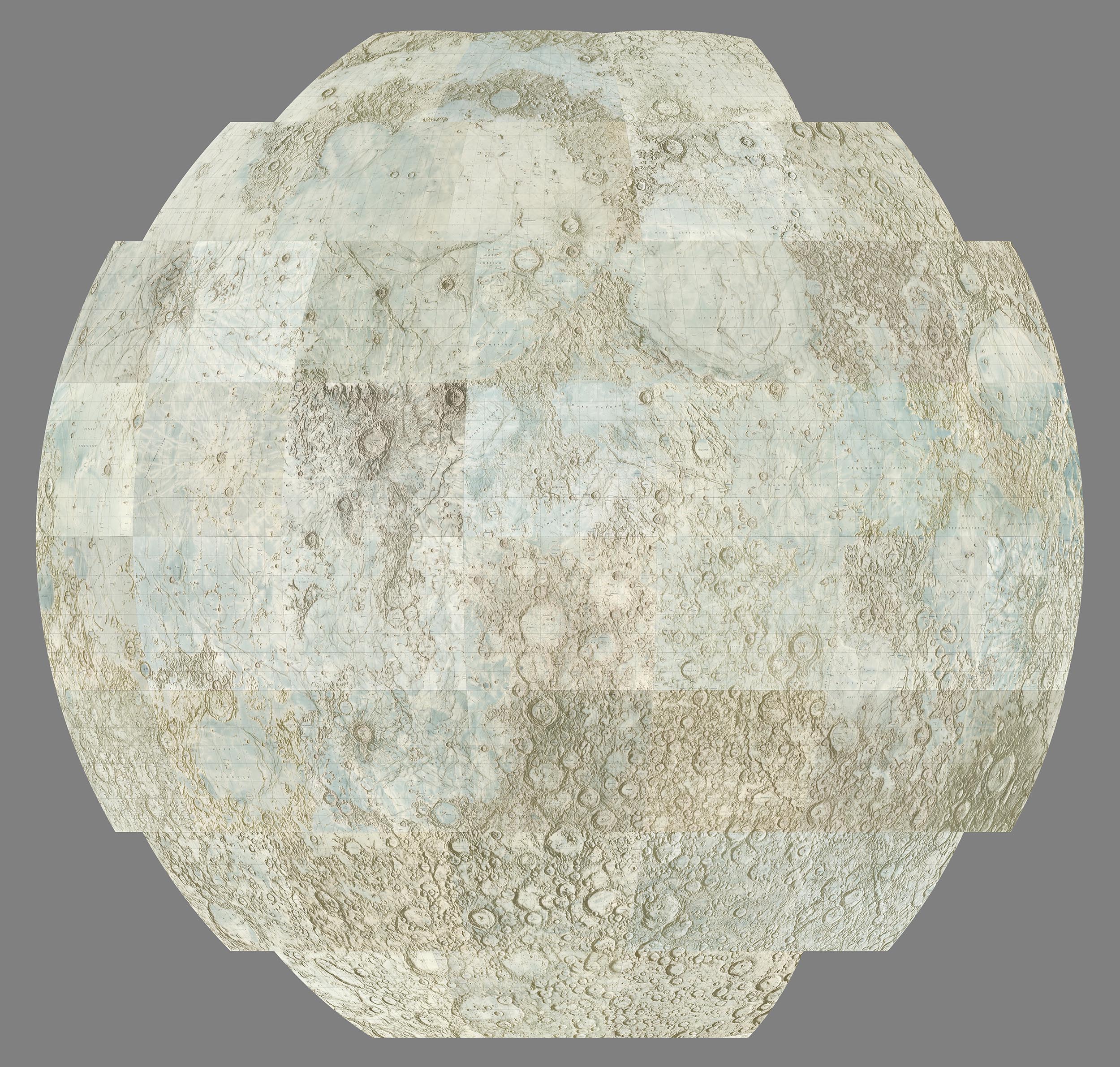
The 44 United States Air Force and NASA separate maps of the moon are below.
An interactive three dimensional globe has been created from the 44 georeferenced moon map images.
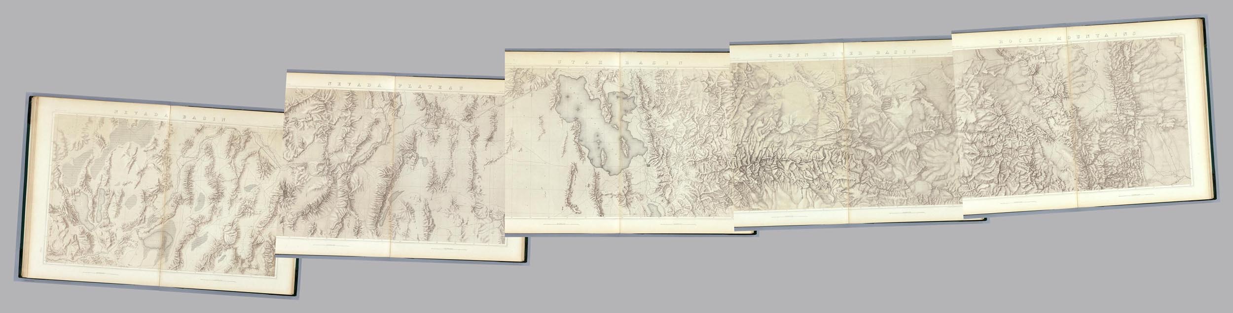
Clarence King and his 40th Parallel Survey of 1876 made 5 maps showing a broad cross section of the American West, something not attempted before. Joining the 5 maps together digitally enables a much better understanding of the importance of the work. Below is the set of 5 geologically colored maps.
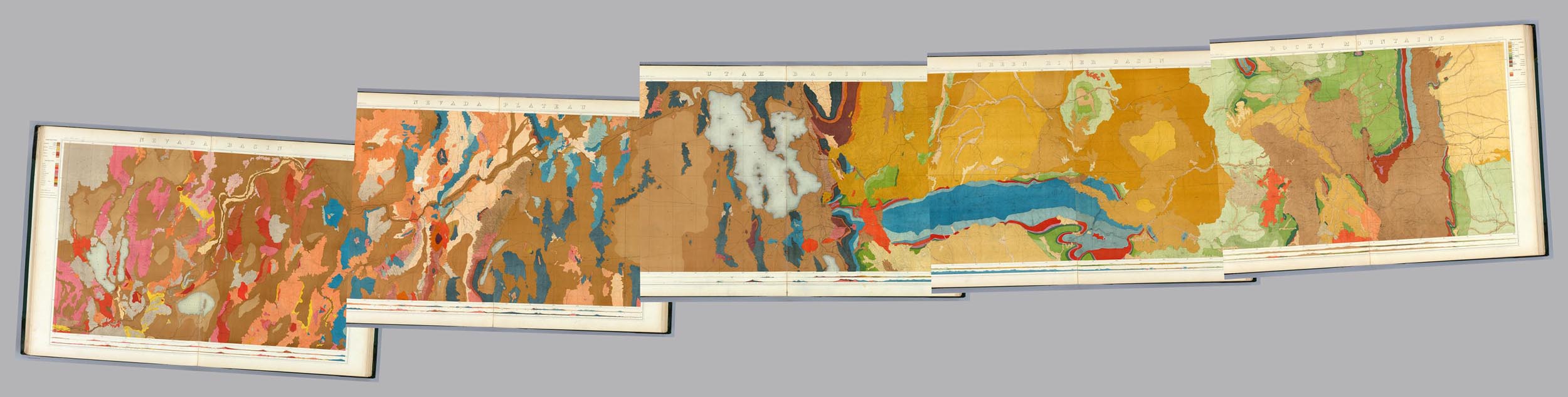
Below are the same 1876 King Survey maps showing only the topography.
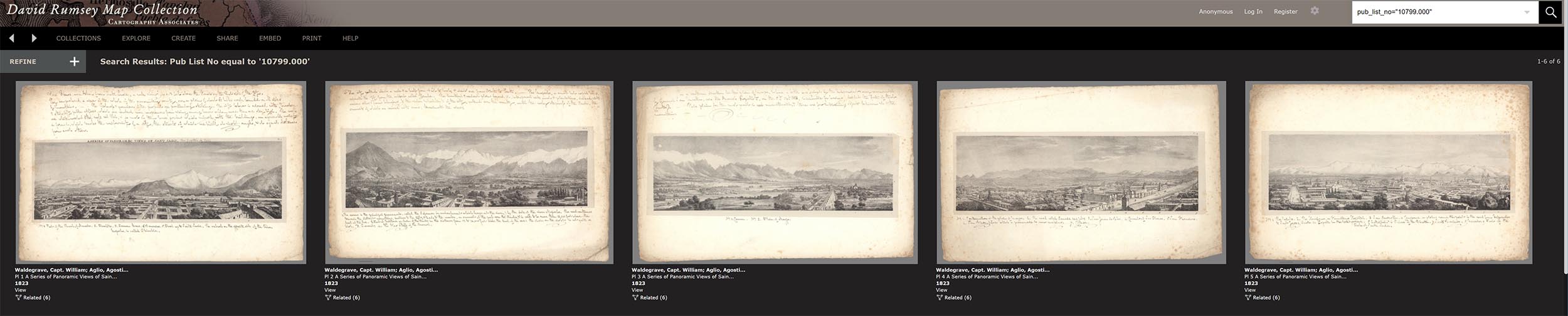
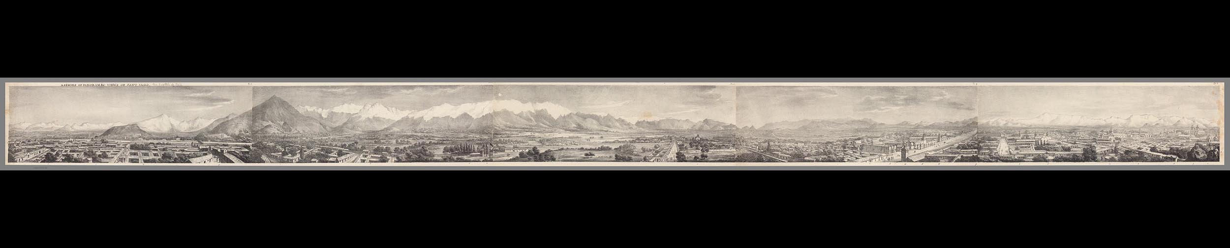
5 separate sheets that when joined below create a 360 degree view of Santiago, Chile, in 1823.
Here the sheets are joined together which enables a complete comprehension of the artist's intent.
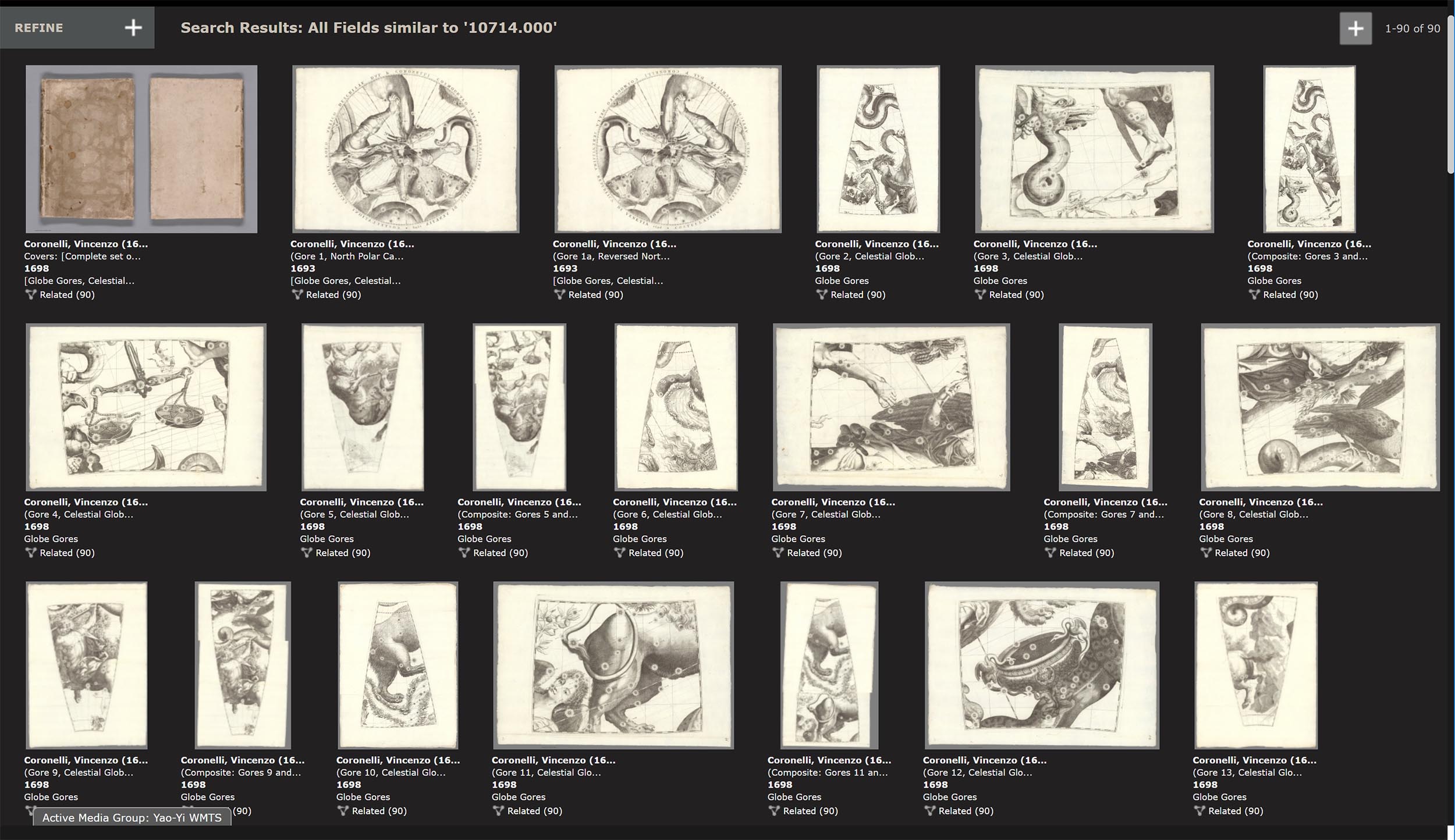
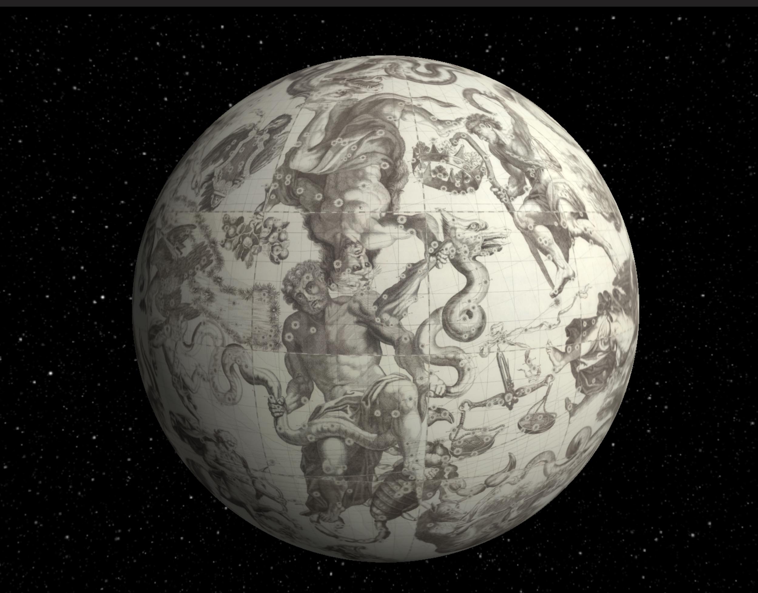
In 1698 Italian map and globe maker Vincenzo Coronelli created an unusual globe of the heavens that was meant to be seen from inside the globe, not from the outside as most celestial globes were made then. He made reverse or counterproof versions of his celestial globe gores for his 1 meter globe to accomplish this. The gores are shown below.
This is the north polar calotte globe gore that covered the top of the globe.
This is a typical globe gore
Here the 44 globe gores and the north and south polar calottes are joined together using a combination of georeferencing to join the 4 gore parts into single gores and photoshop to create the joining of all 12 complete gores and the calottes.
All gores and calottes are joined together using GIS to create a continuous image that can be projected onto the inside of a globe giving a geocentric view of the heavens. Click on the image to see the interactive interior globe.
This is the more typical version of the celestial globe as seen from the outside or God's eye view.
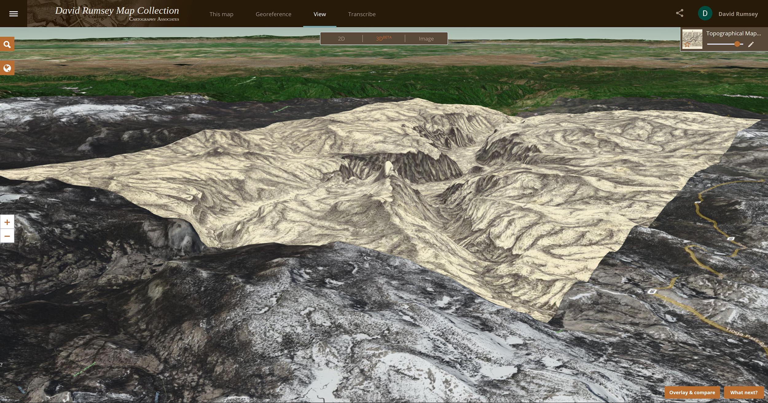
This is a Map of Yosemite Valley made in 1883 by the Wheeler Survey. It was the first accurate map of the valley made by trigonometric survey.
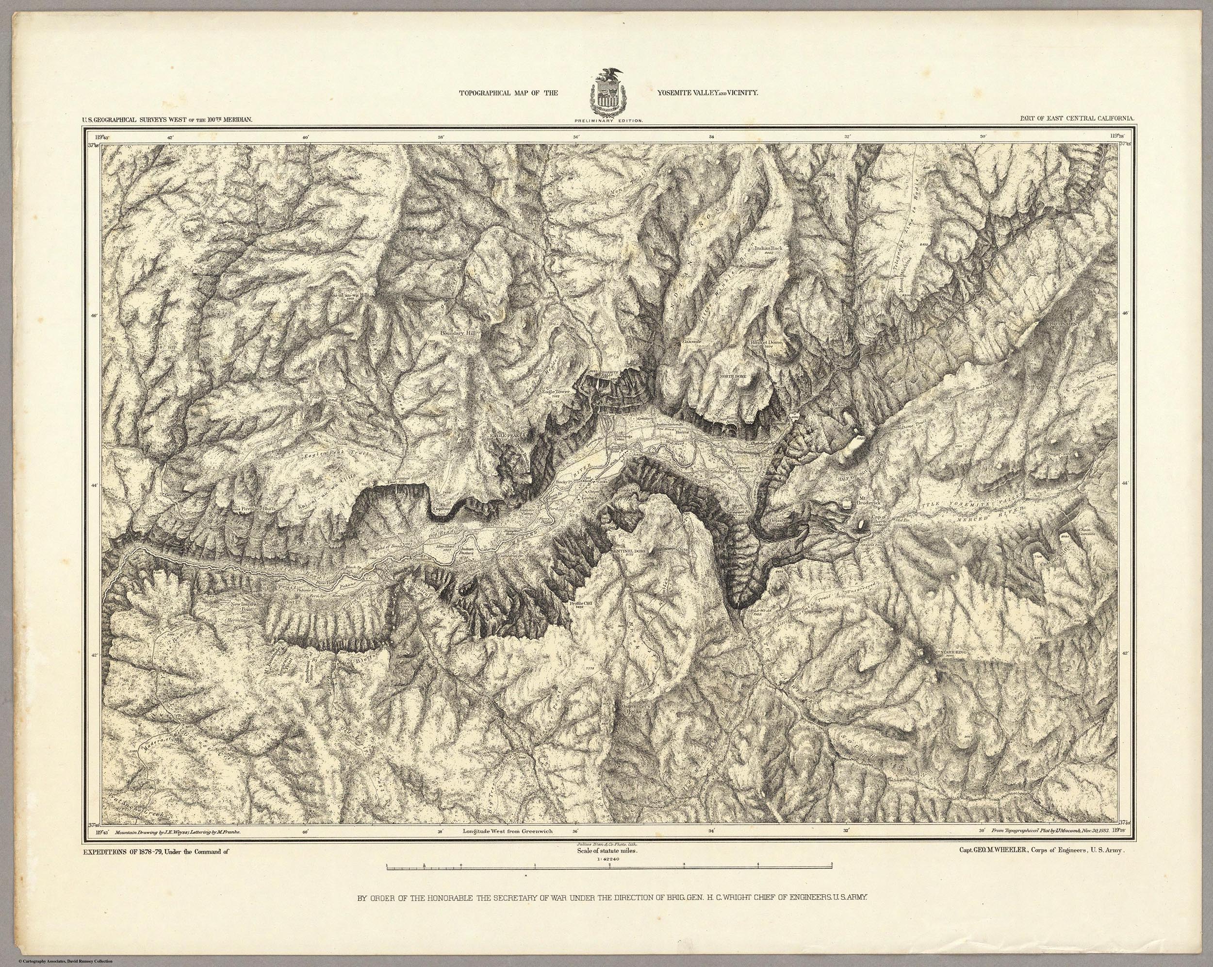
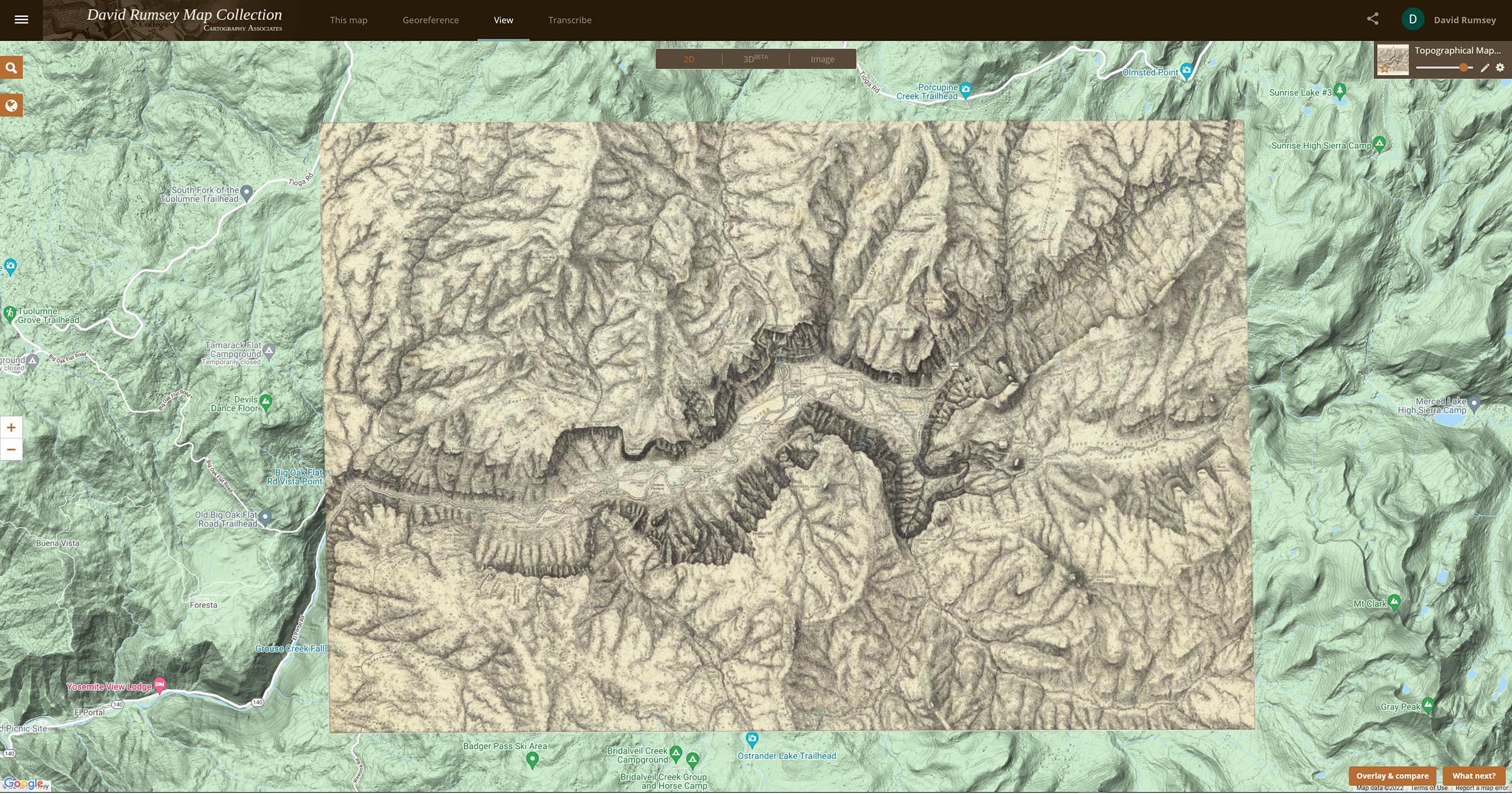
Here the map has been georeferenced in our online georeferencer tool and can be compared to the modern topographic map of the valley to see changes over time. Click on the map to see the live version with the transparency slider in the upper right.
The Georeferencer Compare page below shows a Swipe view of two maps of the Yosemite Map - the present day map and the 1883 map. Click on the image to go to the Compare page Swipe view in Georeferencer for this map:

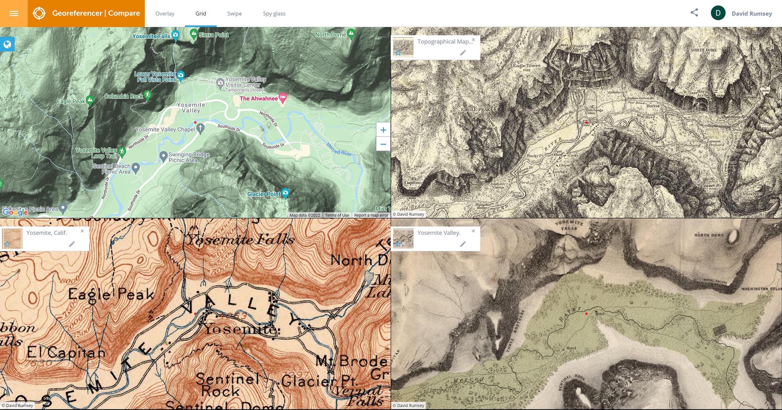
The Georeferencer Compare page below shows a Grid view of four maps of the Yosemite Valley made at different times from the present back to 1868. Click on the image to go to the Compare page Grid view in Georeferencer for this map:
The Georeferencer Compare page below shows a 3D view of the Yosemite Map. Click on the image to go to the 3D view in Georeferencer for this map (requires sign in to a free account):
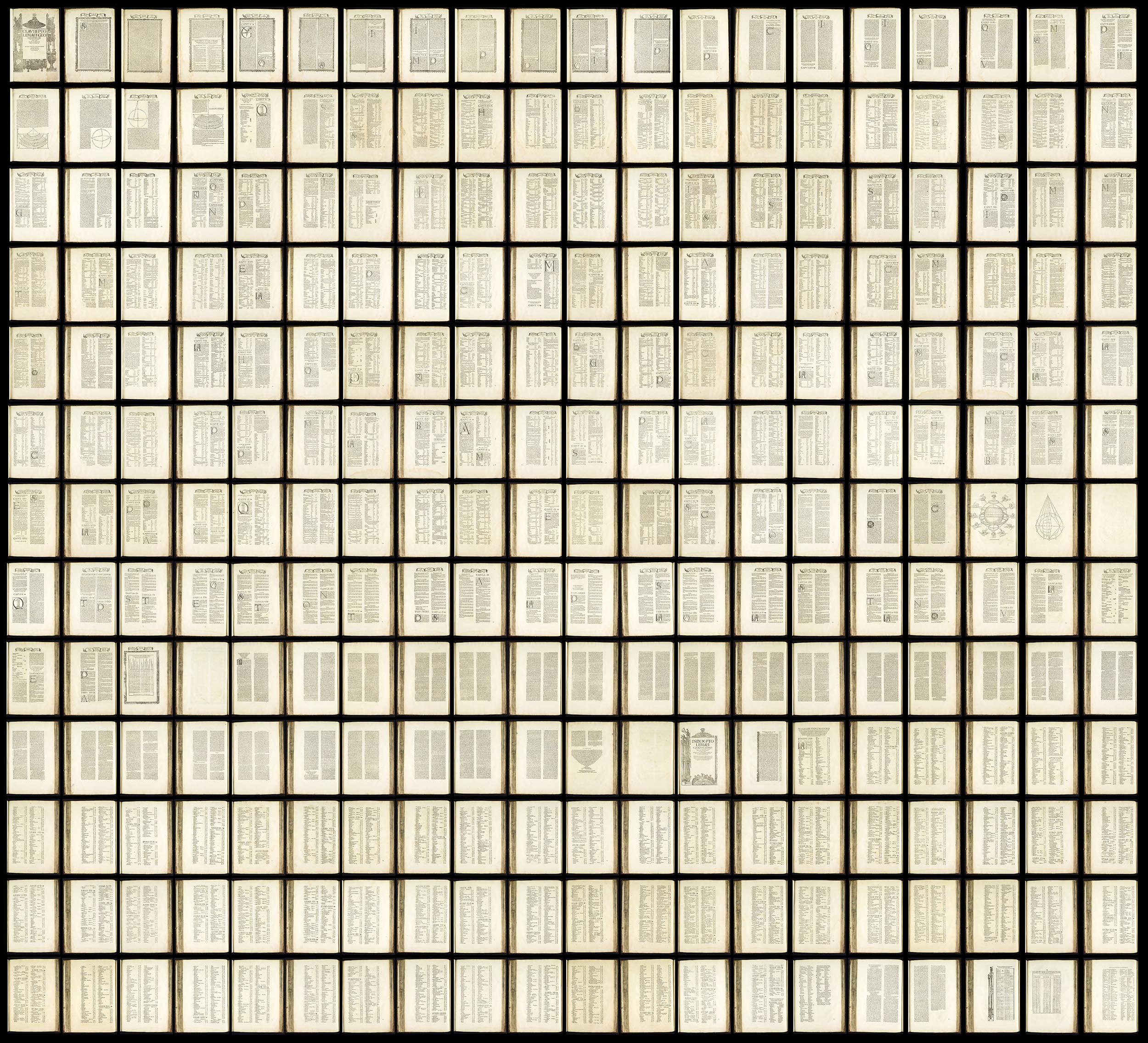
This is a text composite of all the text pages in the 1525 Strassburg edition of Ptolemy's Geographica. The 259 pages plus title page read left to right then down. The composite text image allows for smooth reading of the text, can be OCR enabled, and gives an overview of the entire corpus of text. Click on the image to read the text.
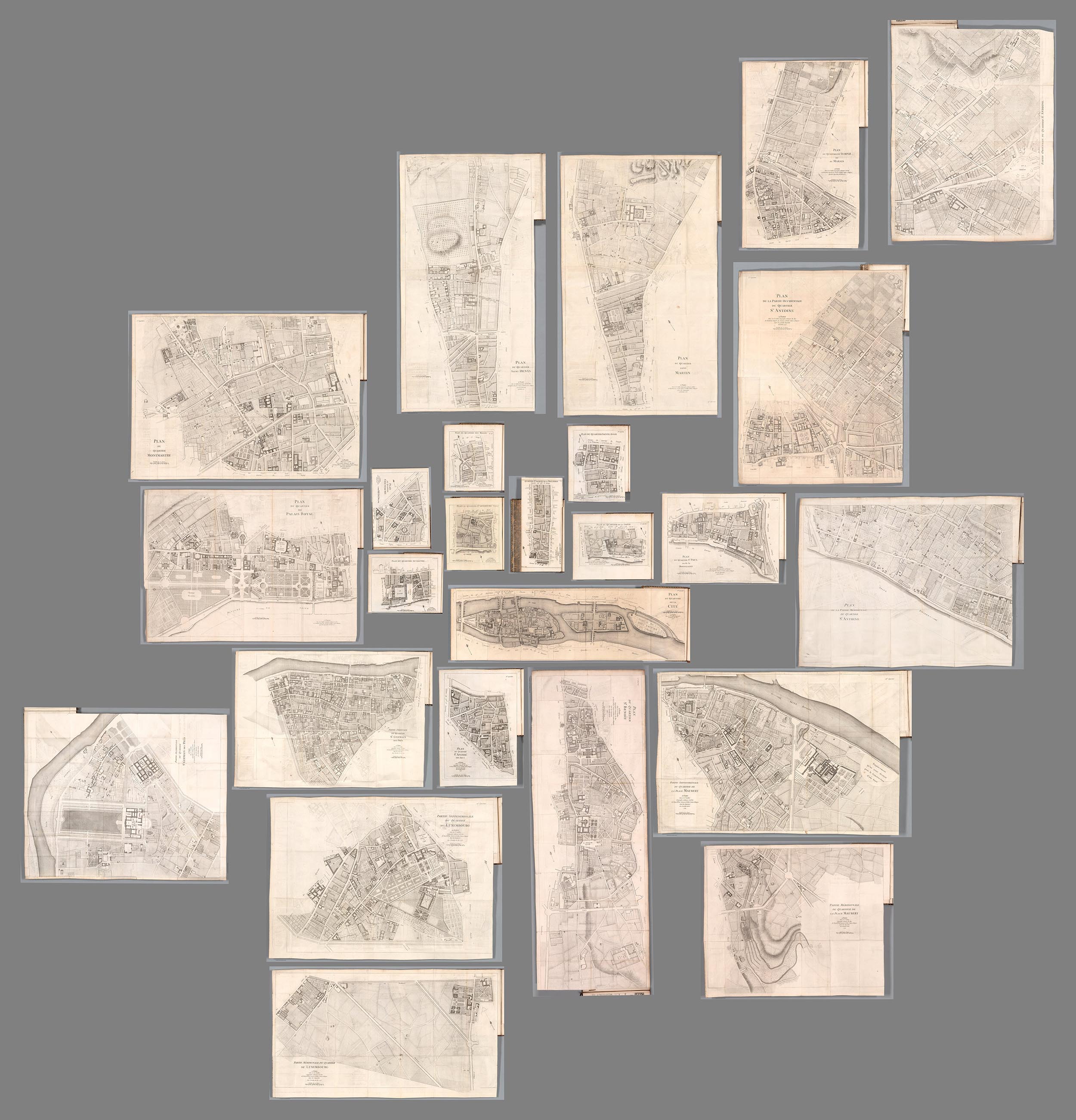
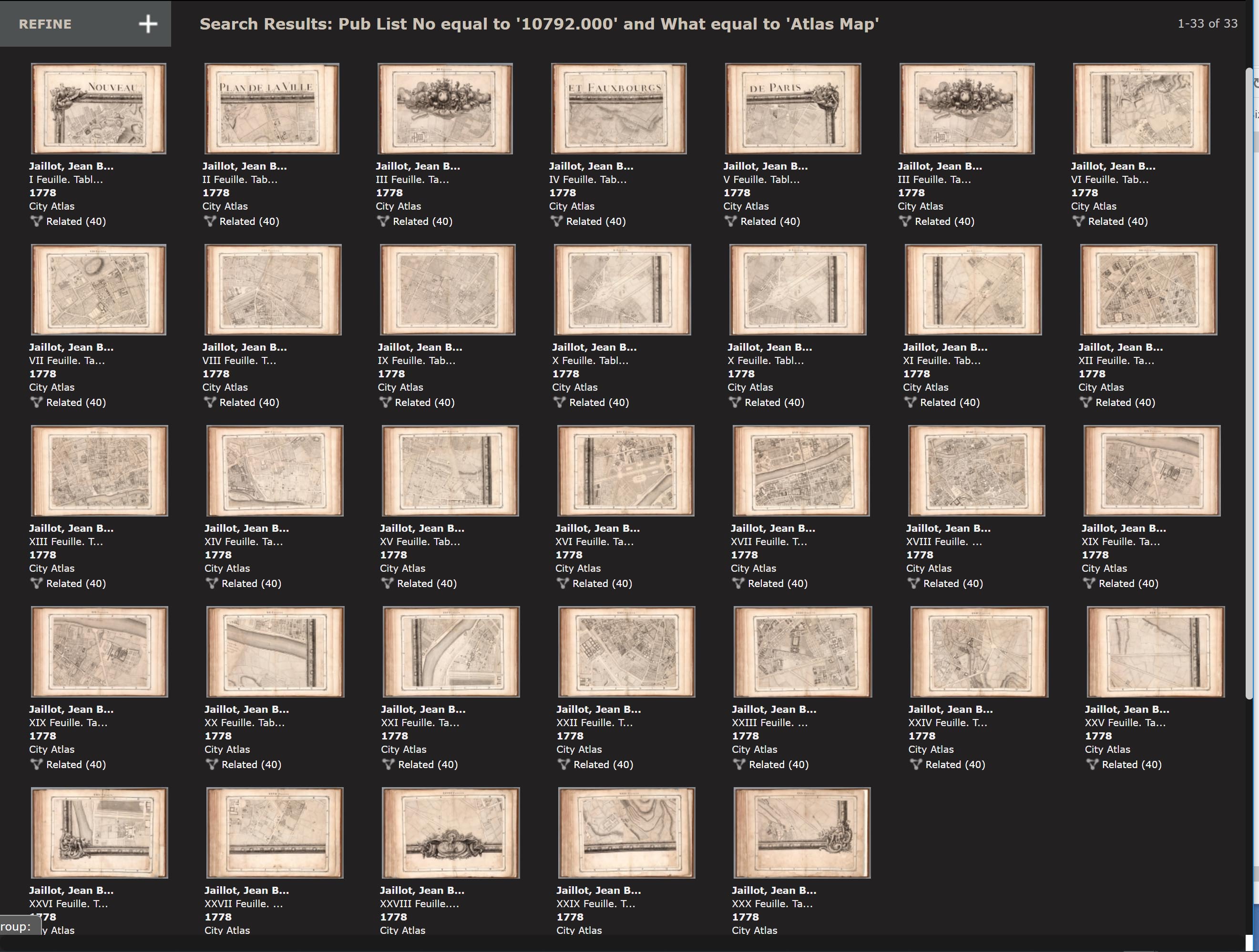
In 1775 Jean Baptise Michel Jaillot published his history of Paris - Recherches Critiques, Historiques et Topographiques Sur La Ville de Paris. The 7 volumes included 25 detailed maps of the city. In 1777 and 1778 Jaillot combined the 25 sheets to make one large map of Paris. This composite shows the rough positions of all 25 maps of Paris neighborhoods and illustrates the complexity of joining them all together to make one map. Jaillot added various infill map sections at the edges and the decorative border to make the full map.
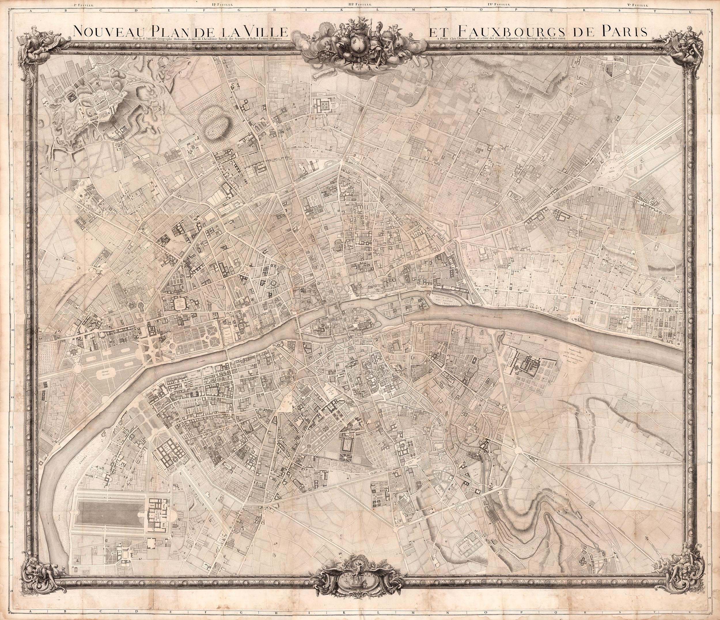
This is the map that Jaillot made from all the 25 parts plus infill sections. In the history of Paris mapping, usually map makers would make the full map first and then create smaller parts from it for other purposes but Jaillot did it the other way round. If you look closely at this map below you will see the section lines where he joined the 25 separate maps.
Apparently demand for Jaillot's large map was not what he expected so he decided to create a 30 sheet Atlas of Paris volume in 1778 by cutting the large map into 30 book sized sections and adding a title page, index and binding. So he had come full circle from his original 25 separate maps of Paris for his history.
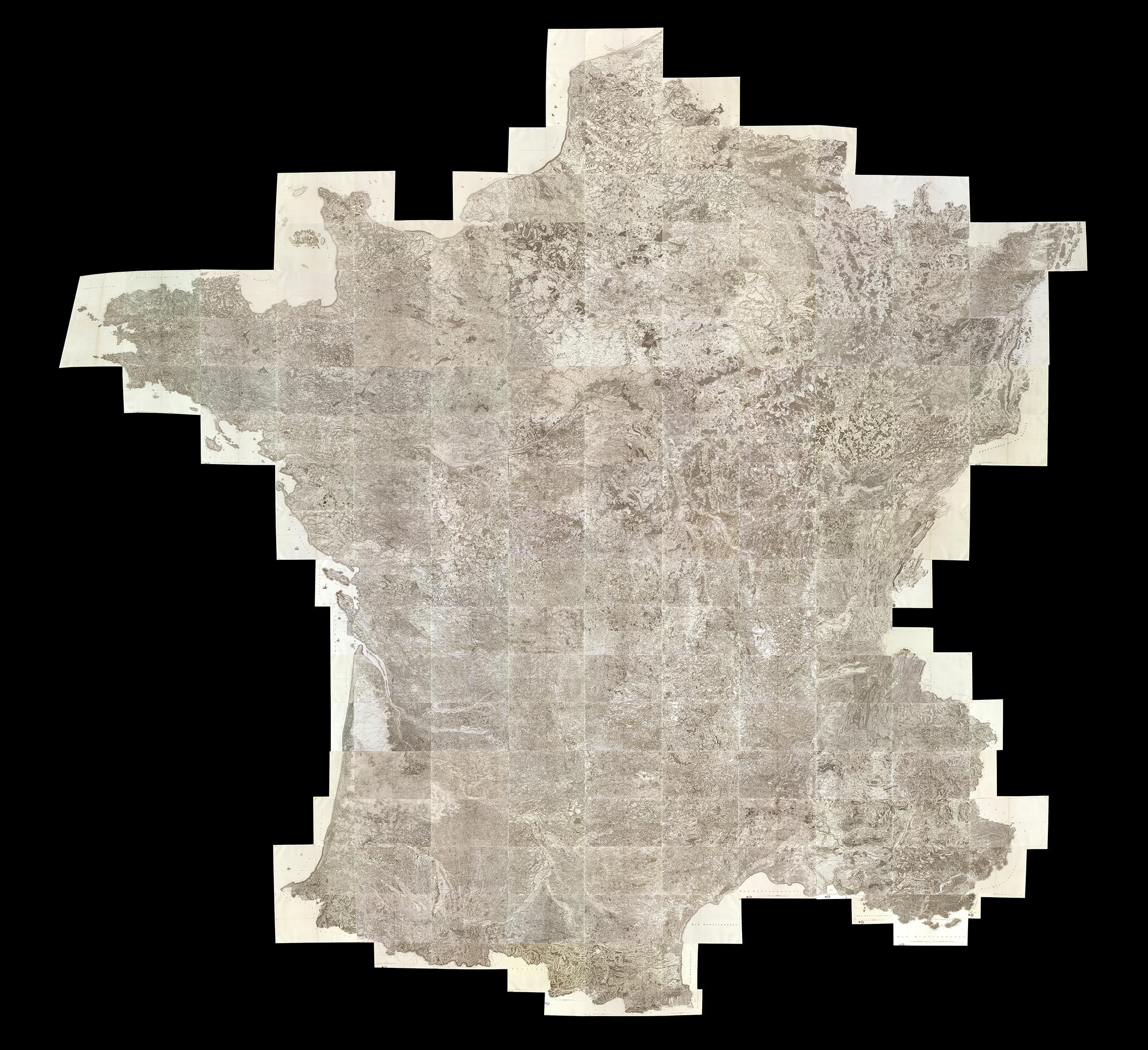
This large map of France made from 182 sheets of the 1750-1818 Cassini survey gives a view of the country at multiples scales that are not possible with the individual maps unless one tried to join them physically which would result in a map 40 feet square. This composite map is a dramatic example of the interpretation made possible through the use of derivative maps like this. Georeferencing this map, which we have done, also allows further mining of the map data to show changes over time.
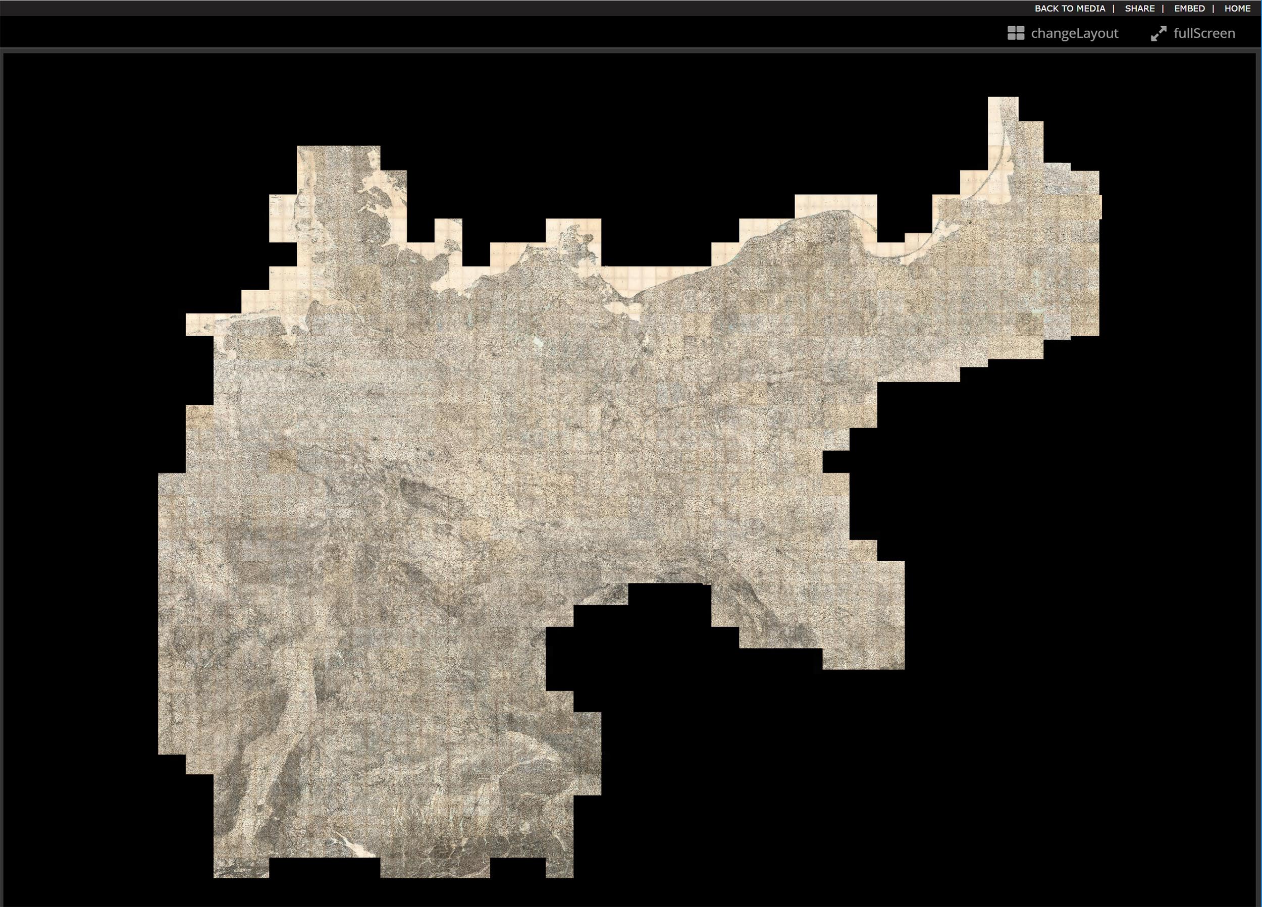
Our largest composite map is this 674 sheet assemblage of the Karte des Deutschen Reiches - the 1893 survey of Germany at a scale of 1:100,000. Like the Cassini France composite, we also georeferenced this map, in fact the map was built in GIS layers as it proved too large for photoshop to create.
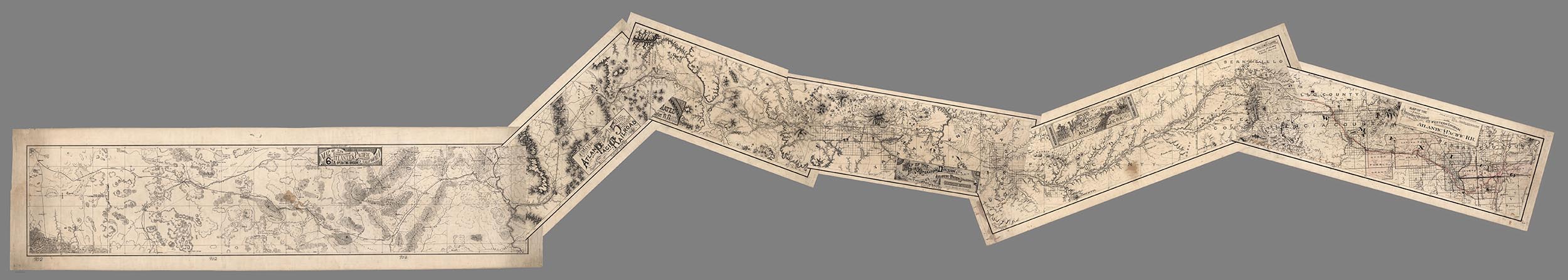
A more modest composite map but equally interesting is this 6 sheet manuscript map made by the First Operating Division of the Western Division, Atlantic & Pacific R.R. (Railroad) in 1882. The survey runs from Albuquerque, New Mexico to Mojave, California.
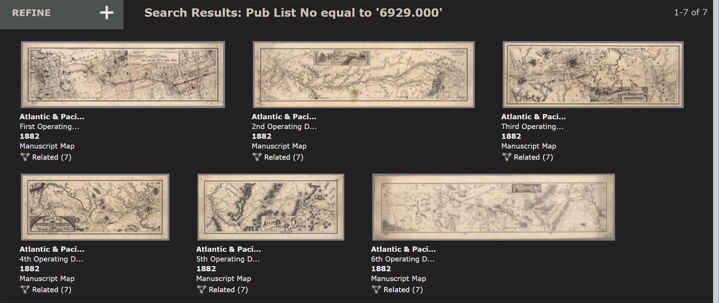
The composite map below vividly shows the unusual orientation of the sheets as they proceed east to west.
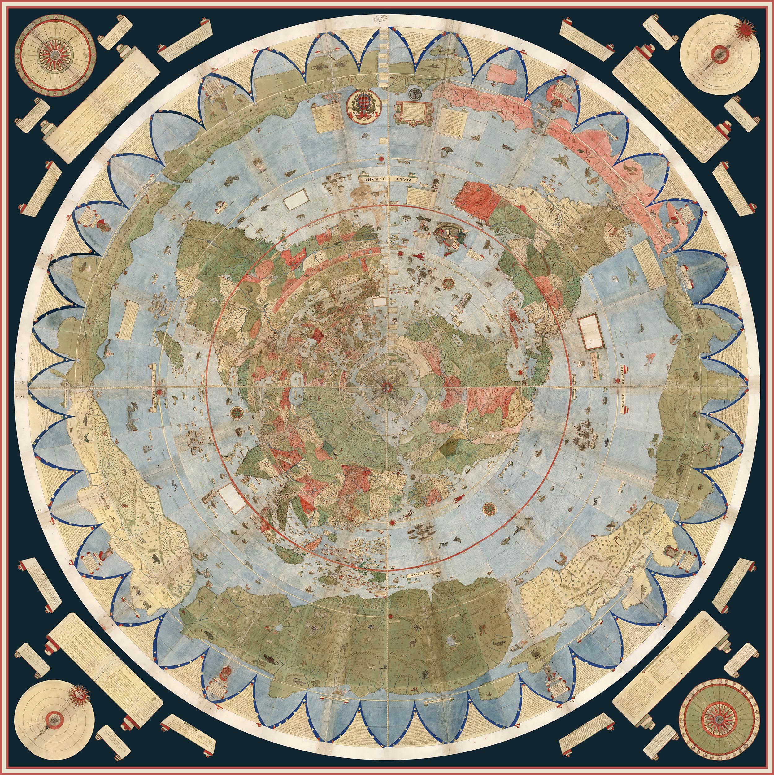
Urbano Monte of Milan, Italy, made his hand drawn map of the world from 66 sheets that when joined created a world map 10 feet in diameter. Monte never was able to assemble his map but we have been able to do so using digital scans of the sheets below.
Monte's dream is realized in this digital composite map of all his sheets. Monte intended his assembled map to be hung on a wall with a peg in the center allowing it to be rotated around so that all parts of the map could be viewed up close. We accomplish this digitally.
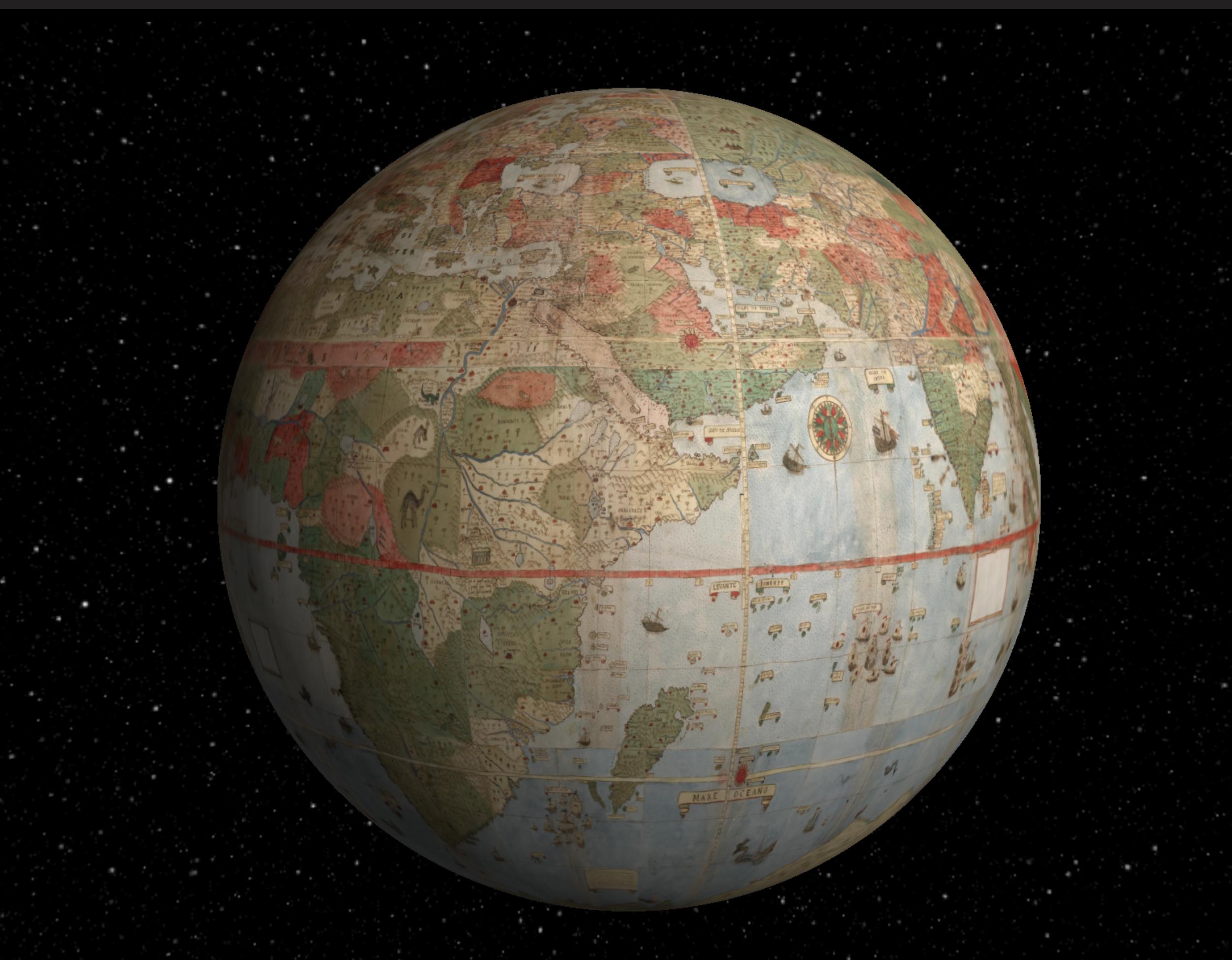
We georeferenced Urbano Monte's flat map and reprojected it as a globe.
From these examples, it can be seen that repurposing, georeferencing, compositing, and other manipulations allowed by the digital nature of our facsimiles can give us much greater understanding of the original map makers intentions and goals. In addition to the uses shown above, we can use the digital map images as sources of text information. In the coming years we expect to add search capability for any text on our maps by reading and indexing all the words on the maps using powerful software programs. This will greatly expand the searchability of our maps and allow pathways into their content and provide new interpretations in yet other ways from those shown above..
- Featured Maps
- January 2, 2021
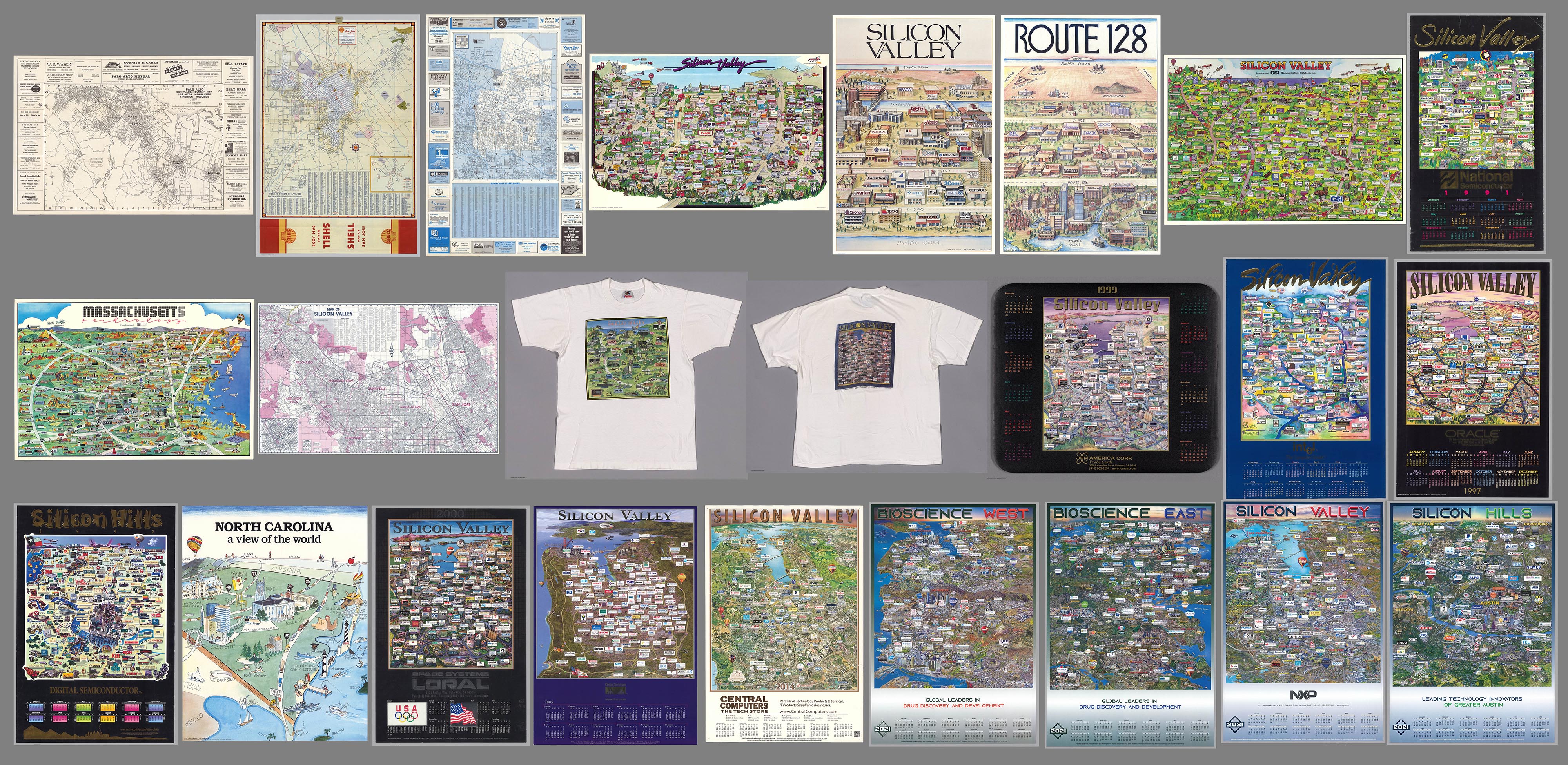
25 Maps of Silicon Valley And Other Tech Hubs
We previously wrote about Early Mapping of Silicon Valley and the Internet. Since then we have added 25 maps of Silicon Valley and other tech hubs like Route 128 in Boston, Austin, Texas, and Chapel Hill, North Carolina. Also we have added some maps of Silicon Valley before it became a tech center. Here is a link to the entire group, including the earlier maps. These maps offer a unique view of the spatial arrangement of Tech firms. While the process of selling advertising spaces on the maps no doubt resulted in some firms being omitted and some included firms being overemphasized, still the result gives us a view in time that few other documents possess. As the maps continued to be published many evolved into calendar illustrations. We are grateful for the assistance of Curtis Bird in describing and assembling this group of maps.
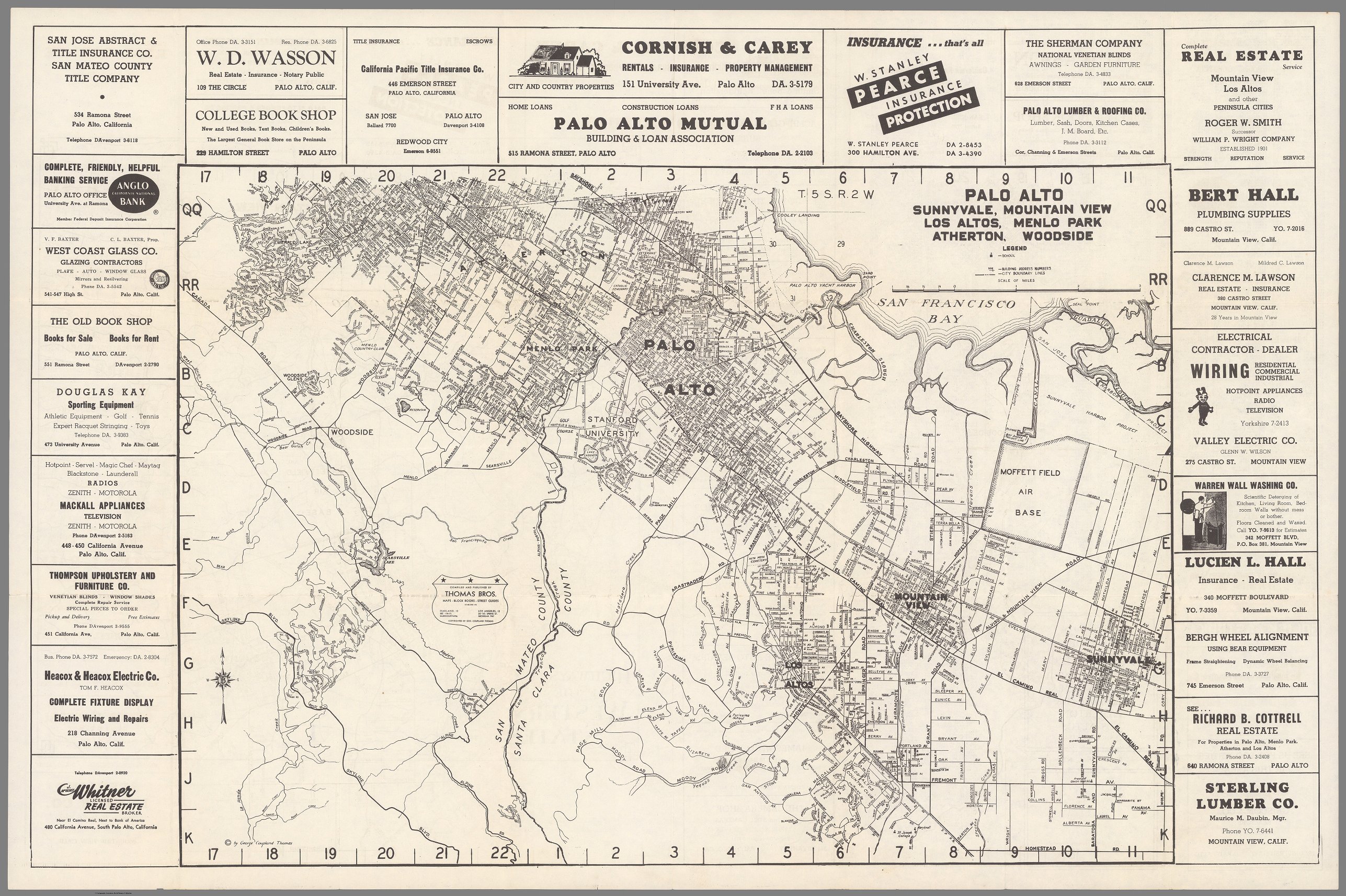
The map below is an almost perfect starting point for looking at the 20th century evolution of the Silicon Valley region. Plumbers, Roofers, Glass repair, some bookstores, the surrounding ads for local businesses could be almost anywhere in the U.S. at the time. Aside from the "Moffett Field Air Base" and Stanford University, there is little that's unique, but those two locations were roots for the the development to come.
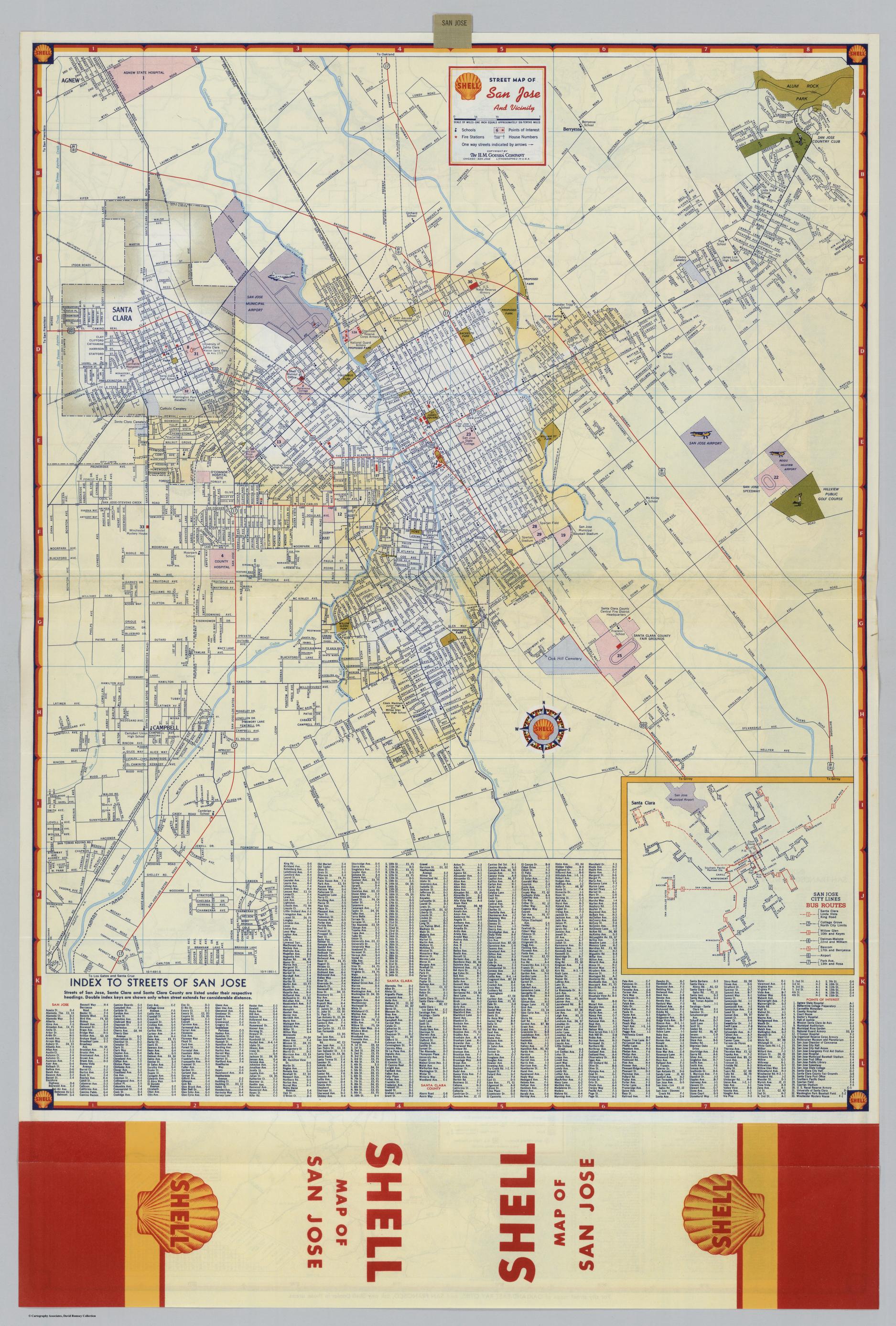
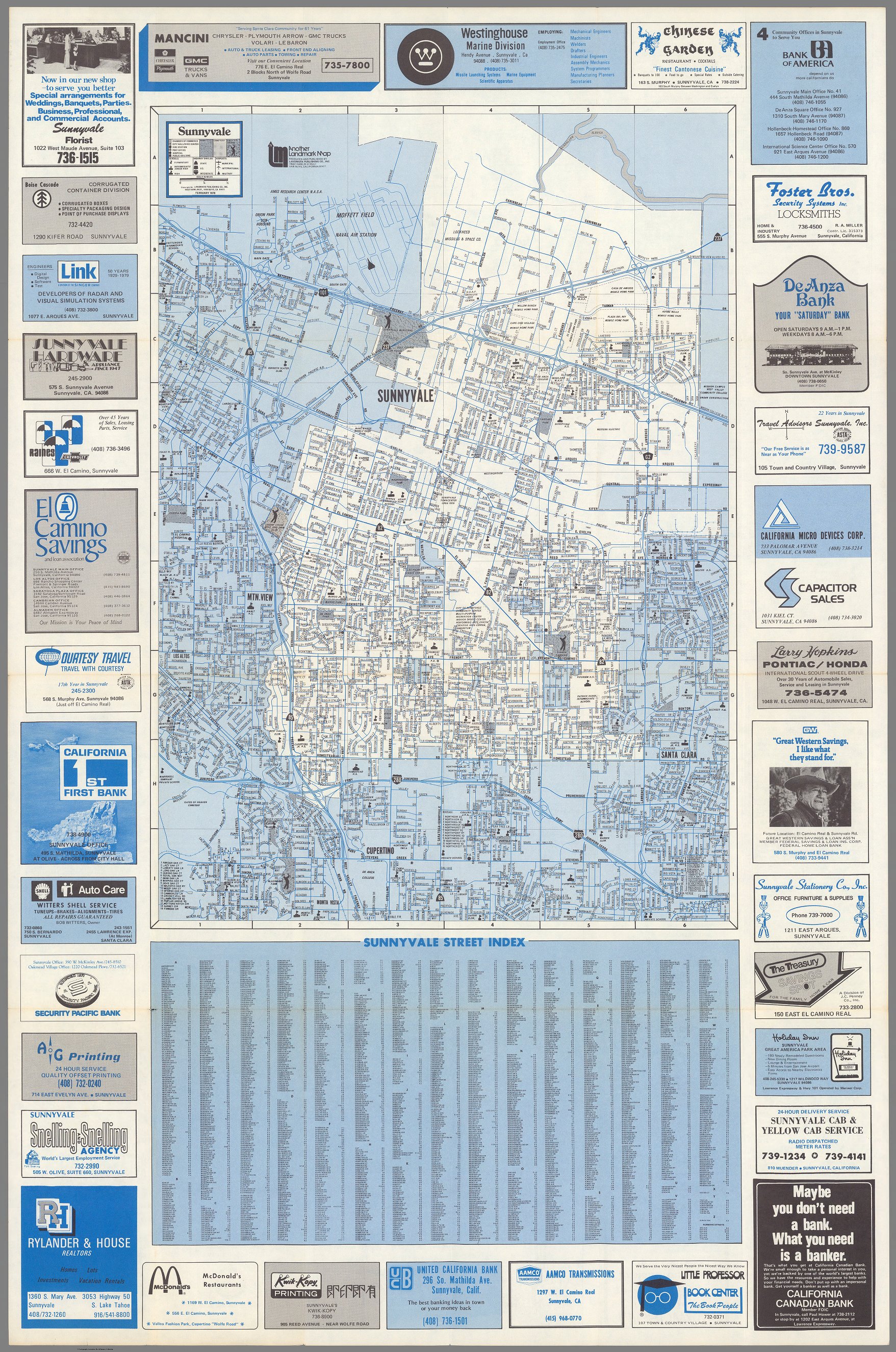
The map on the left, The Shell Oil map of San Jose in 1951 shows how rural the area surrounding the city was. The 1979 map on the right of Sunnyvale California is a regional map that includes good portions of the neighboring communities and grants a glimpse of life and commerce, with the cover title font giving some interesting foreshadowing. Done in a computer style script for "Sunnyvale" we now see surrounding advertisements for not just restaurants and real estate, but Microwave Tech, "Printed Circuit Boards" and "Capacitor Sales." The start of a huge inclusion of specialty businesses.
|
|
The 1985 map below is filled with advertising for computer and other companies in Silicon Valley. A plane flying over the Valley notes "Launching The Bay Area Regional Technology Center Fall 1985. Apple appears in the lower left, below the Budweiser truck, and above Olivetti, in Saratoga. This is one of the rarest of the early views of Silicon Valley.
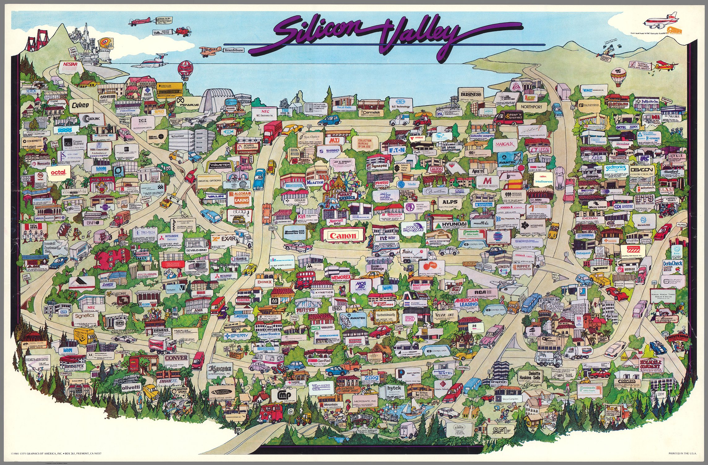
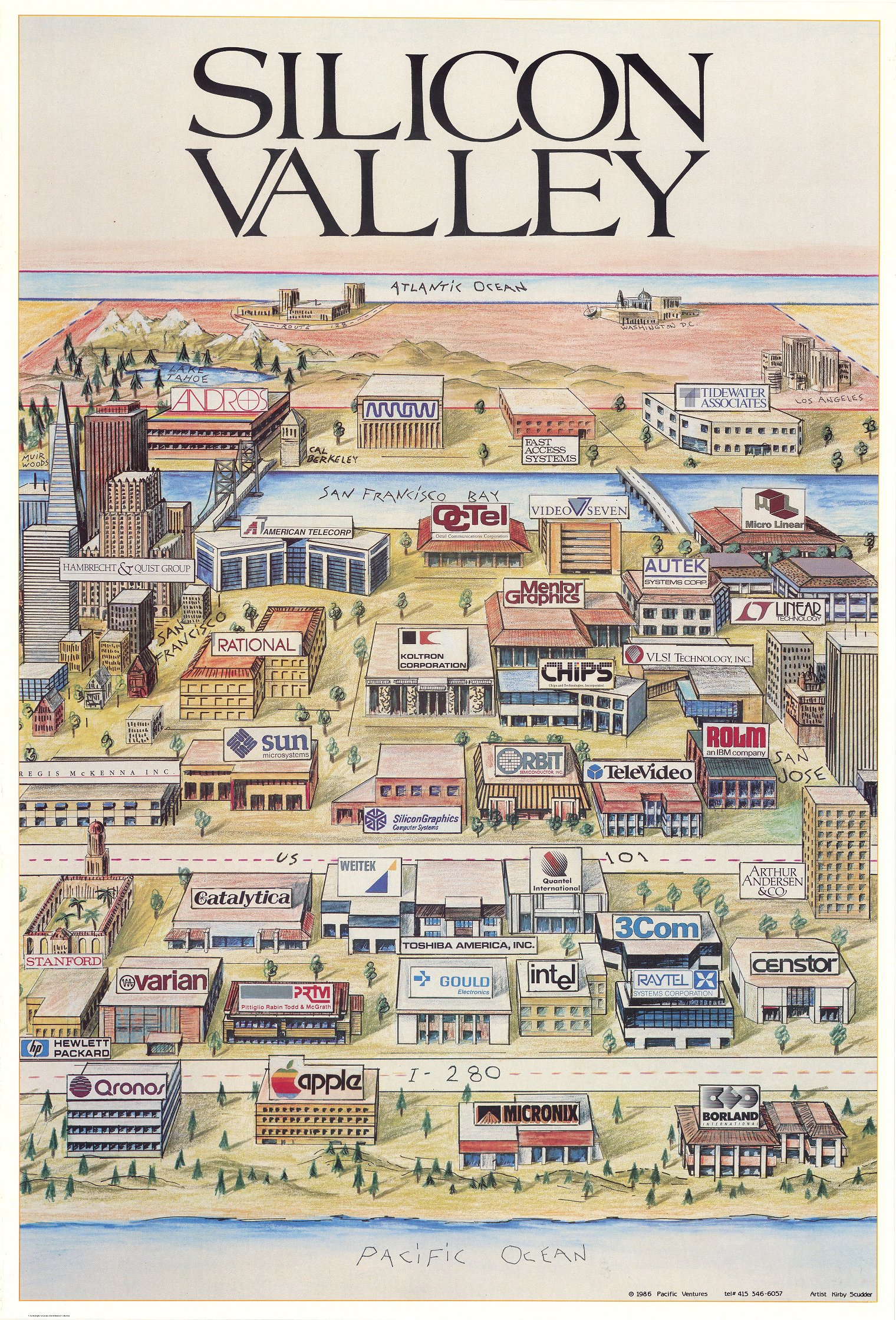
The left side map shows Silicon Valley occupying practically all the real estate from the Pacific Ocean to the Atlantic Ocean. The expanse from the west to the east coast of the US is depicted in bands with the Pacific Ocean in the foreground, then I-280, then US 101, then the San Francisco Bay and in the far distance the Atlantic Ocean. In the foreground bands there are depicted many high tech companies, advertising and communication companies, business and distributors of digital contents, along with Stanford, the San Francisco Bay, Cal Berkeley. At left is Lake Tahoe and the Rockies, and at right Los Angeles. The right side map shows the area from Gloucester Mass to Norwood Mass, which is the belt highway the encircled the tech hub residing around Boston. The view notes Silicon Valley in the distance, as well as Silicon Gulch in Texas. In interviewing Kirby Scudder it becomes clear that this map and its Silicon Valley peer was made after the success of Maryanne Hoburg's 1982 map, and sought to meld the popular current of Saul Steinberg's whimsical maps with growing tech regions.
|
|
Extrapolating from the same Hoburg 1982 map and with updated content, here Stephanie Russell reworks but retains the same composition.
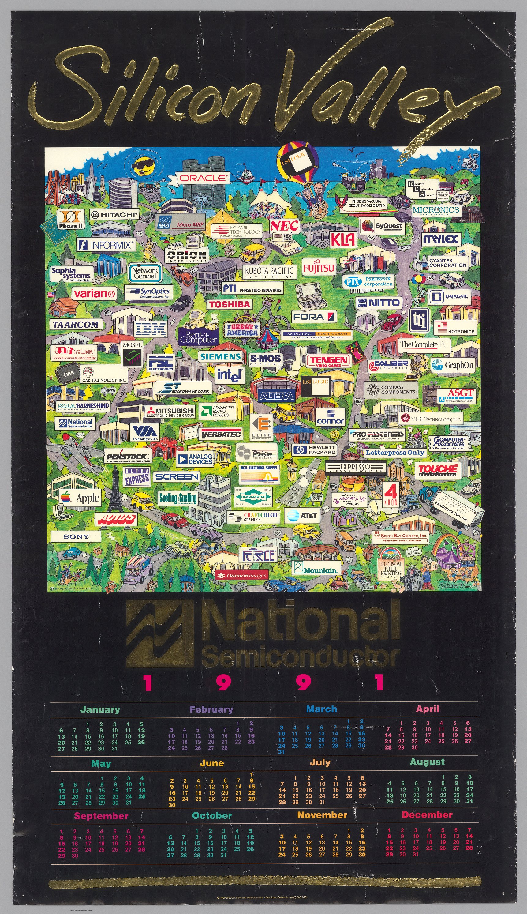
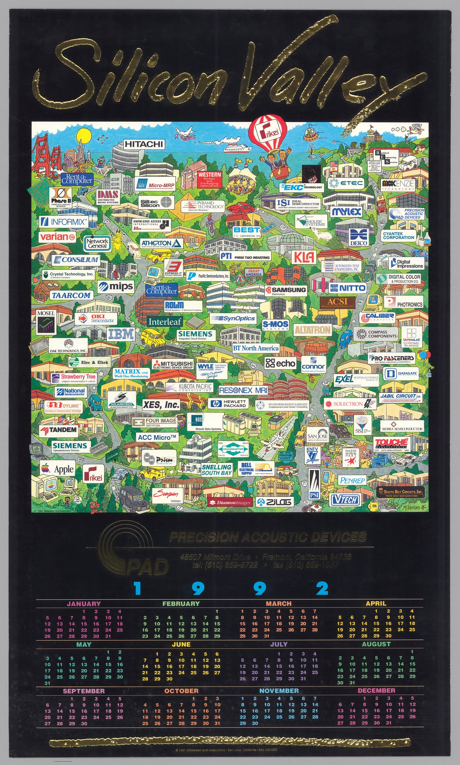
The left 1991 map is a bit more primitive and cartoonish, being the earliest of Mikkelsen's work for the area, densely focused on the South Bay. Embossed lettering. The right map, also by Mikkelsen the next year, continues the embossed, high gloss depiction centered more and more deep into the South Bay, with an evolving cast of companies shown.
|
|
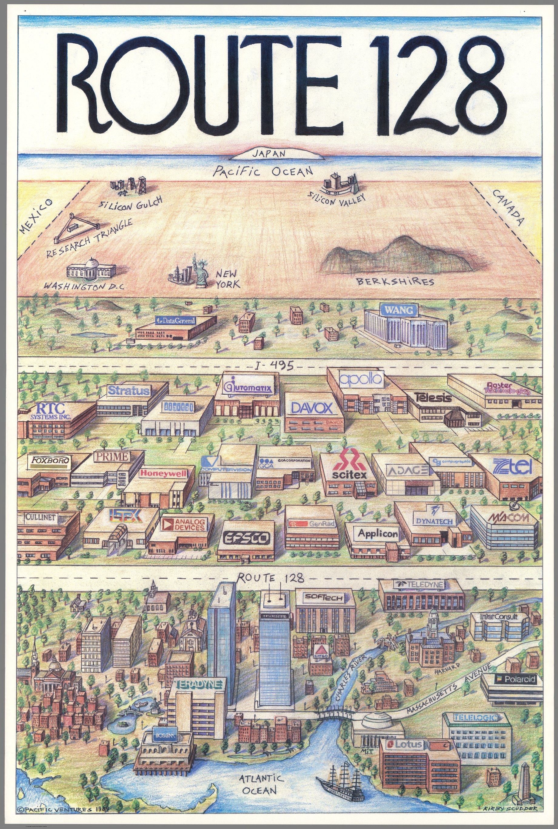
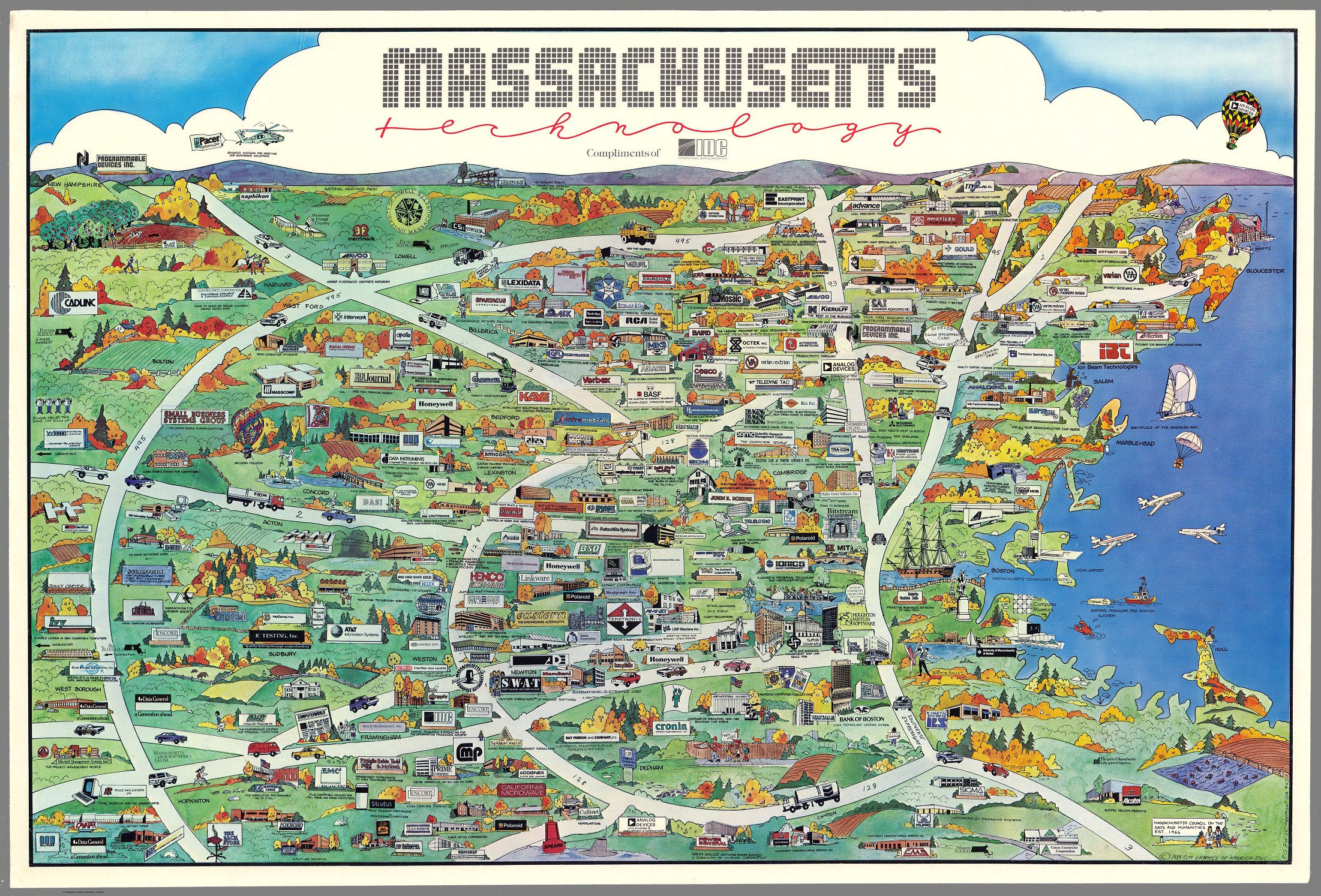
Colorful bird's-eye 1984 map of Massachusetts sponsored by International Data Corp. Annotated throughout. Includes numerous individual vignettes of buildings, landmarks, place names, streets, parks, bridges, and businesses, all clustered around the Tech hub along Route 128 outside of Boston. This is one of the earliest maps to depict the Route 128 region.
A very orthodox 1993 regional map centered around the identifying name of Silicon Valley, with coverage that anchors in San Jose and Santa Clara, reaching up to Fremont, and around to East Palo Alto, Atherton and surrounding area. A thorough street guide is on back, and treats it as a region, not just a smattering of small towns in the shadow of San Francisco.
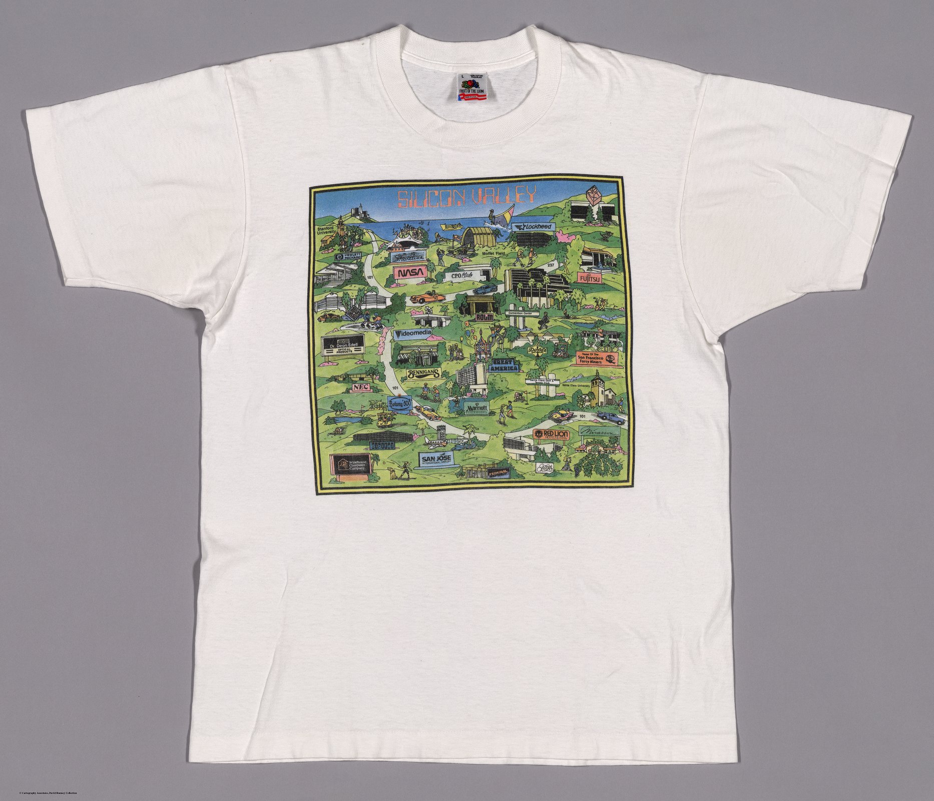
On the left is an example of a map becoming synonymous with how a region thinks of itself. Here a t-shirt with a different set of points of interest, which include restaurants, hotels, and even the odd optometrist. It's evident that this is how culture is going to see itself in Silicon Valley, this version indebted to Hoburg's 1982 map, as so many of these maps are. The right map is a large back-of-shirt image for an Atmel shirt (chip and microprocessor fab) that includes a detailed sprawling view of the key companies around the south Bay. A moment in the greater electronics ecosystem, as a map.
|
|
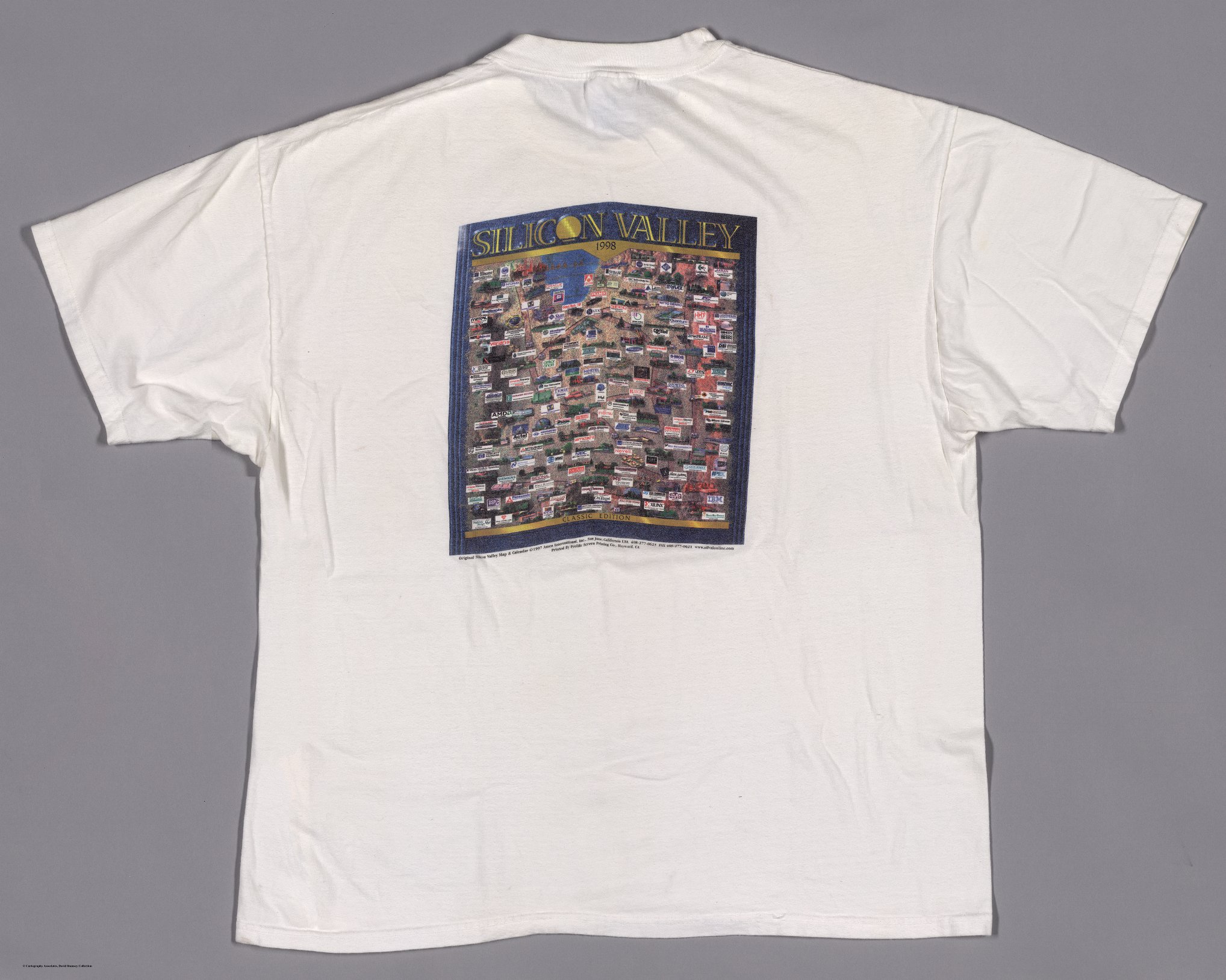
A Mousepad, showing how the map pervaded the sense of place and purpose, here the ranking of advertisers promoting their presence in the area is shown, and now we begin to see Software (Yahoo) first start to up in the midst of all the hardware companies (Apple, Seagate, IBM, HP)
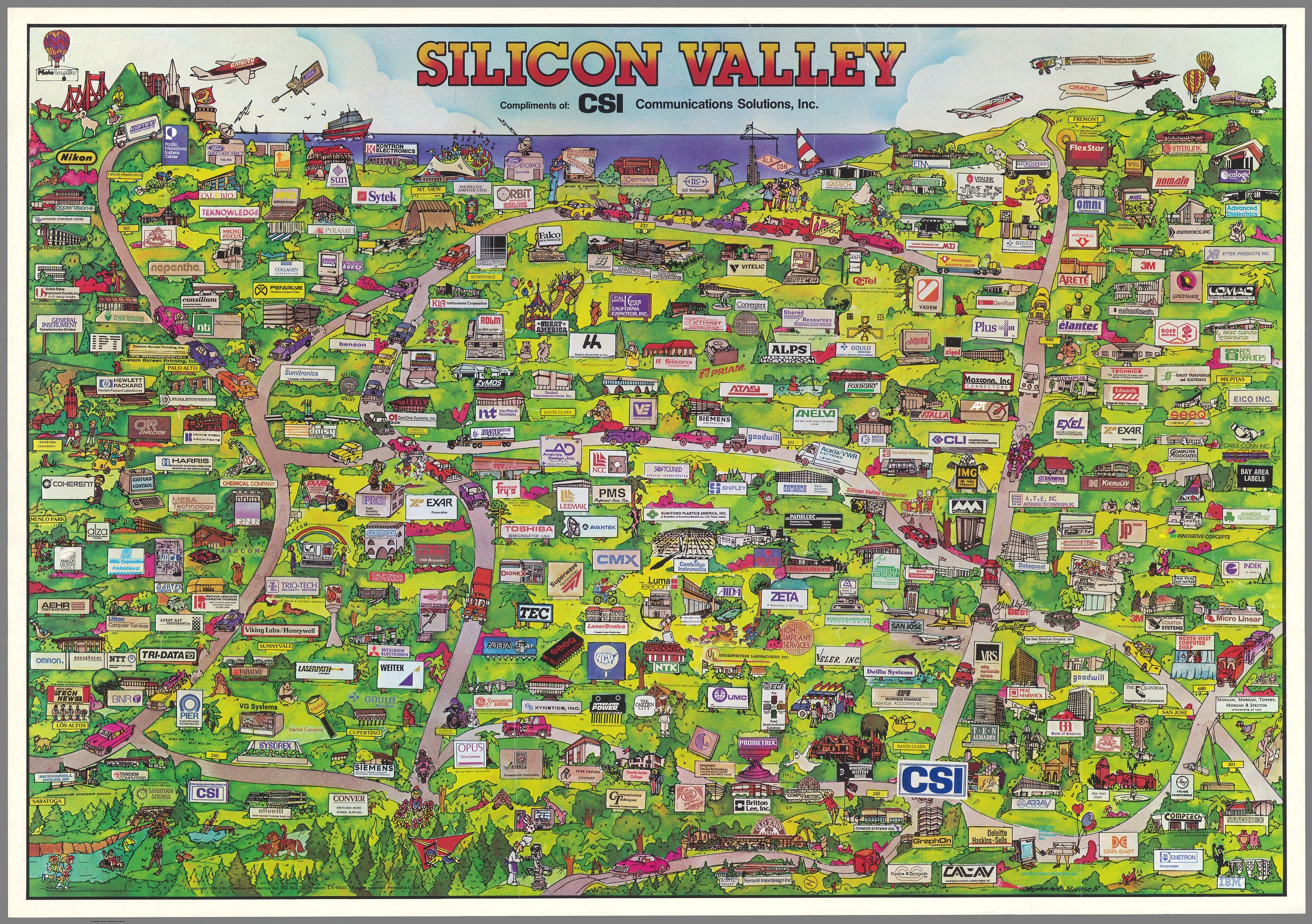
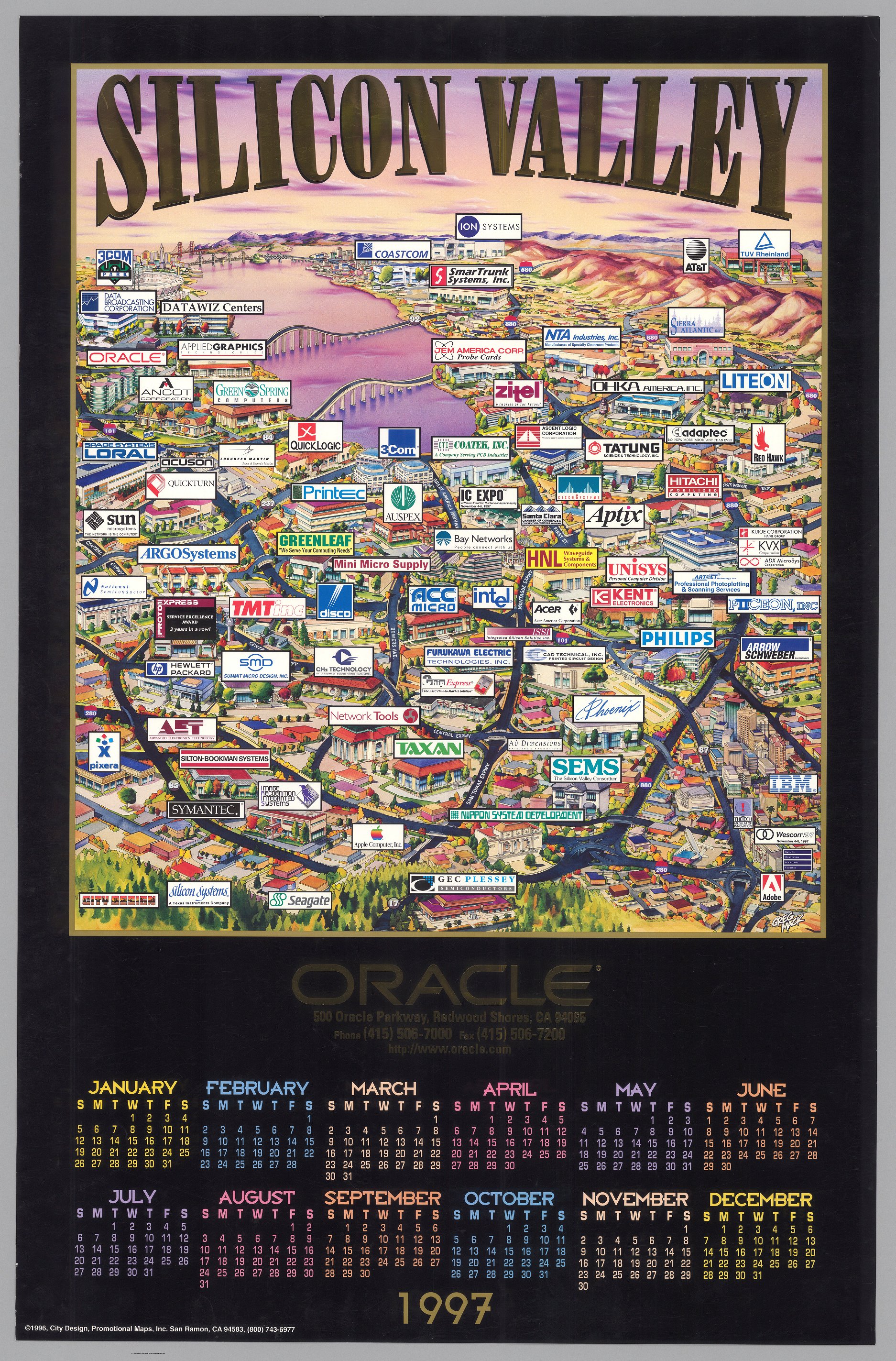
On the left, Diane Gatto's design introduces another view of the valley, adding many sites in the southern East Bay. Another edition was made in 1995 for Cisco. On the right, a Greg Mack map of high gloss, with an expanded perspective, reaching up to the Golden Gate and over to the East Bay. Hints at the growth of what had been the secluded South Bay.

|
|
Not Silicon Valley, but here Austin Texas metro gets into the game of fabrication and emulates the same map style to show their tech ecosystem. The 1997 map is one of the earliest to show the Austin Tech hub.
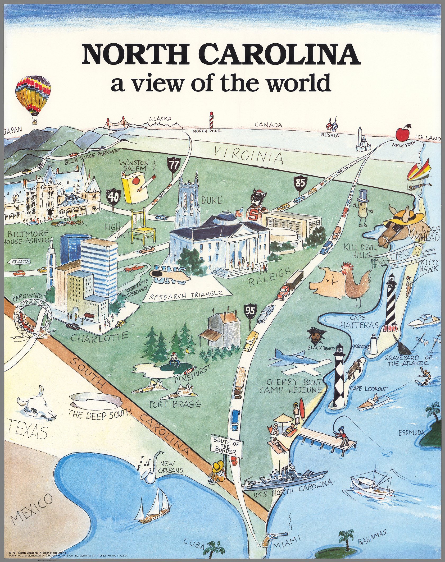
Yet another descendant of Saul Steinberg's tongue-in-cheek perspective maps, and this one for North Carolina, uniquely noting the growing tech region of the "Research Triangle". "The Triangle" is anchored in the three colleges of the area where the government tech investment began in the 1950's.
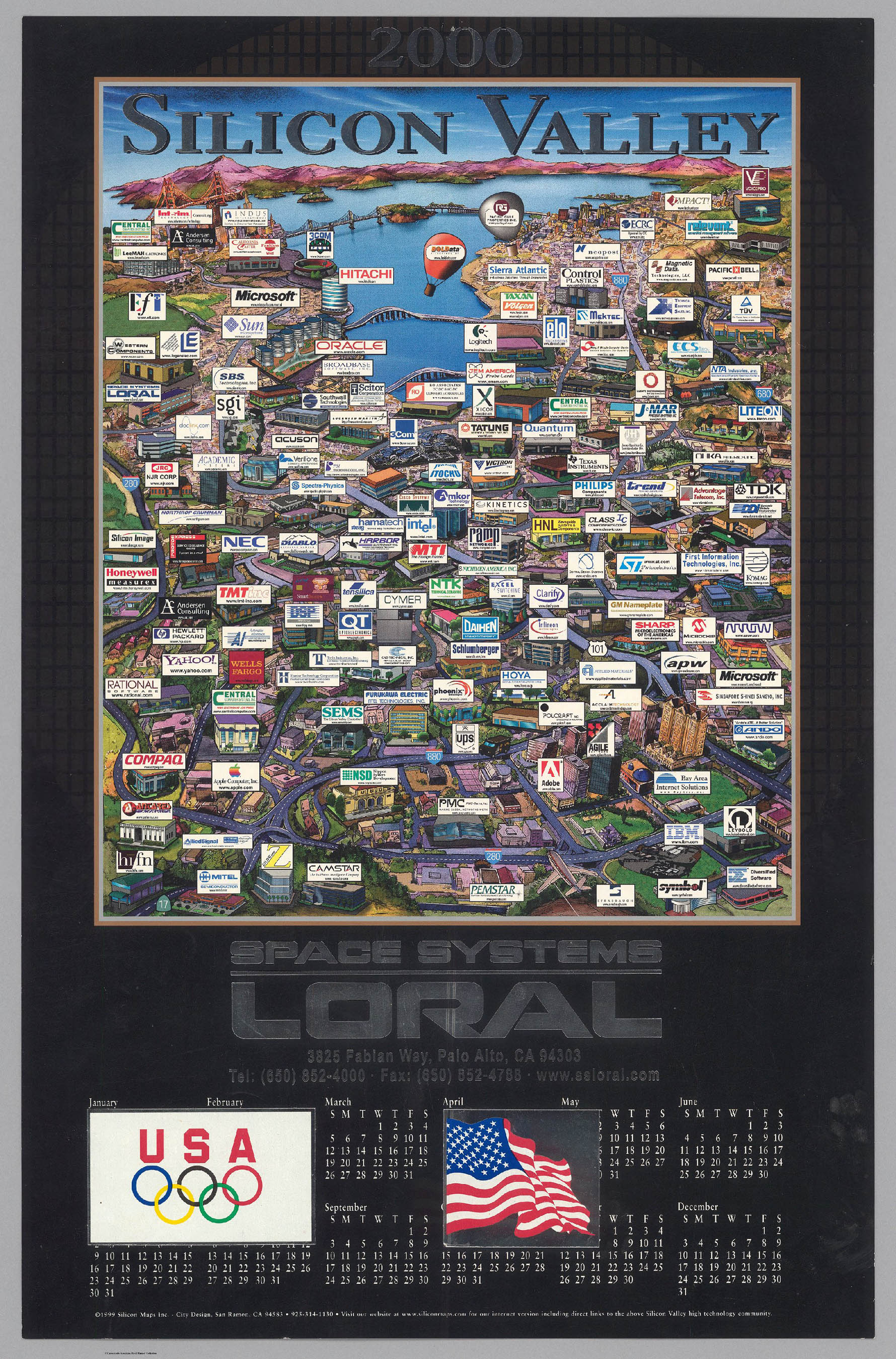
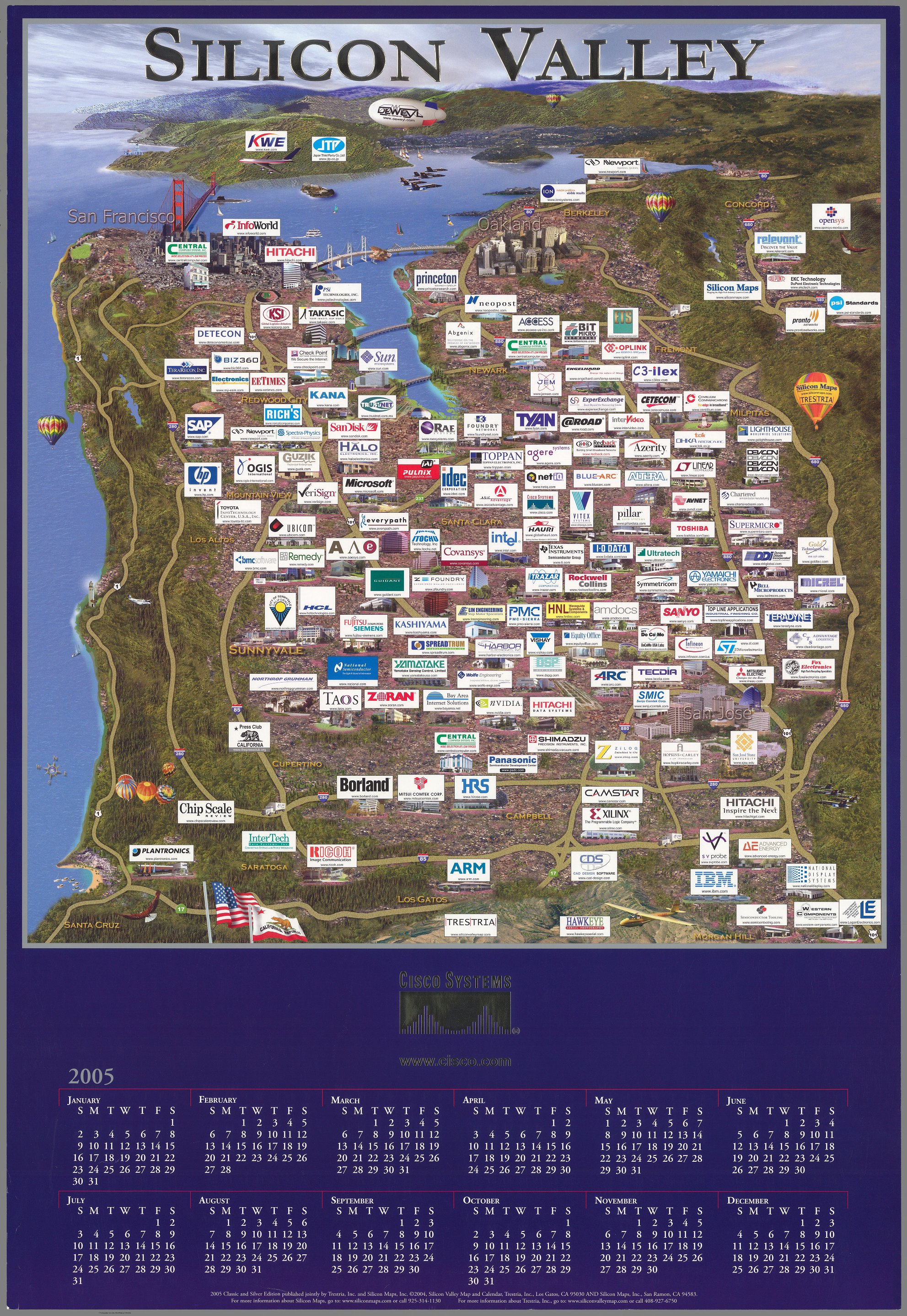
Left, a 2000 map probably patterned off of Greg Mack's map, here we see an overview, with tech companies rapidly reaching to San Francisco, Oakland, and all across South Bay. On the right, a 2005 Bird's-eye view of Silicon Valley and vicinity, including the San Francisco Bay, Golden Gate Bridge, and Marin County. Shows cities and towns, major roads, topography, bodies of water and coastline. Relief illustrated with satellite photography. Includes compass rose, with north oriented toward upper right. Features Silicon Valley company names with website addresses.
|
|
A bigger and bigger region, now reaches out to Sacramento, down to Los Gatos and Santa Cruz, and beyond San Francisco. More of a realistic map, using satellite imagery, includes small logos and company names, spanning the decades from Intel and IBM, to Oracle, to Linked In and Facebook.

These two maps show the growth in recent years of the biomedical industries in both the extended San Francisco Bay Area (left), and on the east coast from Boston to Washington, D.C. (right)
|

|
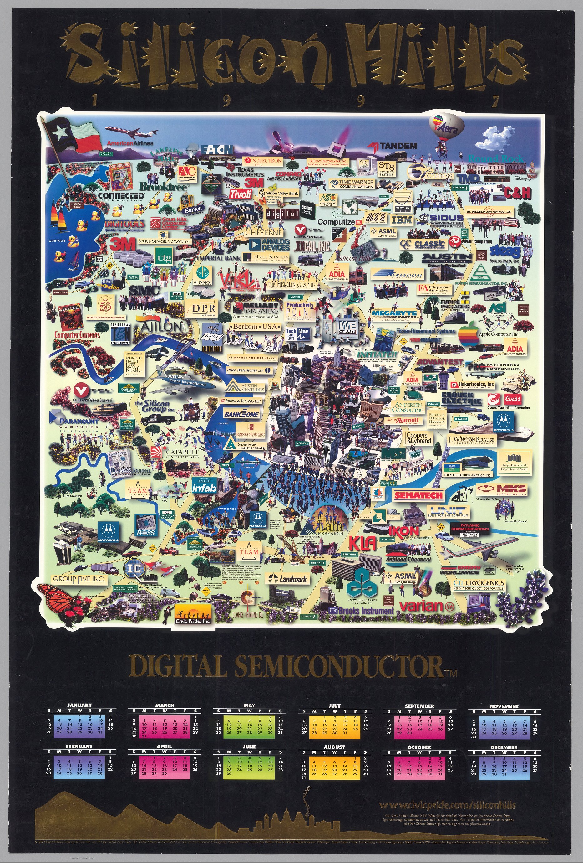
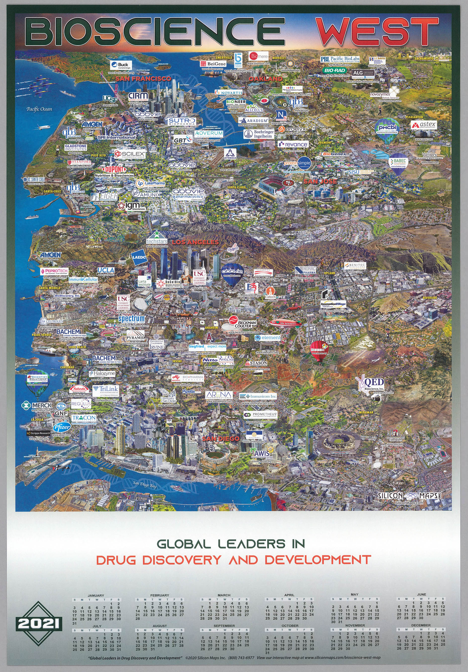
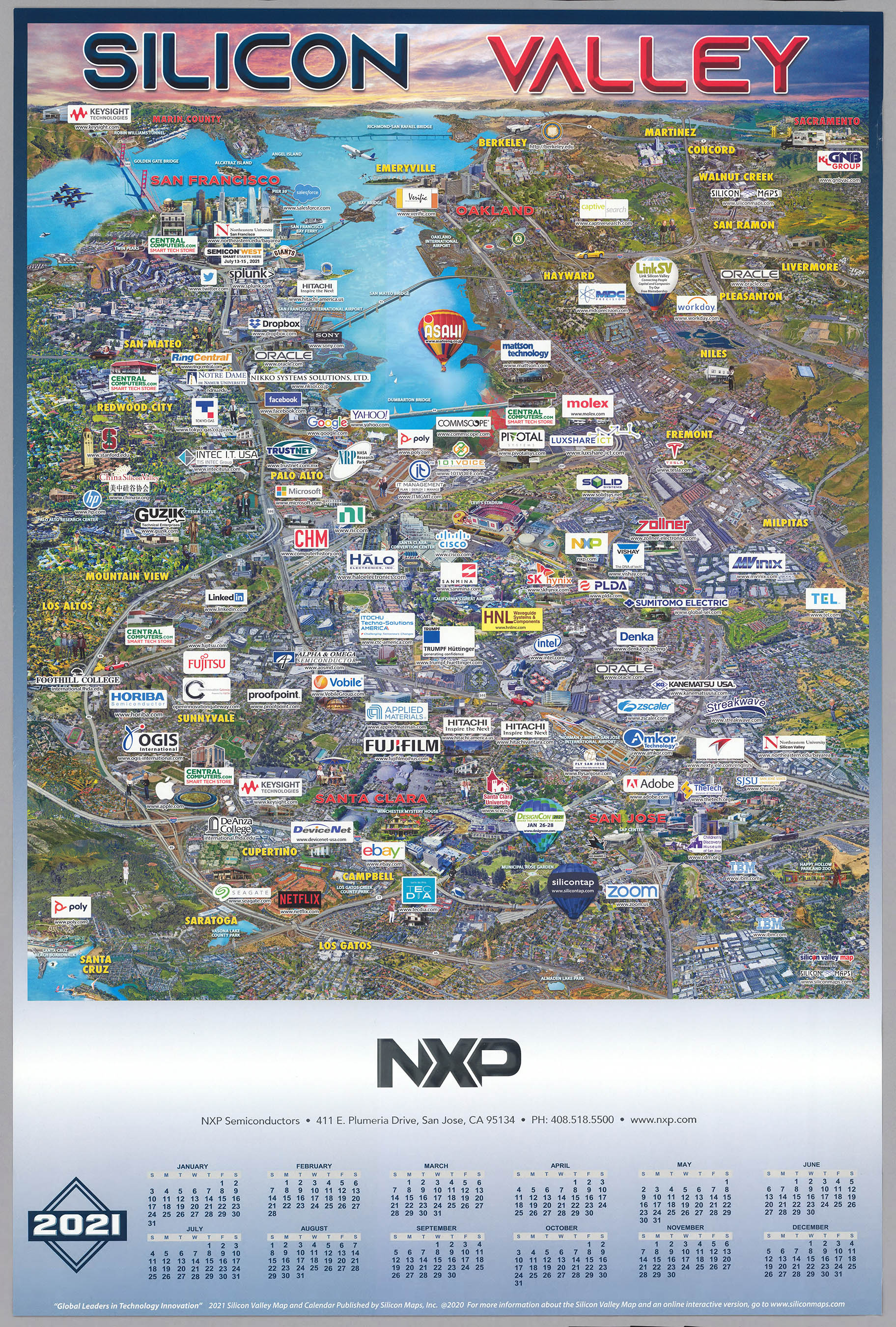
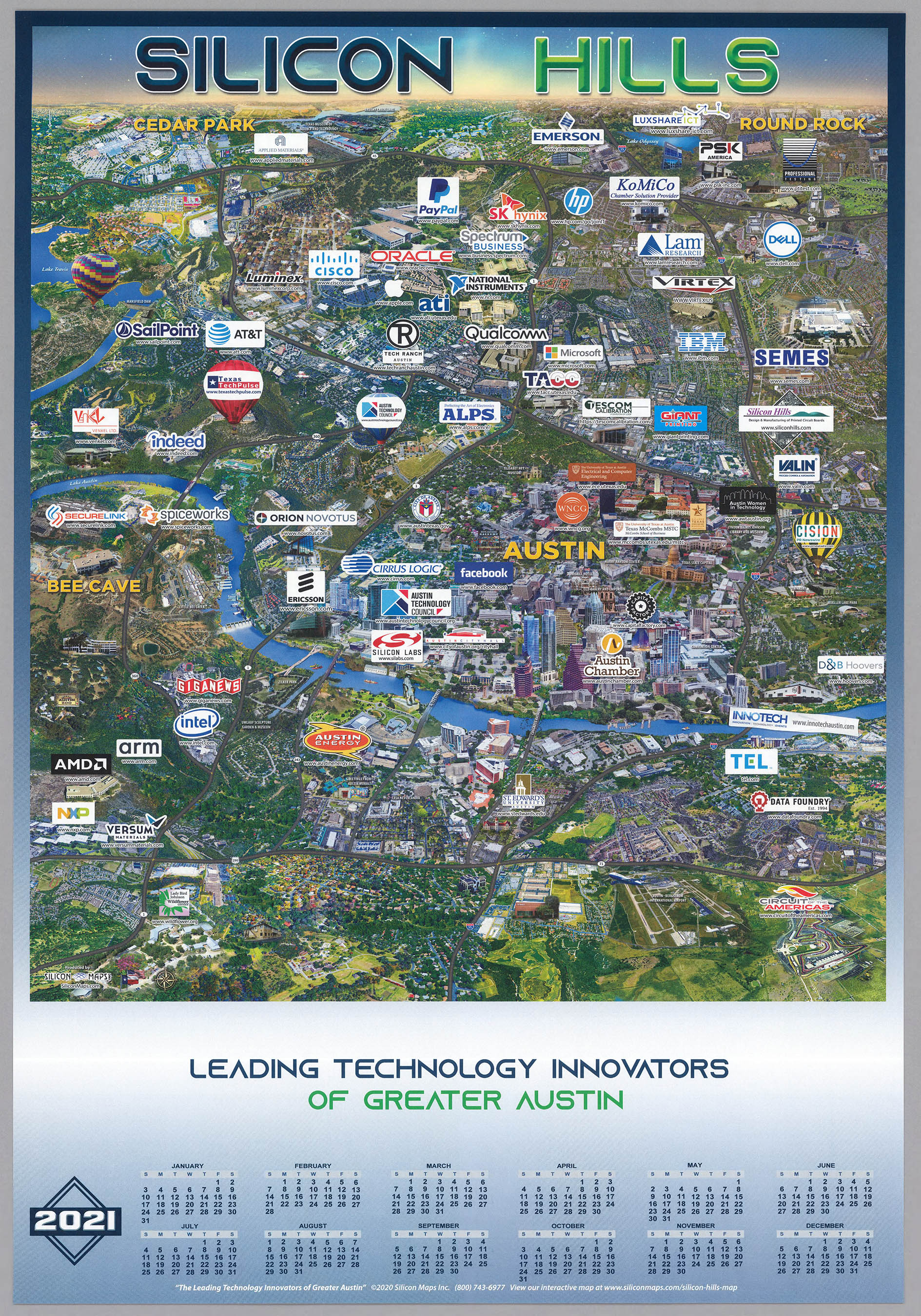
The Tech world in 2021 - on the left in California, stretching from Sacramento south to Santa Cruz, with the satellite image background moving away from the pictorial views of the early 1980's almost 40 years ago. On the right, the same style applied to the greater Austin region in Texas, now known as Silicon Hills.
|
|
- Featured Maps
- December 21, 2020
18 Interactive Globes Added To The Collection
18 Interactive Globes have been created and added to the map collection - 9 Terrestrial Globes, 3 Celestial Globes, and 6 Planetary Globes. View 6 below or browse all Interactive Globes in View Collection or in the Luna Viewer. The Globes may be rotated, enlarged, and shared with URL. The Globes may be viewed in groups of 6 or as individual high resolution globes.

- Featured Maps
- March 7, 2020
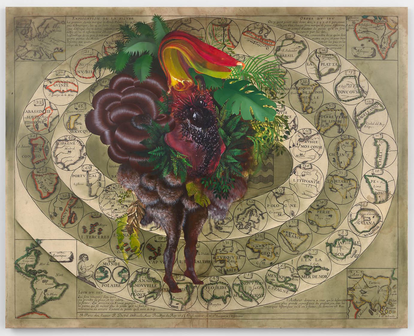
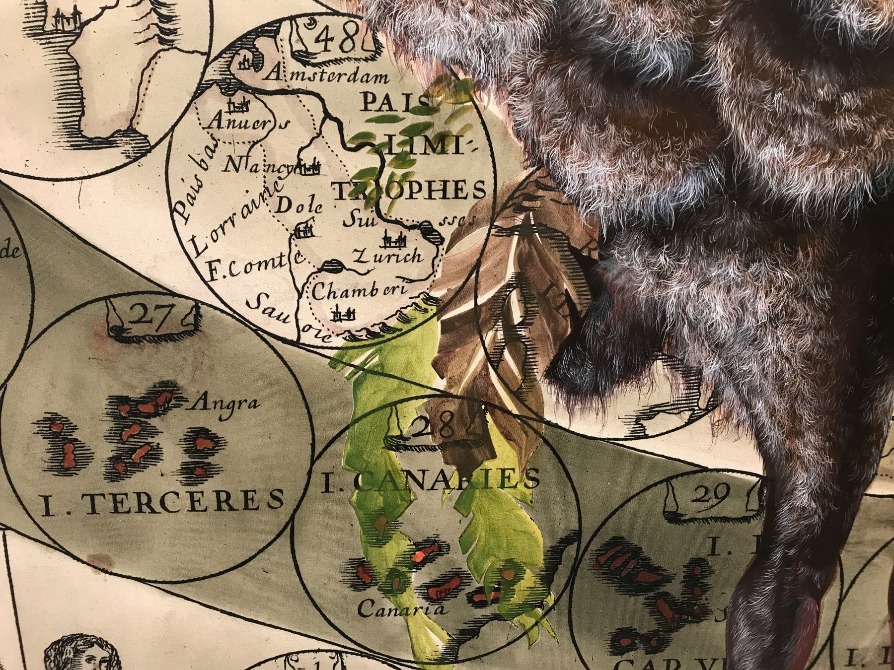
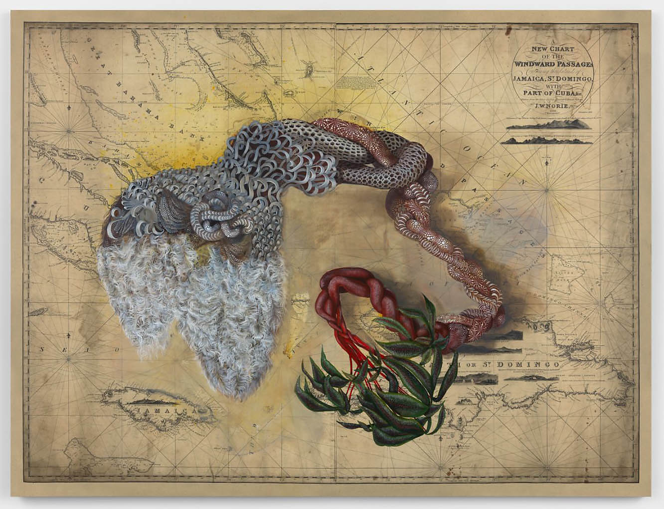
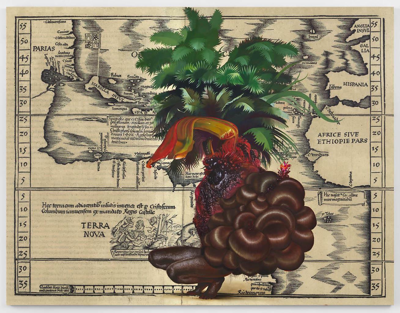
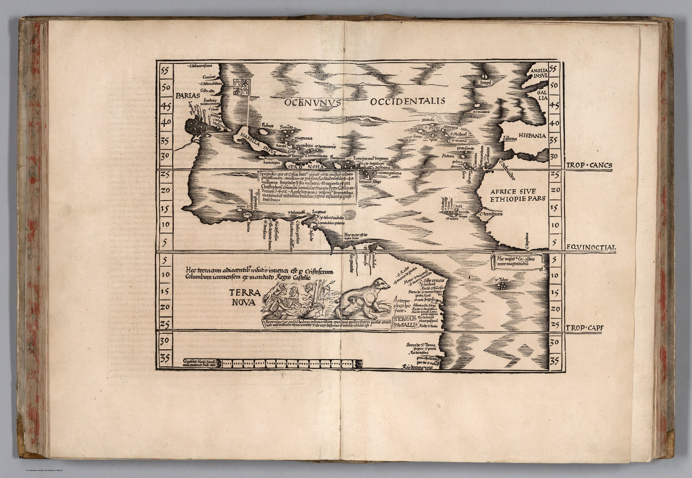
Firelei Báez Paints on Rumsey Maps
Artist Firelei Báez has opened an exhibition of new paintings at the James Cohan Gallery in New York City (March 5 - April 25, 2020). In many of these paintings Báez uses Rumsey Collection historical maps as the background for the works, with the maps enlarged and printed on canvases up to ten feet. David Rumsey provided the ultra high resolution map images necessary for printing at such a scale. The James Cohan Gallery describes Báez's art as work that "casts diasporic histories into an imaginative realm, re-working visual references drawn from the past to explore new possibilities for the future. Often depicting strong, shape-shifting female protagonists, her paintings incorporate motifs sourced from regional mythologies and historical artifacts alongside cues from science fiction and fantasy, to envision identities as unfixed, and inherited stories as perpetually-evolving... For more than a decade, Báez has painted directly onto found cartographic or printed materials to disrupt the boundaries they serve to delineate. Questioning notions of past and present, mark-making and painterly gesture become means of situating subjugated personal memory and experience in dialogue with narratives of the Western tradition. The works in her exhibition carry forward this long-standing interest while upscaling source materials onto large-format canvas to allow for intervention in human-proportion." Images of her extraordinary works and the maps underlying them are shown below.
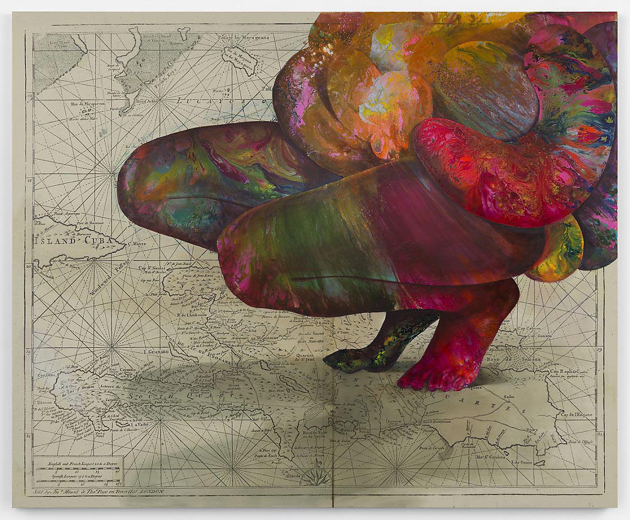
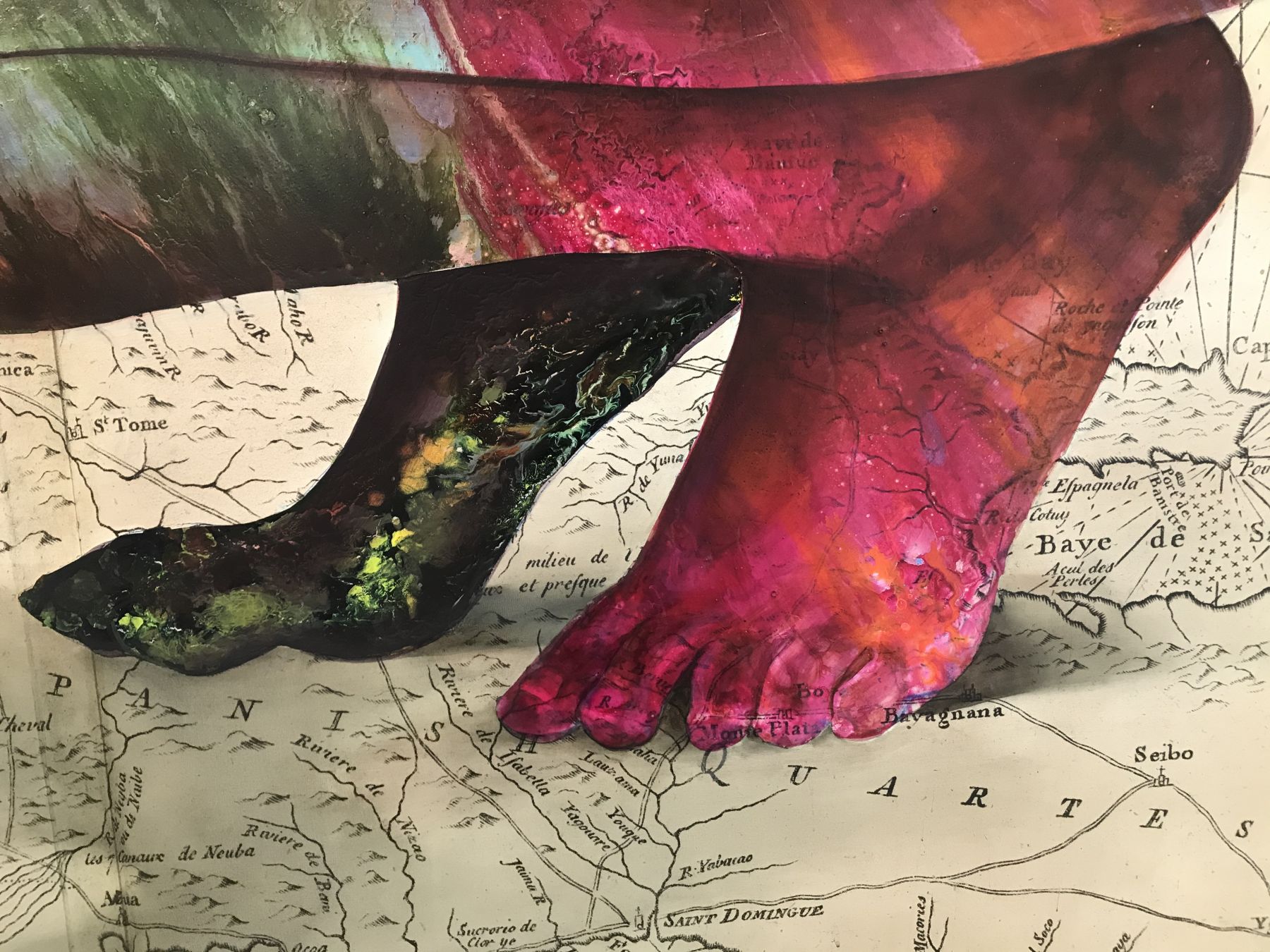
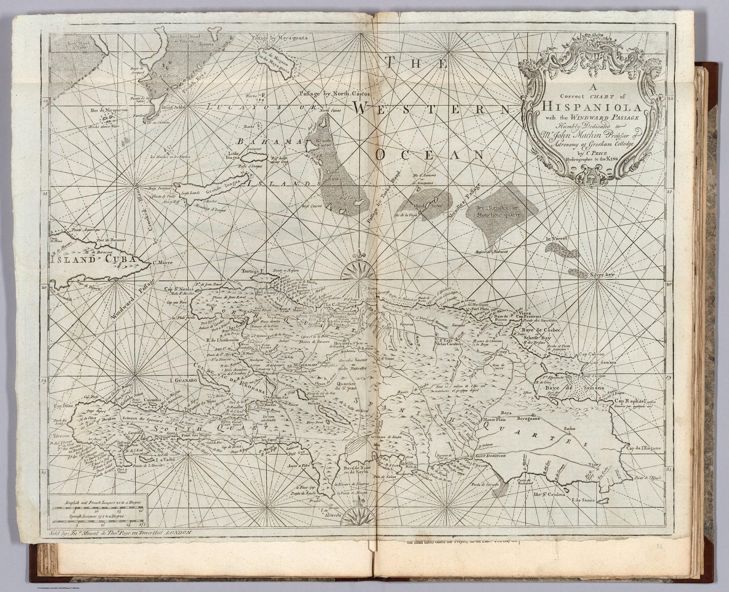
PRICE, C; MOUNT AND DAVIDSON
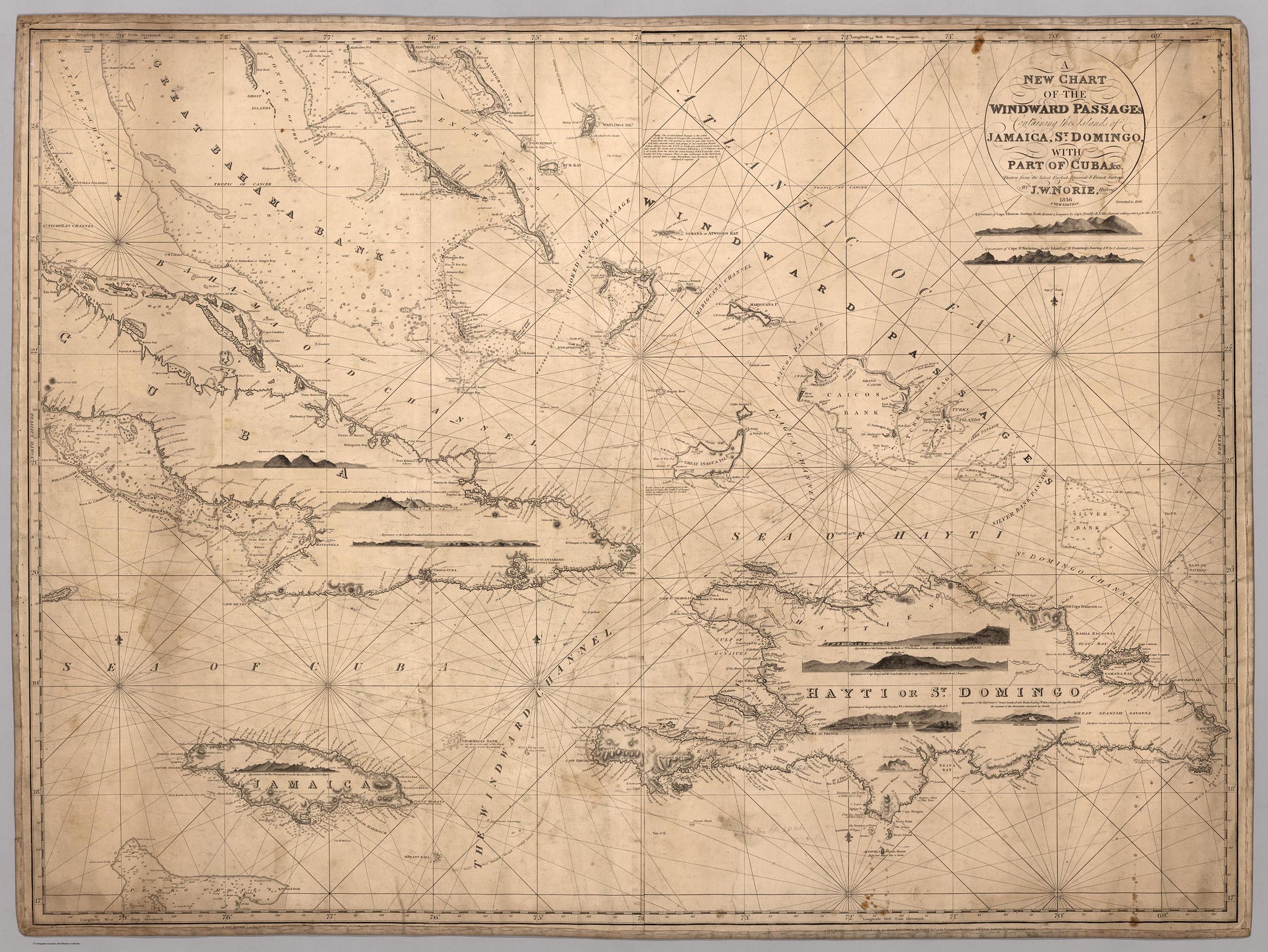
A Correct Chart of Hispaniola with the Windward Passage.
1794
48 x 60cm
A Correct Chart of Hispaniola with the Windward Passage.
1794
48 x 60cm


In its booth at the 2020 Armory Show in New York, the James Cohan Gallery had this additional work by Báez, Untitled (Temple of Time):

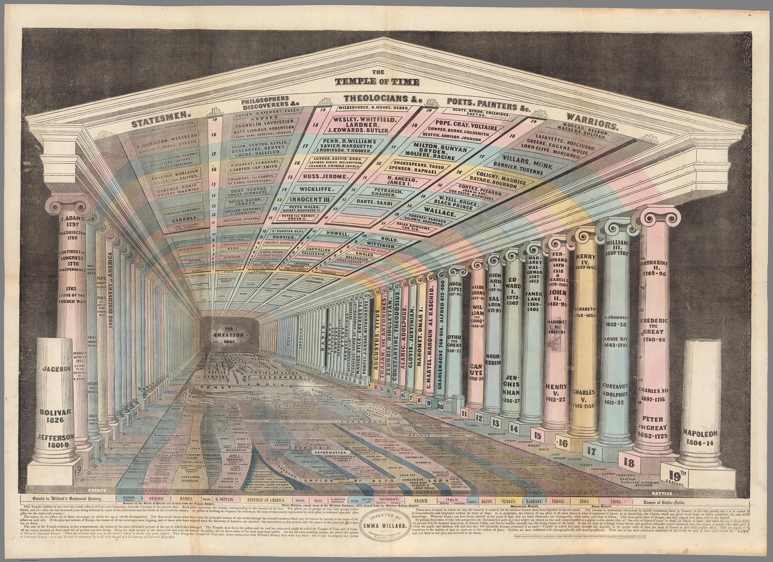
The complete press release for the Firelei Báez exhibition may be read here. All images of the art works courtesy the artist and James Cohan Gallery.
- Featured Maps
- May 12, 2019
Early Mapping of Silicon Valley and the Web
UPDATE: We have added 29 additional maps and related images of Silicon Valley to the Five maps below. Click here to see all 34 Silicon Valley maps. Five pictorial maps below trace the development of Silicon Valley from 1981 to 1991. Six additional maps show the growth of the Web from 1995 to 2009. There are interesting commonalities between the maps, the first group of five showing the physical space of Silicon Valley in the 1980's and the location of its first start up companies, many now gone. The six Web maps are an abstraction of the invisible structure of the early 1995 Web, leading to the complexity of the Web of 2009.
Below is the earliest map we have seen to identify Silicon Valley and show the businesses there, although it is likely there may be earlier ones. Published in 1981, it shows the San Francisco Bay area from San Francisco south to Almaden Valley. The graphic method is typical for pictorial maps of the period, using a cartoon style and bright colors. It was drawn by children's book illustrator Corbin Hillam.

This 1982 map of the valley shows many more businesses, both technology firms and others. It was published by City Graphics and drawn by Maryanne Regal Hoburg, like Corbin, a children's book author. See this video interview of Hoburg. City Graphics also published a map of the technology businesses along route 128 outside of Boston, Massachusetts.

In 1983 City Graphics published a new version of Hoburg's 1982 Silicon Valley map, updated and apparently not drawn by her. Many of the companies have moved to new locations and new companies have replaced their former sites.

Kirby Scudder's 1986 Silicon Valley map is done in the style of Saul Steinberg's famous 1976 New Yorker Magazine cover.

The last map in the series is a 1991 calendar published by F.A.P. Fine Art Printers. Seagate is a feature name above the calendar, likely due to sponsorship of the map. The valley seems less dense with companies than the earlier maps, either due to industry consolidation or the map's focus on larger businesses or both.

The following six maps attempt to show the structure of the Internet and its form. Most but not all of the companies listed originated in Silicon Valley. The last four maps are by Information Architects, an international design firm based in Tokyo.
Below is a map published by P.C. Computing. Drawn by Timothy Downs and Neil Randall, it shows where free content was available on the Internet in 1995 and how to access it. It is an interesting data visualization of the early Internet structure. Many of these services are long gone from the Web. Timothy Downs created another web navigation map in 1996, as well as another one in 1994

P.C. Computing also published this 1996 guide to the Internet for Mac users. Many of the institutional information resources remain, but many other resources are long gone.

Skipping ahead 10 years to 2006, the Internet has changed in significant ways as shown by this map by iA Information Architects. From the 30. December 2006 iA blog: "The iA Trend Map shows all the big players, the current Internet trends and how they’re connected, using the Tokyo Metro map. It’s totally unscientific and almost useless, but definitely fun to look at." More at iA blog.

Information Architects updated their 2007 map later the same year with a version 2. From the 26. June 2007 iA blog: "We have done it before: the 200 most successful websites pinned down on the Tokyo Metro Map, ordered by category, proximity, success, popularity, and perspective. Now we have done it again—and better. Back by popular demand: here is iA’s next Web Trend Map..." More at the iA blog.

In 2008, Information Architects came up with a completely new version of their Web map. From the 11. January 2008 (and other dates) iA blog: "As you can tell, we’ve redesigned the Web Trend Map from scratch. It’s now presented as an isometric landscape. It employs the Kanto area as its metaphor with two additional layers: one showing the brand evaluation of the main sites, and another their interface. We’ve invested another two hard weeks of work into this, so you’d better madly love it. Just like Windows Vista, it may be 'the last of its kind.'" More at https://ia.net/topi… and https://ia.net/topi… and https://ia.net/topi…

In 2009 Information Architects published their last Web map, an elegant multi dimensional version. From the 02. June 2009 iA blog: "It hangs in the headquarters of Google, Microsoft, Facebook, WordPress, and Yahoo! Japan. Even the CERN in Geneva has its own copy… It has been featured all across the web from TechCrunch to BoingBoing, and Gawker. The Web Trend Map plots the Internet’s leading names and domains onto the Tokyo Metro map. Domains and personalities are carefully selected through dialog with map enthusiasts, and every domain is evaluated based on traffic, revenue, and character. We grouped together closely associated websites, ensuring that every domain is on an appropriate line. As a result, the map produces a web of associations: some provocative, some curious, others ironically accurate." More at iA blog.

- Featured Maps
- April 28, 2019
Coordinates Maps and Art Exhibit Opens at Stanford's David Rumsey Map Center
The David Rumsey Map Center at Stanford Libraries for the first time has borrowed art from artists and institutions around the country, pairing their pieces with cartographic material from its collection for Coordinates: Maps and Art Exploring Shared Terrain. The exhibition features a variety of ways in which the two mediums overlap in inquiries about space, both geographical and metaphorical. The exhibition opened on Thursday April 25, 2019 with a daylong symposium and reception. The exhibit has an extensive catalog documenting the maps and art works. Printed copies are available for free at the Rumsey Map Center. Digital PDF versions can be downloaded here: Standard Resolution (18MB) or High Resolution (200MB). A exhibition checklist is also available.
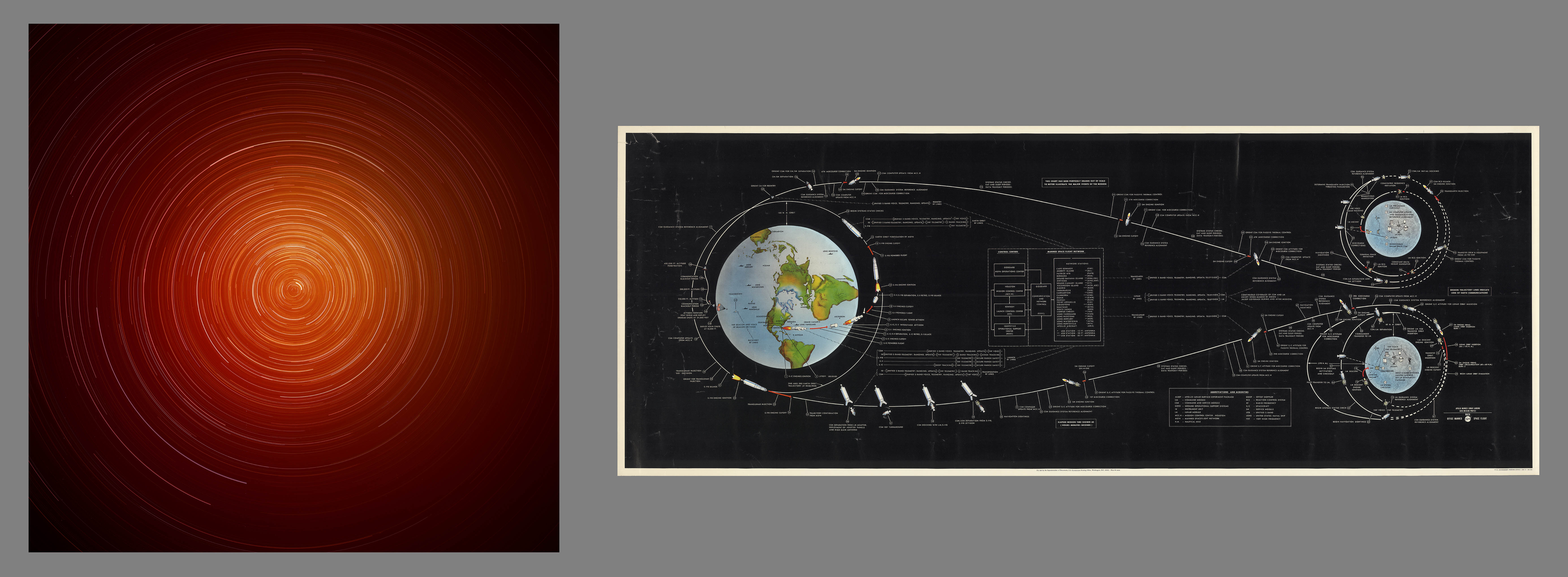 (Left) Trevor Paglen, STSS-1 and Two Unidentified Spacecraft over Carson City (Space Tracking and Surveillance System; USA 205), from series The Other Night Sky, 2010.
 (Right) United States. Office of Manned Flight, Apollo manned lunar landing : GOSS mission profile, 1969.
Two sides of the machines launched into space to gather data. Paglen captures mere traces of the satellites the government wishes to conceal; the Apollo Mission profile is dense with information and intended for public consumption of the historic moon landing.
“The crux of this exhibition is to provide visitors with an opportunity to ponder new questions and ideas about both the map and the art pieces and to liberate pre-conceived notions about what either is or is not,” said G. Salim Mohammed, head and curator of the David Rumsey Map Center.

(Left) Baron F.W. von Egloffstein, Geological map and profiles of some of the principal mining districts of Mexico, 1864.
(Right) Tauba Auerbach, Untitled (Fold), 2010.
Depictions of topography attempt to create an illusion of multidimensionality on a picture plane. Here, von Egloffstein and Auerbach show how the eye is seduced into seeing three dimensions, both real and imagined, through the subtleties of shading.
The exhibition was conceived and curated by David Rumsey, founder and namesake of the map center at Stanford and Emily Prince, cartographic metadata librarian at Stanford. Rumsey, who received a Master of Fine Arts from Yale University, always envisioned the David Rumsey Map Center as an interdisciplinary ‘geolab’ where maps offer scholars, from any discipline, a new lens for investigation and inquiry. Since its opening in 2016, the Rumsey Map Center has welcomed several classes spanning disciplines in art, civil engineering, classics, earth sciences, among many others.
In a written introduction for the exhibit catalog Rumsey and Prince describe their desire for combining the two formats, “Art holds our attention in looking and makes us conscious of our focus. Maps pull us deep into a three-dimensional space that is laid before us in two dimensions. Both force us to observe ourselves in the act of seeing—examining not only what we see, but how and why. Viewed together, they take us by surprise.”
Coordinates is curated in a way that brings together two seemingly different objects, but when collocated the efforts of the mapmaker and artist to convey location, perspective and imagination begin to look more similar than different. As Rumsey and Prince note in their essay, “Both rely on visual symbols and their codes of association to convey meaning. Both play with scale. Neither represent terrain literally, stripped of all symbology, or in a one-to-one scale. A map is not so much a visualized topography as an interpretive guide to it; just as an artwork is not an illustration but an investigation of how to look with an eye that widens from the concrete to envision an abstract concept. As an aesthetic gesture, a map is inherently an art: tracing, interlacing, erasing. As a document of interpretation, art becomes a map of meaning.”

(Left) Sol LeWitt, A Circle of Manhattan without a Circle, 1976–78.
(Right) Zero per Zero, New York City Railway system, 2014.
How can you see all the networks that traverse Manhattan, above and below ground? LeWitt and Zero per Zero use transparency, shape, and negative space to convey this information in clearly manipulated views, transcending street geography.
(Right) Zero per Zero, New York City Railway system, 2014.
How can you see all the networks that traverse Manhattan, above and below ground? LeWitt and Zero per Zero use transparency, shape, and negative space to convey this information in clearly manipulated views, transcending street geography.
Rumsey and Prince partnered with curator and writer Jordan Stein to produce a catalog for the exhibition. Stein explains his role in the development of the catalog was more akin to a correspondent, “tracing the contours of Rumsey and Prince’s work and conveying it in writing.”
“…My aim is somewhat similar to theirs: to unsettle the ground between the perceived objectivity of maps and subjectivity of art; to loosen—even if slightly—our grip on knowing; and to take a closer look at what terra incognita might mean in the context of their efforts,” wrote Stein in the catalog.
Coordinates: Maps and Art Exploring Shared Terrain will be on display from April 25 thru September 31, 2019 in the David Rumsey Map Center at the Cecil H. Green Library on the Stanford campus.
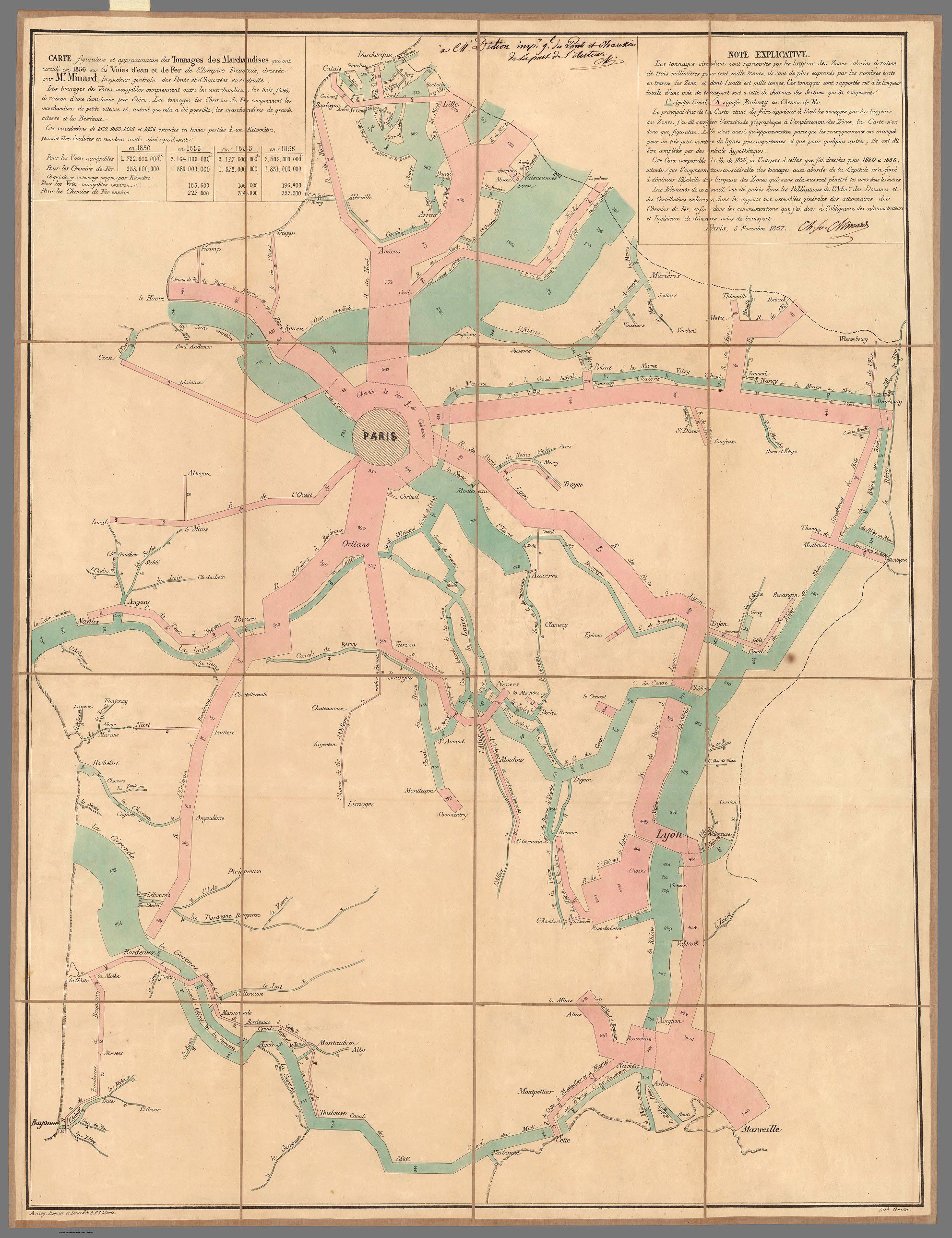
Among the artists included in the exhibition are Zoe Leonard, Trevor Paglen, Tauba Auerbach, On Kawara, Sol LeWitt, Richard Long, Felix Gonzalez-Torres, Agnes Denes, John Pfahl, Ed Ruscha, Robert Smithson, Nancy Holt, Christo and Jeanne-Claude. In dialogue with the art, will be maps by pioneering cartographers, such as J. C. Fremont, R. Buckminster Fuller, Richard Saul Wurman, Zero per Zero, Charles Joseph Minard, Joseph Salway, F. W. von Egloffstein, J. A. Martignoni, Isaac Frost, Sir David Brewster, and Stanford’s own Dr. Rob Dunbar.
In one instance, the art is meant to be taken. A stack piece known as Untitled 1992/1993 by Felix Gonzalez-Torres (pictured below on the right), will be placed one on top of another in a stack, welcoming interaction with the art and inviting visitors to take a piece and reinterpret the piece in their own environments. "We are honored to collaborate with both The Felix Gonzalez-Torres Foundation and SFMOMA in order to bring this work into the library. This partnership is a beautiful example of our ethos as librarians - sharing," said Prince.
The opening day symposium included talks by SFMOMA Librarian David Senior; Director of the Felix Gonzalez-Torres Foundation Emilie Keldie; writer Abby Smith Rumsey; art historian Emanuele Lugli; Director of the Holt-Smithson Foundation Lisa Le Feuvre; geographer Joshua Jelly-Schapiro from the New York University Institute for Public Knowledge; Jordan Stein from KADIST, San Francisco; and mapmaker David Medeiros.
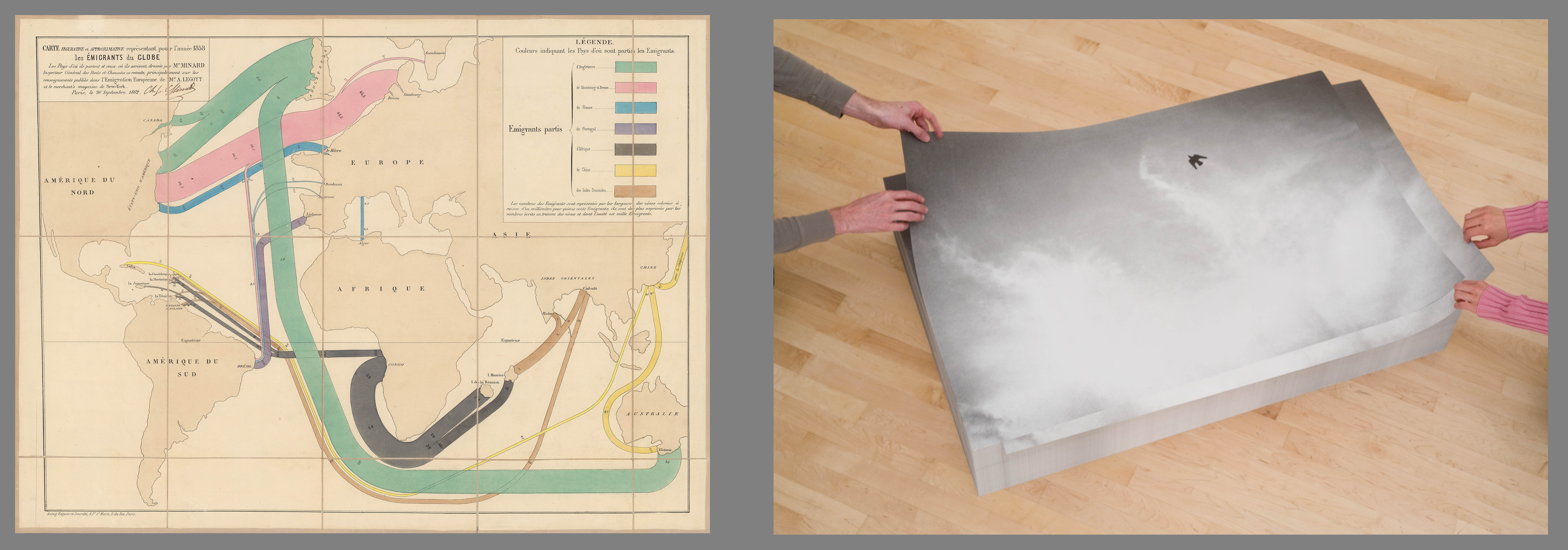
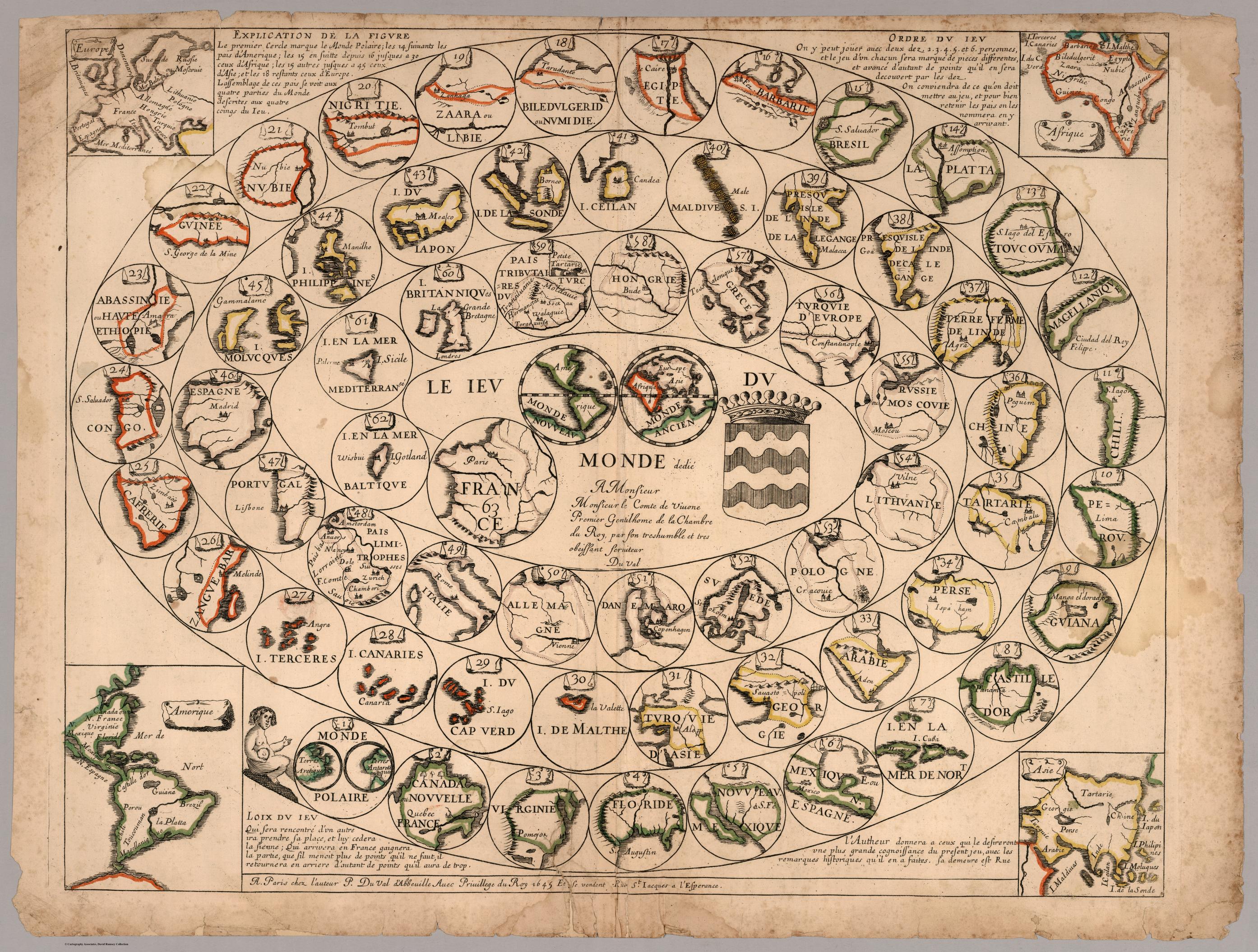
(Left) Charles Joseph Minard, Carte figurative…1858 les émigrants du globe, 1858.
(Right) Felix Gonzalez-Torres, “Untitled”, 1992/1993.
Minard, the founding genius of data visualization, subordinates everything, even the shape of the continents, to the flow lines that indicate movement of people. Gonzalez-Torres, here also in the realm of dispersal, defies the pieties of art—uniqueness and scarcity—by letting people take his images away with them, re-enacting the act of letting go.
The exhibit has an extensive catalog documenting the maps and art works. Printed copies are available for free at the Rumsey Map Center. Digital PDF versions can be downloaded here: Standard Resolution (18MB) or High Resolution (200MB). A exhibition checklist is also available.

Front and Back Cover of Coordinates Exhibition Catalog
(Background) Christo & Jeanne-Claude, Running Fence, Sonoma and Marin Counties, California, 1972–76.
(Foregraound) International Boundary Commission, Linea Divisoria Entre Mexico y Los Estados Unidos, 1901.
Boundaries come in all shapes and sizes—soft and undulating, hard and contemptuous of natural barriers. These images ask us to question what they are and who delineates them, how permanent they can ever be, and where, if anywhere, remains without borders?
The David Rumsey Map Center is open to the public from 1:00p.m. to 5:00p.m. Monday thru Friday; entrance is free but requires registration. When planning your trip to the Rumsey Map Center, please check rumseymapcenter.stanford.edu as there are occasions when the Center is closed due to class use.
- Featured Maps
- January 1, 2019
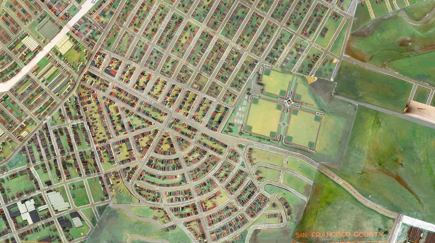
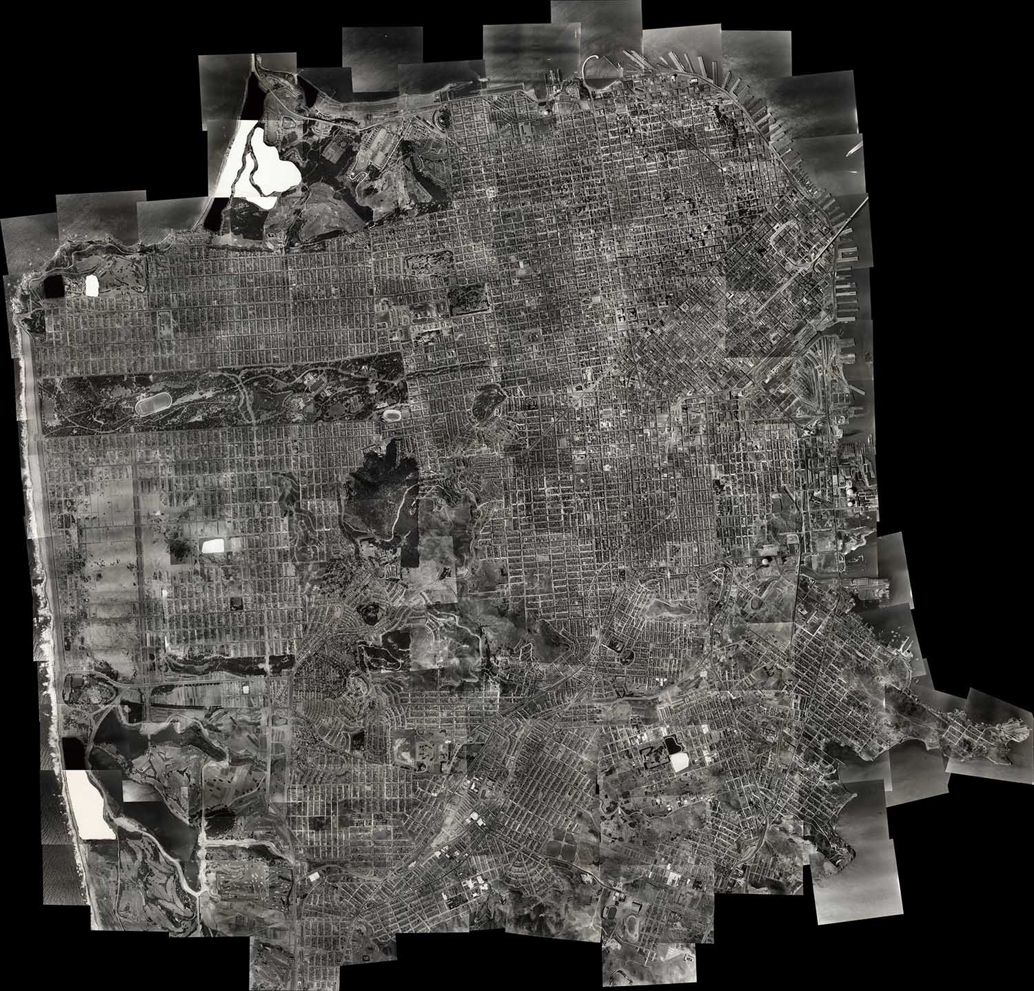
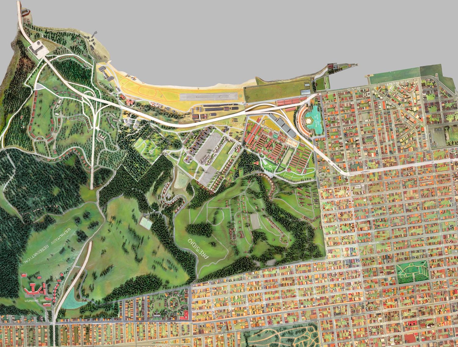
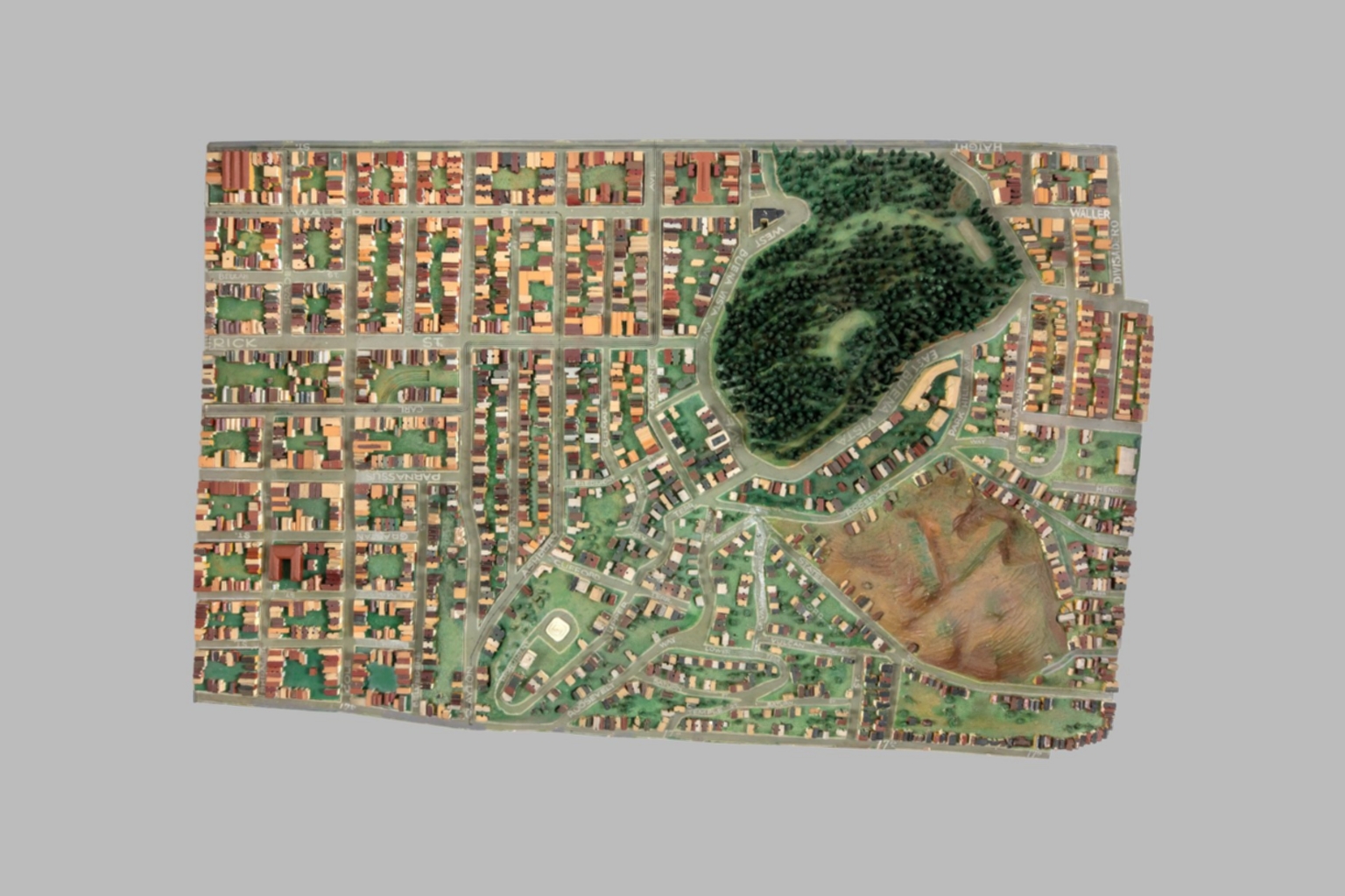
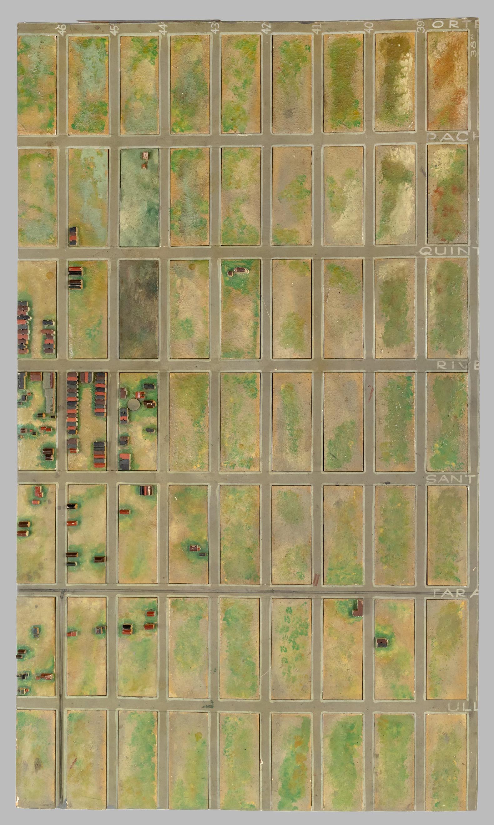
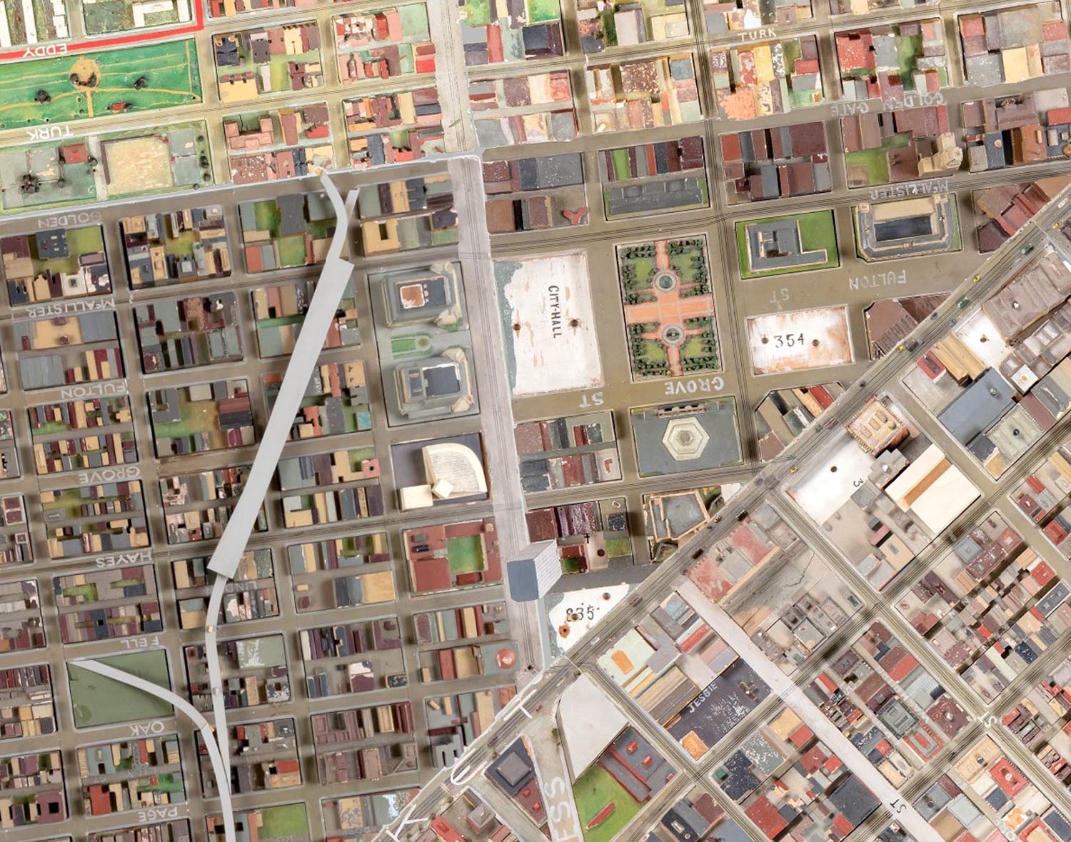
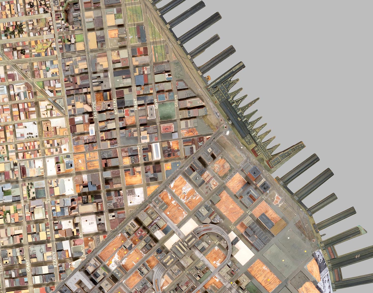
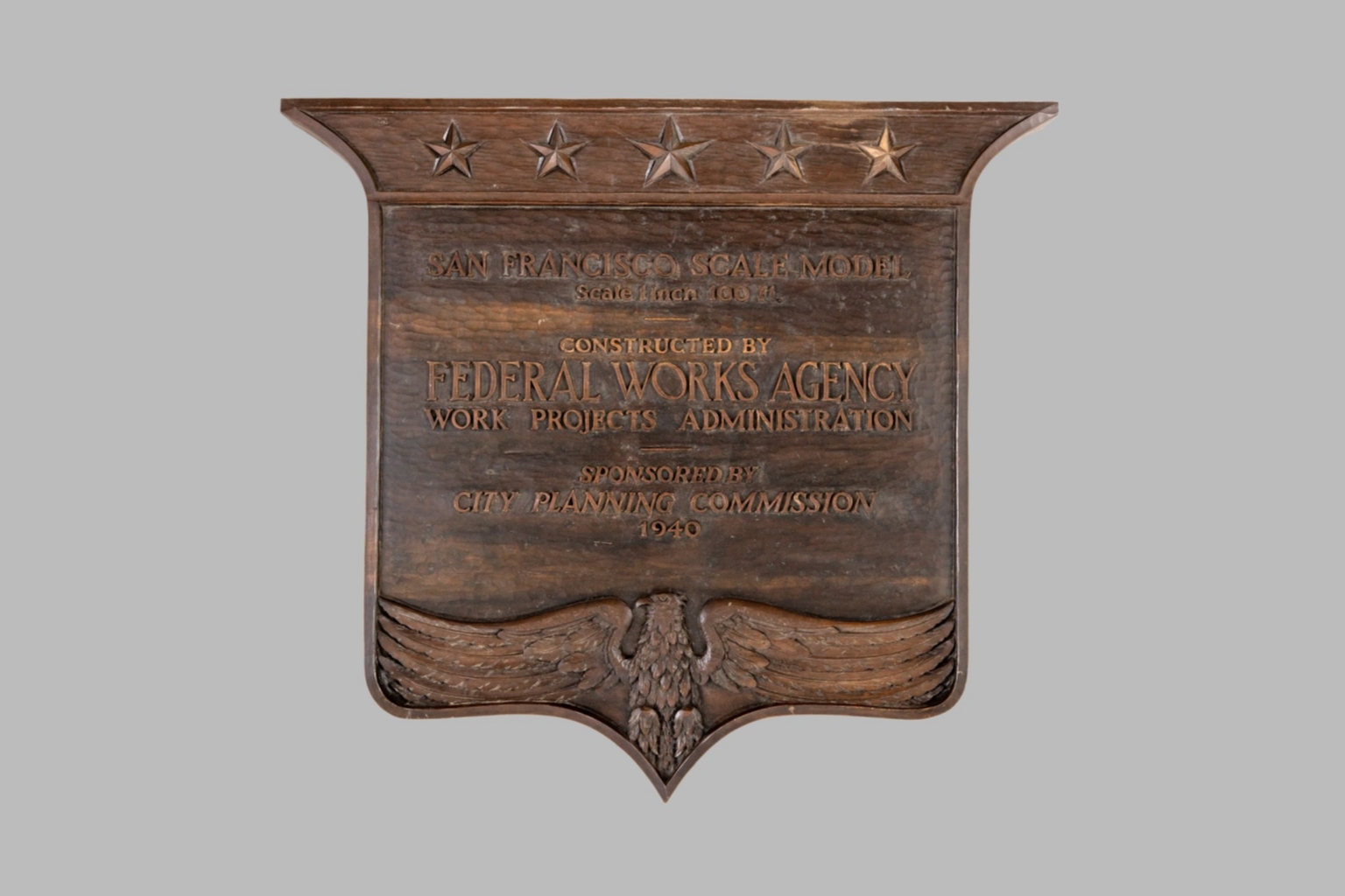
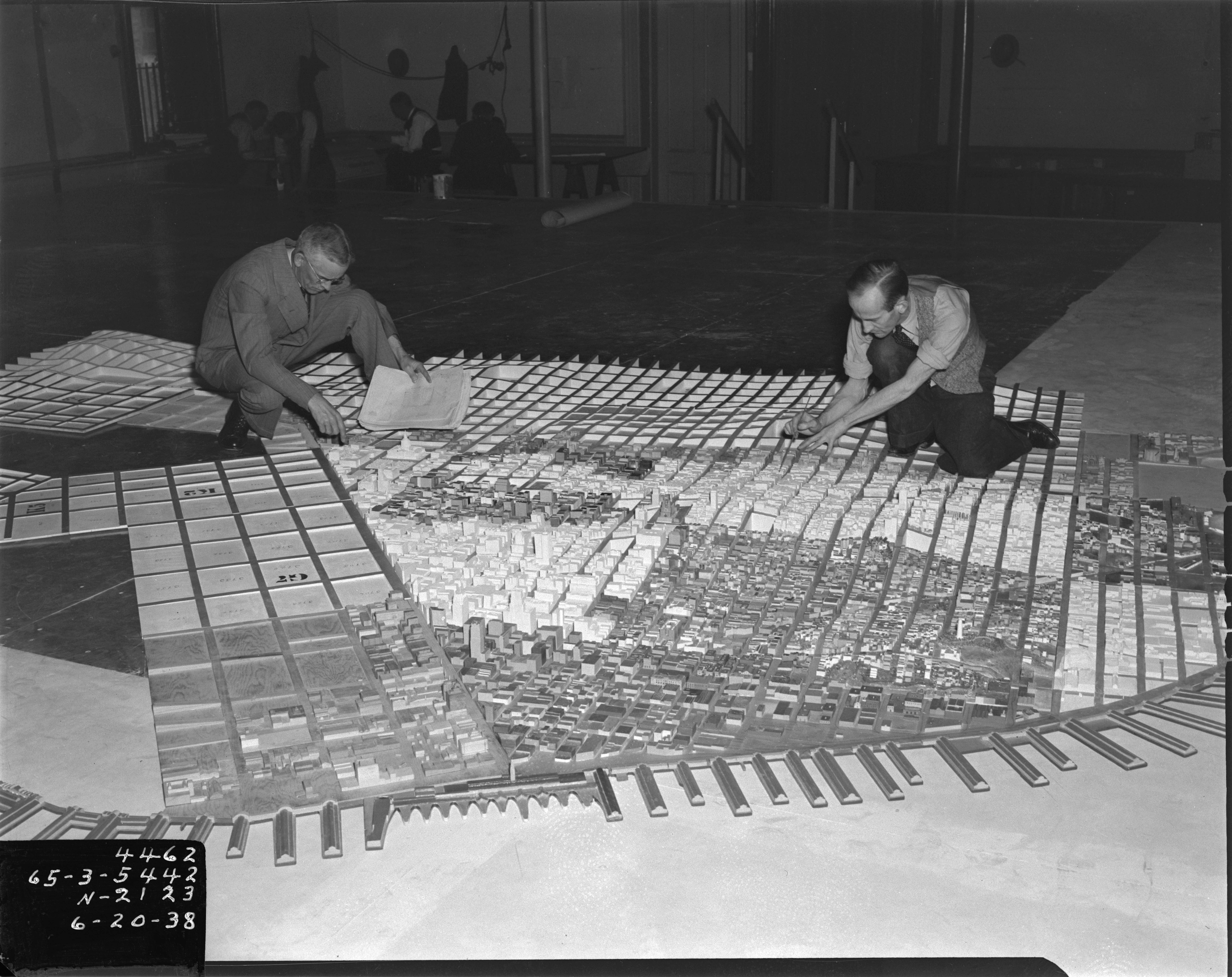
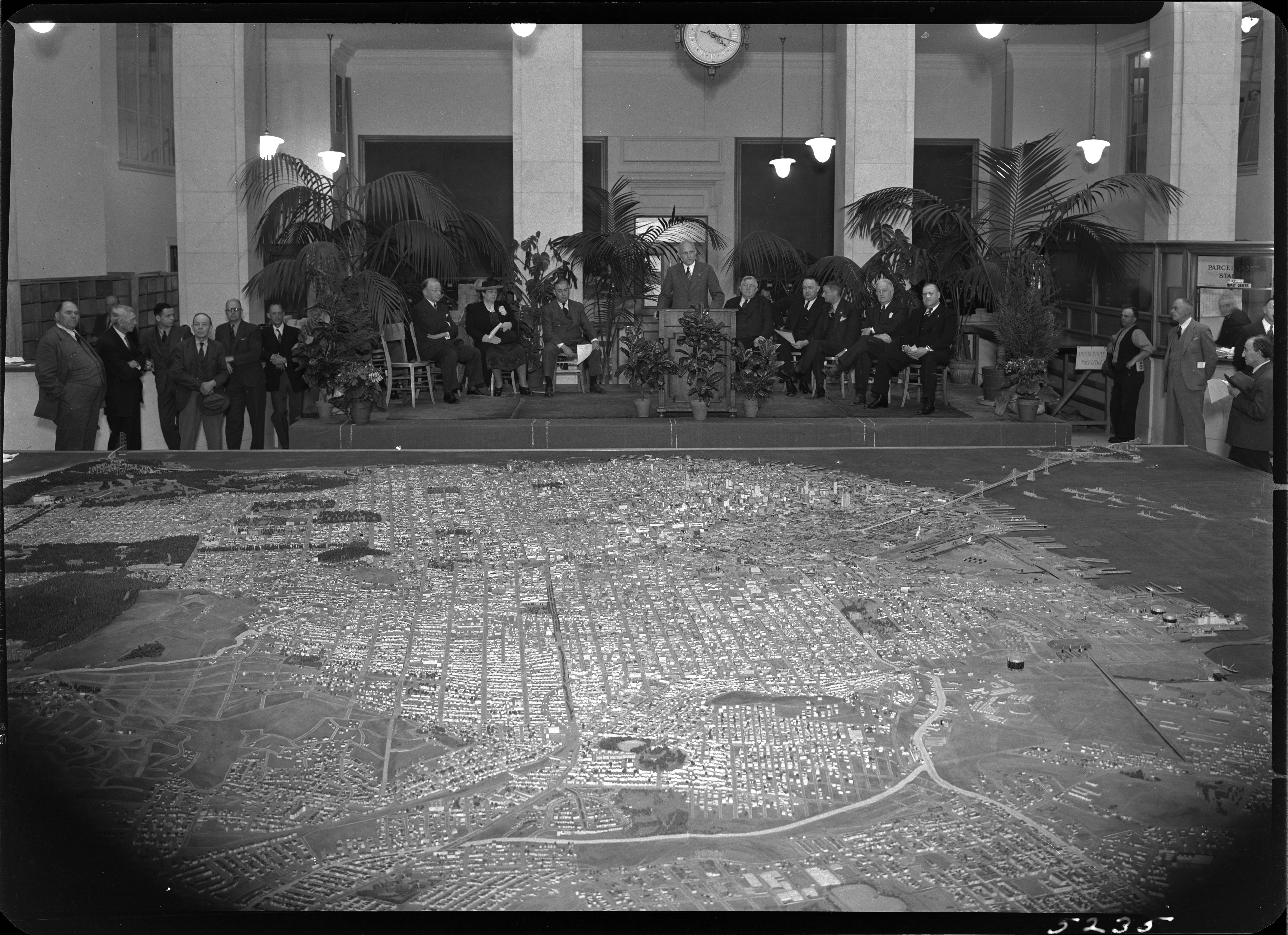
1940 WPA San Francisco Model 42x38 ft Now Online
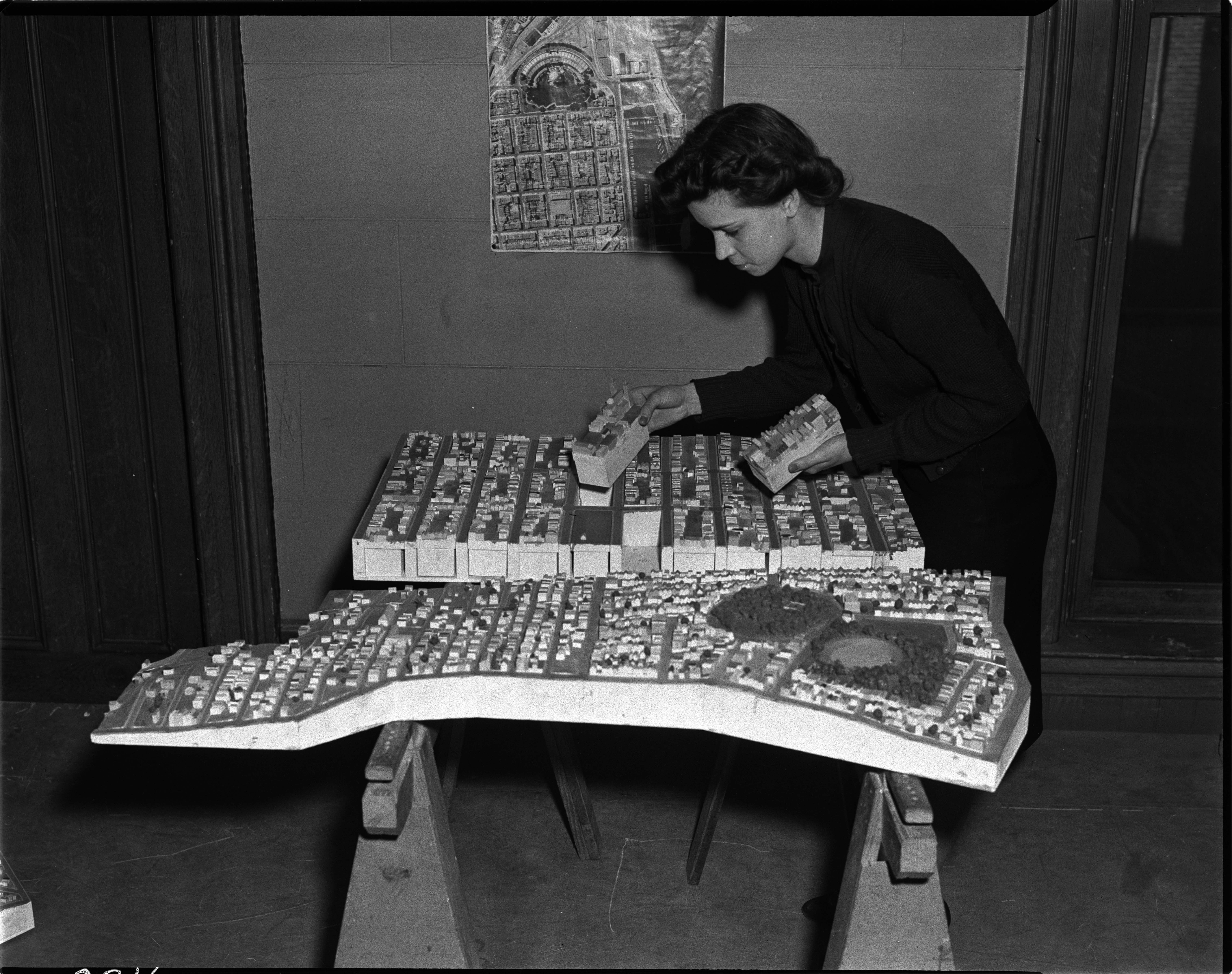
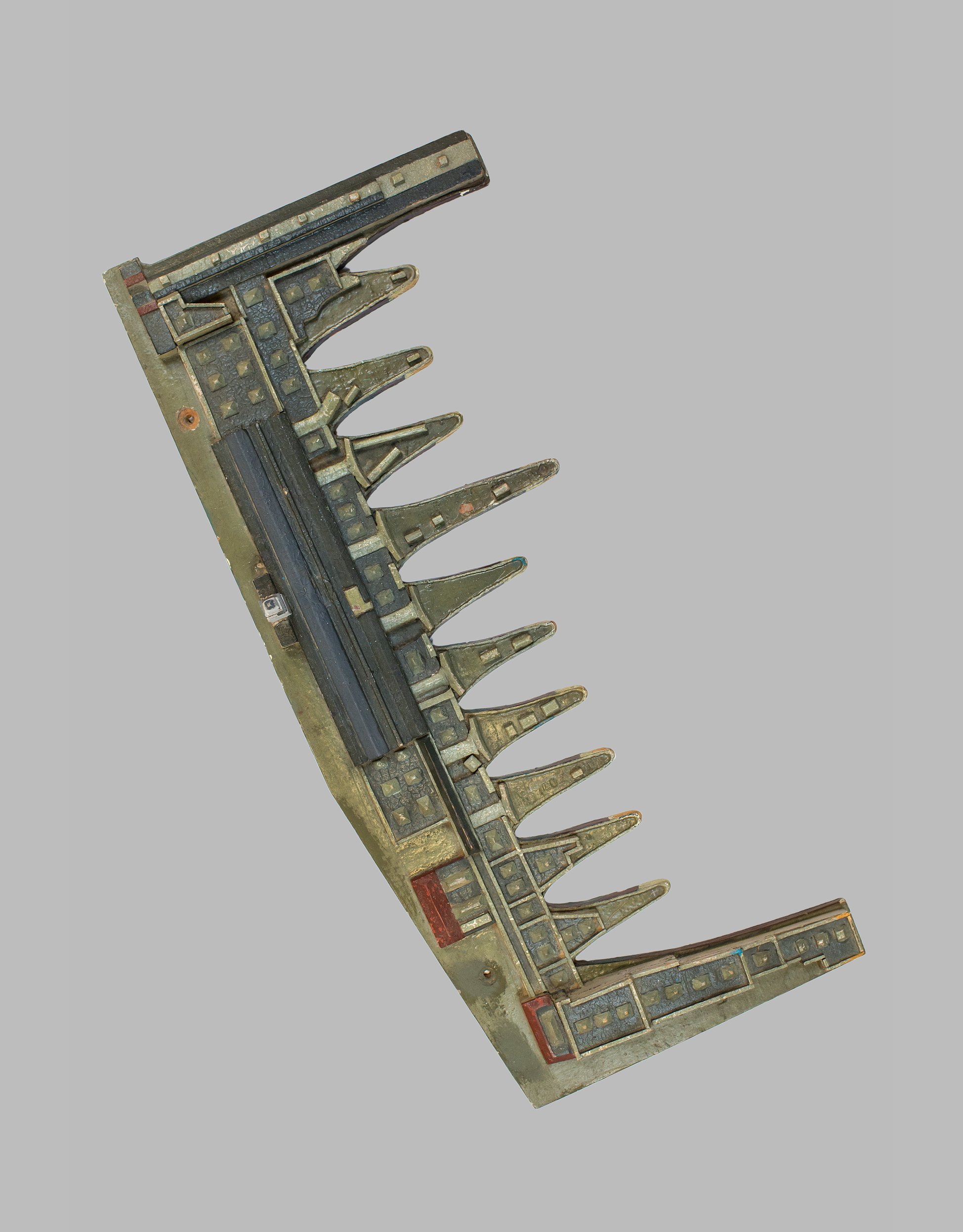
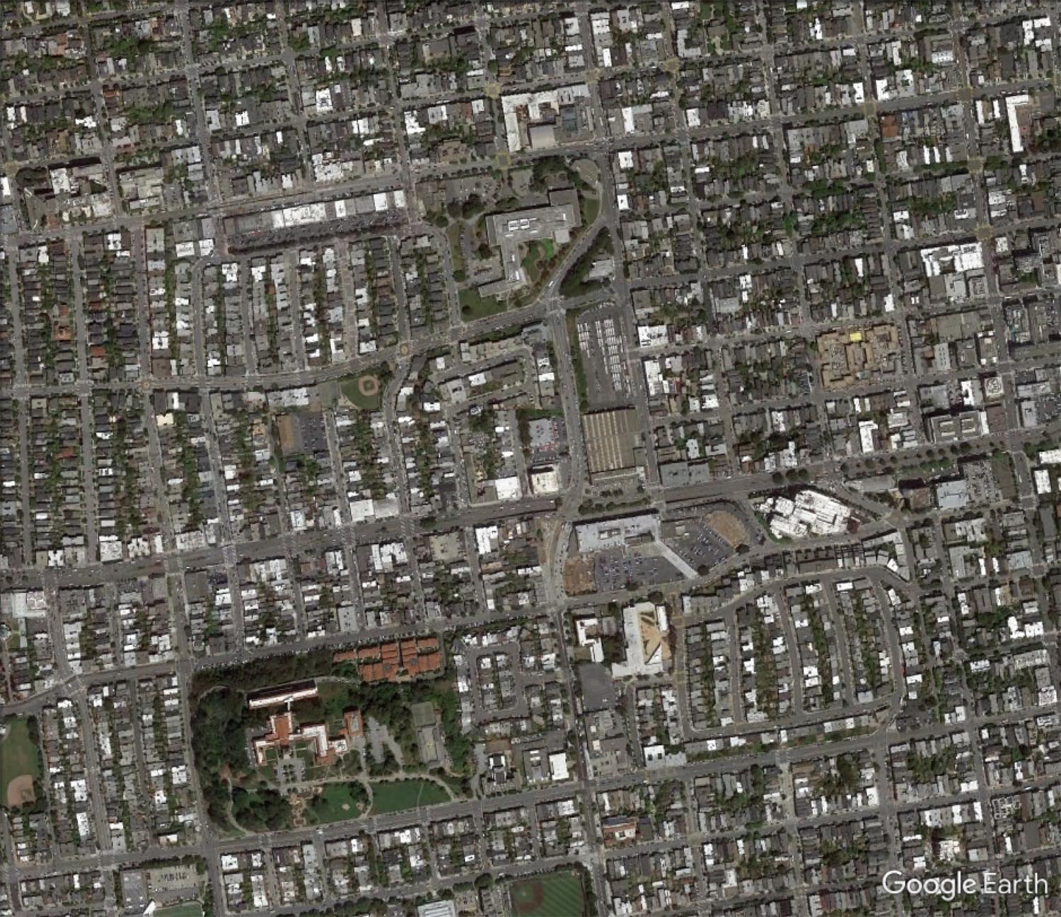
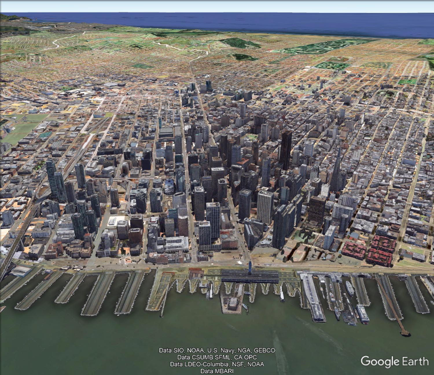
For the first time since 1942, the entire immense 42 by 38 foot WPA built San Francisco Model can be seen assembled virtually. Digitally knitting together all 158 separate pieces with over 6,000 blocks gives the viewer a sense of the extraordinary accomplishment the model represents. Recently recovered after decades of dusty storage, the model has been cleaned and photographed by a dedicated team of individuals as part of the SFMOMA and San Francisco Public Library project called Public Knowledge: Take Part. The model pieces were expertly photographed by Beth LaBerge. David Rumsey created the large Composite image below of the 158 pieces, as well as the image and metadata database of all the images, which he hosts. Rumsey also georeferenced the large Composite image and placed it in Google Earth.
Some details of the model's history: it is a 42 by 38 foot wooden replica of the city of San Francisco as it was in 1940 in 158 pieces at a scale of 1 inch to 100 feet. The pieces contain about 6,000 removable city blocks. The model was built by The Works Progress Administration in the late 1930's, under the New Deal. It was first displayed in sections in the Golden Gate International Exposition on Treasure Island in San Francisco Bay in 1939. In 1940-1942 it was displayed in San Francisco City Hall. The model was used as an urban planning tool by San Francisco city agencies and departments through the 1960's. In 1968, the downtown portion of the model became a research and planning tool in the Environmental Simulation Laboratory in the College of Environmental Design at UC Berkeley. The model has not been on public view, in its entirety, since 1942. UC Berkeley is the current owner of the model. The intent of the makers of the model was to have it updated as the city changed over time and they conceived of it as a tool to help understand and plan for changes in the city's built environment. Read a San Francisco Planning Department document from 1940 describing the building and purposes of the model.
The condition of the model is generally good except for the downtown and south of market portions which need restoration - many blocks there have been removed and lost, probably from the time it was used and updated as a planning tool. The team that has made the model available again to the public are the principals of Public Knowledge: Take Part: Bik Van der Pol, Artists; Stella Lochman Project Manager; Tomoko Kanamitsu, Project Director; Deena Chalabi, Curatorial Lead; and Bay Area historian Gray Brechin, who for many years has championed the Model's preservation as a critical piece of Bay Area history during the New Deal.


 |
 |
 |
 |
 |
 |
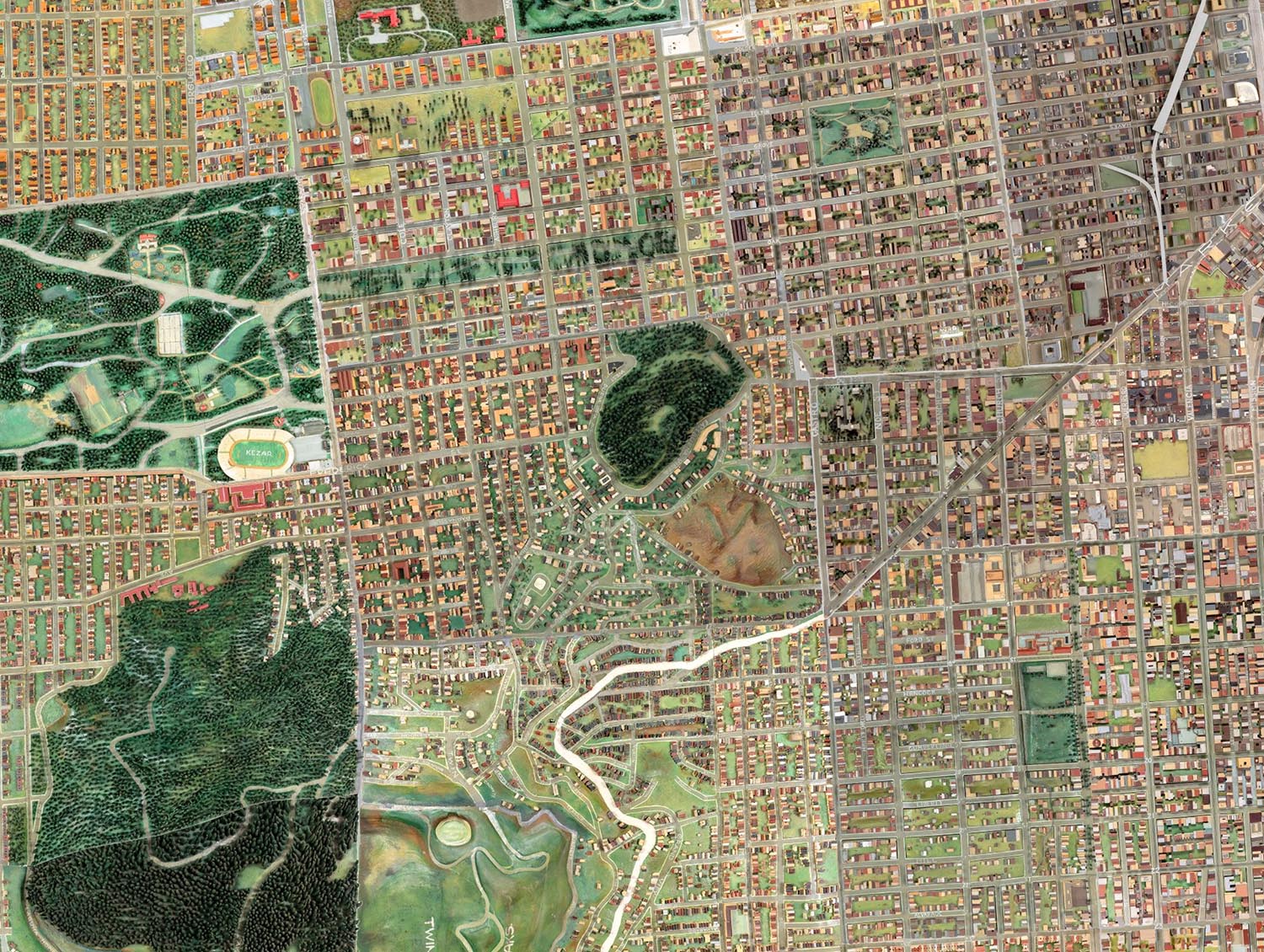


The large Composite image was georeferenced and placed in Google Earth. Viewing the Model in this platform allows several new functions: it may been seen obliquely or at an angle, as it is by viewers seeing the physical model; a digital elevation database in Google Earth gives the Model image height and depth; and changes over time can be seen by comparing the Model 1940 image to the modern satellite image using the transparency slider. The Google Earth App can be downloaded - choose Google Earth Pro for Desktop. The Google Earth KMZ of the Model will download here and open in Google Earth App by clicking on it after download.


 |
 |
 |
 |
 |
 |
The WPA San Francisco Model was an attempt both to look back and ahead at the City's environment in 1940. While it is an antiquarian object today, it holds its power to inspire us by its creativity and craftsmanship. We hope that it finds a permanent home and is restored - it is a crucial link to the history of San Francisco.
Historical images of WPA model courtesy of the San Francisco Department of City Planning Records (SFH 465), San Francisco History Center, San Francisco Public Library.
- Featured Maps
- December 6, 2017
HD Maps for Self Driving Cars - Podcast with David Rumsey and Wei Luo
The need for ultra high definition maps for self driving cars is creating a new kind of map - the High Definition or HD map - with resolution down to a few centimeters. This is a new version of the one to one map anticipated by Jorge Luis Borges in his 1946 short story "On Exactitude in Science." Listen to a podcast with David Rumsey and Wei Luo, COO of DeepMap, as they explore how HD maps will change our ideas of what a map is and can be, as well as how past maps have anticipated these coming changes in cartography. By making a map of our world that is literally 1:1 scale, HD maps explode the map to encompass everything around us - and we will experience it by moving in it and through it in our self driving cars.
Below is a DeepMap's conceptual visualization of how HD maps could work with self driving cars:
A Visualization of how HD maps could work with self driving cars - provided by DeepMap
- Featured Maps
- March 31, 2015
Over 2,000 Pictorial Maps in Online Collection
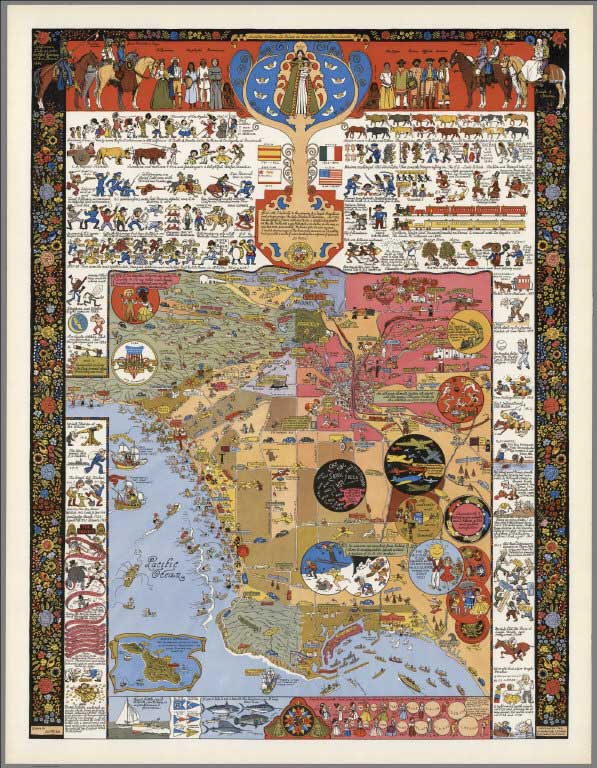
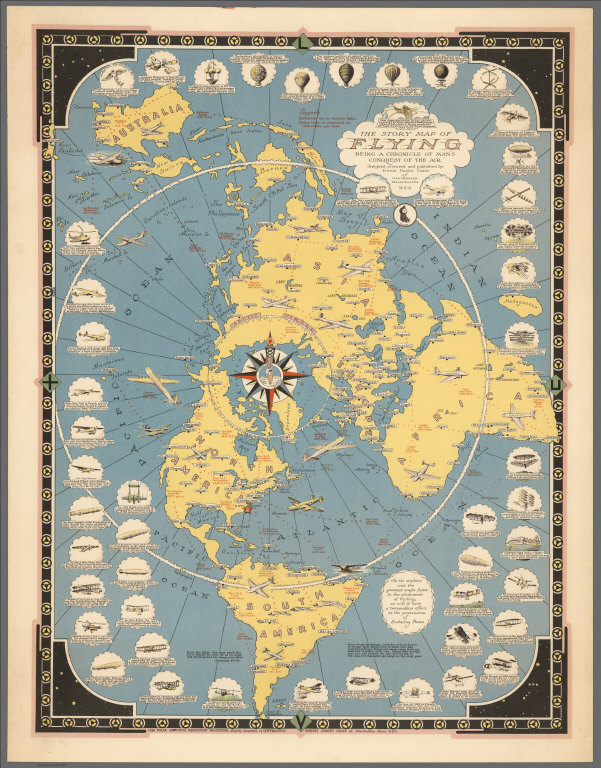
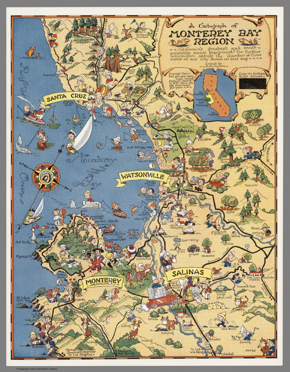
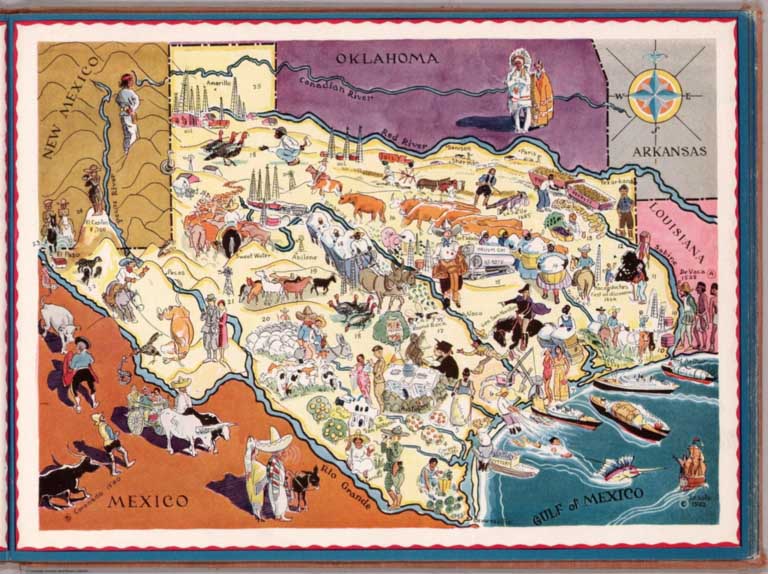
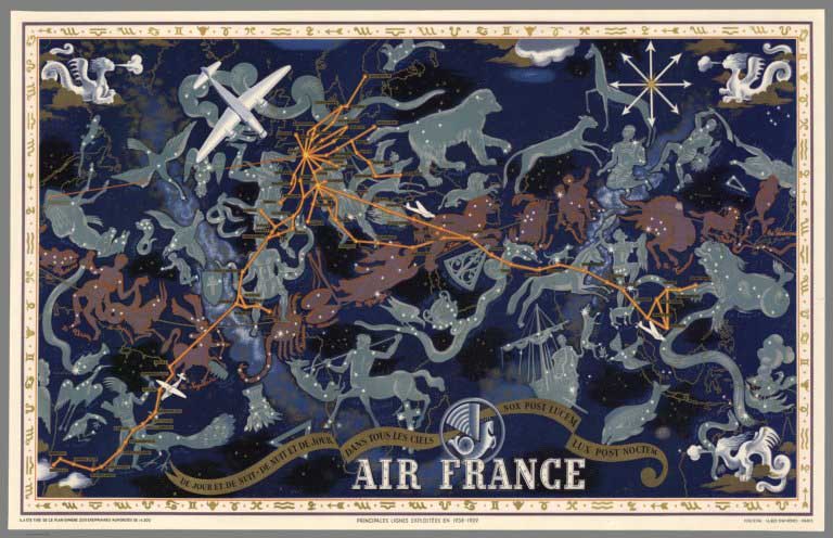
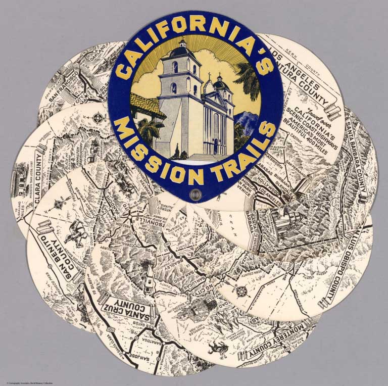
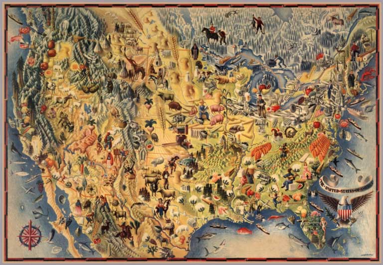
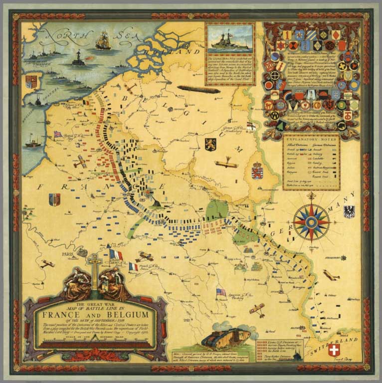
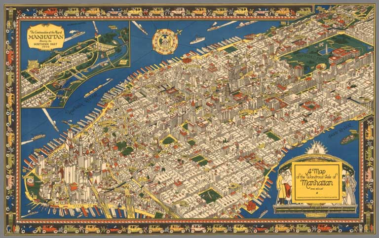
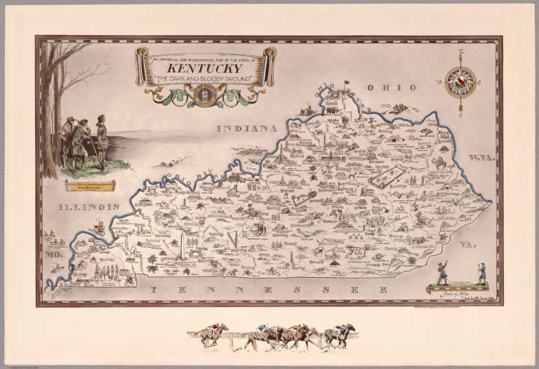
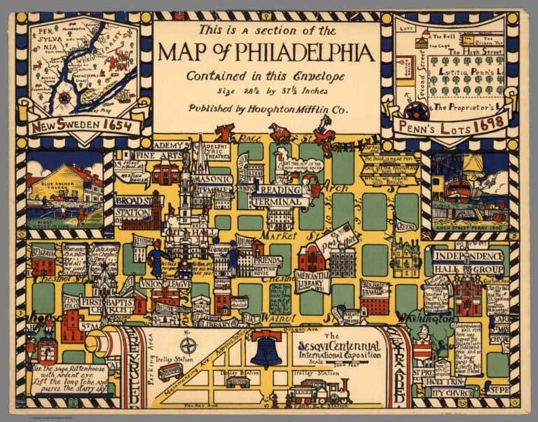
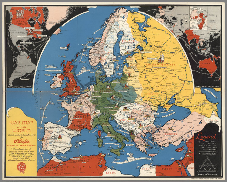
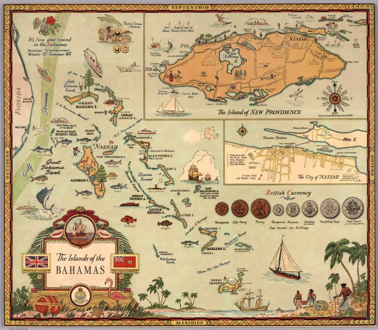
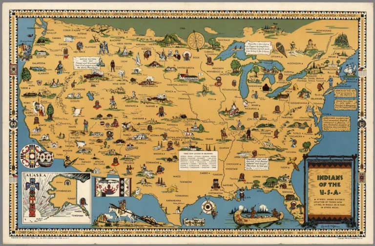
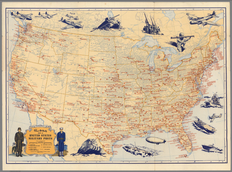
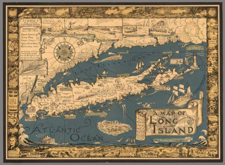
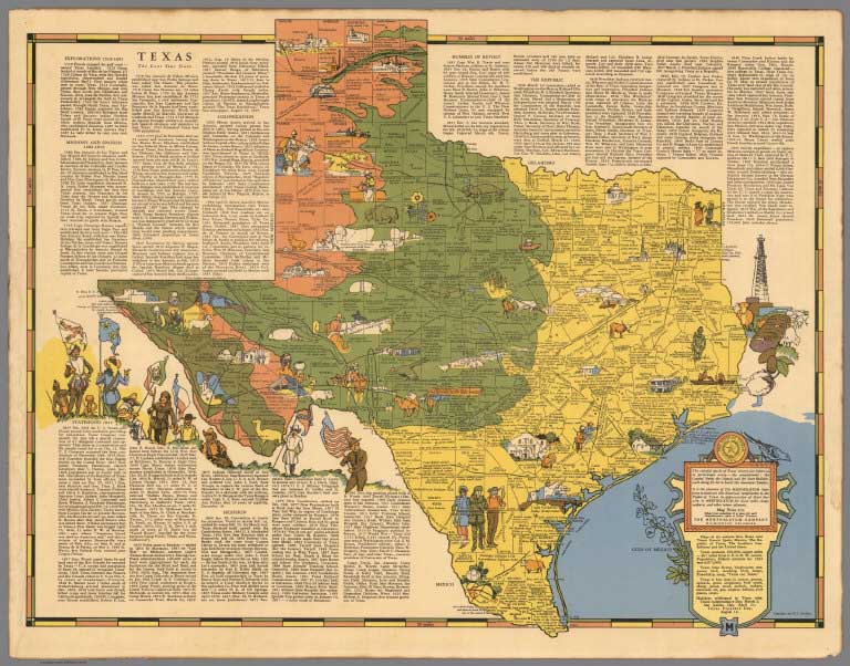
Over 2,000 Pictorial maps and related images have been added to the David Rumsey Map Collection in the form of separate maps, pocket maps, case maps, atlases, manuscript maps, and wall maps. Pictorial maps are generally described as maps that employ various kinds of illustrations, images, and text that enhance the cartographic message. While they seem to have peaked in popularity in the 1920 to 1940 period, they have antecedents in the 19th and earlier centuries and the form continues today. We will be continuing to add more pictorial maps to the collection, and this link will automatically update with the new maps. We are broad in our definition of pictorial maps, and include in that category certain panoramic and birds-eye maps, diagrammatic maps, and timelines. Some of the more prolific or exceptional pictorial map makers are detailed below. Highlights in this addition are pictorial maps by MacDonald Gill, Ernest Dudley Chase, Ashburton Tripp, Jo Mora, Ruth Taylor White, Lucien Boucher, Gerald Eddy, Miguel Covarrubias, Heinrich Berann, Ernest Clegg, Karl Smith, Edwin Olsen, Stanley Turner, Coulton Waugh, Everett Henry, Lindgren Brothers, Don Bloodgood, Colortext Corp, Frank Dorn, C.V. Farrow, Richard Edes Harrison, Alva Scott Garfield, Elizabeth Shurtleff, Tony Sarg, Louise Jefferson, Harrison Godwin, and Courtland Smith. A group of original pictorial map catalogs is also included. For more information on pictorial maps, see writings of Elisabeth Burdon, George Glazer, Roderick Barron, Wikipedia, and Library of Congress.
View Pictorial Maps Sorted by Date
View Pictorial Maps Sorted by Author
View All Pictorial Maps in the Collection, Including New Additions
 |
Pictorial Maps by MacDonald Gill, 1915 to 1947 |
 |
Pictorial Maps by B. Ashburton Tripp, 1925 to 1954 |
 |
Jo Mora Pictorial Maps, 1926 to 2007 |
 |
Pictorial Maps by Ernest Dudley Chase, 1931 to 1965 |
 |
Picture Map Geography of the United States, 1931 (with) Picture Map Geography of South America, 1941 |
 |
Atlas and Maps by Ruth Taylor White, 1929 - 1941 |
 |
Berta and Elmer Hader's Picture Book of the States, 1932 |
 |
Pictorial Maps by Lucien Boucher, 1934 to 1962 |
 |
Gerald A. Eddy Pictorial Maps, 1933 to 1965 |
 |
Pictorial Maps by Miguel Covarrubias, 1940 to 1942 |
 |
Pictorial Maps by Heinrich Berann, 1936 to 1995 |
 |
Ernest Clegg Pictorial Maps, 1926 to 1947 |
 |
Pictorial map of Manhattan by C.V. Farrow, 1926 |
 |
Pictorial Maps by Karl Smith, 1933 to 1959 |
 |
Edwin Olsen and Blake Clark Pictorial Maps, 1926 |
 |
Pictorial Maps by Stanley Turner and C.C. Petersen, 1942 to 1969 |
 |
Pictorial Maps by Harrison Godwin, 1927 and 1928 |
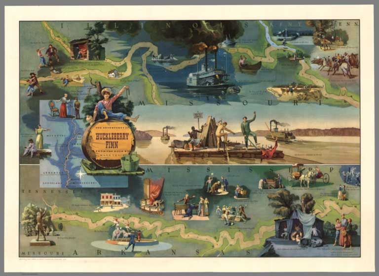 |
Pictorial Maps by Everett Henry, 1928 to 1981 Everett Henry designed maps with literary themes: Moby Dick, Huckleberry Finn, Ivanhoe, Tale of Two Cities, Robin Hood, Treasure Island, and others. |
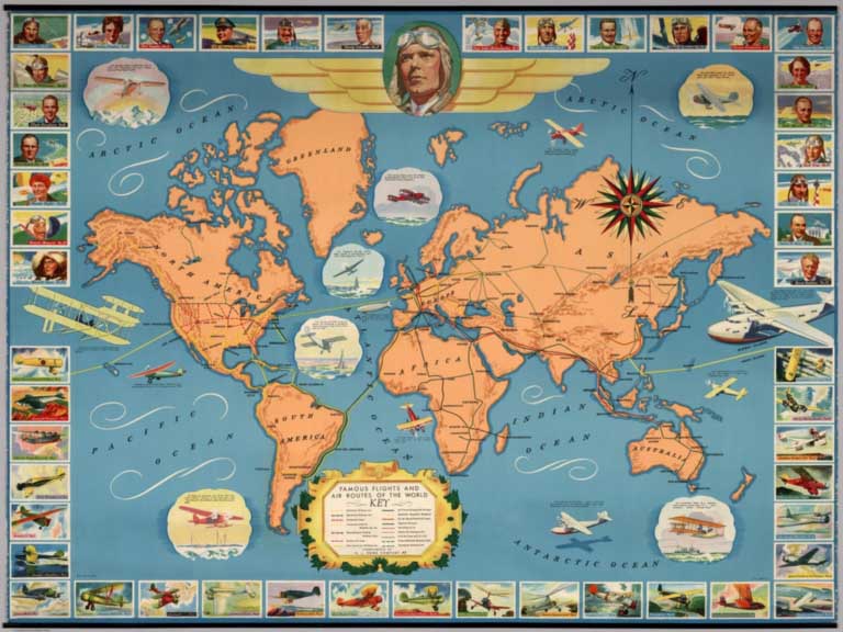 |
Famous flights and air routes of the world. Complement of H.J. Heinz Company 57, 1937 |
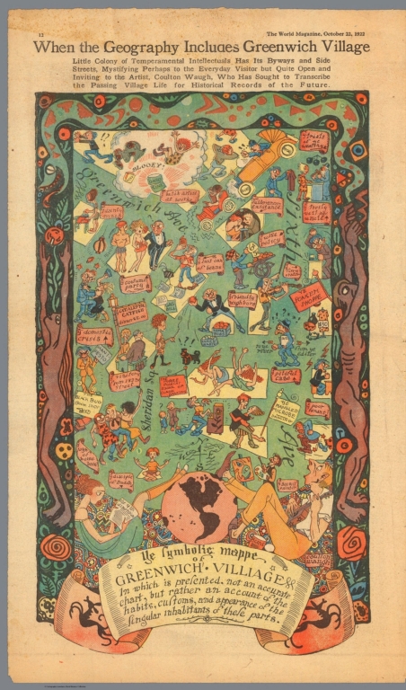 |
Pictorial Maps by Coulton Waugh, 1922 to 1930 |
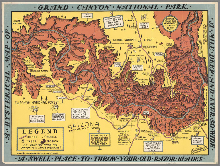 |
Pictorial Maps by Lindgren Brothers, 1936 to 1948 |
 |
Pictorial Maps by Don Bloodgood, 1935 to 1968 |
 |
L'Epanouissement du Monde. (The Fulfillment of the World.) 1948 |
 |
Pictorial Maps by George Annand, 1934 to 1951 |
 |
Pictorial Maps by Louise Jefferson, 1944 and 1945 |
 |
Urban Pictorial Maps by Hermann Bollmann, 1952 to 2014 |
 |
Isometric Maps by Tadashi Ishihara, 1982 - 2002 |
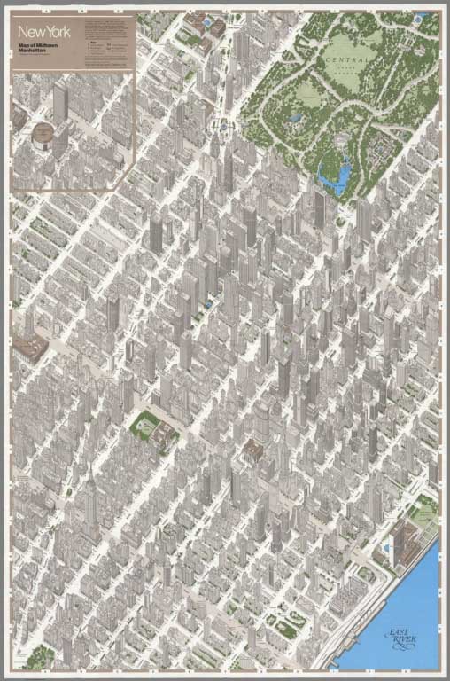 |
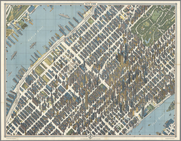
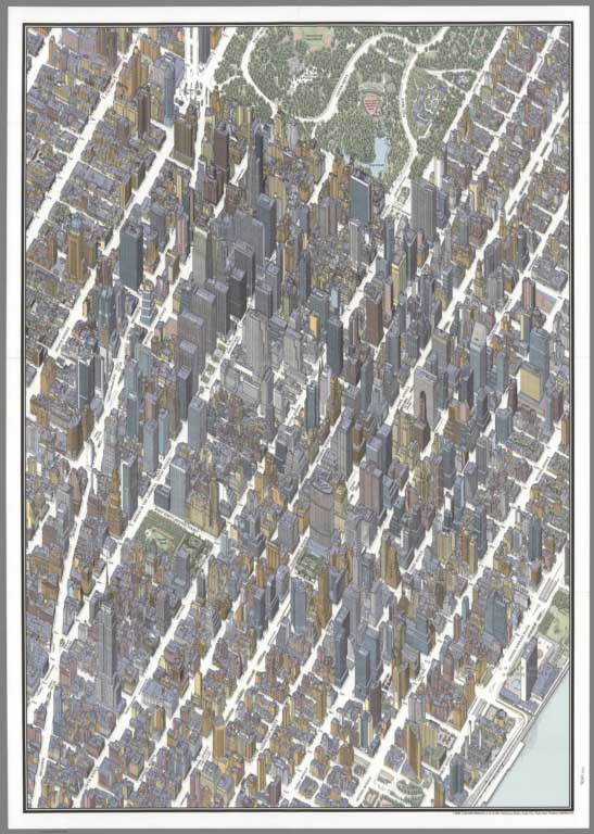
Maps of Manhattan, New York City, 1960 to 1985 |
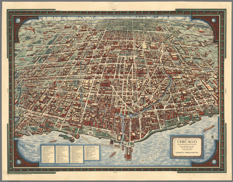 |
Colortext Pictorial Maps, 1935 to 1938 |
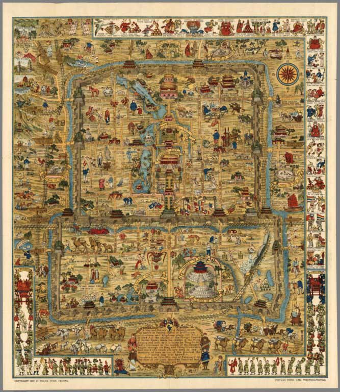 |
A Map and History of Peiping (Beijing). Explanatory Booklet. By Frank Dorn, Peiping. Lithographed and Published by The Peiyang Press, Ltd. Tientsin-Peiping. 1936 |
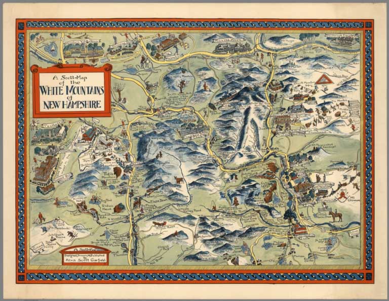 |
Pictorial Maps by Alva Scott Garfield, 1959 to 1960 |
 |
Pictorial Maps by General Drafting, 1932 to 1962 |
 |
Pictorial Maps by Richard Edes Harrison, 1937 to 1947 |
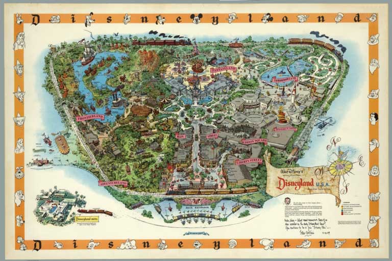 |
Disneyland Pictorial Maps by Sam McKim and others, 1958 to 2005 |
 |
Paul M. Paine Pictorial Maps, 1926 to 1939 |
 |
Pictorial Maps by Rand McNally, 1931 to 1962 |
 |
Pictorial Maps by Tony Sarg, 1933 to 1939 |
 |
Elizabeth Shurtleff Pictorial Maps, 1926 to 1930 |
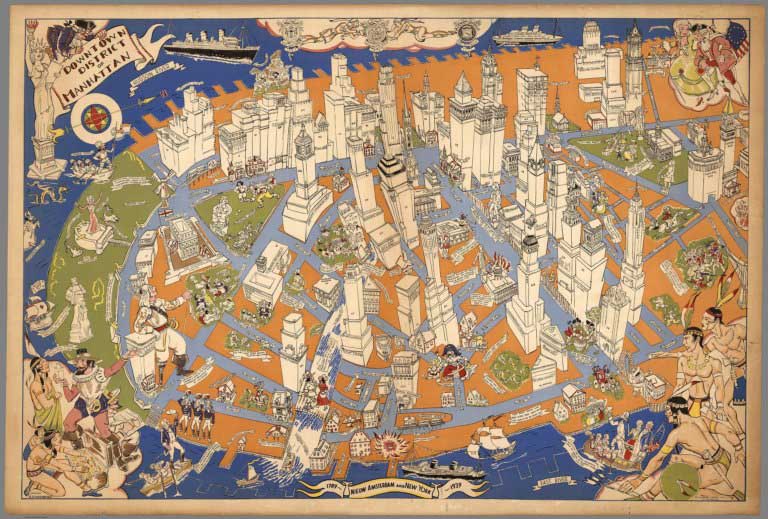 |
Downtown District of Manhattan, 1938 |
 |
Pictorial Maps by Courtland Smith, 1933 to 1961 |
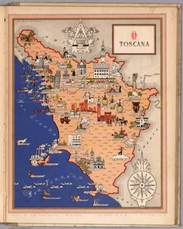 |
Italia Viva del Prof. G. De Agostini ... Atlante Artistico In XXI Quadri a Colori, 1938 |
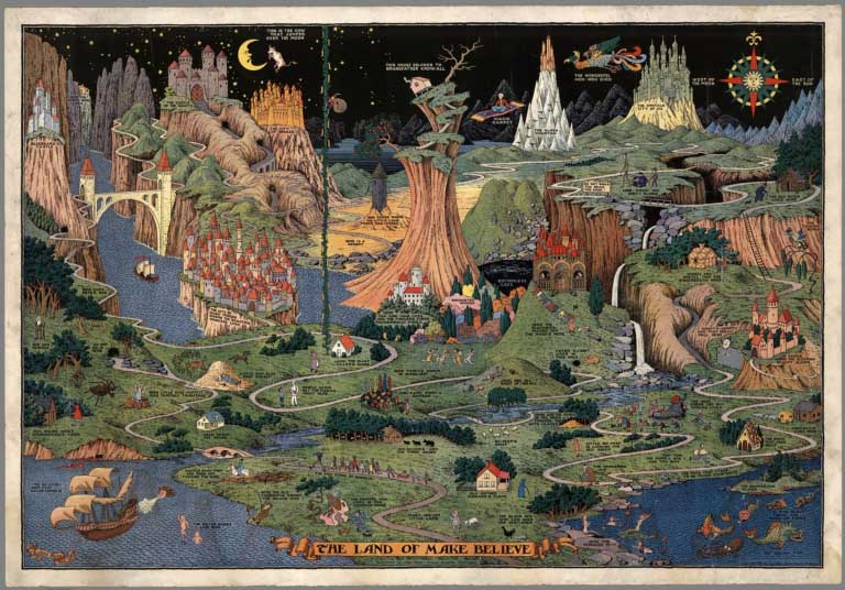 |
Pictorial Maps by Jaro Hess, 1930 and 1953 |
 |
Pictorial Maps by the Mentholatum Company, 1936 to 1939 |
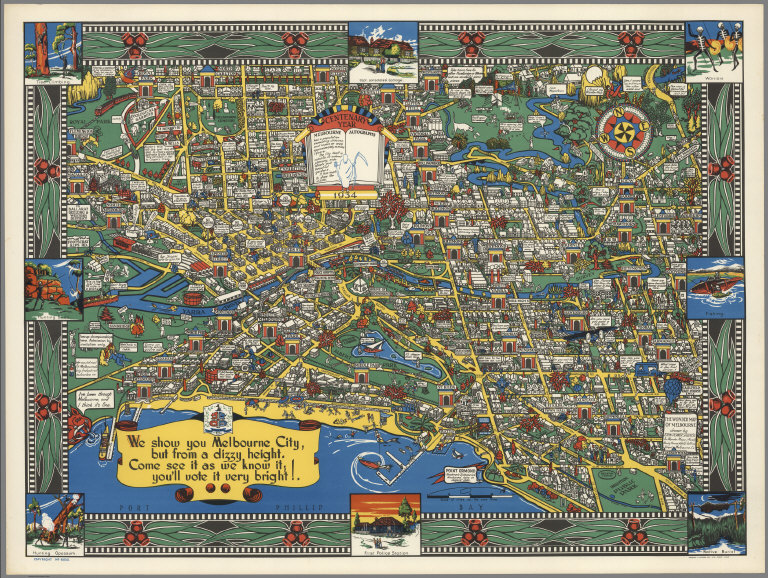 |
Wonder Map of Melbourne, 1934 |
 |
Pictorial Maps by Alfred Taylor, 1930 to 1933 |
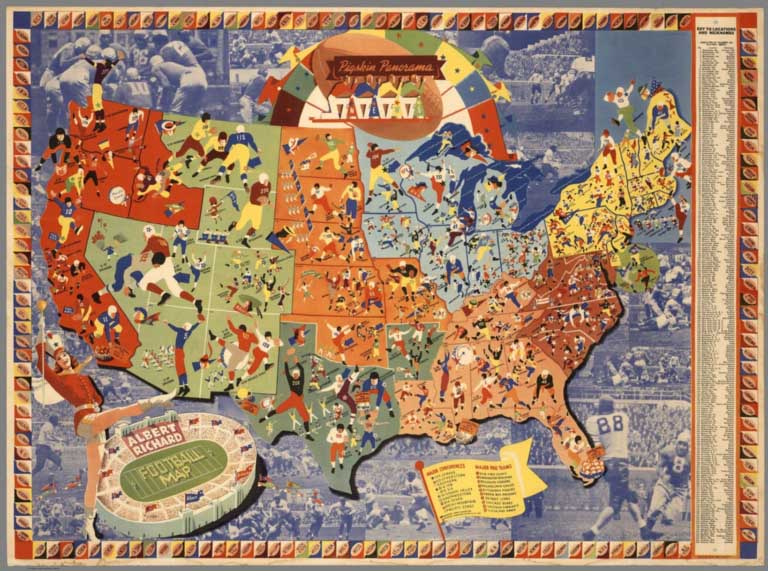 |
Pictorial Maps by Albert Richard Co., 1938 to 1940 |
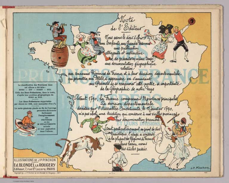 |
Les provinces de France Illustrees et leurs divisions departmentales. Illustrations de J.P. Pinchon. Ed. Blondel la Rougery. Editeur, 7 Rue St. Lazare, Paris. Deuxieme edition. 1929 |
 |
Pictorial Maps by Robert Waldmire, 1981 - 2001 |
 |
Pictorial Map Catalogs and Articles, 1925 - 1977 |
- Featured Maps
- August 21, 2012
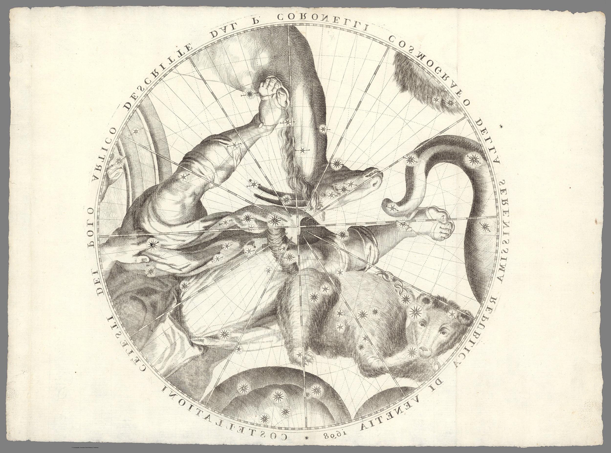
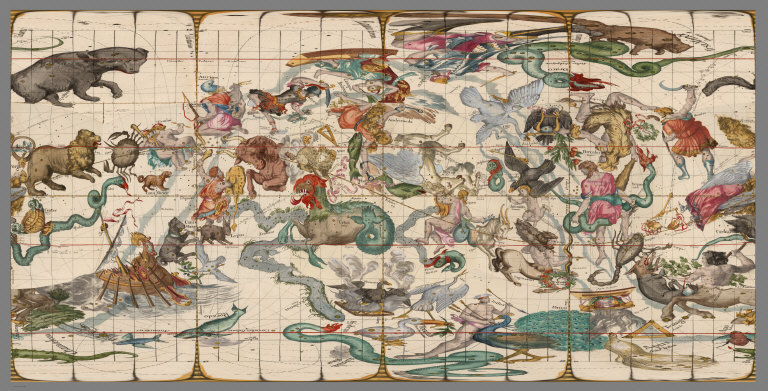
Mapping the Heavens in 1693
Ignace Gaston Pardies created a series of six beautiful star and constellation maps in the late 17th century. All six map plates join together to make a unified view of the Heavens as seen from the Earth. Pardies, a French Jesuit and professor of mathematics in Paris, corresponded with leading scientists of his day, including Newton, Leibniz and Huygens. His background in classical literature and science is evident in the complex artistry and mathematical precision of the six star maps. Pardies' use of a geocentric cartographic view of the stars was unusual for the time - most star charts and celestial globes used the God's eye perspective - looking at the entire universe from outside it. Our Cassini 1792 Celestial Globe is an example of the God's eye view - an earth-bound user had to imagine seeing the drawn constellations in the actual sky in reverse. With Pardies' maps we see the sky as it appears from earth. Pardies drew the maps on the gnomonic projection which visualized the universe as a six-sided cube instead of a globe. This method allows for accurate measurement by straight lines between any point on the map. He also showed the paths of many important comets from 1577 to 1682 moving through the constellations. In order to assist users in visualizing various aspects of these star maps, we have georeferenced the maps in GIS and then joined them together, first as a cube, then as a globe, then in other projections, and in Google Earth, and those visualizations are shown below.
Pardies' stunning artistry can be seen in the second of the six plates, with the constellations Cetus, Aquarius, Andromeda, Pegasus and Aries:
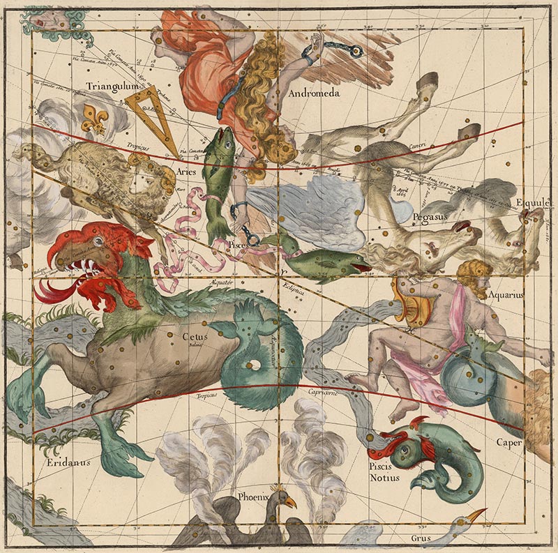
Here is the full image of Plate 2 with Latin text on the left side and French text on the right side:

A detail of Plate 2 shows the head of Cetus and the tracks of two comets:

When Pardies' plates where published separately as an atlas, it was titled in Latin "Globi coelestis in tabulas planas redacti descriptio auctore R.P. Ignatio Gastone Pardies Societatis Jesu mathematico opus postumum." Below are all six plates, showing the explanatory text and tables on the sides of the star maps in Latin and French. First the two polar or "top and bottom" plates:
 |
 |
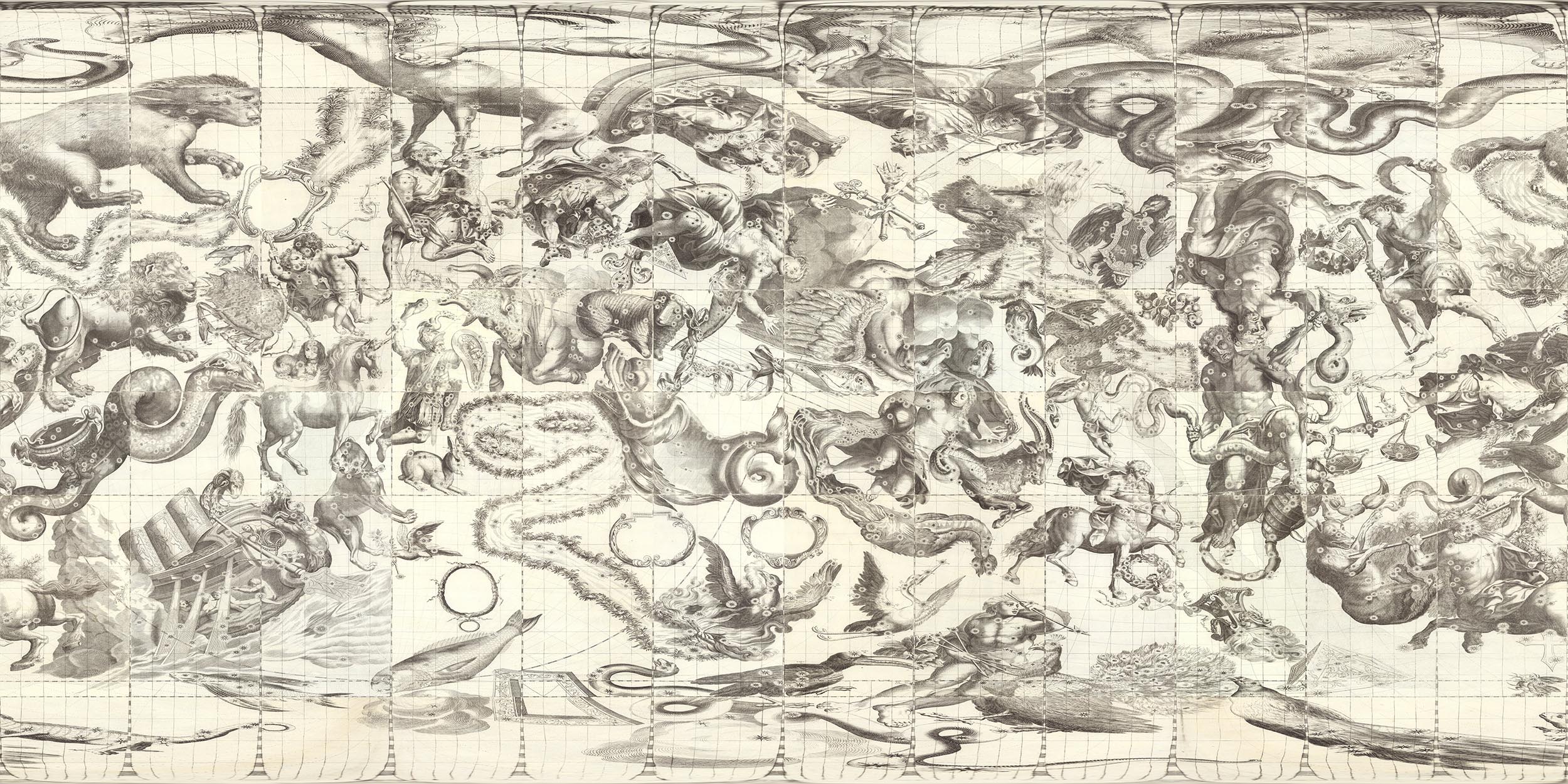
Then the four middle latitude or "side" plates in the order they are joined:
 |
 |
 |
 |
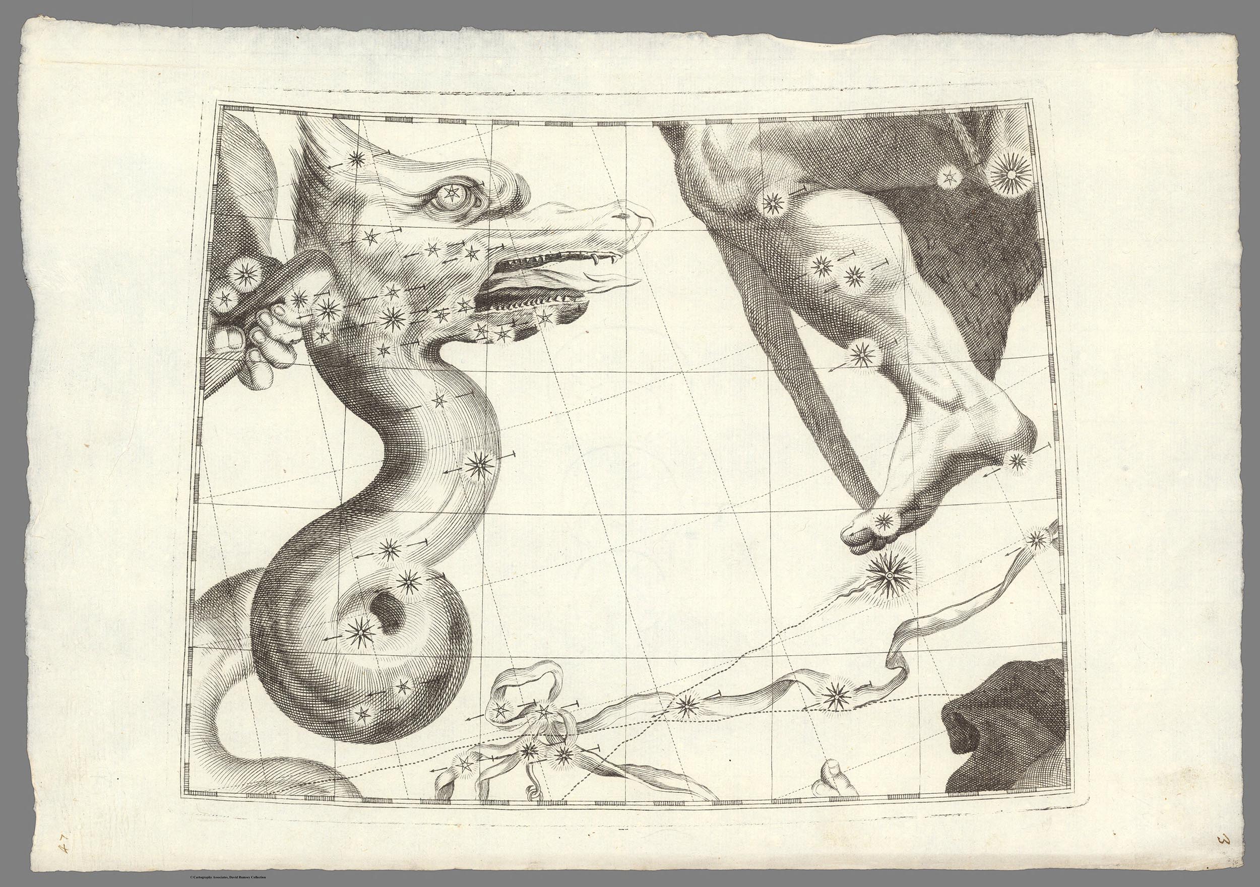
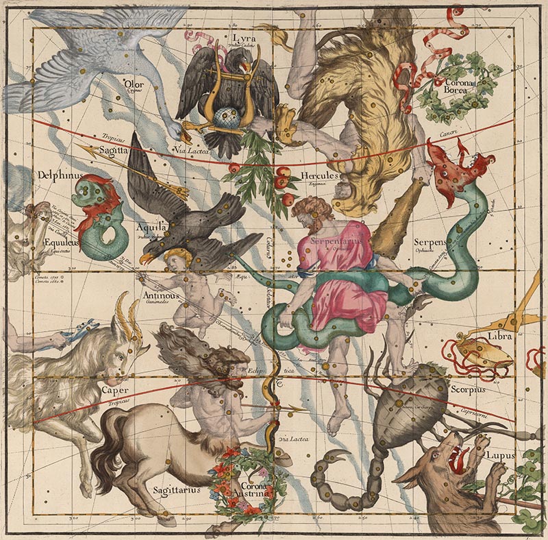
The Linda Hall Library of Science, Engineering and Technology in Kansas City, Missouri, has a notable collection of Pardies' atlases and plates and commented on his work in one of their exhibition catalogs: "Pardies' star atlas is stylistically one of the most attractive ever published. Pardies took his constellation figures primarily from Bayer's Uranometria, but since each chart covers a large section of the sky, these figures had to be carefully integrated, which was not an easy task. Pardies' engraver accomplished this task with great success.... The plate [which] shows Hercules, Ophiuchus, Scorpius, Sagittarius, Aquila, and Lyra...is one of the most stunning compositions in the history of celestial cartography." Below is that Plate 5:
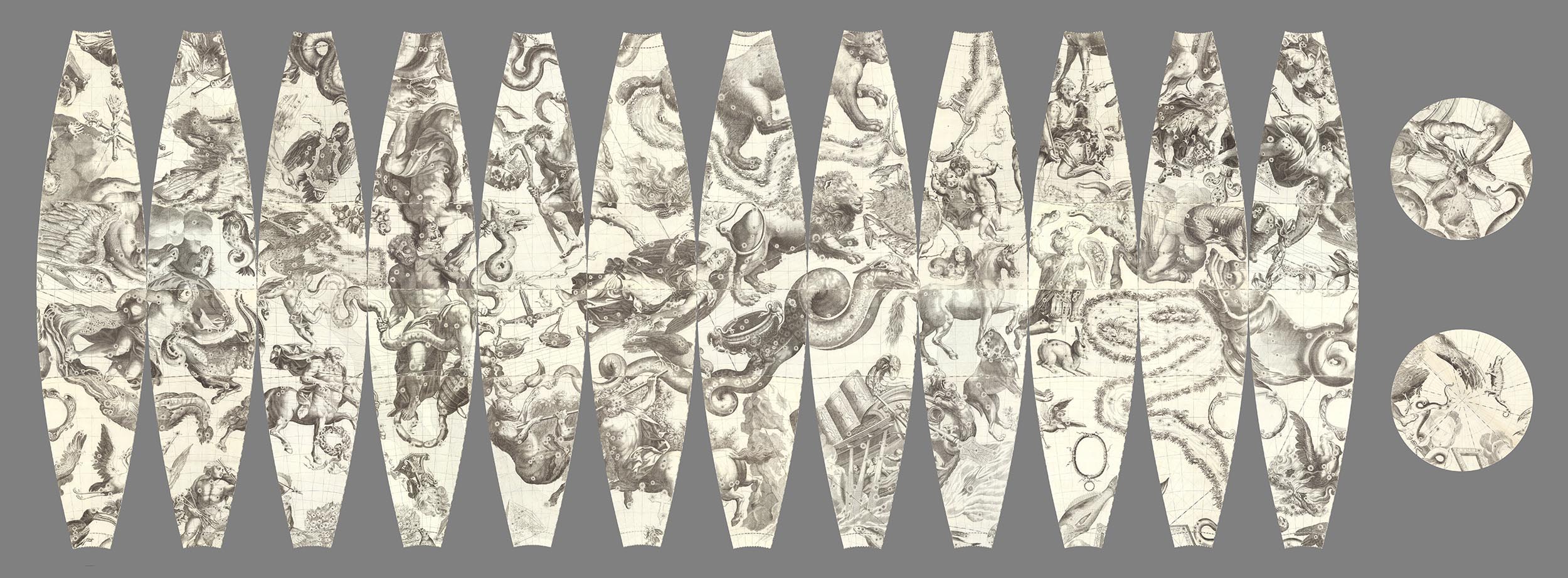
The six Pardies plates can be trimmed and laid out as the six sides of a cube:

When the six sides are joined as a cube, they look like this (Plates 1, 2, and 5 visible):

Rotating the cube (Plates 1, 4, and 3 visible):

Instead of visualizing the map plates as a cube, we can still keep the gnomonic projection but show it differently in GIS, here centered on Plate 5, but showing the parts of the four plates that adjoin Plate 5 (the gnomonic projection in GIS limits our view to about 130 degrees to avoid extreme distortion at the edges):

All six plates in the same gnomonic projection in GIS:
 |
 |
 |
 |
 |
 |
In GIS, the same plates can be reprojected in orthographic projection, which allows us to see a full 180 degrees around each plate. Below is polar Plate 1 and its four adjoining plates in orthographic projection:

All six plates in the orthographic projection in GIS:
 |
 |
 |
 |
 |
 |
For a novel projection, we can use the Berghaus star projection, here centered on the North Pole. This projection allows us to see five full plates (Plates 1-5) in one projected map:

And here centered on the South Pole (Plates 2-6):

We have used the geographic projection in order to put the plates in Google Earth. This projection distorts the northern and southern parts of the sky but allows us to see the entire group of six plates in one map:
When the geographic projection map of the six plates is placed in Google Earth, it loses any distortions and gives us a complete joined view of Pardies map of the Heavens. View singly in Google Earth Application (requires download of app) or with all the Rumsey georeferenced maps in the Google Earth application (New Maps section, Celestial Globe 1693, turn off Atmosphere in View).

We can turn the Google Earth globe view inside out and float it 64 million meters outside the earth so that the Pardies star maps appear as we would see them in the sky. We use a mirror image of the geographic projection so that all the positions and labels of the stars and constellations are correct (rotate the earth in order to move through the sky). View singly in Google Earth Application below (requires download of app) or with all the Rumsey georeferenced maps in the Google Earth application (New Maps section, Celestial Sphere 1693, turn off Atmosphere in View).

Below is a short video of moving through the six joined Pardies plates as a globe in Google Earth:
And another video of moving through the six joined Pardies plates 64 million meters outside of the earth, much as they would be seen in the sky by earth-bound viewers:
Unfortunately, Pardies did not live to see his amazing star maps published - he died in 1673 and the first edition of his atlas of six plates was published posthumously in 1674. A second edition was published in 1693 (our copy shown here), and a third edition in 1700. But the usefulness of his work continued long after his death and his star maps took on a life of their own. Deborah Warner ("The Sky Explored") states: "The published reports of their observations indicate that Jesuit astronomers throughout the world relied heavily on Pardies' maps for obtaining coordinates of both old stars and newly discovered ones. Furthermore, while using the maps they improved them by adding new stars and correcting the positions of old ones; many of these revisions were incorporated into the second edition. Pardies' maps served as a model for the gnomonic maps of Jonas Moore, Doppelmeyer, Kordenbusch, and, in the nineteenth century, the Society for the Diffusion of Useful Knowledge, and for Grimaldi's maps of the Chinese constellations."
We can appreciate and admire Pardies genius today, over 300 years later, because a few copies of his work still survive. Putting images of them online now allows many more people to enjoy his unique mapping of the Heavens long ago.
- Featured Maps
- May 21, 2012
Atlas for The Blind 1837
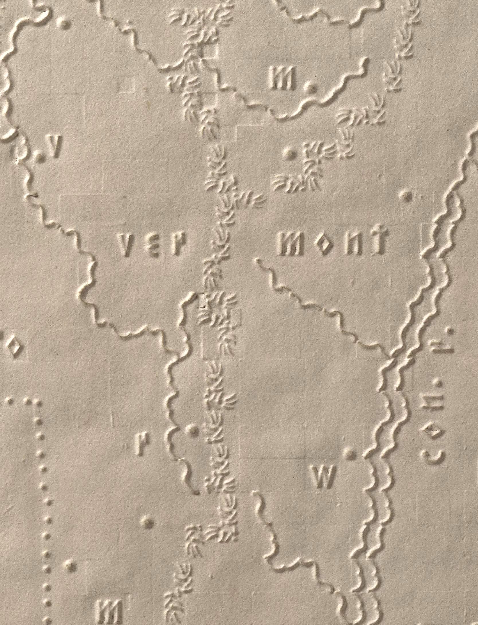
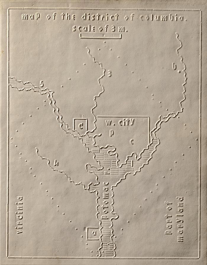
The Atlas of the United States Printed for the Use of the Blind was published in 1837 for children at the New England Institute for the Education of the Blind in Boston. Without a drop of ink in the book, the text and maps in this extraordinary atlas were embossed heavy paper with letters, lines, and symbols. To the best of our knowledge, this is the first atlas produced for the blind to read without the assistance of a sighted person. Braille was invented by 1825, but was not widely used until later. It represented letters well, but could not represent shapes and cartographic features. Samuel Gridley Howe (1801-1876) was the founder and president of the New England Institute (later known as the Perkins Institute) and produced the atlas with the assistance of John C. Cray and Samuel P. Ruggles. Howe was the husband of Julia Ward Howe, the American abolitionist and author of the U.S. Civil War song "The Battle Hymn of the Republic." He was a champion of people with disabilities and believed that blind youth could be taught geography through maps created with his special paper embossing process. In his introduction to the atlas Howe notes that crude attempts had been made to create maps for the blind, but they used primitive methods of creating relief and required the assistance of a sighted person. He claimed that his new embossing method was superior in all respects. Today, it is difficult to know how successful the atlas was, although there can be little doubt that these maps helped Howe's blind students visualize geography. We do know that 50 copies were made and five survive today, including this one. The atlas includes 24 state maps with a page of text describing each state and the symbols used on the maps. In our scans, we have lit the maps and text pages from one side to create shadows that reveal the embossing.
Below is the first map in the atlas, of Maine, with dotted lines showing the border with Canada and New Hampshire. Numbers and letters indicate towns, rivers and lakes, and numbers 6 through 9 and 44 through 47 show longitude from Washington D.C. and latitude. The map shows a scale of 50 miles. All of this and more is explained in the text page for Maine.

The text page titled "map of maine, explanation" that follows the Maine map:

This enlarged view of the Vermont map shows the various symbols used as well as the impressions of the underlying blocks used in the embossing method. Mountains are shown as a series of short lines in this detail of the Green Mountains:
The map of Florida:

The map of Michigan:

This enlargement of the map of the District of Columbia shows Washington (w.city), Georgetown (g), and Alexandria (a) as well as the President's house (p) and the Capital (c).
The title page to the atlas:

The first page of the introduction to the atlas, explaining the plan:

The second page of the introduction to the atlas:

The covers of the atlas:

Even the title label on the spine of the atlas covers is raised and embossed saying "Atlas of The United States":

Howe wrote about the success of his method of raised relief to teach geography to blind children: "They soon understood that sheets of stiff pasteboard, marked by certain crooked lines, represented the boundaries of countries; rough raised dots represented mountains; pin heads sticking out here and there, showed the locations of towns; or, on a smaller scale, the boundaries of their own town, the location of the meeting-house, of their own and of the neighboring houses, and the like; and they were delighted and eager to go on with tireless curiosity. And they did go on until they matured in years, and became themselves teachers, first in our school, afterwards in a private school opened by themselves in their own town."
Eventually Braille proved more effective than Howe's method of embossed letters, but his maps remain today as wonderful examples of teaching the basic elements of geography and spatial relationships to blind students, enabling them to create the idea of maps as visualizations in their memories. And the Perkins Institute he led continues to teach blind students today, comprising a long and successful record of blind education, including the teaching of Helen Keller.
- Featured Maps
- March 28, 2012
Timeline Maps
Mapping time has long been an interest of cartographers. Visualizing historical events in a timeline or chart or diagram is an effective way to show the rise and fall of empires and states, religious history, and important human and natural occurrences. We have over 100 examples in the Rumsey Map Collection, ranging in date from 1770 to 1967. We highlight a few below.
Sebastian Adams' 1881 Synchronological Chart of Universal History is 23 feet long and shows 5,885 years of history, from 4004 B.C. to 1881 A.D. It is the longest timeline we have seen. The recently published Cartographies of Time calls it "nineteenth-century America's surpassing achievement in complexity and synthetic power." In the key to the map, Adams states that timeline maps enable learning and comprehension "through the eye to the mind."
Below is a close up detail of a very small part of the chart: (click on the title or the image to open up the full chart)
Another detail covering a larger area with the chart turned sideways:

Detail of Sebastian Adams, Synchronological Chart of Universal History, 1881 (click to open full chart)
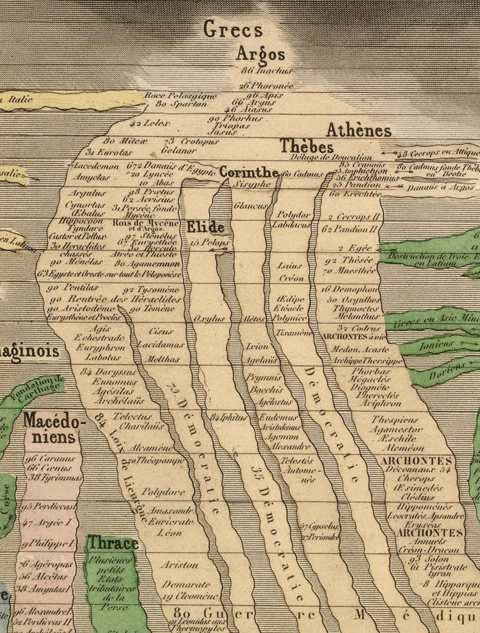
Eugene Pick published the Tableau de L'Histoire Universelle in 1858 in two sheets, one for the Eastern Hemisphere (shown here) and one for the Western Hemisphere. The chart shows history from 4004 B.C. to 1856. Like many timelines in this style, it is based on the 1804 Strom der Zeiten (Stream of Time) by Friedrich Strass of Austria. Part of Pick's chart is shown below:
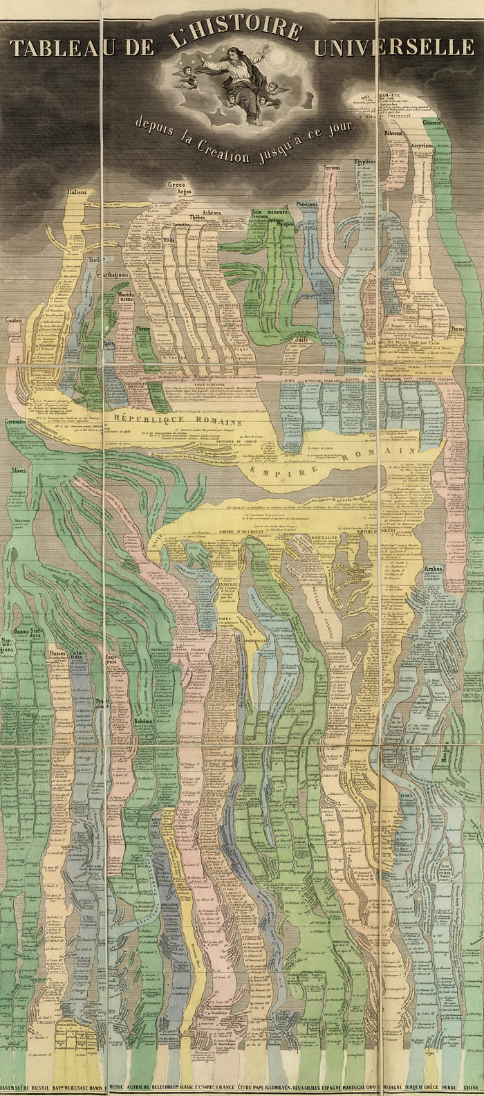
Close up detail of Pick's chart:
Another timeline chart based on the Strass chart was Joseph Colton's 1842 Chart of Universal History. This is one of the earliest examples we have seen of the complete Strass model published in the United States (though earlier partial versions or derivations of the form appeared in the U.S.) The explanation at the bottom of the chart states "Each Nation is represented by a stream which is broken in upon or flows on undisturbed as it is influenced by the accession of Territory or the remaining at Peace."

Detail of Colton's chart:
Emma Willard's 1836 "Picture of nations or perspective sketch of the course of empire" uses innovative perspective to add a time dimension to her chart which is otherwise similar to the Strass-Colton-Pick models. It appears in her "Atlas to Accompany a System of Universal History."

Willard timeline detail:
Emma Willard uses another form of timeline in her 1824 "Progress Of The Roman Empire, Illustrated By The course Of The River Amazon." Here she shows the actual course of the Amazon as a timeline showing the history of the Roman Empire. The chart appeared in her 1824 "Ancient Geography, As Connected With Chronology, And Preparatory to the Study of Ancient History."

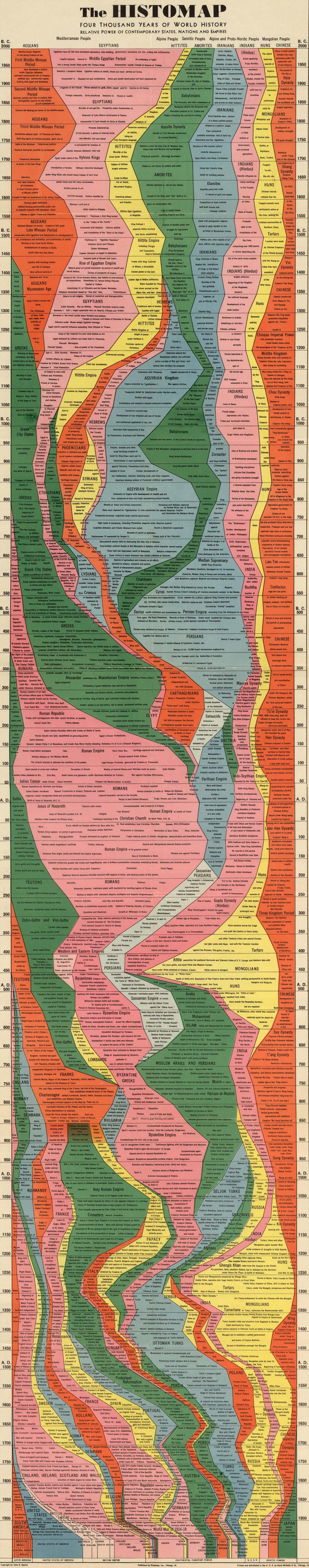
Rand McNally published amateur historian John B. Spark's "The Histomap. Four Thousand Years Of World History" in 1931. This popular chart went through many editions. On the cover, Sparks states: "Clear, vivid and shorn of elaboration, Histomap holds you enthralled as you follow the curves of power down time's endless course. Here is the actual picture of the march of civilization from the mud huts of the ancients thru the monarchistic glamour of the middle ages to the living panorama of life in present day America."
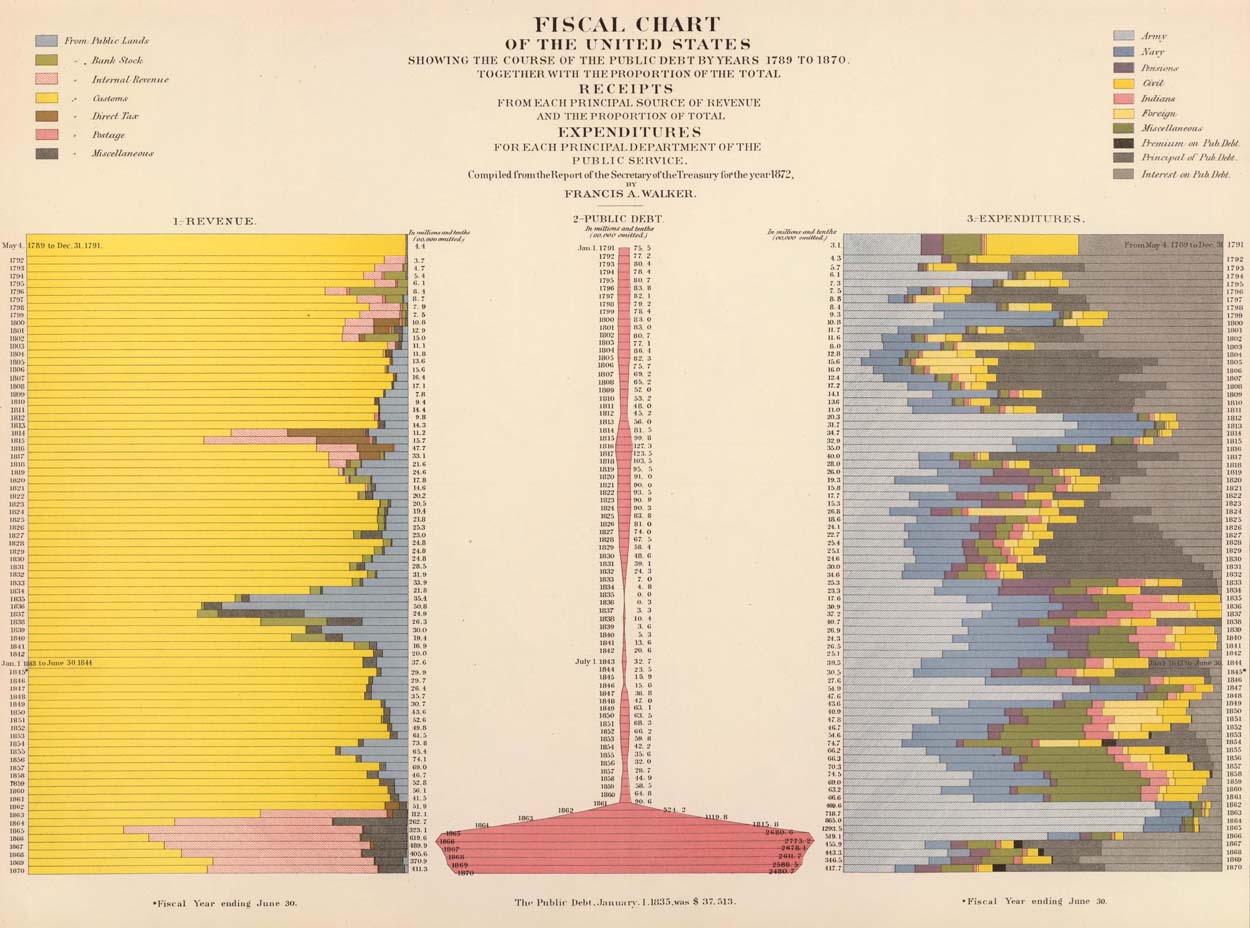
Francis Walker's 1874 "Statistical Atlas of the United States" contains many maps and diagrams that show data from the 1870 U.S. Census arrayed in timelines. The chart below, with the title "Fiscal chart of the United States showing the course of the public debt by years 1789 to 1870 together with the proportion of the total receipts from each principal source of revenue and the proportion of total expenditures for each principal department of the public service," shows 80 years of financial data arranged by time:
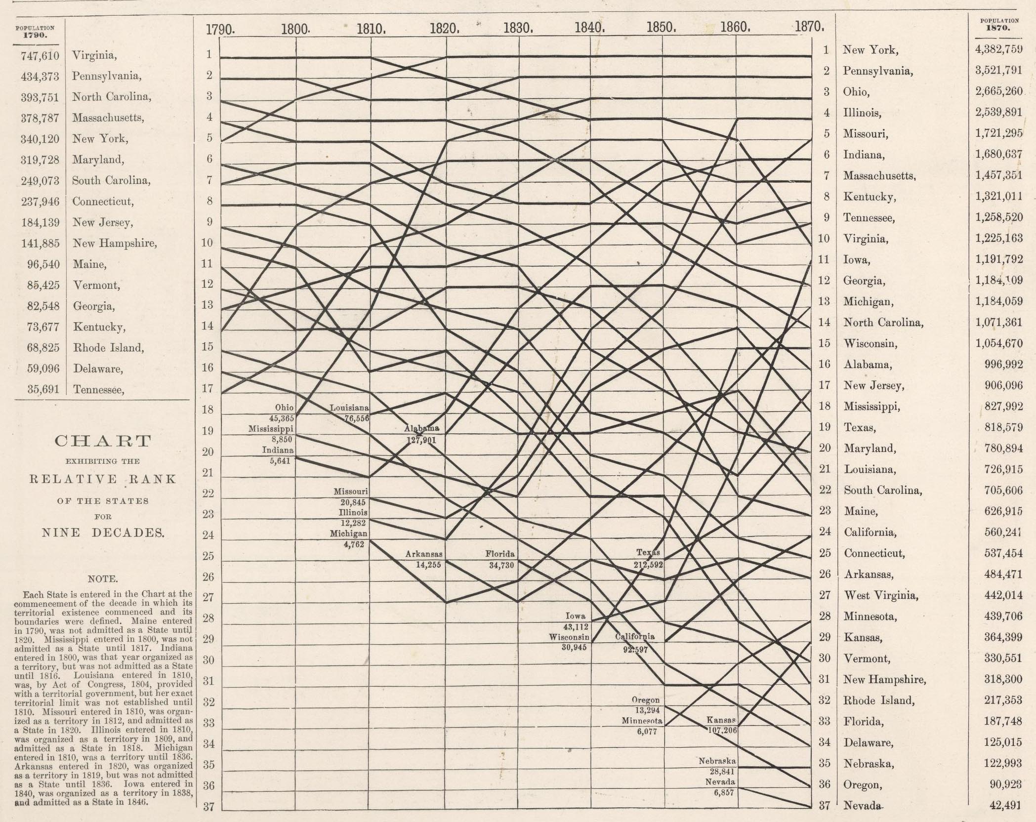
In 1878 O.W. Gray published "Chart Exhibiting the Relative Rank of the States for Nine Decades (1790-1870)." This is another kind of timeline that shows changing rank relationships between the U.S. states over time:
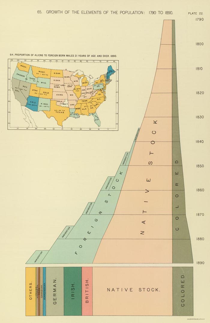
The chart below appeared in Henry Gannett's "Statistical atlas of the United States, based upon results of the Eleventh Census (1890)." Titled "Growth of the elements of the population: 1790 to 1890. (with) Proportion of aliens to foreign born males 21 years of age and over 1890," it is based on the Eleventh Census (1890) of the United States. It combines perspective, three dimensional views, map and timeline together.
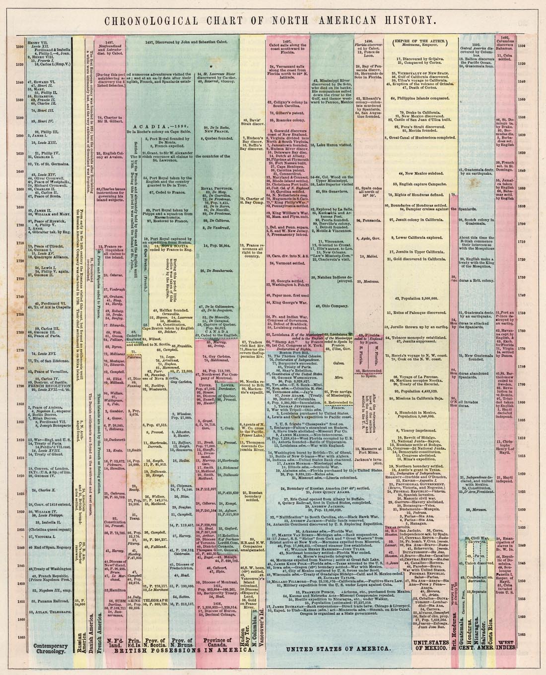
The "Chronological Chart of North American History" appeared in Colton and Fisher's "Illustrated Cabinet Atlas and Descriptive Geography" of 1859. The chart uses color coding to arrange important historical events by time and geography.
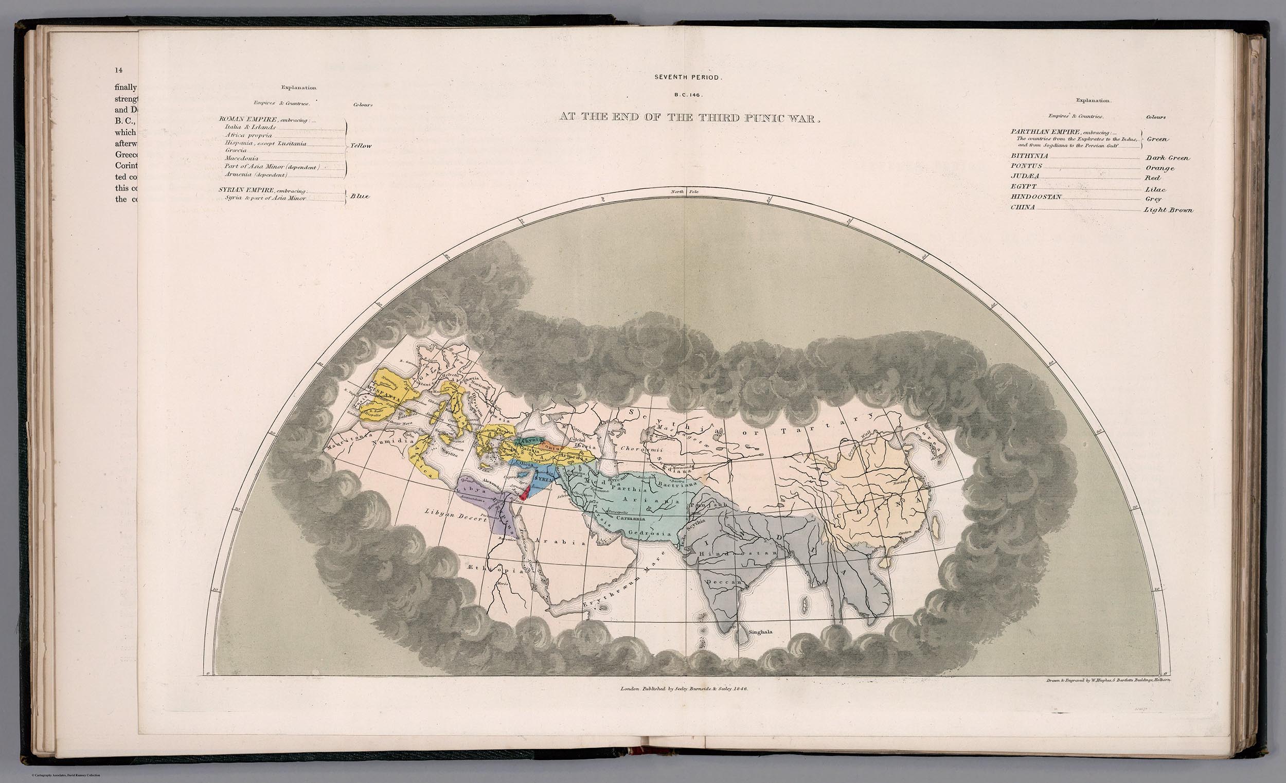
Edward Quin published "An Historical Atlas; In a Series of Maps of the World as Known at Different Periods" in 1830. Rather than a strict timeline, Quin creates an entirely unique kind of time map series by using 21 maps that show progressively receding cloud borders to indicate the expansion of geographical knowledge over time. Below are 4 of the 21 maps.
The first map in the series is B.C. 2348. The Deluge:

The third is B.C. 753. The Foundation Of Rome:

The eighth is A.D. 1. The Roman Empire In The Augustan Age:

And the sixteenth is A.D. 1498. The Discovery Of America:

These two time diagrams show time in several locations relative to the time of noon at Washington, D.C. A.J. Johnson published the diagram below with the title "A Diagram Exhibiting the difference of time between the places shown & Washington." It appeared as the last page in his "New Illustrated (Steel Plate) Family Atlas" of 1860.

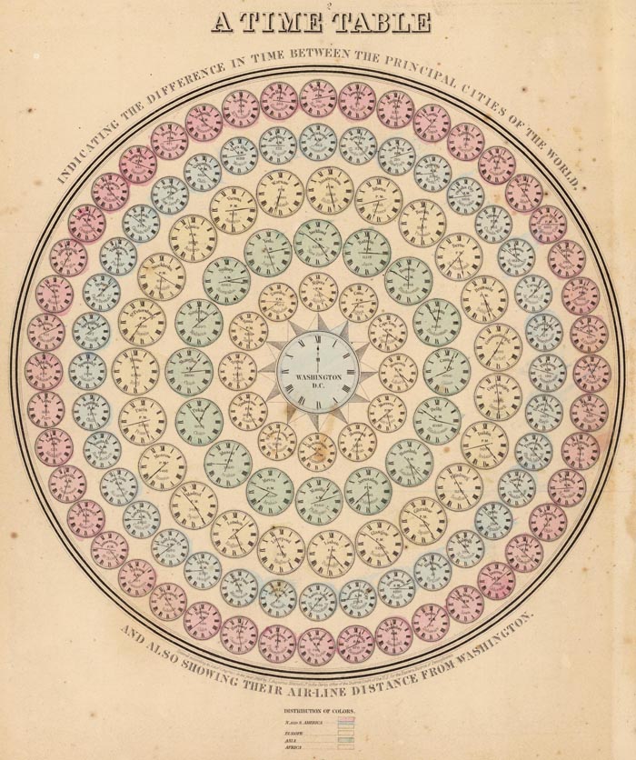
Mitchell's "A time table indicating the difference in time between the principal cities of the World and also showing their air-line distance from Washington" is similar with a slight change in style.
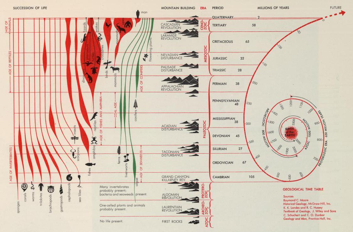
Finally, Herbert Bayer's amazing chart below, the "Succession of Life and Geological Time Table" extends the timeline from the birth of the earth to the appearance of man - tying geologic history and the evolution of life together in one chart. It appeared in his "World Geo-Graphic Atlas" of 1953.
- Featured Maps
- October 24, 2011
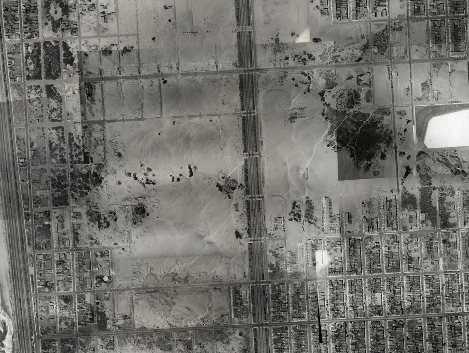
San Francisco Aerial Photographs 1938
We have put online a set of 164 large format, sharp, black and white vertical aerial photographs of San Francisco taken in 1938 from an airplane by Harrison Ryker, a pioneer in aerial photography. The photographs overlap each other and cover the entire city. The resolution is generally better than one foot or even higher with high contrast features allowing visibility of even the paint striping on a basketball court. Relative heights are frequently discernible based on the shadows cast of objects and structures. A handwritten date on the index map indicates the photographs were taken in August, 1938. The photographs are owned by the San Francisco Public Library and are a continuation of our collaboration with them on scanning and putting online important historical maps and views of San Francisco (including our prior collaboration on the 1905 San Francisco Sanborn Insurance Atlas).
Image number 18 of the set shows the active waterfront around the Ferry Building at the foot of Market Street:

Enlarging the image to the area around the Ferry Building shows the high level of detail that can be seen:

Zooming to full resolution of the same scene shows cars and ships at the plaza next to the Ferry Building:
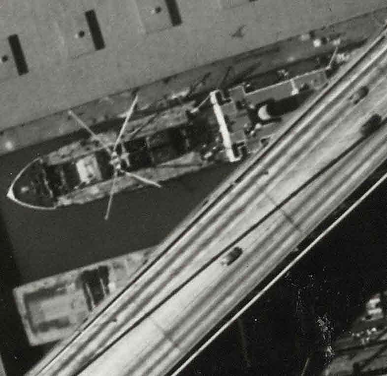
The adjoining image 17, to the south, shows activity of ships being unloaded to trains on the waterfront under the recently opened (November, 1936) San Francisco-Oakland Bay Bridge:
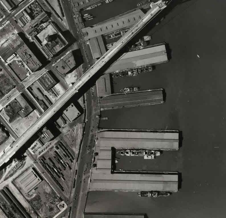
A closer in detail of the same image shows cars on the Bay Bridge above the ships at the docks:
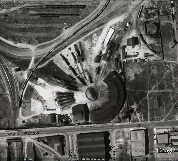
The Mission Bay Roundhouse (demolished early 1960's) of the Southern Pacific rail yards at Mariposa and 3rd streets is clearly visible on image 14:

In the San Francisco neighborhoods, all kinds of interesting details show up, like the vast outer Sunset sand dunes along Sunset Boulevard on image 148:

Image 85 shows the Calvary and Laurel Hill Cemeteries, later moved to Colma:

Crissy Army Airfield and the Presidio Main Post are seen in image 101:

Parts of the Presidio and other military sites in the city are whited out or blacked out, presumably because they show sensitive military installations, like this area of the Presidio near Baker Beach in image 129:

The index map shows how all the images overlap each other in covering the city, using hand drawn numbered rectangles on top of a 1937 map of San Francisco:

We have created a composite image of all 164 images joined together and georeferenced:

The georeferenced composite images are in Google Earth (requires app) below:
We also have an index layer in Google Earth for the same images that shows the overlap as well as identifying each image:

On mousing over any red image outline, the image number shows and reveals a pop up that allows downloading of the original image or the georeferenced image or the large composite image:

The georeferenced composite image and index can be viewed in the Google Earth desktop application (Composite, Index to Composite, opens in Places/Temporary Places). Or you can view them along with all the 300 plus Rumsey historical maps in Google Earth by downloading this link (opens in Places/Temporary Places, see the New Maps folder).
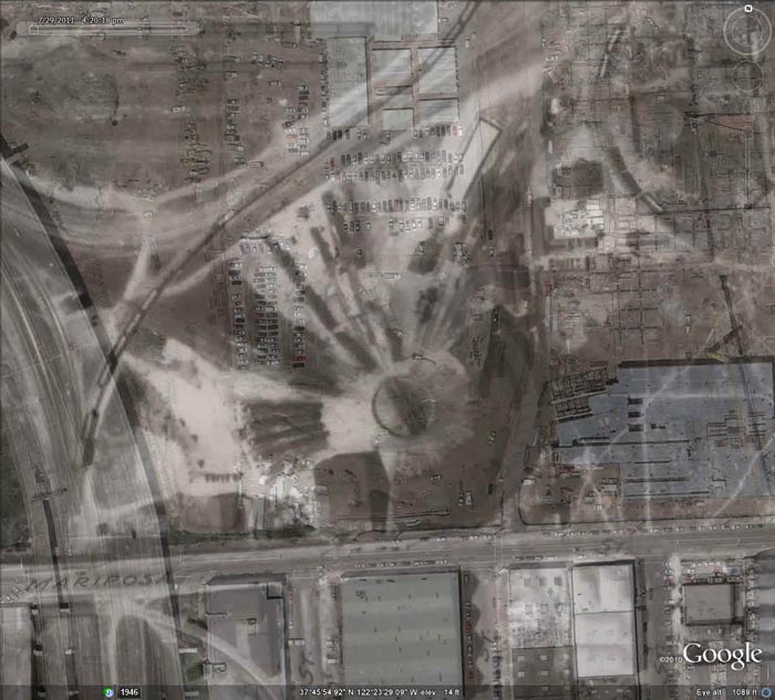
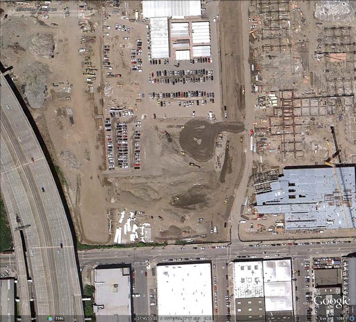
The overlay of the 1938 images on current satellite images in Google Earth allows for interesting time comparisons, as in this view of the Southern Pacific Mission Bay Roundhouse on image 14, seen blending into the current satellite image of the same area today showing construction of the Mission Bay campus of the University of California, San Francisco:
The person who created the 164 aerial views of San Francisco in 1938 was Harrison Ryker of Oakland, California:

Harrison C. Ryker (1898-1981)
Research by Dan Holmes, Librarian of the Rumsey Map Collection, uncovered the following information on Ryker. Harrison C. Ryker (1898-1981) was born in Oakdale, California. He married Charlotte Seward in the mid-1920s; after divorcing, he married Esther Miriam Munson in 1936. He served in the U.S. Army for several years in Germany with the post-World War I occupational forces, and partook of educational opportunities at the University of California, Berkeley. Expanding on his hobby in photography, Mr. Ryker teamed with various pilots beginning aerial photography services out of the Oakland Airport and throughout the West. Colleagues included Lage Wernstedt of the U.S. Forest Service. He also worked with the Fairchild Aerial Camera Company (including an aerial survey of Puerto Rico) and Clyde Sunderland of Pacific Aerial Surveys. As well, he took photographs of the devastating 1923 Berkeley Fire, archived in The Bancroft Library. By 1938 Mr. Ryker was listed in business as a map publisher (see Polk’s Oakland 1938 Street and Avenue Guide) based at 1924 Franklin St., Oakland. At that time, he had at least one patent pending for a stereoscope used for aerial photograph interpretation. Shortly after 1938 Ryker established his company address as Harrison C. Ryker, Inc., at 1000 Ashby Avenue, Berkeley, California (relocating to east Oakland in the 1950s). He subsequently manufactured pocket and desktop stereoscopes and a vertical Sketchmaster, instruments that were extensively used by educational institutions and the military, especially during World War II. An example of his stereoscope viewers was the M-11:

Advertisement for the Ryker Model M-11 Reflecting Stereoscope
Ryker's experience in aerial photography led to further involvement in photo interpretation and cartography. An article in the journal The Timberman (1933) describes means of distinguishing individual species of forest trees on aerial photos; later applications were terrain analysis for petroleum geology and unmasking of ground camouflage during wartime. His largest product was the Wernstedt Mahan map plotter, patented in 1954, which was a standard cartographic device for its time. His instruments are in use today in libraries, air photo collections, and earth sciences departments throughout America; they are in the instrument collections of the Archives of the History of American Psychology, and the Institute of Geographical Exploration at Harvard University has the Ryker M-11 Reflecting Stereoscope. Among his patents were (1) the adjustable pocket stereoscope filed with the United States Patent Office, patented December 1940, Patent No. 2,225,602; and (2) the stereoscope filed with the United States Patent Office, filed September 1, 1937, Serial No. 161,973, patented January 21, 1941, Patent No. 2,229,309. Harrison Ryker pioneered research in aerial photo interpretation. His work has been noted by A. Everett Wieslander, an early (1930s – 1950s) leader in the mapping of California vegetation and soils, in his Oral History produced by The Bancroft Library, and in a letter by Robert Colwell, Forestry Professor at the University of California, Berkeley. Some of our information regarding Harrison Ryker is from personal communications with Ryker's son, Harrison Clinton Ryker, a musicologist from Bellevue, Washington.
- Featured Maps
- July 11, 2011
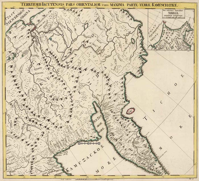
First Atlas of Russia, Published in 1745
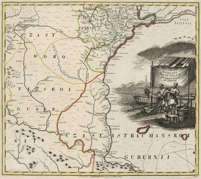
The first Atlas of Russia from 1745 has been added to the online collection. It was published by the Academy of Sciences in St. Petersburg, Russia, expanding on the cartographic work done previously by Russian cartographer Ivan K. Kirilov. Joseph Nicolas de L'Isle, the great French astronomer, was invited by the Academy of Sciences in 1726 to come to St. Petersburg to oversee the production of the atlas, although his role and contributions to the atlas are disputed by historians. The atlas maps present the first complete national survey of the entire country at uniform scales for European and Asiatic Russia. Alexei Postnikov, author of "Russia in Maps," says this atlas "brings together all the geographical discoveries of the early 18th century to give a fuller picture of the entire Empire than shown in the so-called Kirilov atlas. The maps were mostly based on instrumental surveys, geographical descriptions and maps compiled by the Petrine geologists and their successors." Normally the atlas includes 20 maps; this copy is special in adding an additional 17 maps and 2 text pages, including plans of St. Petersburg and Moscow (similar to a copies at the Library of Congress, Phillips 4060 and Phillips 3109). The maps have titles in German and Latin; place names are in Russian and Latin alphabet. The text of cartouches is in Latin. The atlas was also issued with French and Russian title pages and text, with the title Atlas Russicus and Atlas Rossiiskoi. This copy contains 7 pages of text with descriptions of the maps and explanations of geographical names and symbols used in German, Russian, French and Latin, a general map of the Russian empire, 13 maps of European Russia at a uniform scale of 1:1,470,000 (35 versts to one inch, 1 verst equals 3,500 feet), and 6 maps of Siberia at a uniform scale of 1:3,444,000 (82 versts to one inch). Bound in at end of the atlas are 19 additional text and maps of Russian territories, plans from the Russo-Turkish war of 1736, engravings of military fortifications, maps of Ladoga Lake, environs of St. Petersburg, Kronstadt and the Gulf of Finland. Maps are colored in outline, with some maps in full color. We have added 2 composite images of all 13 maps of European Russia and all 6 maps of Siberia. The atlas was printed in September 1745 in St. Petersburg. View the atlas.
The general map of the Russian Empire extends from the Baltic to the Pacific Ocean at a scale of 1: 9,030,000:

Each of the 13 maps of European Russia are drawn at a scale of 1:1,470,00 or 35 versts to the inch. Many have decorative cartouches:
This map shows a long portion of the Volga River:
The 6 maps of Asiatic Russia (Siberia) are at a scale of 1: 3,444,000 or 82 versts to the inch:
A Legend (in German) on the last page of text describes the various symbols used on the maps:

This atlas is unusual in having an additional 17 maps and 2 indexes added to the 20 maps that usually comprise the atlas. Among the 17 extra maps is a plan of St. Petersburg from 1737:
Also included is a map showing the Gulf of Finland between St. Petersburg and the island of Cronstad, and the outlet of the Neva River in St. Petersburg, 1741:

And a plan of Moscow from 1739:

A map of the Caspian Sea from 1728:

We have created 2 composite images, 1 of the 13 maps of European Russia and 1 of the 6 maps of Asiatic Russia or Siberia. Here is the composite image of the European Russia Maps:
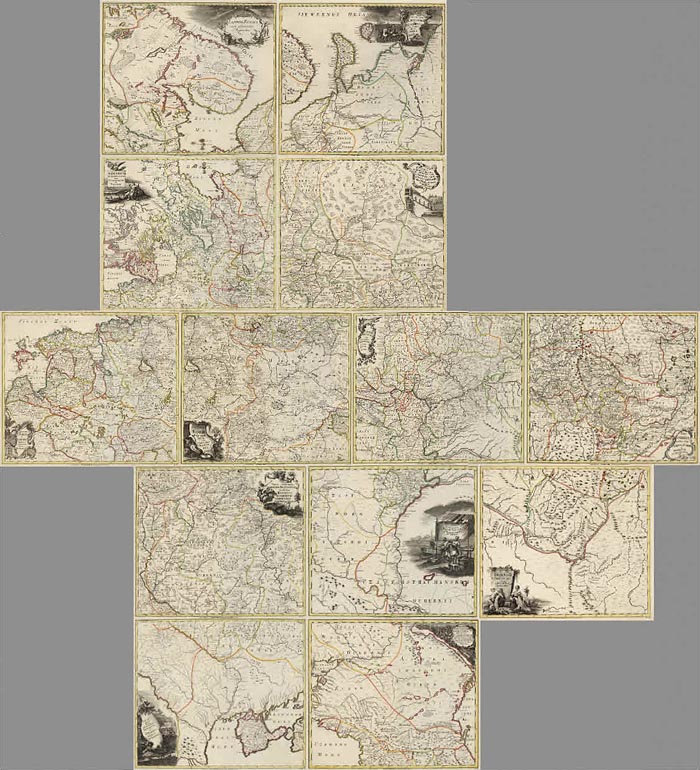
And here is the composite image of the Siberian maps:

4 languages are used in the atlas: Russian, German, Latin and French (although French is used primarily in the map cartouches and notes). The atlas title page and text pages were printed in 3 versions: Russian, French/Latin, and German. The title page and 6 pages of text describing the maps and Russian geographical terms in this copy are the German version:
 |
 |


The index page for the map of Moscow is in Russian:

The text page describing the some of the Turkish Russian War battles is in Latin, Russian, and German:

Considering the vastness of the Russian Empire, this atlas was a remarkable achievement. While not accurate by today's standards, at the time it was a significant improvement in cartographic representation of the country, and it was certainly then the largest part of the globe mapped systematically at a uniform scale, using the best science of the day.
- Featured Maps
- June 27, 2011
Pre-Earthquake San Francisco 1905 Sanborn Insurance Atlas
A rare 6 volume 1905 San Francisco Sanborn Insurance Atlas showing the city as it was just months before the great earthquake and fire of 1906 has been added to the map site in collaboration with the San Francisco Public Library which owns the atlas and keeps it in its San Francisco History Center at the main library branch. The atlas was published in 1899/1900 and was updated manually several times by the publisher, the Sanborn-Perris Map Company of New York, with the last updates done in the fall of 1905. The 6 atlas volumes show the city in great detail, with building shape, height, construction materials, and many other details typical of fire insurance atlases of the period. Apparently the volumes were never updated after the earthquake and fire (except for a few small 1908 updates) because the atlas was damaged in the fire with some loss to the edges (as can be seen from the map images).
Update: a wonderful index and map placement tool for these maps is (note: this site went dark in 2017) available at Maptcha.org
Index Map for Volume 1:
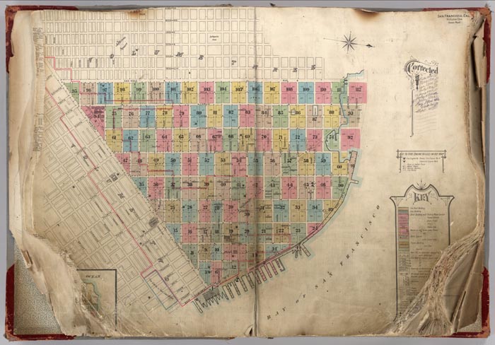
An example of the pages: Volume 1, Pages 5-6, blocks bounded by California, Washington, Davis, East and Market Streets:

Detail of Pages 5-6, one block bounded by California, Sacramento, Davis, and Drumm Streets:
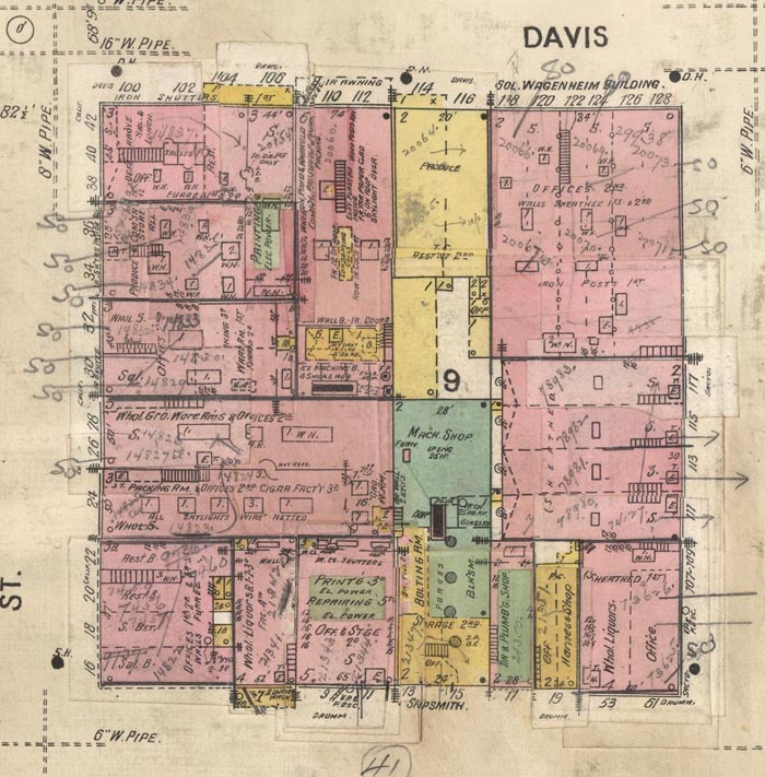
The Key explaining all the map symbols:

Index Map for Volume 2:
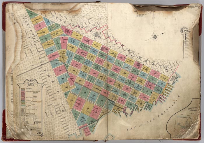
Index Map for Volume 3:

Index Map for Volume 4:
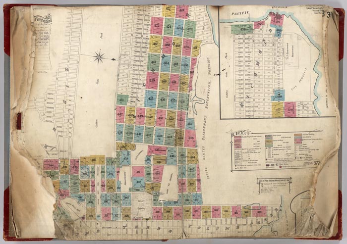
Index Map for Volume 5:
Index Map for Volume 6:

Many of the downtown blocks in this atlas can also be seen as street front drawings in the 1895 Illustrated Directory of San Francisco.
We are grateful to City Archivist Susan Goldstein of the San Francisco History Center, Book Arts and Special Collections, San Francisco Public Library for suggesting this project to us and making the volumes available for scanning and uploading to our online collection. We hope to collaborate on more projects with Susan and the San Francisco Public Library.
- Featured Maps
- April 10, 2011
Karte des Deutschen Reiches 1893 (Map of the German Empire)
The Karte des Deutschen Reiches 1893 consists of 674 sheets at a scale of 1:100,000. All sheets join together to make a huge, highly detailed and historically significant map of about 1,155 cm x 980 cm (38 ft x 32 ft), covering all of present day Germany and much of present day Poland. The maps show the landscape as it was at the end of the 19th century. We have completed the process of scanning all the sheets individually as well as making a very large digital composite image of all 674 sheets joined. We have put sheets 1 to 674 online and made a composite image of sheets 1 to 674. The composite image is also placed in Google Earth (requires app download)(the georeferenced composite image and any of its parts may be downloaded through the Google Earth Index Map), allowing comparison of the historical map with current satellite imagery and other information layers. We completed the project on October 1, 2011. The publication dates of the sheets vary, generally from about 1800 to 1900. For the whole series we use an average date of 1893.
After German unification in 1871, in an agreement dated March 4, 1878, the states of Prussia, Saxony, Bavaria, and Wurttemberg (the areas of modern day Germany, Luxembourg, Poland, and Kaliningrad, and part of Lithuania) agreed to map their areas on a 1:100,000 scale in a common topographic grid survey consisting of 674 sheets. Each sheet covers about 30 minutes in longitude and 15 minutes in latitude. One centimeter on a map is equivalent to 1 kilometer on the ground. Average sheet size is about 35 cm x 28 cm. Each sheet covers about 1000 square kilometers and was engraved on copper. A polyhedral projection was used. Prime meridian was Ferro, later switched to Greenwich.
The series is known as the KDR-100 (German General Staff map) and was surveyed beginning in 1878, although many sheets were simply drawn from pre-existing military maps, often of larger (more detailed) scale. This map series is remarkable for the level of fine detail. As a consequence, it was scanned at 800 PPI providing four times the resolution of the typical detailed map scan of 400 PPI.
Below is a detail of part of Sheet 269, Berlin, 1893: (clicking on any of the images below will open them)
Detail of Sheet 269 Berlin Karte des Deutschen Reiches 1893
Here is part of the same sheet at 800% magnification:
Detail at 800% magnification of Sheet 269 Berlin Karte des Deutschen Reiches 1893
The dates of the maps are estimated based on the apparent library acquisition date, frequently stamped on the back of the map sheet, usually 1893. The maps are mounted on linen in 4, 6, or 8 panels. Comparing our sheets to those at the Library of Congress shows that most of our sheets were published 5 to 10 years before the stamped acquisition date. Thus most sheets were published between 1883 and 1888. A few sheets are duplicated and placed under similar list numbers.
Below is a typical sheet, Sheet 46, Neustadt in West-Pr. 1893, dissected into four parts and folded, with the map seller's label and map scale pasted on one fold:
Sheet 46. Neustadt in West-Pr. Karte des Deutschen Reiches. 1893
Here is the same map, with the four sections joined into a composite, to make georeferencing more accurate.
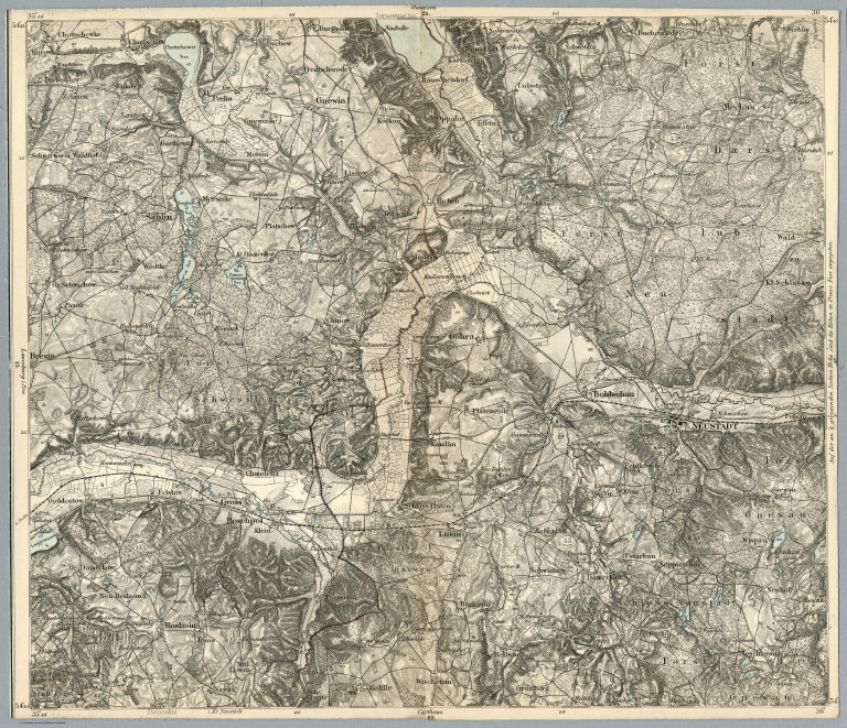
(Composite of) Sheet 46. Neustadt in West-Pr. Karte des Deutschen Reiches. 1893
Below is a detail of the same Sheet 46, Neustadt in West-Pr. 1893 at 400% magnification:
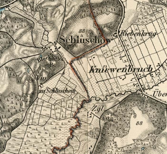
Detail at 400% magnification of Sheet 46. Neustadt in West-Pr. Karte des Deutschen Reiches. 1893
All 674 sheets are joined together in one composite image. The image is 401,310 pixels wide by 332,060 pixels high, 380 GB. Below are sheets 1 to 674 joined together in the composite image and shown in the Luna Browser:
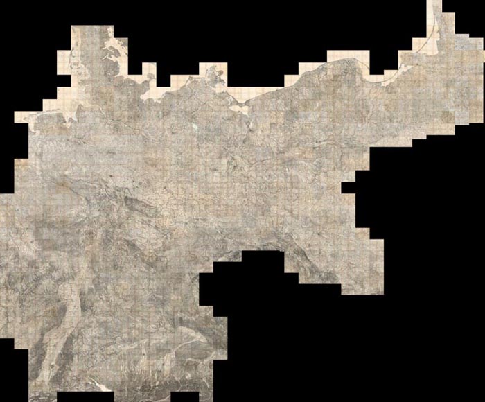
(Composite of) Sheets 1 - 674 Karte des Deutschen Reiches. 1893
The same composite image can also be viewed in Google Earth:
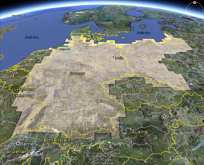
Germany 1893 layer in Google Earth (requires plug-in)
And the index sheet for the composite image can be viewed in Google Earth:
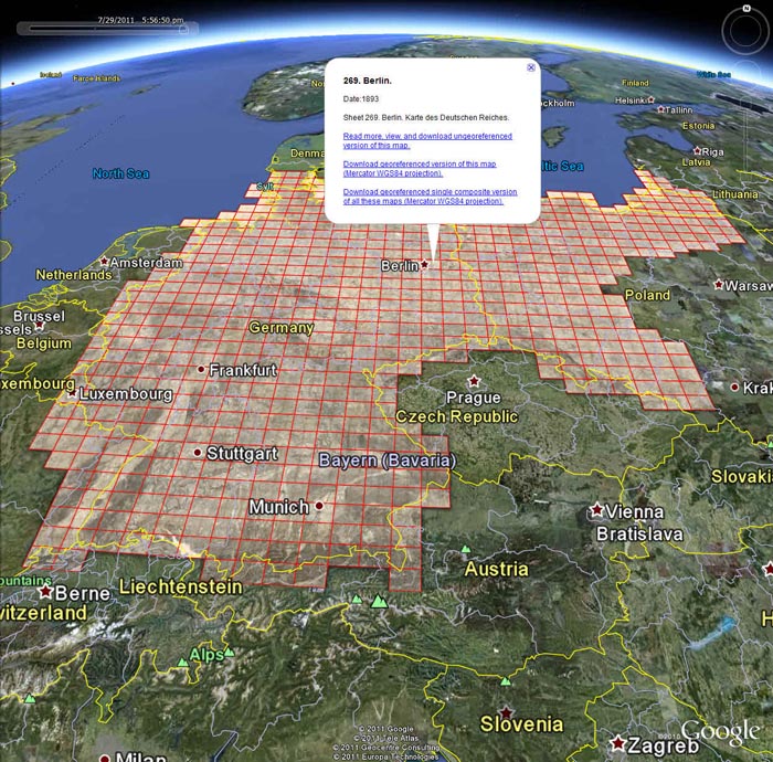
Germany 1893 Index layer in Google Earth (requires plug-in)
The composite image and the index sheet can also be viewed in the Google Earth desktop application (requires download if you do not have Google Earth installed). Or you can view these layers along with 300 other historical maps from the Rumsey Collection in Google Earth by clicking on this link.
The Karte des Deutschen Reiches have extraordinary map detail and many kinds of cultural, physical, political, and historical information. At least ten separate symbols for special buildings were utilized, a method enhanced by placing an abbreviation next to the symbol. Structures with special symbols include: churches, chapels, monuments, windmills, water mills, stamp mills, forester’s lodges, watchtowers, ruins, forts, quarries, clay pits, lime kilns, and coke-ovens. Factories, brick works, powder magazines, and many other important buildings are differentiated by means of abbreviation. Houses appear as black blocks, either rectangular or shaped like the ground plan of the building. Many other features are differentiated, for example there are four different qualities of roads plus bridle paths and footpaths. See the legend here
Vegetation is minutely classified including separate symbols for broadleaf trees, evergreens, underbrush, heather, dry meadows, wet meadows, swamps, orchards, gardens, vineyards, and parks. Relief is shown by hachures. Spot elevations are given in meters above sea level.
This collection strongly trends toward the earliest editions. They were published for the General Staffs of Bavaria, Prussia, Saxony and Wurttemberg by several issuers, but most were by “R. Eisenschmidt, Verlags-Buchhandlung ” (publishing bookstore). (Berlin). Key organizations indicated on the maps include (1) Topographic Bureau of Royal Saxony, abbreviated in German as “topogr. bureau des konigl. sachs.” And (2) Royal Prussian General Staff, abbreviated in German as “Kgl. Preuss. Generalstab.”
Most sheets are stamped with "The Library of Massachusetts, State House, Boston," and the apparent date of acquisition. Almost all of the sheets are trimmed to the neatline to allow for closer alignment of multiple sheets when viewing, apparently a common practice by publishers of the sheets. Therefore the printed publishing date has been removed in most cases and we are estimating the date based on the acquisition stamp date (usually 1893).
Cataloging and research for the maps was done by Daniel Holmes, Librarian of the Rumsey Collection. Scanning and georeferencing of the map images was done by Glenn Bachmann of Cartography Associates. Global Mapper software was used to georeference and composite the map images. We are grateful to the Geography and Map Division of the Library of Congress for providing images of four sheets that were missing from the Rumsey Collection.
- Featured Maps
- February 25, 2010
Cartouches, or Decorative Map Titles
Cartouches are the elaborate decorations that frame map titles and other information about the map. They add an artistic or symbolic narrative to the maps they describe. According to map historian Edward Lynam, cartouches that frame titles first appear on Italian maps in the 16th century. They persist on maps until the middle of the 19th century, going through many stylistic changes. Below are selected cartouches from maps in our collection, beginning in 1703 and ending in 1852. The cartouche styles in this 150 year period are remarkable for their diversity, symbolism, social commentary, and artistic beauty. Many of the cartouches appear to have iconographic meanings that may be lost to us today. Others are just wildly ornate, attempting to give the map they introduce a more arresting aspect. 50 cartouches are shown below; click on any of the images to see the larger maps that the cartouches embellish.
This first group of three cartouches are from Guillaume de Lisle's World Atlas of 1731:
Carte du Canada ou de la Nouvelle France et des decouvertes que y ont ete faites; Guillaume de Lisle; 1708.
Carte des Courones du Nord. Dediee au tres puissant et tres invincible Prince Charles XII; Guillaume de Lisle; 1706.
Carte de la Grece. Dressee sur un grand nombre de memoires anciens et nouveaux; Guillaume de Lisle; 1707.
Henry Popple's 1733 atlas Map of the British Empire in America features a cartouche remarkable for its mysterious symbolism, including a severed head of a (we assume European) man with an arrow sticking into it:

A Map of the British Empire in America with the French and Spanish Settlements adjacent thereto; Henry Popple; 1733.

A detail of the Henry Popple map cartouche showing the severed head with arrow, a crocodile, two monkeys, and female figure.

Another detail of the Henry Popple map cartouche showing a female figure with child, pointing to scenes of trade and commerce.
The large, ornate cartouche of John Mitchell's Map of the British and French Dominions in North America is shown below in the London edition, the Paris edition by Le Rouge, and the derivative Italian edition by Zatta:
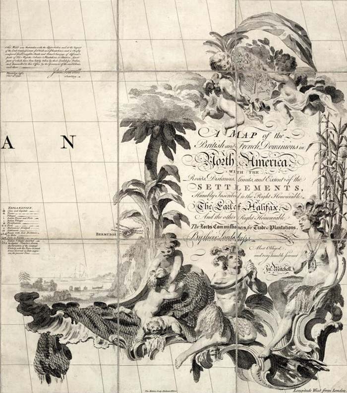
A Map of the British and French Dominions in North America ; John Mitchell; 1757 (London edition).

Amerique Septentrionale avec les Routes, Distances en miles, Limites et Establissements Francois et Anglais. Par le Docteur Mitchel; John MItchell; 1756 (Paris edition by Le Rouge).

Le Colonie Unite dell' America Settentrle; Mitchell, John; Raynal, G.T.; Zatta, Antonio; 1778 (Venice, Italy, edition by Zatta).
Here is the elegant map cartouche of the immense, nine sheet Plan of St. Petersburg 1753, with a depiction of and dedication to the Empress Elizabeth of Russia:
Plan stolichnago goroda Sanktpeterburga s izobraheniem znatiieshikh onago prospektov, izdannyi trudami Imperatorskoi Akademii nauk i khudozhestv. Plan de la ville de St. Petersbourg avec ses principales vues dessine & grave sous la direction de l'Academie imperiale des sciences et des arts; Akademiia nauk SSSR; 1753.
Five imaginative and artistic map cartouches from the Atlas Universel by Didier and Gilles Robert de Vaugondy, 1757:
Carte de l'Egypte Ancienne et Moderne; Didier and Gilles Robert de Vaugondy; 1753.
L'Empire de la Chine, Dresse d'apres les cartes de l'Atlas Chinois; Didier and Gilles Robert de Vaugondy; 1751.
L'Empire du Japon; Didier and Gilles Robert de Vaugondy; 1750.

Nouvelle France ou le Canada; Didier and Gilles Robert de Vaugondy; 1755.

Etats du Grand-Seigneur en Asie, Perse, Pays des Usbecs, Arabie; Didier and Gilles Robert de Vaugondy; 1753.
Thomas Jefferys used cartouches showing scenes of commerce and landscape in many of the maps in his American Atlas, published after his death by Sayer and Bennet in 1776, three of which are shown below:

A Map of the most Inhabited part of New England; Thomas Jefferys; 1776.
A Map of the most Inhabited part of Virginia; Thomas Jefferys; 1776.

The Provinces of New York, and New Jersey; with part of Pennsilvania, and the Province of Quebec; Thomas Jefferys; 1776.
Some of Thomas Jefferys' maps were also published posthumously by Kitchin, Laurie and Whittle in their New Universal Atlas of 1787, including this map of the Western Coast of Africa (derived from a French map by D'Anville) with a cartouche full of various African themes:

The western coast of Africa from Cape Blanco to Cape Virga; Thomas Jefferys; 1789.
Even Thomas Jefferys' trade-card was in the form of an elaborate cartouche:

Thomas Jefferys Engraver... (trade card advertisement); Thomas Jefferys; 1750.
James Cook's 1773 map of South Carolina has a cartouche that follows Jefferys' themes of colonial enterprise, nature, and indigenous peoples:

A Map of the Province of South Carolina; James Cook; 1773.
The four cartouches below using engraved Baroque style frames are from maps in Thomas Kitchin's General Atlas of 1790:

England and Wales; John Rocque; 1790.

Map of the Empire of Germany; Louis Stanislas d'Arcy Delarochette; 1790.

A new map of North America, with the West India Islands; Thomas Pownall; 1786.

A map of South America; Thomas Kitchin; 1787.
William Faden's General Atlas of 1811 included the four map cartouches below, placing titles in buildings, on mountains and rocks, and adding humorous elements (as on the map of Turkey in Europe):
Greece, Archipelago and part of Anadoli; Louis Stanislas d'Arcy Delarochette, William Faden; 1791.

Nouvelle carte de la Suisse; William Faden; 1799.

A map of Bengal, Bahar, Oude & Allahabad; James Rennell, William Faden; 1786.

European dominions of the Ottomans, or Turkey in Europe; William Faden; 1795.
Aaron Arrowsmith, London map publisher, used cartouches on many of his wall maps, including depictions of Niagara Falls, the tropics, and portraits of explorer Captain James Cook:

A map of the United States of North America; Aaron Arrowsmith; 1802.

Map of America; Aaron Arrowsmith; 1811.
Map of the World on a Globular Projection; Aaron Arrowsmith; 1808.
American map publishers used modest cartouches starting in the late 18th century and gradually developed more elaborate ones in the first half of the 19th century:

Vermont From actual Survey Delineated & Engraved by Amos Doolittle; Mathew Carey; 1795.

Connecticut From the best Authorities. Delineated & Engraved by A. Doolittle; Mathew Carey; 1796.

Map Of Massachusetts; Osgood Carleton; 1801.

New Hampshire; Philip Carrigain; 1816.

To The Citizens Of Philadelphia This New Plan Of The City And Its Environs Is respectfully dedicated By the Editor; Charles P. Varle; 1802.

The State of New York with part of the adjacent States; John H. Eddy; 1818.

Map of Pennsylvania, constructed from the county surveys authorized by the State; John Melish; 1826.
Samuel Lewis' simple illustration of a traveler with his dog form the title cartouche for his 1819 map of the United States:
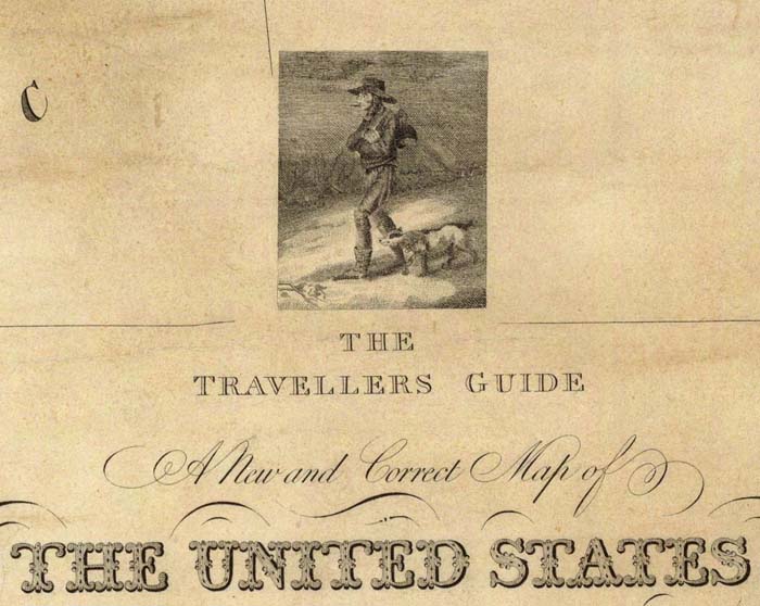
The travellers guide. A new and correct map of the United States; Samuel Lewis; 1819.
Joseph Bouchette's maps of Canada were surveyed and drawn by him in Canada, but printed in London by William Faden. The cartouches for two of the maps below are extremely ornate, probably reflecting the influence of Faden:
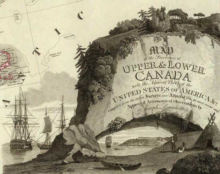
Map of the Provinces of Upper & Lower Canada with the adjacent parts of the United States of America; Joseph Bouchette, William Faden; 1815.

Topographical map of the Province of Lower Canada; Joseph Bouchette, William Faden; 1815.
Philadelphia map publisher Henry Tanner used scenes of the American landscape in his panoramic cartouches for his maps of North America, New England, and the United States:

A Map of North America; Henry Tanner; 1823.

Map Of The States Of Maine, New Hampshire, Vermont, Massachusetts, Connecticut & Rhode Island; Henry Tanner; 1823.

United States of America; Henry Tanner; 1829.
Smaller, independent American map publishers produced some interesting variations. This pocket map of Ohio by Columbus, Ohio map publisher Hiram Platt has an unusual cartouche:

Ohio; Hiram Platt; 1825.
S.A. Mitchell and James H. Young of Philadelphia used landscape and commerce as the themes for this cartouche:

Map Of The United States; Samuel Augustus Mitchell, James H. Young; 1831.
Even American school atlas maps had cartouches, as shown in this map from Thomas Smiley's Atlas of 1842:
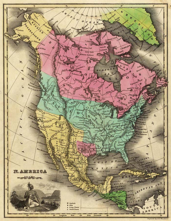
N. America; Thomas T. Smiley; 1842.
By the middle of the 19th century, map cartouches were incorporating actual views of cities or landscapes into the maps to add decoration to the titles, as in this map of Naples, Italy and the one below it of North America:
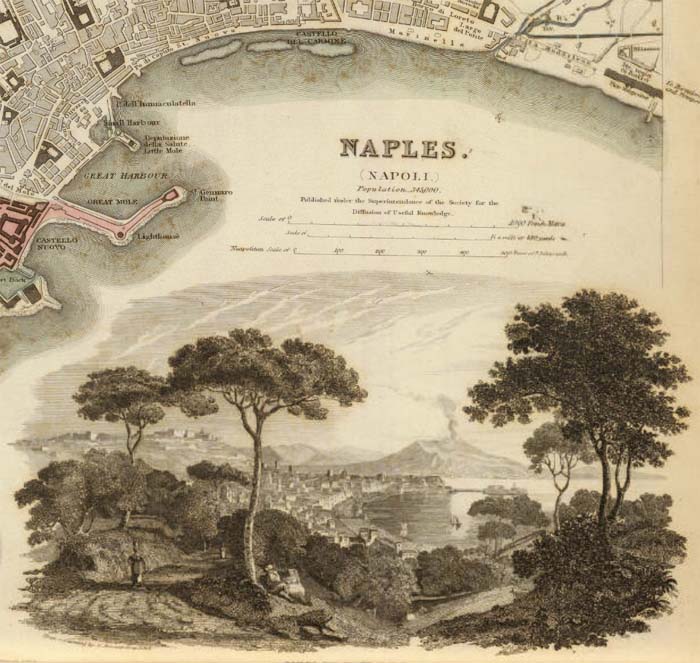
Naples. Napoli.; Society for the Diffusion of Useful Knowledge: 1844.

Map of North America; J.H. Colton; 1852.
The use of views to embellish maps largely replaced decorative cartouches after 1850. In a sense, the illustrated cartouche now wraps the entire map, not just the title. Three examples are shown below, the first from the Illustrated Atlas of 1851 by Martin and Tallis:

Ceylon; R.M. Martin, J & F. Tallis: 1851.
An even more ornate example of map illustration is this map from Levasseur's Atlas National Illustre des 86 Departments et des Possessions De La France from 1856:

Dept. De Corsica; Victor Levasseur; 1856.
The final example of the use of views is this map from Fullarton's Royal Illustrated Atlas of 1872, one of the last of the decorative atlases published in the 19th century:

British Possessions on the North East Coast of South America; A. Fullarton & C0.; 1872.
This entire group of cartouches and the maps they are taken from can be seen as a slide-show or as a group. For further reading, especially on the early period of map cartouches from the 16th and 17th centuries, see Edward Lynam's discussion of cartouches in his 1953 Mapmaker's Art (PDF).
- Featured Maps
- January 7, 2010
19th Century Maps by Children
In the 18th and 19th centuries, children were taught geography by making their own maps, usually copies of maps available to them in books and atlases at their schools or homes. Below is a group of maps and geographical diagrams made by children in the 19th century; and some of the school atlases, geographies, and wall maps that may have been their sources. These old maps made by children were hand drawn and colored, one-of-a-kind productions, and it is amazing that any have survived down to our time. That they have is due to luck and the efforts of families to preserve the history of their children. These maps have a special poignancy today in the way that they reflect the optimism of youth from another time.
The geographical diagram of Connecticut below is from Frances A. Henshaw's Book of Penmanship Executed at the Middlebury Female Academy April 29, 1823. She drew geographical diagrams for each of her hand-drawn maps in her book. Notwithstanding the title, this geography book is drawn by a very promising student. It includes descriptions of Astronomical Geography, the Ptolemaic, Brahean and Copernican Systems, Comets, Great Circles, Equator, Meridian, Horizon, Colures, Tropics, Polar Circles, Zones, Climates, Latitude and Longitude, a section titled "America," and 19 maps of the states with a descriptive geographical diagram for each.
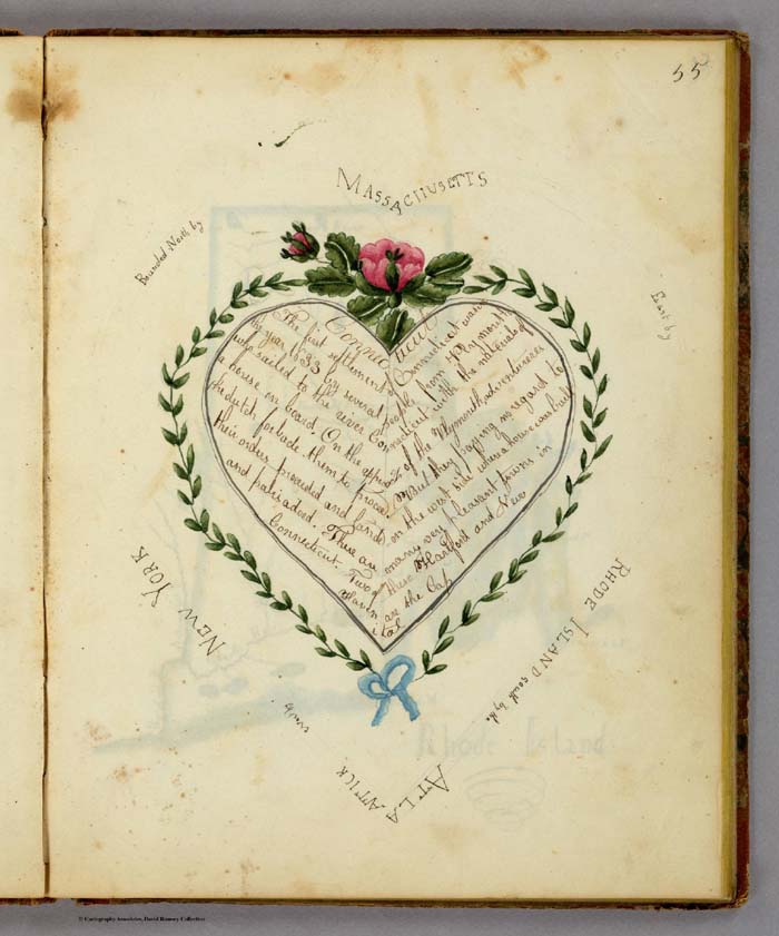
Geographical Diagram showing information about Connecticut including the bounding States, by Frances A. Henshaw, from Frances A. Henshaw's Book of Penmanship Executed at the Middlebury Female Academy April 29, 1823.
The diagram above accompanied a hand-drawn map of Connecticut, shown below. Of the 19 maps in her book, most were copied from the 1805 edition of Carey's American Pocket Atlas (see our 1796 edition, which is similar), except for Ohio, which is from Arrowsmith and Lewis' Atlas, 1812, and Indiana, from an unknown source.
Map of Connecticut, by Frances A. Henshaw, from Frances A. Henshaw's Book of Penmanship Executed at the Middlebury Female Academy April 29, 1823.
The text sections of her book are copied from Morse's "Geography Made Easy", probably 1807 edition, but the text describing the maps in her geographical diagrams is entirely original. The geographical diagrams themselves are very unusual and unlike anything we have seen in children's books. A selection of them is shown below:
 |
 |
 |
 |
 |
 |
 |
 |
 |
Nine examples of Henshaw's geographic diagrams for her maps of U.S. states
Henshaw saved her book and gave it to her son, T.A. Post, in 1872, a year before she died. Note the inscription on the bottom of the title page, just below the date of April 29, 1823, when she finished her book. That she kept the book for 44 years into her adult life and then passed it on to her son indicates how much she valued it.

Henshaw's presentation inscription to her son, Truman Augustus Post, February 4, 1872
About a year after we scanned and put the book in our online map library, we were emailed by Henshaw's great-great grandson Truman Young who said "I recently found an item on the online David Rumsey collection that appears to be a notebook written by my great-great-grandmother, Frances Alsop Henshaw Post (1809-1873). I have more information about her, if that would be a useful addition to your records. For example the "T.A. Post" referred to on the title page is her son, Truman Augustus Post (1838-1902)." Mr. Young will visit our library later in 2010 and we hope to gain more information from him about his remarkable ancestor, Frances Henshaw, who would have been 14 years old when she made these maps.
View the entire Frances Henshaw "Book of Penmanship" as a slide-show.
Emma Willard (1787-1870) was a prominent teacher who believed that young women should learn geography by making maps. It is likely that her influence on teaching practices of the first half of the 19th century played a role in the creation of children's maps by young women at the time. Willard published several history school books that included many very imaginative maps and charts that no doubt inspired students to think of space and time as integral dimensions of history. An example is her Atlas to Accompany a System of Universal History, which contains "A chronological picture of nations, or perspective sketch of the course of empire. (and) the progressive geography of the World, in a series of maps, adapted to the different epochas [sic] of the history." Her time-line "Picture of nations or perspective sketch of the course of empire" is shown below:
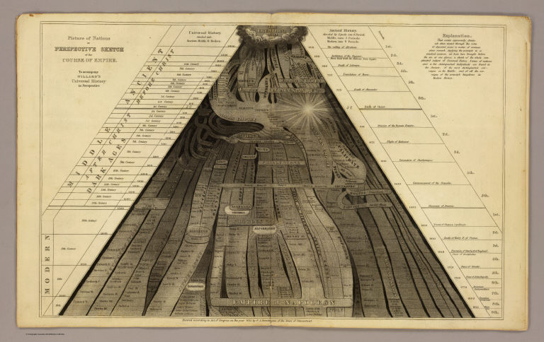
Picture of nations or perspective sketch of the course of empire. To accompany Willard's Universal history in perspective.
In the same book, Willard uses receding dark clouds shrouding parts of the maps to show the expansion of geographical knowledge over time, a convention she probably borrowed from Edward Quin's Historical Atlas of 1830. This technique is an especially delightful visualization that no doubt stimulated children's imaginations and may have helped them remember historical eras. Below is one of her cloud maps showing the period from BC 1921 to the Christian Era:
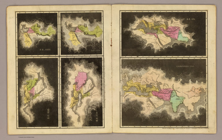
B.C. 1921. B.C. 1491. B.C. 980. B.C. 752. B.C. 323. Christian era. To accompany Willard's Universal history in perspective.
Children often made individual maps or groups of maps. Eliza S. Ordway made a small wall map of the United States in 1829, with black rollers top and bottom as was the style for commercially made wall maps of the period.
Map of the United States by Eliza S. Ordway, 1829
Anna M. Bullard drew her "Map of the World" in hemispheres in 1836 in Boston, Massachusetts. Her cartography is somewhat simplified but generally accurate for the time. She also used a wall-map style, including varnishing the map to better preserve it.
Map of the World. Executed by Anna M. Bullard. Boston March 15, 1836. Western Hemisphere. Eastern Hemisphere.
Maria Symonds of the Topsfield Academy in Topsfield, Massachusetts, made this map of the United States and dated it 1830. It bears a strong resemblance to John Melish's United States of 1822 (although the Melish map does not cover the West Coast). This is very well drawn, backed with linen and varnished, and outlined in color.
United States. Maria Symonds. Topsfield Academy. 1830.
Another map of the United States--we think made about 1821, based on the geography and boundaries in the map-- was most likely done by a student using the John Melish 1816 United States Map (which covers the entire county coast to coast) as a source.
Anonymous Student, United States, 1821
It is interesting to compare the above two maps' delineation of Florida and get a closer look at their styles of drawing and level of detail:

Anonymous Student, United States, 1821 Maria Symonds, United States, 1830
Most of the children's maps in our collection are by young women. Only a few are by young men. These three maps made by Bradford Scott are very individualized productions and striking in their use of bold colors and strong lines.
North America. Bradford Scott.
United States of America by Bradford Scott 1816.
South America. By Bradford Scott. 1816.
The earliest children's atlas that we have in the collection is "A General Atlas, done by Frances Bowen under the care of her Sister Eliza in the year 1810"
Title page to Frances Bowen's "A General Atlas," 1810
Bowen has 37 maps in the atlas, all carefully drawn. The result is very fine and these are some of the most delicate and well executed children's maps we have seen. The paper is watermarked J. Whatman 1808 and E & P 1804, both English watermarks. Hence we assume that Bowen is from England; furthermore, the meridian is from London on the World and U.S. maps, although she could be American. Her World map is shown below:
World map. By Frances Bowen. 1810
View the Frances Bowen General Atlas as a slide-show.
In addition to the previously mentioned influence of Emma Willard, children and students were inspired to draw maps by reading the many other teaching and school atlases that were published in the 18th and 19th centuries. Our online map collection has over 600 maps and images from school atlases. Some of these books encouraged children to draw either by showing simplified maps of the word that were easy to copy, or by specifically providing blank map sheets for the students to fill in.
Johann Baptist Homann published his teaching atlas, the Atlas Methodicus in Nuremberg, Germany, in 1719.
Title page to Homann's "Atlas Methodicus," 1719
An example of the simplified maps in Homann's atlas is this map showing California as an island off the coast of North America, a common geographical misconception of the 18th century. California is identified with the letter "C" which is then listed under the text pages on the islands of North America.
A portion of "Charte von America. Johanne Baptista Homanno, Norimbergae, 1719"
William Faden, a London map and atlas publisher, published the exquisite Geographical Exercises in 1777, containing pairs of drawn maps and blank maps. Students were expected to copy the drawn maps onto the blank maps and thereby learn the geography by drawing it.
Title page to William Faden's "Geographical Exercises,Calculated to Facilitate the Study of Geography," 1777
Faden's Map of Asia is paired with a blank Map of Asia, the blank sheet showing clearly the interesting polyconic projection used to draw the map.
"Asia. Engraved by Jefferys & Faden, Geographers to the King." 1777

"Asia. London, publish'd by Jefferys & Faden, Corner of St. Martin's Lane, Charing Cross." 1775
In the 19th century, Samuel Augustus Mitchell of Philadelphia published in 1839 a School Atlas that was accompanied by a separate Atlas of Outline Maps. Below is the drawn Map of the United States from the School Atlas and the outline Map of the United States from the Atlas of Outline Maps:

"Map of the United States and Texas Engraved to Illustrate Mitchell's School and Family Geography. No. 4. (with) Map of Mexico and Guatimala ... No. 5" 1839
"Map of the United States and Texas. (with) Map of Mexico and Guatimala." Entered ... 1839, by S. Augustus Mitchell.
View a slide-show of Mitchell's drawn and outline maps.
Another example of school atlases that taught map drawing is George W. Fitch's Mapping Plates from 1850, "designed for learners in geography, being a collection of plates prepared for delineating maps of the World, and countries forming its principal subdivisions ..." Student Lydia S. Weeks completed this page of the Western and Eastern Hemispheres:
"Western Hemisphere ... Eastern Hemisphere drawn by Lydia S. Weeks." By George W. Fitch.
In addition to Lydia Weeks, several other students filled in the map plates. View the entire Fitch "Mapping Plates" book as a slide show below. Click on the link "Go to Source" to view larger.
Towards the end of the 19th century, solutions to teaching map drawing became even more imaginative, including the use of stencils in the Drawing Teacher published in 1885. It has six stencil maps in its box, below, one of the United States (shown) and five more of the continents:

It gives me special pleasure to share these maps online, as I have long treasured them as special parts of the collection. Imagine what would happen today if we brought back the classroom practice of making maps to teach geographical literacy, with all the easy tools and satellite images of the Earth available on our desktops, and these old children's maps for inspiration.
- Featured Maps
- October 11, 2009
Carte de France - The National Survey of France 1750 - 1815
The Carte de France was one of the first national surveys completed on the same scale, 100 toises (a toise was equal to 6ft and the equivalent scale today would be 1:86,400), according to a specific plan. It was led by several generations of the Cassini family (not to be confused with the Italian globemaker Giovanni M. Cassini) starting in the 1740's and continuing through the French revolution and Napoleon's time, to 1815. Four generations of the Cassini family held the position of director of the Paris Observatory, and three of those worked on the Carte de France: Jacques Cassini (Cassini II, 1677-1756); Cesar-Francois Cassini (Cassini III, 1714-1784); and Jean Dominique Cassini (Cassini IV, 1748-1845). The 182 sheets that comprise the map are superb examples of cartographic engraving. The use of trigonometric surveying techniques gave the map a high degree of accuracy for its time. The sheets can therefore be joined together to present a unified view of France in the 18th century. In the view below, they are joined digitally - if they were physically joined together they would form a map about 39 feet high by 38 feet wide:
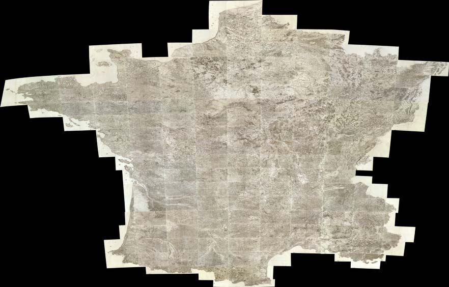
(Composite of 182 sheet) Carte de France. Levee par ordre du Roy. (1750-1815), Cassini family; Cassini, Cesar-Francois, 1714-178, Paris, 1750 - 1815
The Tableau de la Carte Generale de la France by Louis Capitaine shows the plan of dividing the country into map sheets:
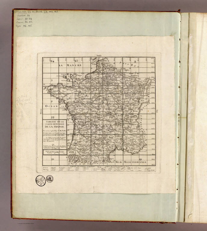
Tableau de la carte generale de la France. Pour servir a l'assemblage de 24 feuilles de la carte reduite sur l'Echelle d'une ligne pour 400 toises, et de celle en 180 feuilles, Capitaine, Louis, ca. 1749-ca. 1797, Paris, 1797
At the bottom of the Tableau is an Explication des Caracteres Geographiques employes dans la Carte Generale de la France, which is a key to the symbols used in the 182 sheet map - there are no keys on the sheets themselves. As such, it is invaluable in understanding the cultural information on the maps. A portion of the key is shown below in detail (click on the image to see the full key). Additional explanations of the map symbols can be found on this site.
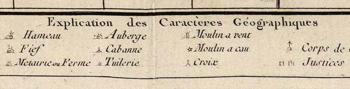
A portion of the Explication des Caracteres Geographiques employes dans la Carte Generale de la France
The plan for the triangulation survey is shown clearly in the Nouvelle carte qui comprend les principaux triangles... published in 1744 by Cesar-Francois Cassini and Giovanni Domenico Maraldi:

Nouvelle carte qui comprend les principaux triangles qui servent de fondement a la description geometrique de la France, Cassini, Cesar-Francois, 1714-1784; Maraldi, Giovanni Domenico, Paris, 1744
The first sheet published was centered on Paris, with the prime meridian running through the Paris Observatory and titled Carte de France Levee par ordre du Roy Premiere Feuille:

Carte de France levee par ordre du Roy. No. 1 (Paris). Ecrit par Bougoin. 1736 (i.e. 1756, corr. 1761-1762, Cassini family; Cassini, Cesar-Francois, 1714-178, Paris, 1762 (revised from the first edition of 1756)
This close up of sheet 1 shows Paris and the meridian passing through the Paris Observatory. It also gives a good sense of the rich cultural information shown on the sheets (click to open in a new window with zoom and pan):
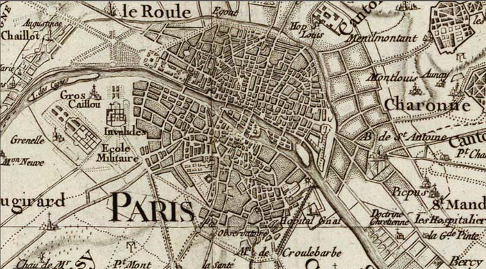
Detail of sheet 1, Paris, showing the city and the intersection of the two meridians at the Paris observatory
The production of the atlas sheets continued for about 65 years, to 1815. The cartographic style changed somewhat over that period, with slightly different symbols used for cultural and natural features at different times. Yet the map still has a consistency that that is impressive for such a long project. A version of the map on a reduced scale of 400 toises (1:345,600) on 24 sheets was published in 1790:

(Composite of 24 sheet) Carte de la France. Dediee au Roi. Par les directeurs et associes de la Carte de la France, Cassini, Cesar-Francois, 1714-1784; Capitaine, Louis, ca. 1749-ca. 1797; Cassini famil, Paris, 1790
We have georeferenced both the 100 and 400 toises issues of the Carte de France and put them in Google Maps and in Google Earth. Below is the 100 toises scale map in Google Maps (click on the image to open in Google Maps). The 400 toises reduced scale map can also been seen in Google Maps.
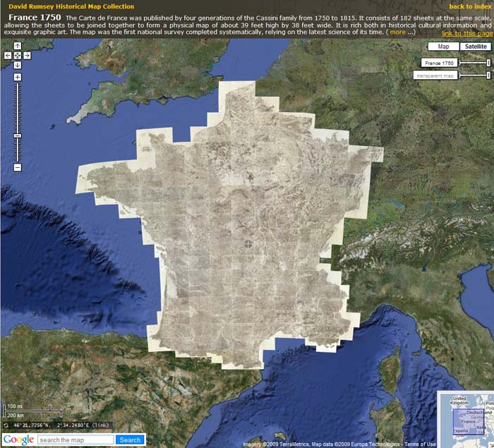
The 182 sheet Carte de France, 1750 - 1815, in Google Maps
The Carte de France in Google Maps and Google Earth can be searched by location, for example (in Google Maps) Marseilles, or Bordeaux, or Paris Environs, or regions like Brittany.
The 100 toises scale map in Google Earth is below (requires Google Earth app). The 400 toises scale map can also be viewed in Google Earth.
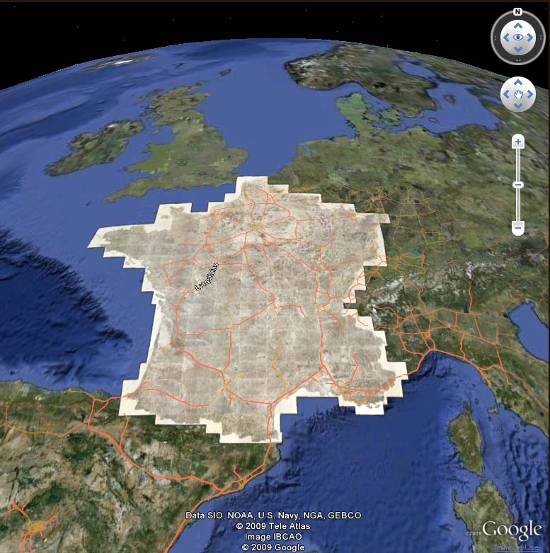
The 182 sheet Carte de France, 1750 - 1815, in Google Earth
- Featured Maps
- September 13, 2009
Julius Bien, Master Printer and Cartographer
Julius Bien (1826-1909) was an American lithographic printer and cartographer who worked in New York City in the second half of the 19th century. He was responsible for the publication of thousands of maps issued by the U.S. government and private map publishers. He was a pioneer in the development of chromolithography. He is recognized as one of the finest map printers of his time. The Rumsey collection contains over 1,100 maps published by Bien. Although authorship of 19th century maps and atlases is never limited to one person, and most of these cartographic productions list authors other than Bien, it is clear that he had a major role in shaping the final results. Bien's printing and publishing of geological maps was outstanding and he took geological visualizations to new levels, as can be seen in the example below from Hayden's Atlas of Colorado, 1881.

One of the plates for Hayden's Atlas of Colorado, printed by Bien. Title: SW. Colorado and Parts of New Mexico, Arizona and Utah. U.S. Geological and Geographical Survey of the Territories. F.V. Hayden in Charge. Wm. H. Holmes, and F.M. Endlich, Geological Assistants. Surveyed in 1874 & '75. Sheet XV.
Bien was born in Naumburg, Germany in 1826 and was educated at the Academy of Fine Arts in Cassel and at Stadel's Institute in Frankfurt. He became involved with the German revolution of 1848, which led to his immigration to America in 1849. He established a lithographic business in New York City in 1850 and continued it there for over 50 years. Bien was drawn to map publishing and was interested in improving the quality of map printing. He made maps for the growing western surveys including the Pacific Railroad Surveys, the census, the coast surveys, and provided maps during the Civil War. Although primarily a printer, he did publish later in his career several atlases. His deep interest and understanding of the science of printing make his productions exceptional. He was given numerous awards during his lifetime and was the first president of the National Lithographers Association. In addition to his cartographic productions, Bien issued exquisite chromolithographic reproductions of Audubon's Birds of America.
Of Bien's many atlases, his Grand Canyon, Colorado, and Fortieth Parallel are outstanding examples, shown below.
 |
 |
 |
| Department Of The Interior, United States Geological Survey, J.W. Powell Director. Atlas To Accompany The Monograph On The Tertiary History Of The Grand Canon District By Capt. Clarence E. Dutton U.S.A. Washington 1882. Julius Bien & Co. Lith. New York. | Department Of The Interior. United States Geological And Geographical Surveys Of The Territories. Geological And Geographical Atlas Of Colorado And Portions Of Adjacent Territory By F.V. Hayden, U.S. Geologist In Charge. Corrected To Date And Printed In Accordance With An Act Of Congress Approved February 9th 1881. Julius Bien, Lith. | Geological and Topographical Atlas Accompanying the Report of the Geological Exploration of the Fortieth Parallel Made by the Authority of the Honorable Secretary of War under the direction of Brig. and Brvt. Major General A.A. Humphreys, Chief of Engineers U.S.A. by Clarence King, U.S. Geologist in Charge, 1876. Julius Bien Lith. |
William Henry Holmes' topographical drawings of the 1882 Grand Canyon were printed by Bien with extraordinary result in Dutton's Grand Canyon Atlas. A detail from the Panorama From Point Sublime is shown in the image below:

"Panorama From Point Sublime" 1882 - printed by Julius Bien, click on the image to pan or zoom
Bien published the cartographic output of the Wheeler Geographical Surveys West of the 100th Meridian, from 1871 to 1883. The maps are rich in cultural and historical detail from the period. Below is the title page of the Topographical Atlas sheets.

The title page to the Topographical Atlas sheets of the Wheeler Geographical Surveys West of the 100th Meridian
Below is a selection of Bien's cartographic output from 1859 to 1904, as a slide-show - use the arrows to advance the slides; click on the little "i" to view the catalog record; click on "Go to Source" to see the slide-show full screen.
A slide-show of examples of Bien's cartographic printing in many different styles
Bien's last atlases were some of his finest - The Atlas of the Metropolitan District of New York, the massive Atlas to Accompany the Official Records of the Union and Confederate Armies, and The Statistical Atlas of the Twelfth Census.
 |
 |
 |
| Atlas of the Metropolitan District and adjacent country comprising the counties of New York, Kings, Richmond, Westchester and part of Queens in the state of New York, the county of Hudson and parts of the counties of Bergen, Passaic, Essex and Union in the state of New Jersey ... From original surveys by J.R. Bien and C.C. Vermeule, the U.S. Coast and Geodetic Survey and the Geological Survey of New Jersey. Published by Julius Bien & Co. New York. 1891. | Atlas to accompany the official records of the Union and Confederate armies. Published under the direction of the Hons. Redfield Proctor, Stephen B. Elkins and Daniel S. Lamont, secretaries of war, by Maj. George B. Davis, U.S. Army, Mr. Leslie J. Perry, civilian expert, Mr. Joseph W. Kirkley, civilian expert, Board of Publication. Compiled by Capt. Calvin D. Cowles, 23d U.S. Infantry. Washington: Government Printing Office, 1891-1895. | Statistical atlas of the United States, based upon results of the Eleventh Census (1890). By Henry Gannett. Washington: Government Printing Office. 1898. (At head of title:) Department of the Interior, Census Office. Robert P. Porter, Superintendent ... Carroll D. Wright, Commissioner of Labor in Charge ... (seal) Department of the Interior. |
Bien engraved the plates for the U.S. Civil War Atlas titled "Military Maps Illustrating the Operations of the Armies Of The Potomac & James May 4th 1864 to April 9th 1865 including Battlefields of the Wilderness, Spottsylvania, North Anna, Totopotomoy, Cold Harbor, The Siege Of Petersburg And Richmond Battle-fields of Five Forks." The view below shows details from six of those plates, click on the images to open them in a larger window that enables zooming and panning. The close up details of the battle maps below show the extraordinary level of Bien's printing skill.

Details of six battle maps printed by Bien for the U.S. Civil War Atlas titled "Military Maps Illustrating the Operations of the Armies Of The Potomac & James..." click on the image to pan or zoom
By the time of Bien's death in 1909 his innovations in printing technology had been recognized by numerous awards and his election as the first president of the National Lithographers Association. His prolific cartographic output during his lifetime included all the U.S. western surveys, the U.S. Census, the coast surveys, the Pacific Railroad Surveys, Civil War maps, and several atlases that he published himself.
- Featured Maps
- September 7, 2009
Cassini Terrestrial and Celestial Globes 1790 - 1792
Giovanni Maria Cassini was a noted geographer, engraver, and publisher in Rome. He was one of the last of the fine Italian globe makers active at the end of the 18th century. Cassini made Terrestrial and Celestial Globes in 1790 and 1792. He also published the twelve terrestrial and twelve celestial globe gores that formed these globes in his atlas "Nuovo Atlante Geografico Universale" along with rules for the construction of globes and globe gores.
The full title of the Terrestrial Globe is Globo terrestre / delineato sulle ultime osservazioni con i viaggi e nuove scoperte del Cap. Cook, inglese ; Gio. Ma. Cassini C.R.S. inc. Roma : Presso la Calcograf[i]a cam[era]le, 1790. The globe shows contemporary discoveries in the Pacific as well as the routes of three of Captain James Cook's voyages.
Cassini's terrestrial globe gores were used to create a physical globe about 34cm in diameter. In the virtual world, we have scanned the gores, georeferenced them and then projected and wrapped them on a three dimensional globe shown in the two images below - clicking on the globe image will open the globe in Google Earth (download app required) .
|
|
|
The Cassini Globe Gores projected onto a virtual globe - click to open in Google Earth
The terrestrial globe gores are shown below in their original printed form on four sheets of three gores each. The images of the sheets were downloaded from the Library of Congress, Geography and Map Division.

The twelve Cassini Terrestrial Globe Gores on four sheets
The gores were then trimmed in Photoshop and georeferenced in ArcMap to the WGS 1984 coordinate system as shown in the image below. This is the image that is used to create the virtual globe in Google Earth and ArcGlobe. Clicking on the image will open it in Rumsey Google Maps, in a Mercator Projection.
The Cassini Globe Gores georeferenced and joined in a WGS 1984 coordinate system
Terrestrial and Celestial globes were often paired together so in 1792 Cassini made a companion Celestial Globe, showing the Heavens and all the known stars and constellations. The Celestial Globe's full title is Globo Celeste calcolato peril corrente anno sulle osservazioni de Sigg. Flamsteed e de la Caille. Roma : Calc(ografi)a Cam(era)le, 1792. Inciso dal P. Gio. Ma. Cassini, C.R.S. Like the terrestrial globe gores, the celestial gores were scanned and georeferenced and then placed on a virtual globe as shown below. Click on the globe image below to open the globe in Google Earth (download app required).
|
|
The Cassini Celestial Globe of 1792, "Globo Celeste" - click to open in Google Earth
Since the Terrestrial and Celestial Globes were typically viewed side by side in their physical instantiations, we wanted to join them together in their virtual copies. We were able to do this in Google Earth by turning the Cassini Celestial Globe inside out and placing it 64 million meters outside the Terrestrial Globe, as seen in the video below. The same space can be viewed live in Google Earth (download app required, turn off Atmosphere layer in Google Earth).
The Cassini Terrestrial Globe surrounded by the Cassini Celestial Globe - seen as the "Heavens."
At the time we did the Cassini Globes project, the Rumsey Collection did not have copies of the Cassini globe gores. The Celestial Globe gores as well as copies of the Terrestrial Globe gores were added to the Rumsey collection in 2007. The Terrestrial gores are the same issue as the Library of Congress copies, but the coloring is different, as can be seen from the images below, in a slide-show from the Rumsey collection database, which includes the gores and the printed parts for the "ring sheet" of zodiacs and 2 polar calottes (caps). Use the arrows to advance the slides; click on the little "i" to view the catalog record; click on "Go to Source" to see the slide-show full screen.
A slide-show of the Terrestrial and Celestial Globe Gores, Rumsey Collections copies
Taking the virtualization of the Cassini globes a step further, the Cassini Globes have been placed on the Rumsey Map Islands in the virtual world, Second Life. As shown in the video below, David Rumsey's avatar, Map Darwin, explores the virtual globes which are over 100 meters in diameter and placed next to each other on the map islands, floating above an 1883 map of Yosemite Valley.
Map Darwin exploring the Cassini Globes on the Rumsey Map Islands in Second Life's virtual world
Finally, as shown in the video below, it is possible to combine the Cassini Terrestrial Globe with other GIS layers, including NASA's satellite image of the world at night, several satellite images of world topography and bathymetry, and other historical maps and globes.
The Cassini Globes combined with other GIS layers and seen in ArcGlobe
Perhaps Giovanni Maria Cassini would be intrigued to see his Terrestrial and Celestial Globes take on new life in the 21st century digital world, all firmly based on the great accuracy of his geographic knowledge and the high quality of his engraving skills.
- Featured Maps
- September 5, 2009
Heights of Mountains, Lengths of Rivers
For over 100 years, atlas and map publishers in the United States and Europe published a style of map that was a visualization of the heights and lengths of the world's mountains and rivers. Some of the earliest examples appeared in Europe towards the end of the 18th century. In the United States, the form was popular throughout the 19th century and the early part of the 20th. These maps appeared in atlases, as wall maps, and as pocket maps. One of the most elegant examples was engraved originally on copper by map publisher Henry Tanner in Philadelphia in 1836 and then continued by S. Augustus Mitchell, also of Philadelphia, in lithographic versions into the 1850's. The example below was published by Mitchell in 1846.
Heights Of The Principal Mountains In The World. Lengths Of The Principal Rivers In The World, S. Augustus Mitchell, 1846
The Mountains and Rivers maps appeared in several styles and formats. One of the earliest styles was to show just mountains, piled up in a landscape, with a key of mountain heights on the left and right sides of the illustration. Also listed on the side would be the highest flights of the Condor, limits of plants and trees, elevations of lakes, elevation of certain high altitude cites, and climate zones. An early example in the Rumsey collection is Charles Smith's Comparative View of the Heights of the Principal Mountains &c. In The World, published in London in 1816:
Comparative View of the Heights of the Principal Mountains &c. In The World, Charles Smith, London, 1816
Eight examples in this style are shown below. Each uses a different method to unpack the dense information contained in the maps: a grid system, a numbering system, elevation lines and an outline chart. (click on images to enlarge)
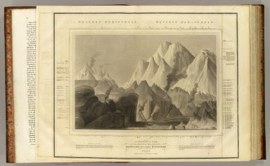 |
 |
| A comparative view of the heights of the principal mountains and other elevations in the World. Drawn & engraved for Thomson's New general atlas by W. & D. Lizars, Edinburgh; Thomson, John; 1817. Thomson's map uses a grid system to identify the locations on the left and right sides of the map. |
Map And Description Of The Principal Mountains, &c. Throughout The World. Western Hemisphere. Eastern Hemisphere. Comparative Heights Of The Principal Mountains And Other Elevations In The World; Carey, H. C.; Lea, I.; 1822. A numbering system is used on this map. Carey and Lea copied the Thomson map on the left. |
 |
 |
| Comparative Height of the Principal Mountains and other Elevations in the World. J. Cone Sc. Published by F. Lucas Jr. Baltimore; Lucas, Fielding Jr.; 1823. Lucas also copied the Thomson map above, but introduced a new system of an outline map and key. |
Tableau comparatif des principales hauteurs du globe. D'apres A.M. Perrot; Perrot, A. M. (Aristide Michel), 1793-1879; Vandermaelen, Philippe, 1795-1869; 1827. Vandermaelen used a combination of grid and numbering system in his map. |
 |
 |
| A comparative view of the heights of the principal mountains of Scotland. (with) View of the Grampian Mountains, being a specimen of the formation of that range; Thomson, John; McKenzie, D.; 1832. Thomson used a grid system to identify the mountains of Scotland and an oblique view to show the Grampians. |
Tableau comparatif de la forme et de la hauteur des principales montagnes du globe terrestre, dedie a Monsieur le Baron, Alexdre. de Humboldt; Andriveau-Goujon, J.; Bruguiere, Louis; 1850. Andriveau-Goujon used a system of elevation lines. |
 |
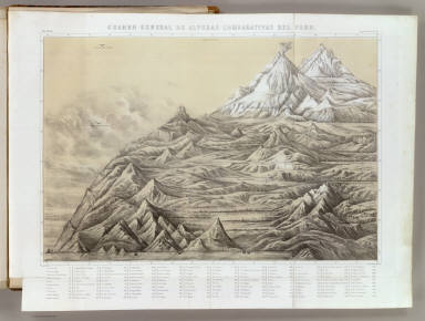 |
| Geographical distribution of indigenous vegetation. The distribution of plants in a perpendicular direction in the torrid, temperate and frigid zones...; Henfrey, Arthur, 1819-1859; Johnston, Alexander Keith, 1804-1871; Schouw, Joakim Frederik, 1789-1852; 1854. While this map shows the elevation of mountains, it focuses more on the distribution of plants at different elevations around the globe. |
Cuadro general de alturas comparativas del Peru; Paz Soldan, Mariano Felipe, 1821-1886; 1865. Paz Soldan used a numbering system to show the comparative elevations of the cities and mountains of Peru. |
Another popular style combined heights of mountains and lengths of rivers in one view. The rivers are stretched out in single lines, with the longest on the left combining with the shortest mountains, while the shortest rivers combine with the highest mountains on the right. The visual result is very compelling. One of the earliest examples was W.R. Gardner's Comparative Heights of the Principal Mountains and Lengths of the Principal Rivers, published by William Darton in London in 1823:

New and Improved View of the Comparative Heights of the Principal Mountains and Lengths of the Principal Rivers In The World, Gardner, W.R., Darton, William, London, 1823
Three examples of this style are shown below. (click on images to enlarge).
 |
 |
| A comparative view of the heights of the principal mountains and lengths of the principal rivers of the World; Fenner, Rest.; 1835. Fenner hangs the rivers below the mountains in this map. |
Mountains & Rivers; Colton, G.W; 1856. The Colton firm published this map in their world atlas from 1856 to 1880 and perhaps later. The mountains are keyed to a list on a separate page. |
The map below is an unusual example that divides the mountains and rivers maps into five illustrations of the continents.

Johnson's Chart of Comparative Heights of Mountains, and Lengths of Rivers of Africa ... Asia ... Europe ...South America ... North America; Johnson, A.J.; 1874.
A third variation of the mountain and rivers designs was putting the mountains in the center of the view with the rivers extending downward on each side. One of the earliest examples of this type was published by Henry Tanner in 1836, Heights of the Principal Mountains in the World.

Heights Of The Principal Mountains In The World, Tanner, Henry S., Philadelphia, 1836
John Dower and Henry Teasdale published another version in London in 1844 titled Principal Mountains and Rivers of the World. It is possible that there was an earlier version of this London map that Tanner copied from - a common practice of American mapmakers in the first half of the 19th century - but Tanner's map is centered on information important to American readers and the Dower/Teasdale map is oriented to England and Europe.

A Comparative View of the Heights of the Principal Mountains and Lengths of the Principal Rivers in the World, Dower, John Nicaragua; Teesdale, Henry, London, 1844
Other examples of this style:
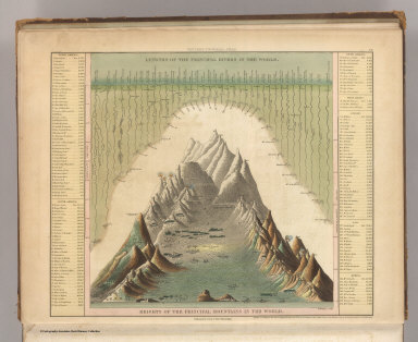 |
 |
| Heights Of The Principal Mountains In The World; Tanner, Henry S.; Philadelphia; 1845. A later edition of Tanner's 1836 map with updates to the statics. |
Heights Of The Principal Mountains In The World; Mitchell, Samuel Augustus; Philadelphia; 1846. Mitchell acquired the rights to Tanner's atlas and published his own version of the 1845 Tanner map, with little change to the map itself, while transferring it to lithography and adding a decorative border. |
 |
 |
| A Comparative View Of The Principal Waterfalls, Islands, Lakes, Rivers and Mountains, In The Western Hemisphere; Martin, R.M.; Tallis, J. & F.; New York; 1851. Tallis and Martin published this impressive pile up of mountains, rivers, waterfalls, and lakes. The Western Hemisphere view. |
A Comparative View Of The Principal Waterfalls, Islands, Lakes, Rivers and Mountains, In The Eastern Hemisphere; Martin, R.M.; Tallis, J. & F.; New York; 1851. The Eastern Hemisphere view. |
 |
 |
| Western Hemisphere; Mitchell, Samuel Augustus; Philadelphia; 1880. In Mitchell's version, he adds the hemisphere maps as well as the polar views - here the Western Hemisphere. |
Eastern Hemisphere; Mitchell, Samuel Augustus; Philadelphia; 1880. And here the Eastern Hemisphere, replacing the polar views with the greatest mass of land and greatest mass of water views. |
Gray's new map of the World in hemispheres, with comparative views of the heights of the principal mountains and lengths of the principal rivers on the globe, of 1885, provided a simplified view of the mountains and rivers. It appeared in George N. Colby's Atlas of the State of Maine, 1885.

Gray's new map of the World in hemispheres, with comparative views of the heights of the principal mountains and lengths of the principal rivers on the globe, Gray, Frank Arnold, Houlton, Maine, 1885
The double hemisphere style continued to the end of the 19th century, as shown by Rand McNally's Western Hemisphere, Eastern Hemisphere, of 1897 from their Indexed Atlas of the World.

Rand, McNally & Company's indexed atlas of the world Western Hemisphere, Eastern Hemisphere, Rand McNally and Company, Chicago, 1897
There are other types of mountains and rivers maps that defy categories. Many atlas publishers issued them in pairs, such as this mountains and rivers pages from Anthony Finley's General Atlas of 1831:
 |
 |
| Table of the Comparative Heights of the Principal Mountains &c. in the World; Finley, Anthony, Philadelphia, 1831. | Table of the Comparative Lengths of the Principal Rivers throughout the World; Finley, Anthony, Philadelphia, 1831. |
And this pair from Antonio Garcia Cubas' beautiful Atlas Pintoresco, an illustrated atlas of Mexico published in 1885:
 |
 |
| Carta Orografica. VI; Garcia Cubas, Antonio, 1832-1912; Mexico; 1885. | Carta Hydrografica. VII; Garcia Cubas, Antonio, 1832-1912; Mexico; 1885. |
School atlases often used schematic pairs of charts to indicate the heights of mountains and the lengths of rivers:
 |
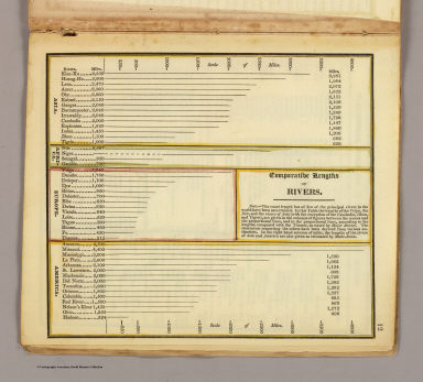 |
| Comparative heights of mountains; Worcester, Joseph E.; Boston; 1826 | Comparative lengths of rivers; Worcester, Joseph E.; Boston; 1826 |
And some examples show unique local interpretations such as Thomson's Comparative view of the lengths of the principal rivers of Scotland from 1822:

A comparative view of the lengths of the principal rivers of Scotland. (with) Comparative view of the height of the falls of Foyers and Corba Linn, Thomson, John; Lizars, William Home, Edinburgh, 1822
Or this example from Venezuela, Augutin Codazzi's Un cuadro de alturas que comprende las de las cordilleras de Merida... of 1840:

Un cuadro de alturas que comprende las de las cordilleras de Merida, de la costa de Caracas, Coro, Cumana y Margarita, y ultimamente las del sistema de la Parima. Otro cuadro comparativo de la superficie y poblacion de cada provincia. Otro de los principales rios que banan el territorio venezolano, ora procedentes de sus sistemas de montanas, ora de los Andes granadinos, o de la serrania de la Parima, Codazzi, Agustin, 1793-1859, Caracas, 1822
The Society for the Diffusion of Useful Knowledge (SDUK) had a remarkable plate in their 1844 World Atlas of A map of the principal rivers shewing their courses, countries, and comparative lengths:
 A map of the principal rivers shewing their courses, countries, and comparative lengths, Society for the Diffusion of Useful Knowledg, London, 1844
The final map in this series is from one of the last decorative 19th century atlases, the Royal Illustrated Atlas by Fullarton, 1872, Comparative Views of the Heights of the Principal Mountains and Basins of the principal Rivers... It combines an unusual showing of the basins of the major world rivers with the principal mountains of the world which also show the major geographical distributions of plant regions of the globe by altitude, a Humboldt inspired convention.

The World in Hemispheres with Comparative Views of the Heights of the Principal Mountains and Basins of the principal Rivers on the Globe, Fullarton, A. & Co., London and Edinburgh, 1872
Below is a slide-show of another 23 maps that use the mountains and rivers conventions in school atlas maps, profiles, physical maps, and general maps, followed by all 33 of the various mountain and rivers maps shown above. Use the arrows to advance the slides; click on the little "i" to view the catalog record; click on "Go to Source" to see the slide-show full screen. To view the entire group in the LUNA Browser, click here
For more information on the subject of mountains and rivers maps, see the excellent post on BibliOdyssey as well as John Wolter's extensively researched article in the Quaterly Journal of the Library of Congress, The Heights of Mountains and the Lengths of Rivers.