- Featured Maps
- March 28, 2012
Timeline Maps
Mapping time has long been an interest of cartographers. Visualizing historical events in a timeline or chart or diagram is an effective way to show the rise and fall of empires and states, religious history, and important human and natural occurrences. We have over 100 examples in the Rumsey Map Collection, ranging in date from 1770 to 1967. We highlight a few below.
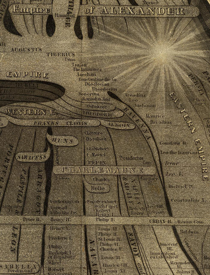
Sebastian Adams' 1881 Synchronological Chart of Universal History is 23 feet long and shows 5,885 years of history, from 4004 B.C. to 1881 A.D. It is the longest timeline we have seen. The recently published Cartographies of Time calls it "nineteenth-century America's surpassing achievement in complexity and synthetic power." In the key to the map, Adams states that timeline maps enable learning and comprehension "through the eye to the mind."
Below is a close up detail of a very small part of the chart: (click on the title or the image to open up the full chart)
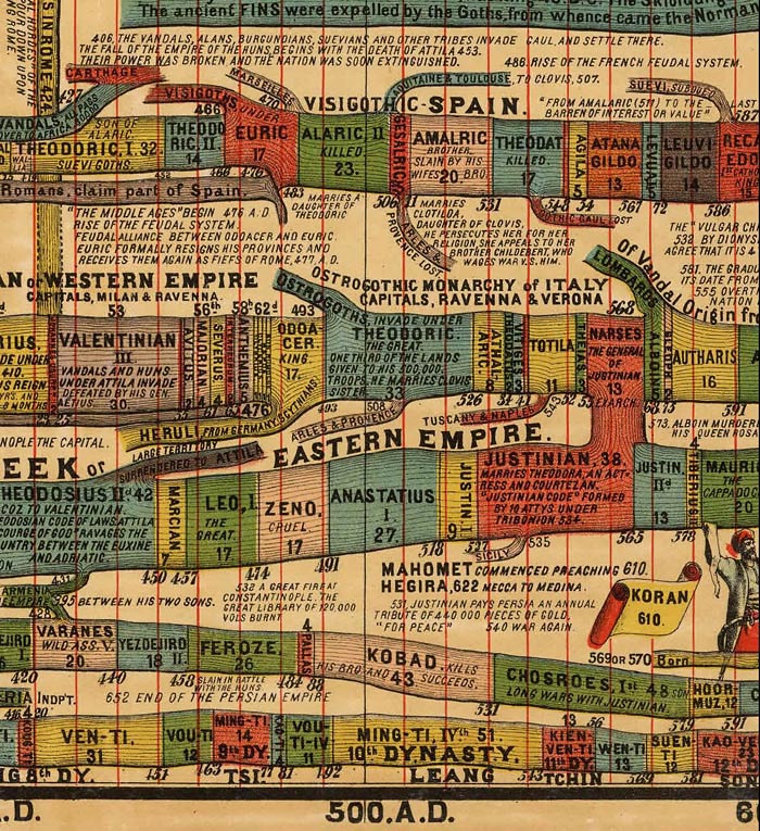
Another detail covering a larger area with the chart turned sideways:

Detail of Sebastian Adams, Synchronological Chart of Universal History, 1881 (click to open full chart)
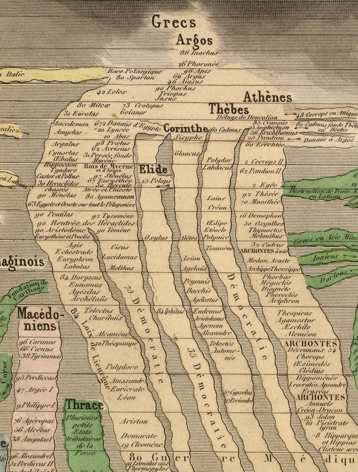
Eugene Pick published the Tableau de L'Histoire Universelle in 1858 in two sheets, one for the Eastern Hemisphere (shown here) and one for the Western Hemisphere. The chart shows history from 4004 B.C. to 1856. Like many timelines in this style, it is based on the 1804 Strom der Zeiten (Stream of Time) by Friedrich Strass of Austria. Part of Pick's chart is shown below:
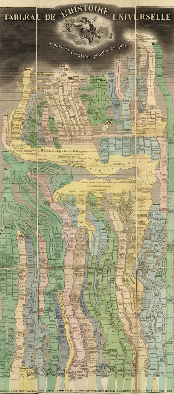
Close up detail of Pick's chart:
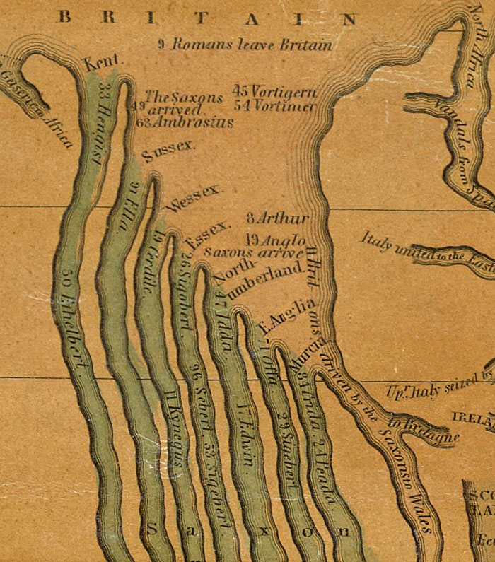
Another timeline chart based on the Strass chart was Joseph Colton's 1842 Chart of Universal History. This is one of the earliest examples we have seen of the complete Strass model published in the United States (though earlier partial versions or derivations of the form appeared in the U.S.) The explanation at the bottom of the chart states "Each Nation is represented by a stream which is broken in upon or flows on undisturbed as it is influenced by the accession of Territory or the remaining at Peace."

Detail of Colton's chart:
Emma Willard's 1836 "Picture of nations or perspective sketch of the course of empire" uses innovative perspective to add a time dimension to her chart which is otherwise similar to the Strass-Colton-Pick models. It appears in her "Atlas to Accompany a System of Universal History."

Willard timeline detail:
Emma Willard uses another form of timeline in her 1824 "Progress Of The Roman Empire, Illustrated By The course Of The River Amazon." Here she shows the actual course of the Amazon as a timeline showing the history of the Roman Empire. The chart appeared in her 1824 "Ancient Geography, As Connected With Chronology, And Preparatory to the Study of Ancient History."

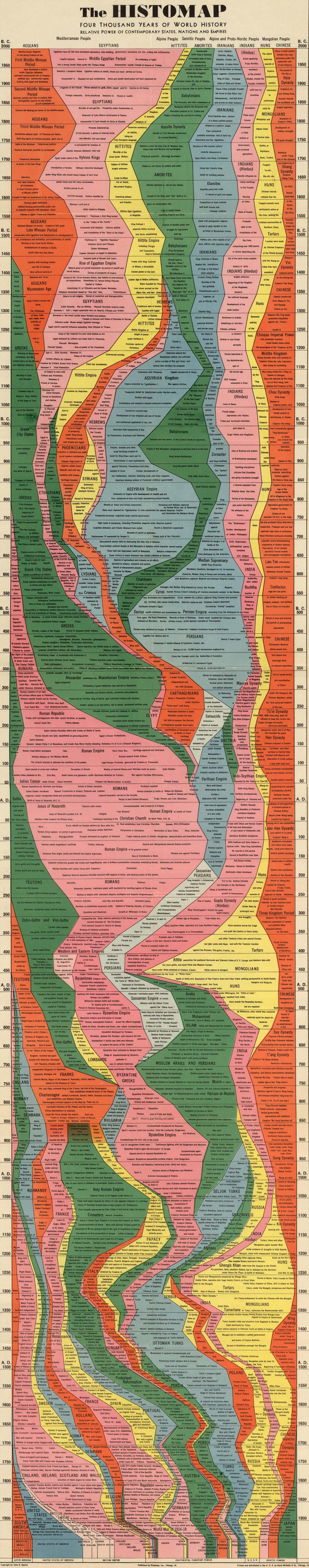
Rand McNally published amateur historian John B. Spark's "The Histomap. Four Thousand Years Of World History" in 1931. This popular chart went through many editions. On the cover, Sparks states: "Clear, vivid and shorn of elaboration, Histomap holds you enthralled as you follow the curves of power down time's endless course. Here is the actual picture of the march of civilization from the mud huts of the ancients thru the monarchistic glamour of the middle ages to the living panorama of life in present day America."
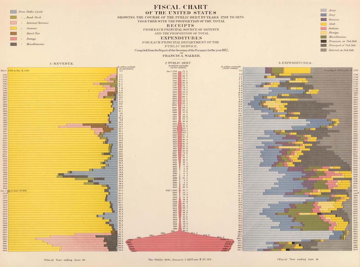
Francis Walker's 1874 "Statistical Atlas of the United States" contains many maps and diagrams that show data from the 1870 U.S. Census arrayed in timelines. The chart below, with the title "Fiscal chart of the United States showing the course of the public debt by years 1789 to 1870 together with the proportion of the total receipts from each principal source of revenue and the proportion of total expenditures for each principal department of the public service," shows 80 years of financial data arranged by time:
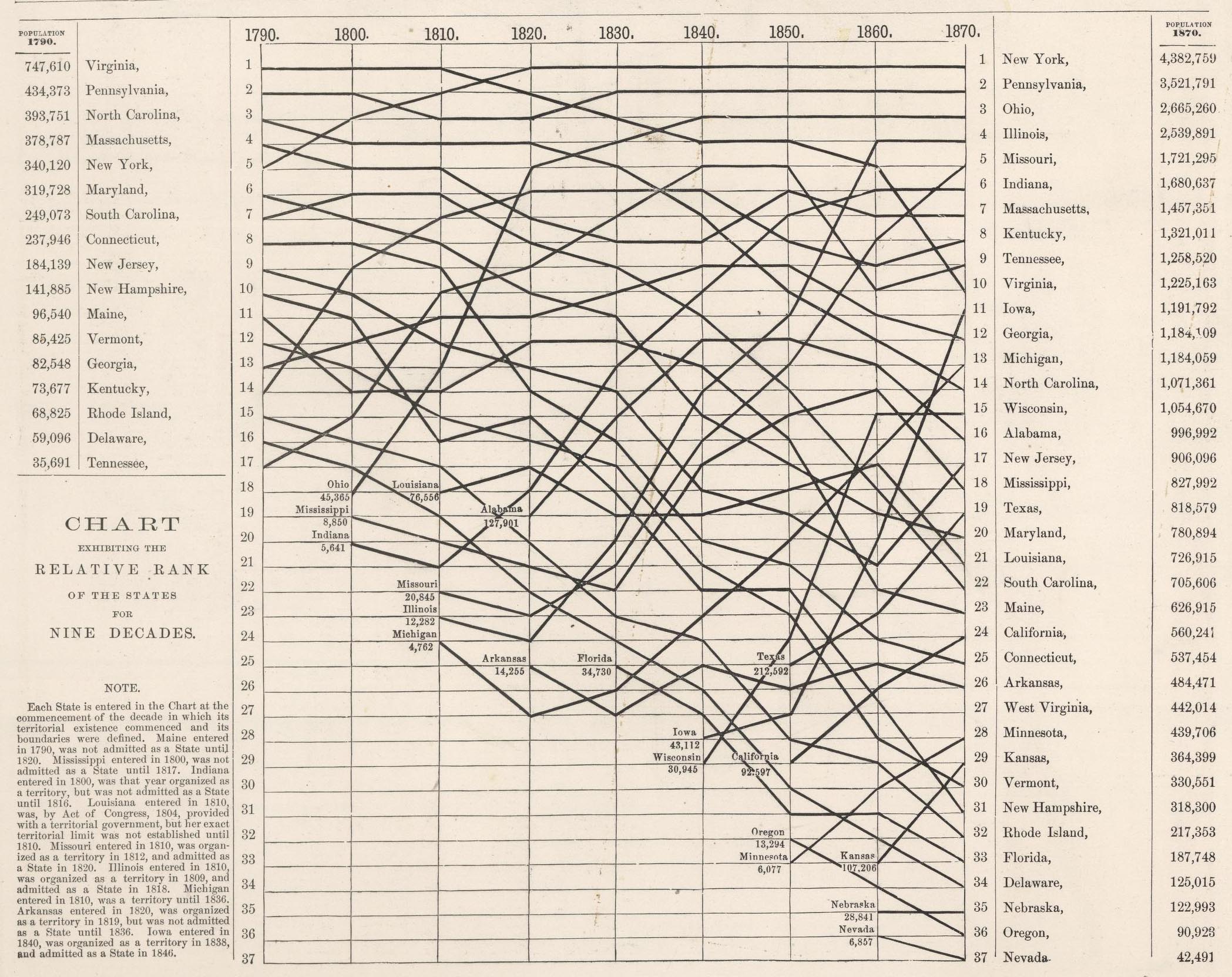
In 1878 O.W. Gray published "Chart Exhibiting the Relative Rank of the States for Nine Decades (1790-1870)." This is another kind of timeline that shows changing rank relationships between the U.S. states over time:
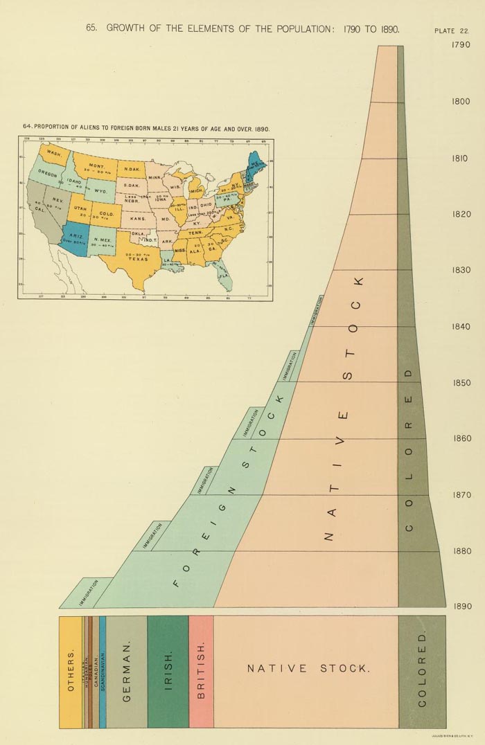
The chart below appeared in Henry Gannett's "Statistical atlas of the United States, based upon results of the Eleventh Census (1890)." Titled "Growth of the elements of the population: 1790 to 1890. (with) Proportion of aliens to foreign born males 21 years of age and over 1890," it is based on the Eleventh Census (1890) of the United States. It combines perspective, three dimensional views, map and timeline together.
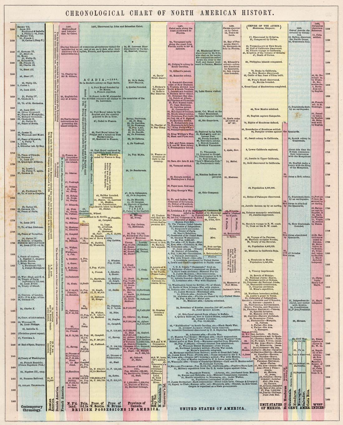
The "Chronological Chart of North American History" appeared in Colton and Fisher's "Illustrated Cabinet Atlas and Descriptive Geography" of 1859. The chart uses color coding to arrange important historical events by time and geography.
Edward Quin published "An Historical Atlas; In a Series of Maps of the World as Known at Different Periods" in 1830. Rather than a strict timeline, Quin creates an entirely unique kind of time map series by using 21 maps that show progressively receding cloud borders to indicate the expansion of geographical knowledge over time. Below are 4 of the 21 maps.
The first map in the series is B.C. 2348. The Deluge:

The third is B.C. 753. The Foundation Of Rome:

The eighth is A.D. 1. The Roman Empire In The Augustan Age:

And the sixteenth is A.D. 1498. The Discovery Of America:

These two time diagrams show time in several locations relative to the time of noon at Washington, D.C. A.J. Johnson published the diagram below with the title "A Diagram Exhibiting the difference of time between the places shown & Washington." It appeared as the last page in his "New Illustrated (Steel Plate) Family Atlas" of 1860.

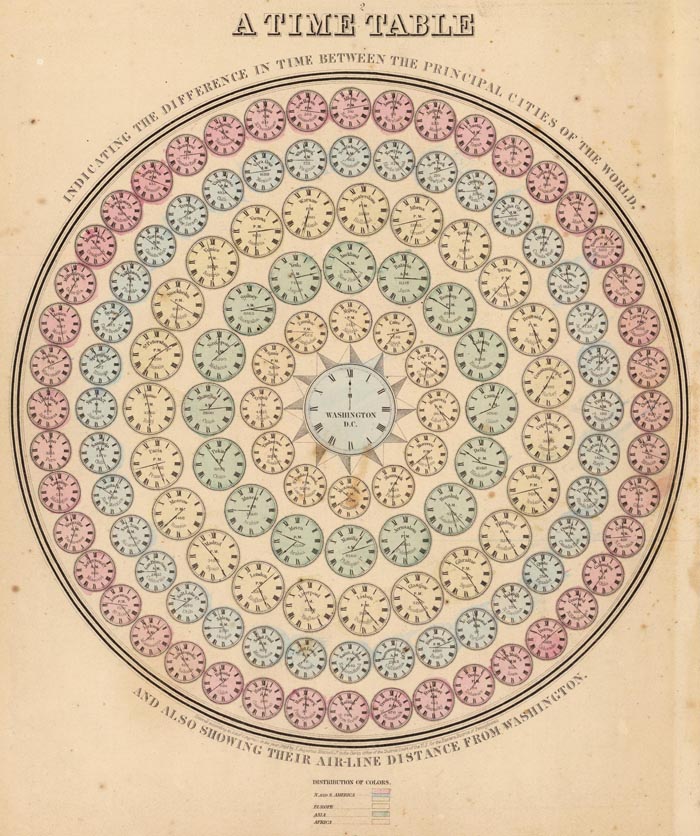
Mitchell's "A time table indicating the difference in time between the principal cities of the World and also showing their air-line distance from Washington" is similar with a slight change in style.
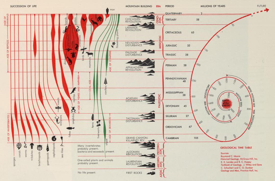
Finally, Herbert Bayer's amazing chart below, the "Succession of Life and Geological Time Table" extends the timeline from the birth of the earth to the appearance of man - tying geologic history and the evolution of life together in one chart. It appeared in his "World Geo-Graphic Atlas" of 1953.
23 Comments on Timeline Maps
Julie S-S
on March 29, 2012 at 9:48PM wrote:
Fantastic! I had no idea you had so many of these timeline charts. They are great.
Edla Maria Bezerra Lima
on March 31, 2012 at 3:09PM wrote:
Very, very good! I love it.
Patrick Durusau
on April 10, 2012 at 1:47AM wrote:
A welcome reminder of world views that fascinate, despite not being our own. Thanks!
Patrick
Gael
on April 13, 2012 at 2:03AM wrote:
Magnifique. C’est le début de tout voyage. Même en rêve. Fantastic. The beginning of any sort of travel. Daydreaming as well.
PATRICK
on April 24, 2012 at 12:59PM wrote:
ON ADAMS TIMELINE YOU ARE MISSING PAGE 8
David Rumsey
on April 24, 2012 at 7:44PM wrote:
Thanks for pointing this out. Actually the pages were just mis-numbered and we have corrected that – all pages are present.
Jon Hurst
on April 27, 2012 at 12:34AM wrote:
Absolutely wonderful. Thank you so much. What a great compilation you have provided. I find it fascinating how so many of these conceptualizations are based off our cognitive/geographical understanding and illustrations of water systems. Now – to wrap my mind around this content…
Katy
on April 28, 2012 at 6:26AM wrote:
This is amazing!!!!
solomon
on May 5, 2012 at 5:04PM wrote:
Great collection!
Thanks for the great quality scans!
Cristina
on May 24, 2012 at 8:40AM wrote:
awesome, thank you so much!
Felipe Magalhaes
on May 25, 2012 at 4:52AM wrote:
an excellent collection. however, it’s really important to point out the ethnocentric dimension to many of these maps. people are talking out there on tumblr about “civilization breaking the clouds of ignorance” and other 19th century eurocentric views of things (which is always scary to see…)
Richard Webb
on May 27, 2012 at 1:35AM wrote:
Lovely collection. Thanks David. Very inspiring. BTW I wonder if you saw the History of London through mapping exhibition a couple of years ago at British Library. Almost like a stop motion development of a city, in lots of different styles. Worth seeing the book
Ahmed Fasih
on June 21, 2012 at 6:15AM wrote:
I particularly liked Sparks’ Histomap (memories of the computer game Civilization3 came to mind). The thing I really miss when scrolling through it, or Eugene Pick’s or Sebastian Adams’ chronofiles, is the primary sources of an era, be it literature, archaeology, myth, etc. I was recently pleasantly surprised by the number of European and Arab accounts of the Mongol empires (Ibn Battuta, Ruy de Gonzalez, John of Pian de Carpine, William of Rubruck, Marco Polo)—-most whom are available on Google Books or Archive.org as 100+ year old English translations. At the same time I was devastated upon learning that the Khazars left no literature of their own, and like many Germanic and British tribes are known only through other nations’ writers. Are there any modern tools that could help me in constructing a chronofile like the ones here but focusing on the myriad primary sources available for any era?
HowardJay
on May 2, 2013 at 10:48PM wrote:
David, I found an 1846 version of this Chart with events updated through 1846. Do you know of such a version? Do you thing they updated it periodically or is there something questionable about an 1846 version? Thanks,
HowardJay
on May 2, 2013 at 10:49PM wrote:
I should have added that I'm speaking of the Colton Chart. Thanks.
David Rumsey
on May 3, 2013 at 8:18AM wrote:
Interesting. Yes Colton did update the chart, but I was not aware of your 1846 issue.
Suzanne Abajian
on August 26, 2013 at 1:15PM wrote:
Agree...great collection. By any chance know if/and or where the "History of Religion" by Sparks is housed or on display? Thanks.
Max Ralph
on May 3, 2014 at 8:51AM wrote:
Great collection. Thank you for sharing ! I have some questions about Eugene Pick's timeline. What are the meanings of the numbers beside the names ? What does the Western Hemisphere's map look like ? Does it represent the history of America ? In fact, I am wondering if this second timeline really exists, because it does not fit with the mentality of the first one. It seems that there is a little mistake in the text concerning the date of the chart's beginning: it is 4963 BC and not 4004 BC. I would be glad to read your answer. Again, thank you for this post. Max
chetan k. patel
on July 17, 2014 at 3:25AM wrote:
good
Ada
on March 4, 2016 at 6:41AM wrote:
I cannot speak about the accuracy of the other nations and states,but on the Histomap it indicates that Bulgaria emerged as a state around 800 A.D. while it actually emerged in 681 A.D.
AJ Bengoa
on August 17, 2017 at 9:04PM wrote:
Thank you so much for the effort to provide a collection such as this and it just goes to show that brilliant minds have been organizing data throughout the ages and I would be of a mind to "update" so many of these ideas with new data. So cool thank you!!!
google keyword
on November 23, 2018 at 4:46AM wrote:
Have you ever thought about creating an ebook or guest authoring on other sites? I have a blog centered on the same ideas you discuss and would really like to have you share some stories/information. I know my viewers would value your work. If you’re even remotely interested, feel free to send me an e-mail. google keyword
Great maps. Wonderful collection. Thanks!